Bootstrap 4 flex grid system only
UPDATE (JULY 2019)
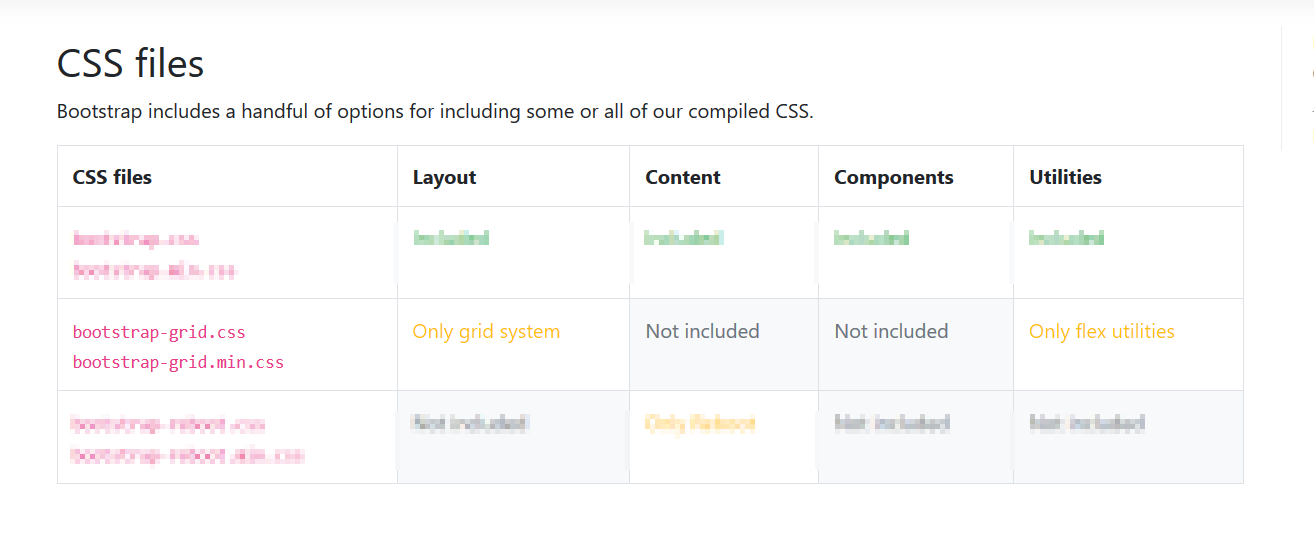
With the release of v4 you can simply use either bootstrap-grid.css or bootstrap-grid.min.css , it only includes grid system and flex utilities
Old Answer:
At this Alpha stage, you can toggle between true/false for using flexbox (if using a CSS preprocessor) as per bootstrap V4 Alpha docs
Flexbox support has finally come to Bootstrap. Opt-in to the new CSS
layout styles with the flick of a variable or the swap of a
stylesheet.
How it works:
If you’re familiar with modifying variables in Sass—or any other CSS
preprocessor—you’ll be right at home to move into flexbox mode.
- Open the
_variables.scssfile and find the$enable-flexvariable.- Change it from
falsetotrue.- Recompile, and done!
Alternatively, if you don’t need the source Sass files, you may swap
the default Bootstrap compiled CSS with the compiled flexbox
variation. Head to the download page for more information.
bootstrap 4.1 - to get grid system only
Just use bootstrap-grid.css included in the Bootstrap 4 download.
http://getbootstrap.com/docs/4.1/getting-started/contents/#css-files
This includes the grid, flexbox and display utilities, but not all the utilities like the borders, spacing, etc..
Is this kind of layout possible with only flexbox or bootstrap?
Bootstrap 4 uses flexbox, so columns in each row are the same height. The desktop layout could be achieved using nesting with 2 outer columns. However, to change the order/position of the columns, as you want for mobile, the columns must all be in the same .row...
Therefore, you can "disable" the flexbox on md and larger using the d-block
class along with the float utility classes. On smaller mobile widths, the flexbox behavior will kick back in, and the order-* classes can be used to position the columns.
<div class="container">
    <div class="row d-md-block">
        <div class="col-md-8 order-1 float-left">1</div>
        <div class="col-md-4 order-3 float-right">3</div>
        <div class="col-md-8 order-2 float-left">2</div>
        <div class="col-md-4 order-5 float-right">5</div>
        <div class="col-md-8 order-4 float-left">4</div>
    </div>
</div>
https://www.codeply.com/go/5z7096wfGO
Related: Rearranging responsive Bootstrap 4 grid layout
Import only grid system from bootstrap to react
The simplest way is to reference the grid only CSS from the React public/index.html
<link
rel="stylesheet"
href="https://stackpath.bootstrapcdn.com/bootstrap/4.4.1/css/bootstrap-grid.min.css" />
Demo: https://codesandbox.io/s/bootstrap-4-react-hello-world-7b8xw
How to break out of 12 col grid with bootstrap 4 flexbox grid?
Bootstrap 4 has flexbox, and it's still based on a 12-unit grid, however there is also a new auto-layout grid which allows for any number of columns...
Auto-layout columns:
http://codeply.com/go/JbGGN4Ok3A
Also, using SASS, you can change the number of grid columns using the $grid-columns variable. In your example, a 10-unit grid would work. Combine this with auto-layout and you can get:
[1:5][-----3:5-----][1:5]
SASS
  $enable-flex:true;
  $grid-columns: 10;
  $grid-gutter-width: 15px;
HTML
 <div class="row">
         <div class="col-xs">
              1:5
         </div>
         <div class="col-xs-6">
               3:5
         </div>
         <div class="col-xs">
               1:5
         </div>
 </div>
http://codeply.com/view/WG1jllYC2K
Note: You can also use the $grid-gutter-width variable to change the spacing between columns.
UPDATE
Bootstrap 4.0.0: https://www.codeply.com/go/6jTDGBnPIO
As of Bootstrap 4 (alpha 6) the auto-layout .col is now used for flex-grow so that you can create half-unit column layouts. The 2.5--7--2.5 layout is mathematically very close to your 1.5--3.5--1.5 (10-unit) so this may be another option instead of the custom SASS 10 unit grid.
http://www.codeply.com/go/kBqRVNPE6E
Bootstrap 4 masonry layout utilizing flexbox grid
This is pretty much doable with standard Bootstrap 4 classes. There is even a whole section in the documentation about the Card columns feature.
From the docs:
Cards can be organized into Masonry-like columns with just CSS by wrapping them in .card-columns. Cards are built with CSS column properties instead of flexbox for easier alignment. Cards are ordered from top to bottom and left to right.
Heads up! Your mileage with card columns may vary. To prevent cards breaking across columns, we must set them to display: inline-block as column-break-inside: avoid isn’t a bulletproof solution yet.
So, all you have to do is to wrap your .cards into a .card-columns container like this:
<div class="container">

  <div class="card-columns">

    <div class="card">

      <img class="card-img-top" src="http://via.placeholder.com/1600x900/483D8B/ffffff?text=Card+1" alt="Card image cap">

      <div class="card-body">

        <h5 class="card-title">Card title that wraps to a new line</h5>

        <p class="card-text">This is a longer card with supporting text below as a natural lead-in to additional content. This content is a little bit longer.</p>

      </div>

    </div>

    <div class="card p-3">

      <blockquote class="blockquote mb-0 card-body">

        <p>Lorem ipsum dolor sit amet, consectetur adipiscing elit. Integer posuere erat a ante.</p>

        <footer class="blockquote-footer">

          <small class="text-muted">

            Someone famous in <cite title="Source Title">Source Title</cite>

          </small>

        </footer>

      </blockquote>

    </div>

    <div class="card">

      <img class="card-img-top" src="http://via.placeholder.com/1600x450/9400D3/ffffff?text=Card+2" alt="Card image cap">

      <div class="card-body">

        <h5 class="card-title">Card title</h5>

        <p class="card-text">This card has supporting text below as a natural lead-in to additional content.</p>

        <p class="card-text"><small class="text-muted">Last updated 3 mins ago</small></p>

      </div>

    </div>

    <div class="card bg-primary text-white text-center p-3">

      <blockquote class="blockquote mb-0">

        <p>Lorem ipsum dolor sit amet, consectetur adipiscing elit. Integer posuere erat.</p>

        <footer class="blockquote-footer">

          <small>

            Someone famous in <cite title="Source Title">Source Title</cite>

          </small>

        </footer>

      </blockquote>

    </div>

    <div class="card text-center">

      <div class="card-body">

        <h5 class="card-title">Card title</h5>

        <p class="card-text">This card has supporting text below as a natural lead-in to additional content.</p>

        <p class="card-text"><small class="text-muted">Last updated 3 mins ago</small></p>

      </div>

    </div>

    <div class="card">

      <img class="card-img" src="http://via.placeholder.com/1600x1600/FF1493/ffffff?text=Card+3" alt="Card image">

    </div>

    <div class="card p-3 text-right">

      <blockquote class="blockquote mb-0">

        <p>Lorem ipsum dolor sit amet, consectetur adipiscing elit. Integer posuere erat a ante.</p>

        <footer class="blockquote-footer">

          <small class="text-muted">

            Someone famous in <cite title="Source Title">Source Title</cite>

          </small>

        </footer>

      </blockquote>

    </div>

    <div class="card">

      <div class="card-body">

        <h5 class="card-title">Card title</h5>

        <p class="card-text">This is a wider card with supporting text below as a natural lead-in to additional content. This card has even longer content than the first to show that equal height action.</p>

        <p class="card-text"><small class="text-muted">Last updated 3 mins ago</small></p>

      </div>

    </div>

  </div>

</div>

<link href="https://maxcdn.bootstrapcdn.com/bootstrap/4.0.0/css/bootstrap.min.css" rel="stylesheet"/>
Related Topics
Scale HTML Table Before Printing Using CSS
Use HTML Tag Names, Classes or Ids in CSS
React Pseudo Selector Inline Styling
CSS Scroll Snapping, Vertical Not Working
Twitter Bootstrap 3 How to Activate Navbar-Collapse on Small Devices
Firefox Line-Height Issue with Input Fields
CSS Transition Does Not Work on Top Property in Ff
How to Change Background-Color on Text Links on Hover But Not Image Links
How to Get Div Height 100% Inside Td of 100%
Font Face Not Working in IE8 as Expected
How to Use Svg Sprite Sheet as CSS Background-Image While Maintaining Aspect Ratio and Scalability
How to Make a Transparent Border with CSS
:Hover:Before Text-Decoration None Has No Effects
Are There Specific CSS Selectors Targeting Ie10
Adding Custom CSS Tags to an Rmarkdown HTML Document
Table Cell Loses Border When CSS Gradient Filter Is Applied in IE8
Css: Fixed with Horizontal Menu, with Variable Width Tabs, Using Ul