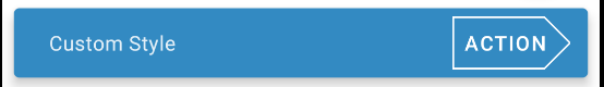
How to customize the style of the action button in the Snackbar
With the version 1.1.0 of the Material Components Library you can define in your app theme the style used by the action button within a Snackbar using the snackbarButtonStyle attribute.
<style name="AppTheme" parent="Theme.MaterialComponents.*">

    <!-- Style to use for action button within a Snackbar in this theme. -->
    <item name="snackbarButtonStyle">@style/Widget.MaterialComponents.Button.TextButton.Snackbar</item>
    ....
</style>
You can customize the style using:
  <style name="Custom.MaterialComponents.Button.TextButton.Snackbar" parent="@style/Widget.MaterialComponents.Button.TextButton.Snackbar">
    <item name="strokeColor">@color/...</item>
    <item name="strokeWidth">1dp</item>
    ....
    <item name="shapeAppearanceOverlay">@style/Snackbar.ShapeAppearanceOverlay.Arrow</item>
  </style>
With the shapeAppearanceOverlay you can customize the shape:
  <style name="Snackbar.ShapeAppearanceOverlay.Button.Arrow" parent="">
    <item name="cornerFamily">rounded</item>
    <item name="cornerFamilyTopRight">cut</item>
    <item name="cornerFamilyBottomRight">cut</item>

    <item name="cornerSizeTopLeft">0dp</item>
    <item name="cornerSizeBottomLeft">0dp</item>
    <item name="cornerSizeTopRight">50%</item>
    <item name="cornerSizeBottomRight">50%</item>
  </style>
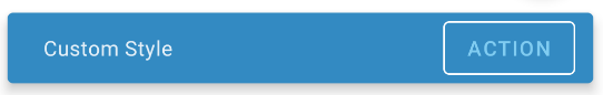
You can obtain an OutlinedButton style in same way. Just define a custom style with:
  <style name="Outlined.MaterialComponents.Button.TextButton.Snackbar" parent="@style/Widget.MaterialComponents.Button.OutlinedButton">
    <item name="strokeColor">@color/...</item>
    <item name="strokeWidth">1dp</item>
    <item name="android:textColor">@color/...</item>
  </style>
How to change background color of the snackbar?
Try setting background color like this:
sbView.setBackgroundColor(ContextCompat.getColor(getActivity(), R.color.BLACK));
It will work 100% !
Android Material Snackbar Old Style
Snackbars can span the entire width of the screen only when a UI does not use persistent navigation components like app bars or bottom navigation bars.
Snackbars that span the entire width of a UI can push only FABs up when they appear.
Since I don't have your code you can try setting the style of Snackbar by adding this line in your AppTheme in styles.xml or themes.xml:
<item name="snackbarStyle">@style/Widget.MaterialComponents.Snackbar.FullWidth</item>
Or programmatically you can try this:
// Create the Snackbar
Snackbar snackbar = Snackbar.make(containerLayout, "", Snackbar.LENGTH_LONG);
// Get the Snackbar's layout view
Snackbar.SnackbarLayout layout = (Snackbar.SnackbarLayout) snackbar.getView();
//If the view is not covering the whole snackbar layout, add this line
layout.setPadding(0,0,0,0);
// Show the Snackbar
snackbar.show();
How to use Material Snackbar in my application?
I have found the error as there was <item name="android:background">@color/white</item> overriding the TextView background color and even specifying the android:background in the specified style of the widget will not override the main background specified in the main AppTheme
Angular Material custom theme on dialog, snackbar,...entryComponents
Somewhere in your app you need to apply your typography to the application page body so that all components automatically inherit from it including the overlay component that holds the dialog. In the stackblitz demo, you commented that out to test your typography:
body {
    /* font-family: Roboto, Arial, sans-serif; */
    margin: 0;
}
So you either need to replace that in your theme file with something like:
body {
    font-family: mat-font-family($custom-typography);
    margin: 0;
}
Or (you can't do this when using stackblitz) use the Angular Material typography class in your main index.html page:
<body class="mat-typography">
    ...
</body>
Also, your typography configuration needs to define sizes and weight for all of the typography levels used by Angular Material. An easy way to simply modify the default configuration is using a SASS merge. For example:
$custom-typography: map-merge(
    mat-typography-config(),
    mat-typography-config(
        $font-family: 'Roboto, sans-serif'
    )
);
This takes your definitions and writes them over the default configuration, leaving anything you didn't re-define intact.
And you only need to call mat-core() alone as it will call angular-material-typography() which in turn calls mat-base-typography().
Related Topics
Android:Change Button Text and Background Color
Sqlite Query in Android to Count Rows
Custom 'Keyboard' Built in an Application on Android
Failed to Launch Emulator: Error: Emulator Didn't Connect Within 60 Seconds
Android Camera: Onactivityresult() Intent Is Null If It Had Extras
Android: Subscribe to Firebase Cloud Messaging(Fcm) Topic
Change Device Language via Adb
Updated Sdk Version, Getting Classnotfoundexception: Android.Support.V4.View.Viewpager
How to Detect "Recent Apps" System Button Clicks (Honeycomb+)
5.1 Crash - a Taskdescription's Primary Color Should Be Opaque
How to Set an Imageview's Image from a String
Using Webview Sethttpauthusernamepassword
Dependency Ignored Because of Conflict Android Studio
What Is the Android UI Thread Stack Size Limit and How to Overcome It