set view text align at center in spinner in android
Create a adapter for your spinner like this,
ArrayAdapter<String> adapter = new ArrayAdapter<String>(context, R.layout.my_spinner_style,array_of_values) {

    public View getView(int position, View convertView,ViewGroup parent) {

        View v = super.getView(position, convertView, parent);

        ((TextView) v).setTextSize(16);

        return v;

    }

    public View getDropDownView(int position, View convertView,ViewGroup parent) {

        View v = super.getDropDownView(position, convertView,parent);

        ((TextView) v).setGravity(Gravity.CENTER);

        return v;

    }

};
Now your layout R.layout.my_spinner_style,
<?xml version="1.0" encoding="utf-8"?>
<TextView xmlns:android="http://schemas.android.com/apk/res/android"
android:id="@+android:id/text1"
style="?android:attr/spinnerItemStyle"
android:singleLine="true"
android:textColor="#ffffff"
android:layout_width="fill_parent"
android:layout_height="wrap_content"
android:ellipsize="marquee" />
Now set this adapter to your spinner,
spinner.setAdapter(adapter);
Align Text in Center - Spinner
I've followed this : http://nevescheng.blogspot.fr/2013/05/spinner-with-item-text-aligned-to-center.html & this worked fine
I've noticed that i had another spinner xml in value-v11 Folder & this one was Not Modified, i've Modified it & its worked
How do I center text in a spinner in Android
The component that actually creates the items for the Spinner is the adapter. So you should customize it (by overriding the getView() method) to return centered TextView widgets.
In your case, replace the new ArrayAdapter<String> ... initialization with this code:
ArrayAdapter<String> dataAdapter = new ArrayAdapter<String>(this, android.R.layout.simple_spinner_item, NomProjets)
{
    @Override
    public View getView(int position, View convertView, ViewGroup parent)
    {
        return setCentered(super.getView(position, convertView, parent));
    }

    @Override
    public View getDropDownView(int position, View convertView, ViewGroup parent)
    {
        return setCentered(super.getDropDownView(position, convertView, parent));
    }

    private View setCentered(View view)
    {
        TextView textView = (TextView)view.findViewById(android.R.id.text1);
        textView.setGravity(Gravity.CENTER);
        return view;
    }
};
How to align text in Spinner for android?
Thank you all for giving all possible answers here is solution i get
 android:layout_width="75dp"

  android:layout_height="35dp"

  android:layout_marginLeft="5dp"

  android:paddingLeft="5dp"

  android:gravity="left"
Align spinner text to center
You have to pass layout on adapter.
Use below code:-
gender_array=getResources ().getStringArray (R.array.Gender);
gender_str= new ArrayAdapter<String> (c,R.layout.spinner_layout,gender_array);
gender_str.setDropDownViewResource (android.R.layout.simple_dropdown_item_1line);
gender.setAdapter (gender_str);
spinner_layout.xml
<?xml version="1.0" encoding="utf-8"?>
<TextView xmlns:android="http://schemas.android.com/apk/res/android"
    android:id="@+id/spinnerTarget"
    android:layout_width="match_parent"
    android:layout_height="40dp"
    android:paddingLeft="5dp"
    android:maxLines="1"
    android:gravity="center"
    android:singleLine="true"
    android:textColor="@color/white"
    android:textSize="12sp" />
Aligning Selected Spinner Item
You can adjust the settings for selected item in getView(int position, View convertView, ViewGroup parent) method. If you just want to set the gravity and text alignment, you should set it to the TextView in the method like
@Override
public View getView(int position, View convertView, ViewGroup parent) {
    TextView v = new TextView(mContext);
    v.setText(mColors.get(position));
    v.setGravity(Gravity.END); // OR v.setGravity(Gravity.RIGHT);
    return v;
}
Or you can simply inflate custom layout if you want to make further customization:
@Override
public View getView(int position, View convertView, ViewGroup parent) {
    LayoutInflater inflater = (LayoutInflater) mContext.getSystemService(
            Context.LAYOUT_INFLATER_SERVICE);
    View row = null;
    if (inflater != null) {
        row = inflater.inflate(R.layout.list_item_view_color, parent, false);
        TextView textView = row.findViewById(R.id.textview);
        textView .setText(mColors.get(position));
    }
    return row;
}
Where list_item_view_color.xml is your layout file for the selected value.
(NOTE: If you want to use options like autoSizeTextType, you can use them with app prefix for AppCompatTextView in xml files)
Setting the text to be in the center works for one spinner, but not for other
Try adding :
android:dropDownWidth="wrap_content"to the spinner.You can try to set the text style programatically after an item is selected from the spinner. Set an
setOnItemSelectedListenerand inside it set TextView to be centred.Spinner spinner1 = (Spinner) findViewById(R.id.spinner1);
spinner1.setOnItemSelectedListener(new AdapterView.OnItemSelectedListener() {
@Override
public void onItemSelected(AdapterView<?> arg0, View view, int arg2, long arg3) {
// Set the text style after item is selected.
setSpinnerSelectedItemParams(spinner1, getActivity());
}
@Override
public void onNothingSelected(AdapterView<?> parent) {
}
});
/**
* Sets the spinner text style to a different one after one value has been chosen.
* @param spinner Spinner currently in use
*/
public void setSpinnerSelectedItemParams(Spinner spinner, Context context) {
if (spinner.getChildCount() > 0){
TextView tvSpinner = ((TextView) spinner.getChildAt(0));
tvSpinner.setPadding(0, 0, 0, 0);
tvSpinner.setGravity(Gravity.CENTER);
LinearLayout.LayoutParams params = new LinearLayout.LayoutParams(ViewGroup.LayoutParams.WRAP_CONTENT, ViewGroup.LayoutParams.WRAP_CONTENT);
params.gravity = Gravity.CENTER;
params.setMargins(0, 0, 0, 0);
tvSpinner.setLayoutParams(params);
}
}If you want the text before selecting it in centre as well, try setting a custom resource when creating the adapter.
In Activity or Fragment:
ArrayAdapter<String> yourAdapter = new ArrayAdapter(activity, R.layout.default_spinner_adapter_view, yourDataToFillTheSpinner);"default_spinner_adapter_view.xml" file:
<?xml version="1.0" encoding="utf-8"?>
<!-- This is the view for each individual item of the spinner-->
<CheckedTextView xmlns:android="http://schemas.android.com/apk/res/android"
    android:id="@+id/tv_default_spinner"
    style="?android:attr/spinnerItemStyle"
    android:layout_width="match_parent
    android:layout_height="wrap_content"
    android:layout_gravity="center"
    android:ellipsize="marquee"
    android:gravity="center"
    android:singleLine="true"
    android:textAppearance="?android:attr/textAppearanceMedium"
    android:textColor="@android:color/black" />
How can I align text of the spinner to the centre?
You need to set your own layout for spinner item.
ArrayAdapter adap = new ArrayAdapter<String>(this, R.layout.spinner_item, new String[]{"ABC", "DEF", "GHI"});
spriner.setAdapter(adap);
Where R.layout.spinner_item is a layout with content:
<?xml version="1.0" encoding="utf-8"?>
<TextView xmlns:android="http://schemas.android.com/apk/res/android"
    android:layout_height="fill_parent"
    android:layout_width="fill_parent"
    android:gravity="center"/>
How to align spinner drop-down menu to center with spinner
To achieve the above requirements you can use a Material Drop Down Menu with a custom style which inherits from a parent of Widget.MaterialComponents.TextInputLayout.OutlinedBox.ExposedDropdownMenu.
1)First you have to declare this Material Drop Down Menu in your xml layout like below using a custom style. Note that using the attributes : android:dropDownHorizontalOffset="0dp" or android:dropDownVerticalOffset="10dp" you can move the popup menu Vertically/Horizontally with a specific amount of dp value.
<com.google.android.material.textfield.TextInputLayout
        android:id="@+id/dropDownTextInputLayout"
        style="@style/MyExposedDropdownMenu"
        android:layout_width="wrap_content"
        android:layout_height="wrap_content">

        <com.google.android.material.textfield.MaterialAutoCompleteTextView
            android:id="@+id/autoCompleteTextView"
            android:layout_width="160dp"
            android:layout_height="70dp"
            android:ellipsize="end"
            android:focusable="false"
            android:maxLines="1"
            android:gravity="center"
            android:dropDownHorizontalOffset="0dp"
            android:dropDownVerticalOffset="10dp"
            android:dropDownWidth="160dp"
            android:dropDownHeight="wrap_content"
            android:textColor="@color/white"
            android:inputType="none"
            android:singleLine="true"/>

    </com.google.android.material.textfield.TextInputLayout>
where @style/MyExposedDropdownMenu is your custom style like below. In this style the key points is that we inherit from the parent OutlinedBox.ExposedDropdownMenu and we override the boxBackgroundColor to change the TextInputLayout Drop Down Box Colour and the custom shapeAppearance where you can change the corner radius of TextInputLayout.
    <style name="MyExposedDropdownMenu" parent="Widget.MaterialComponents.TextInputLayout.OutlinedBox.ExposedDropdownMenu">
        <item name="boxBackgroundColor">@android:color/black</item>
        <item name="shapeAppearance">@style/ShapeAppearance.App.SmallComponent</item>
        <item name="hintTextColor">@android:color/white</item>
        <item name="endIconTint">@android:color/white</item>
    </style>

    <style name="ShapeAppearance.App.SmallComponent" parent="ShapeAppearance.MaterialComponents.SmallComponent">
        <item name="cornerSize">50dp</item>
    </style>
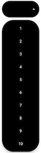
2)To make also each item in the Drop Down list to have rounded corners you can achieve this programmatically using a custom ShapeAppearanceModel with the attribute CornerFamily.ROUNDED and the rounded value in pixels. Finally to align each item in Center you have to make a custom layout with android:textAlignment="center" and pass this custom layout item into your adapter.
Below is how to achieve the above tasks in code:
//your data
String[] items  = {"1","2","3","4","5","6","7", "8","9", "10"};

//get your MaterialAutoCompleteTextView
MaterialAutoCompleteTextView mAutoCompleteTV = findViewById(R.id.autoCompleteTextView);

//initialize your adapter with a custom list item layout
ArrayAdapter<String> adapter = new ArrayAdapter<String>(this, R.layout.custom_drop_down_item , items);

//create your custom ShapeAppearanceModel for your Drop Down Item
ShapeAppearanceModel shapeAppearanceModel = new ShapeAppearanceModel()
        .toBuilder()
        .setAllCorners(CornerFamily.ROUNDED, dp2px(getResources(), 50))
        .build();

//get the current DropDownBackground
Drawable dropDownDrawable = mAutoCompleteTV.getDropDownBackground();

//and change the MaterialShapeDrawable fill Color and set your Custom ShapeAppearanceModel
if(dropDownDrawable instanceof MaterialShapeDrawable)
{
    MaterialShapeDrawable dropDownBackground = (MaterialShapeDrawable) dropDownDrawable;
    dropDownBackground.setFillColor(ContextCompat.getColorStateList(this, android.R.color.black));
    dropDownBackground.setShapeAppearanceModel(shapeAppearanceModel);
}

//sets the adapter to MaterialAutoCompleteTextView
mAutoCompleteTV.setAdapter(adapter);
with a helper function of dp to pixels to set the correct corner radius in pixels:
public static int dp2px(Resources resource, int dp) {
    return (int) TypedValue.applyDimension(TypedValue.COMPLEX_UNIT_DIP, dp,resource.getDisplayMetrics());
}
and the R.layout.custom_drop_down_item is your custom item layout like below (with android:textAlignment="center" to center each item):
<?xml version="1.0" encoding="utf-8"?>
<TextView
    xmlns:android="http://schemas.android.com/apk/res/android"
    android:layout_width="match_parent"
    android:layout_height="wrap_content"
    android:padding="16dp"
    android:ellipsize="end"
    android:textAlignment="center"
    android:textColor="@android:color/white"
    android:maxLines="1"
    android:textAppearance="?attr/textAppearanceSubtitle1" />
And the Final Result will be like below:
Related Topics
Change Background of Edittext's Error Message
How to Get Background Color from Current Theme Programmatically
Designing Android Apps for Tablets
Add Drop Shadow Effects to Edittext Field
Calling Camera from an Activity, Capturing an Image and Uploading to a Server
How to Prevent The Activity from Loading Twice on Pressing The Button
Signing My Android Application as System App
Remove Animation/Shifting Mode from Bottomnavigationview Android
Android: Choose Default Launcher Programmatically
Syncadapter Without a Contentprovider
Android Understanding Heap Sizes
How to Load Image as Bitmap to Glide
How to Make Part of The Text Bold in Android at Runtime
How to Take Pictures from The Camera Without Preview When My App Starts
How to Debug on a Real Device (Using Eclipse/Adt)