MaterialComponents theme alert dialog buttons
I figured out what was causing this problem. I need to use different AlertDialog class:
androidx.appcompat.app.AlertDialog
When I switched to this everything started working as expected. Here's where I found the solution:
https://github.com/material-components/material-components-android/issues/162
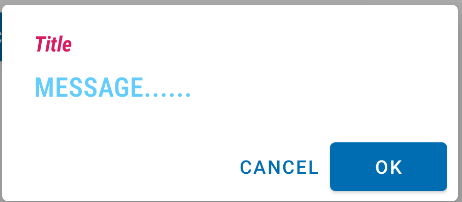
MaterialComponents AlertDialog text color
With the Material Components you can use a style like:
<!-- Alert Dialog -->
  <style name="MyThemeOverlay.MaterialAlertDialog" parent="@style/ThemeOverlay.MaterialComponents.MaterialAlertDialog">

      <!-- Title -->
      <item name="materialAlertDialogTitleTextStyle">@style/MyTitle_MaterialAlertDialog.MaterialComponents.Title.Text</item>

     <!-- Body -->
     <item name="materialAlertDialogBodyTextStyle">@style/BodyTextAppearance.MaterialComponents.Body2</item>

     <!-- Buttons -->
     <item name="buttonBarPositiveButtonStyle">@style/PositiveButtonStyle</item>
     <item name="buttonBarNegativeButtonStyle">@style/NegativeButtonStyle</item>
     <item name="buttonBarNeutralButtonStyle">....</item>
  </style>

  <style name="PositiveButtonStyle" parent="@style/Widget.MaterialComponents.Button.TextButton.Dialog">
    <item name="android:textColor">#FFFFFF</item>
    <item name="backgroundTint">#00f</item>
  </style>

  <style name="NegativeButtonStyle" parent="@style/Widget.MaterialComponents.Button.TextButton.Dialog">
    <item name="android:textColor">@color/primaryDarkColor</item>
  </style>

  <style name="MyTitle_MaterialAlertDialog.MaterialComponents.Title.Text" parent="@style/MaterialAlertDialog.MaterialComponents.Title.Text">
    <item name="android:textColor">@color/colorAccent</item>
    <item name="android:textAppearance">@style/MyTitle_TextAppearance.MaterialComponents.Subtitle1</item>
  </style>

  <style name="BodyTextAppearance.MaterialComponents.Body2" parent="@style/TextAppearance.MaterialComponents.Body2">
    <item name="android:textColor">@color/colorAccent</item>
    <item name="android:textSize">20sp</item>
    <item name="android:textStyle">bold</item>
    <item name="android:textAllCaps">true</item>
    <item name="fontFamily">sans-serif-condensed-light</item>
  </style>
Then you can refer this style in the constructor like:
    new MaterialAlertDialogBuilder(context,
        R.style.MyThemeOverlay.MaterialAlertDialog)
or you can set it as default in your app theme:
<style name="AppTheme" parent="Theme.MaterialComponents.DayNight">

     <item name="materialAlertDialogTheme">@style/MyThemeOverlay.MaterialAlertDialog
    </item>

</style>
Material Components theme dialog buttons go puffy after changing theme of Application
During research, I found the answer I will leave it here maybe it will help someone.
Reason that they look like this is because they use style="attr/buttonBarNegativeButtonStyle" and Material theme overrides them
To fix this problem you need to use Bridge theme instead of Theme.MaterialComponents.Light
<style name="Theme.MyApp" parent="Theme.MaterialComponents.Light.Bridge">
    <!-- ... -->
</style>
more here:
https://github.com/material-components/material-components-android/blob/master/docs/getting-started.md#bridge-themes
Using latest material outlined buttons with alertdialog
Since you are using a Material Theme you can use:
      new MaterialAlertDialogBuilder(MainActivity.this, R.style.MyMaterialAlertDialog)
          .setTitle("Clear cart")
          .setMessage("Pressing back...")
          .setPositiveButton("YES", null)
          .setNegativeButton("NO", /* listener = */ null)
          .show();
And then define the style:
  <style name="MyMaterialAlertDialog" parent="@style/ThemeOverlay.MaterialComponents.MaterialAlertDialog">
    <item name="buttonBarPositiveButtonStyle">@style/OutlinedButton</item>
    <item name="buttonBarNegativeButtonStyle">@style/OutlinedButton</item>
  </style>

  <style name="OutlinedButton" parent="Widget.MaterialComponents.Button.OutlinedButton">
    <item name="strokeColor">@color/colorAccent</item>
    <item name="strokeWidth">2dp</item>
  </style>

Material Alert Dialog, The style on this component requires your app theme to be Theme.AppCompat
You're passing in getApplicationContext() and the application context doesn't have your theme. Pass in your activity as the context:
AlertDialog.Builder builder = new MaterialAlertDialogBuilder(MainActivity.this)
    .setTitle("Title")
    .setMessage("Message")
builder.show();
Full width alert dialog buttons
The implementation of the theme overlays is missing in the library.
You can define it on your own, by:
Declare a full width button style, like:
  <style name="Button.FullWidth" parent="Widget.MaterialComponents.Button.TextButton.Dialog">
    <item name="android:layout_width">0dp</item>
    <item name="android:layout_weight">1</item>
    <item name="android:maxWidth">@null</item>
  </style>
Declare the theme overlay with full-width button styles:
  <style name="ThemeOverlay.MaterialComponents.MaterialAlertDialog.FullWidthButtons">
    <item name="materialAlertDialogButtonSpacerVisibility">2</item>
    <item name="buttonBarPositiveButtonStyle">@style/Button.FullWidth</item>
    <item name="buttonBarNegativeButtonStyle">@style/Button.FullWidth</item>
    <item name="buttonBarNeutralButtonStyle">@style/Button.FullWidth</item>
  </style>

Material' vs 'MaterialComponents'
The Theme.Material is provided by Android starting with API 21.
The Theme.MaterialComponents is provided by the Material Components library.
They are completely different.
If you want to use the Material Components Library the best way is to use the MaterialAlertDialogBuilder.
return new MaterialAlertDialogBuilder(context, R.style.myTheme);
and inherit the theme overlay from:
<style name="myTheme" parent="ThemeOverlay.MaterialComponents.MaterialAlertDialog">
Here you can check all the default attributes applied to the theme.
Why is my default alert dialog button text white?
Use the MaterialAlertDialogBuilder instead of AlertDialog.Builder:
    MaterialAlertDialogBuilder(context)
        .setTitle("Title")
        .setMessage(dialogPrompt)
        .setPositiveButton("OK",listener)
        .show()
The default color of the buttons is based on the colorPrimary color.
If you want to use a custom color you can use:
MaterialAlertDialogBuilder(context,R.style.AlertDialogTheme)
with this style
<style name="AlertDialogTheme" parent="ThemeOverlay.MaterialComponents.MaterialAlertDialog">
    <item name="buttonBarNegativeButtonStyle">@style/NegativeButtonStyle</item>
    <item name="buttonBarPositiveButtonStyle">@style/PositiveButtonStyle</item>
</style>

<style name="NegativeButtonStyle" parent="Widget.MaterialComponents.Button.TextButton.Dialog">
    <item name="android:textColor">@color/.....</item>
</style>

<style name="PositiveButtonStyle" parent="Widget.MaterialComponents.Button.TextButton.Dialog">
    <item name="android:textColor">@color/....</item>
</style>
Related Topics
How to Make an Fm Radio Application in Android
Android - Communicating Between Two Devices
Android Webview for Facebook Like Button
Getting Results of Nearby Places from User's Location Using Google Maps API in Android
Justify Text in an Android App Using a Webview But Presenting a Textview-Like Interface
React Native Adb Reverse Enoent
How to Play Audio File in Android
Mylib.So Has Text Relocations. This Is Wasting Memory and Is a Security Risk. Please Fix
Android Alternate Row Colors in Listview
Technical Details of Android Garbage Collector
How to Capture an Image in Background Without Using the Camera Application
Enabling Wifi on Android Emulator
Multiple Dex Files Define Lorg/Apache/Cordova/Buildhelper