Material Design not styling alert dialogs
UPDATED ON Aug 2019 WITH The Material components for android library:
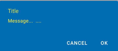
With the new Material components for Android library you can use the new com.google.android.material.dialog.MaterialAlertDialogBuilder class, which extends from the existing androidx.appcompat.AlertDialog.Builder class and provides support for the latest Material Design specifications.
Just use something like this:
new MaterialAlertDialogBuilder(context)
            .setTitle("Dialog")
            .setMessage("Lorem ipsum dolor ....")
            .setPositiveButton("Ok", /* listener = */ null)
            .setNegativeButton("Cancel", /* listener = */ null)
            .show();
You can customize the colors extending the ThemeOverlay.MaterialComponents.MaterialAlertDialog style:
  <style name="CustomMaterialDialog" parent="@style/ThemeOverlay.MaterialComponents.MaterialAlertDialog">
     <!-- Background Color-->
     <item name="android:background">#006db3</item>
     <!-- Text Color for title and message -->
     <item name="colorOnSurface">@color/secondaryColor</item>
     <!-- Text Color for buttons -->
     <item name="colorPrimary">@color/white</item>
     ....
  </style>
To apply your custom style just use the constructor:
new MaterialAlertDialogBuilder(context, R.style.CustomMaterialDialog)
To customize the buttons, the title and the body text check this post for more details.
You can also change globally the style in your app theme:
 <!-- Base application theme. -->
 <style name="AppTheme" parent="Theme.MaterialComponents.Light">
    ...
    <item name="materialAlertDialogTheme">@style/CustomMaterialDialog</item>
 </style>
WITH SUPPORT LIBRARY and APPCOMPAT THEME:
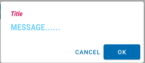
With the new AppCompat v22.1 you can use the new android.support.v7.app.AlertDialog.
Just use a code like this:
import android.support.v7.app.AlertDialog

AlertDialog.Builder builder =
       new AlertDialog.Builder(this, R.style.AppCompatAlertDialogStyle);
builder.setTitle("Dialog");
builder.setMessage("Lorem ipsum dolor ....");
builder.setPositiveButton("OK", null);
builder.setNegativeButton("Cancel", null);
builder.show();
And use a style like this:
<style name="AppCompatAlertDialogStyle" parent="Theme.AppCompat.Light.Dialog.Alert">
        <item name="colorAccent">#FFCC00</item>
        <item name="android:textColorPrimary">#FFFFFF</item>
        <item name="android:background">#5fa3d0</item>
    </style>
Otherwise you can define in your current theme:
<style name="AppTheme" parent="Theme.AppCompat.Light">
    <!-- your style -->
    <item name="alertDialogTheme">@style/AppCompatAlertDialogStyle</item>
</style>
and then in your code:
 import android.support.v7.app.AlertDialog

    AlertDialog.Builder builder =
           new AlertDialog.Builder(this);
Here the AlertDialog on Kitkat: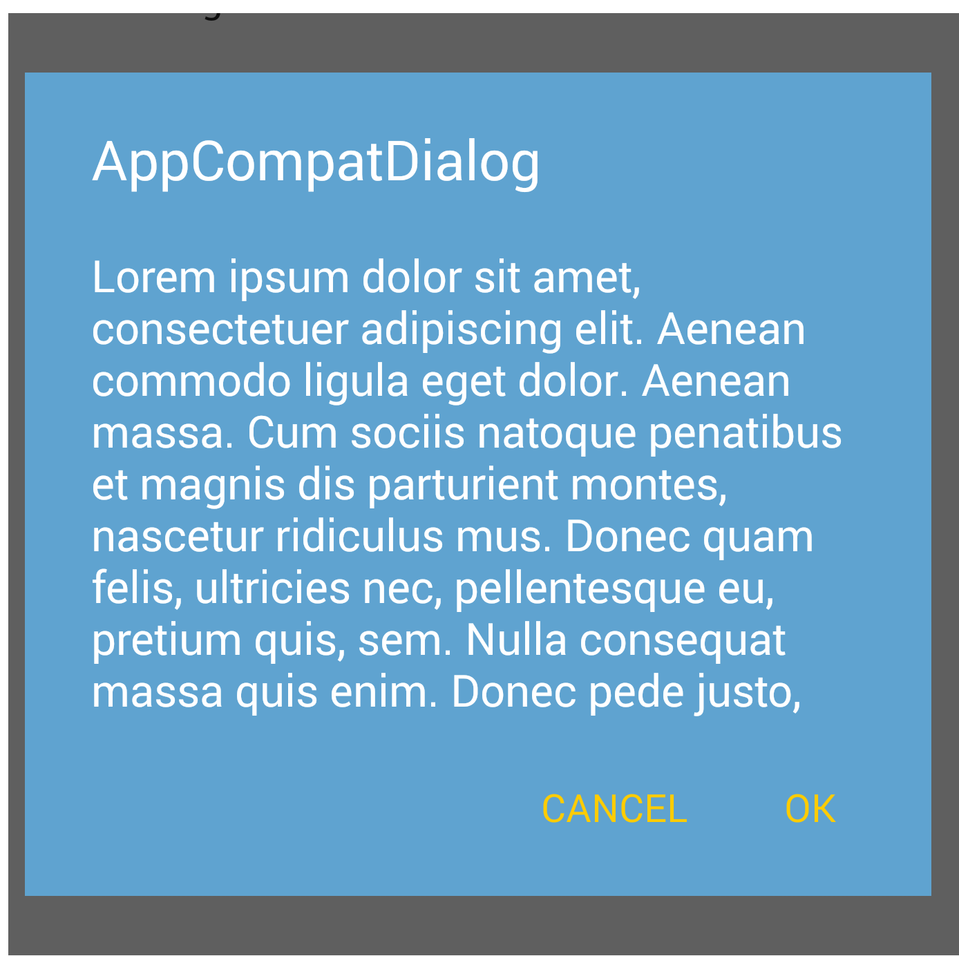
Material Design 3 DialogFragment is not styled like Dialogs using MaterialAlertDialogBuilder
Found the solution here https://dev.to/bhullnatik/how-to-use-material-dialogs-with-dialogfragment-28i1
Here's the sample code where you need to overwrite onCreateDialog and use the standard MaterialAlertDialogBuilder
public class YourSexyMaterialDialogFragment extends DialogFragment {

  View theDialogView;

  @Override
  public Dialog onCreateDialog(Bundle savedInstanceState) {
    MaterialAlertDialogBuilder builder = new MaterialAlertDialogBuilder(requireActivity());
    theDialogView = onCreateView(LayoutInflater.from(requireContext()), null, savedInstanceState);
    builder.setView(theDialogView);

    return builder.create();
  }

  @Override
  public View getView() {
      return theDialogView;
  }

  @Override
  public View onCreateView(@NonNull LayoutInflater inflater, ViewGroup container,
  Bundle savedInstanceState) {
    // remains the same where you inflate your custom view and setup ui components
  }

}
Android: AlertDialog with custom style in MaterialTheme throws resource not found exception
Use the MaterialAlertDialogBuilder which configures the instantiated AlertDialog with Material specs and theming.
Something like:
new MaterialAlertDialogBuilder(context,
                 R.style.MyThemeOverlay_MaterialComponents_MaterialAlertDialog)
            .setTitle("Dialog")
            //...
            .show();
Also use this parent style ThemeOverlay.MaterialComponents.MaterialAlertDialog.
MaterialComponents theme alert dialog buttons
I figured out what was causing this problem. I need to use different AlertDialog class:
androidx.appcompat.app.AlertDialog
When I switched to this everything started working as expected. Here's where I found the solution:
https://github.com/material-components/material-components-android/issues/162
Material Alert Dialog, The style on this component requires your app theme to be Theme.AppCompat
You're passing in getApplicationContext() and the application context doesn't have your theme. Pass in your activity as the context:
AlertDialog.Builder builder = new MaterialAlertDialogBuilder(MainActivity.this)
    .setTitle("Title")
    .setMessage("Message")
builder.show();
MaterialComponents AlertDialog text color
With the Material Components you can use a style like:
<!-- Alert Dialog -->
  <style name="MyThemeOverlay.MaterialAlertDialog" parent="@style/ThemeOverlay.MaterialComponents.MaterialAlertDialog">

      <!-- Title -->
      <item name="materialAlertDialogTitleTextStyle">@style/MyTitle_MaterialAlertDialog.MaterialComponents.Title.Text</item>

     <!-- Body -->
     <item name="materialAlertDialogBodyTextStyle">@style/BodyTextAppearance.MaterialComponents.Body2</item>

     <!-- Buttons -->
     <item name="buttonBarPositiveButtonStyle">@style/PositiveButtonStyle</item>
     <item name="buttonBarNegativeButtonStyle">@style/NegativeButtonStyle</item>
     <item name="buttonBarNeutralButtonStyle">....</item>
  </style>

  <style name="PositiveButtonStyle" parent="@style/Widget.MaterialComponents.Button.TextButton.Dialog">
    <item name="android:textColor">#FFFFFF</item>
    <item name="backgroundTint">#00f</item>
  </style>

  <style name="NegativeButtonStyle" parent="@style/Widget.MaterialComponents.Button.TextButton.Dialog">
    <item name="android:textColor">@color/primaryDarkColor</item>
  </style>

  <style name="MyTitle_MaterialAlertDialog.MaterialComponents.Title.Text" parent="@style/MaterialAlertDialog.MaterialComponents.Title.Text">
    <item name="android:textColor">@color/colorAccent</item>
    <item name="android:textAppearance">@style/MyTitle_TextAppearance.MaterialComponents.Subtitle1</item>
  </style>

  <style name="BodyTextAppearance.MaterialComponents.Body2" parent="@style/TextAppearance.MaterialComponents.Body2">
    <item name="android:textColor">@color/colorAccent</item>
    <item name="android:textSize">20sp</item>
    <item name="android:textStyle">bold</item>
    <item name="android:textAllCaps">true</item>
    <item name="fontFamily">sans-serif-condensed-light</item>
  </style>
Then you can refer this style in the constructor like:
    new MaterialAlertDialogBuilder(context,
        R.style.MyThemeOverlay.MaterialAlertDialog)
or you can set it as default in your app theme:
<style name="AppTheme" parent="Theme.MaterialComponents.DayNight">

     <item name="materialAlertDialogTheme">@style/MyThemeOverlay.MaterialAlertDialog
    </item>

</style>
Related Topics
Stopping an Android App from Console
Android: Remove All the Previous Activities from the Back Stack
How to Know My Android Application Has Been Upgraded in Order to Reset an Alarm
Get Cursor Position in Android in Edit Text
How to Set the Divider Between Tabs in Tablayout of Design Support Library
Google Maps API V2 Draw Part of Circle on Mapfragment
How to Disable Instant Run for Android Studio 3.0
Fragment Over Another Fragment Issue
Android: Get All Pendingintents Set with Alarmmanager
Android:Inapp Purchase Receipt Validation Google Play
Start an Activity from a Fragment
Android - Hold Button to Repeat Action
Android Intent for Playing Video
Proguard: Can't Find Referenced Class Com.Google.Android.Gms.R
How to Change the Package Name of an Android App on Google Play
Why Does My App Size on Device Differ Than the APK or Play Store Size