Image size for all screen devices
use directly https://romannurik.github.io/AndroidAssetStudio/
For example, two devices that both report a screen size of normal
might have actual screen sizes and aspect ratios that are slightly
different when measured by hand. Similarly, two devices that report a
screen density of hdpi might have real pixel densities that are
slightly different. Android makes these differences abstract to
applications, so you can provide UI designed for the generalized sizes
and densities and let the system handle any final adjustments as
necessary
You have to create different dimen , layout , images and icon files to support all devices.
changes in screen density.
xlarge screens are at least 960dp x 720dp
large screens are at least 640dp x 480dp
normal screens are at least 470dp x 320dp
small screens are at least 426dp x 320dp
Make this layout files, so that it will be same for all devices.
Give padding ,margin ,font and all properties as per devices.
res/layout/main_activity.xml           # For handsets (smaller than 600dp available width)
res/layout-sw600dp/main_activity.xml   # For 7” tablets (600dp wide and bigger)
res/layout-sw720dp/main_activity.xml   # For 10” tablets (720dp wide and bigger)
For Layout ,
res/layout/my_layout.xml              // layout for normal screen size ("default")
res/layout-large/my_layout.xml        // layout for large screen size
res/layout-xlarge/my_layout.xml       // layout for extra-large screen size
res/layout-xlarge-land/my_layout.xml  // layout for extra-large in landscape orientation
For Images
res/drawable-mdpi/graphic.png         // bitmap for medium-density
res/drawable-hdpi/graphic.png         // bitmap for high-density
res/drawable-xhdpi/graphic.png        // bitmap for extra-high-density
res/drawable-xxhdpi/graphic.png       // bitmap for extra-extra-high-density
For Icon
res/mipmap-mdpi/my_icon.png         // launcher icon for medium-density
res/mipmap-hdpi/my_icon.png         // launcher icon for high-density
res/mipmap-xhdpi/my_icon.png        // launcher icon for extra-high-density
res/mipmap-xxhdpi/my_icon.png       // launcher icon for extra-extra-high-density
res/mipmap-xxxhdpi/my_icon.png      // launcher icon for extra-extra-extra-high-density
For Launcher icon
36x36 (0.75x) for low-density
48x48 (1.0x baseline) for medium-density
72x72 (1.5x) for high-density
96x96 (2.0x) for extra-high-density
180x180 (3.0x) for extra-extra-high-density
192x192 (4.0x) for extra-extra-extra-high-density (launcher icon only; see note above)
Checkout Dimension and
Supporting Multiple Screens Official Documentaion.
Android splash screen image sizes to fit all devices
Disclaimer
This answer is from 2013 and is seriously outdated. As of Android 3.2 there are now 6 groups of screen density. This answer will be updated as soon as I am able, but with no ETA. Refer to the official documentation for all the densities at the moment (although information on specific pixel sizes is as always hard to find).
Here's the tl/dr version
Create 4 images, one for each screen density:
- xlarge (xhdpi): 640x960
- large (hdpi): 480x800
- medium (mdpi): 320x480
- small (ldpi): 240x320
Read 9-patch image introduction in Android Developer Guide
- Design images that have areas that can be safely stretched without compromising the end result
With this, Android will select the appropriate file for the device's image density, then it will stretch the image according to the 9-patch standard.
end of tl;dr. Full post ahead
I am answering in respect to the design-related aspect of the question. I am not a developer, so I won't be able to provide code for implementing many of the solutions provided. Alas, my intent is to help designers who are as lost as I was when I helped develop my first Android App.
Fitting all sizes
With Android, companies can develop their mobile phones and tables of almost any size, with almost any resolution they want. Because of that, there is no "right image size" for a splash screen, as there are no fixed screen resolutions. That poses a problem for people that want to implement a splash screen.
Do your users really want to see a splash screen?
(On a side note, splash screens are somewhat discouraged among the usability guys. It is argued that the user already knows what app he tapped on, and branding your image with a splash screen is not necessary, as it only interrupts the user experience with an "ad". It should be used, however, in applications that require some considerable loading when initialized (5s+), including games and such, so that the user is not stuck wondering if the app crashed or not)
Screen density; 4 classes
So, given so many different screen resolutions in the phones on the market, Google implemented some alternatives and nifty solutions that can help. The first thing you have to know is that Android separates ALL screens into 4 distinct screen densities:
- Low Density (ldpi ~ 120dpi)
- Medium Density (mdpi ~ 160dpi)
- High Density (hdpi ~ 240dpi)
- Extra-High Density (xhdpi ~ 320dpi)
(These dpi values are approximations, since custom built devices will have varying dpi values)
What you (if you're a designer) need to know from this is that Android basically chooses from 4 images to display, depending on the device. So you basically have to design 4 different images (although more can be developed for different formats such as widescreen, portrait/landscape mode, etc).
With that in mind know this: unless you design a screen for every single resolution that is used in Android, your image will stretch to fit screen size. And unless your image is basically a gradient or blur, you'll get some undesired distortion with the stretching. So you have basically two options: create an image for each screen size/density combination, or create four 9-patch images.
The hardest solution is to design a different splash screen for every single resolution. You can start by following the resolutions in the table at the end of this page (there are more. Example: 960 x 720 is not listed there). And assuming you have some small detail in the image, such as small text, you have to design more than one screen for each resolution. For example, a 480x800 image being displayed in a medium screen might look ok, but on a smaller screen (with higher density/dpi) the logo might become too small, or some text might become unreadable.
9-patch image
The other solution is to create a 9-patch image. It is basically a 1-pixel-transparent-border around your image, and by drawing black pixels in the top and left area of this border you can define which portions of your image will be allowed to stretch. I won't go into the details of how 9-patch images work but, in short, the pixels that align to the markings in the top and left area are the pixels that will be repeated to stretch the image.
A few ground rules
- You can make these images in photoshop (or any image editing software that can accurately create transparent pngs).
- The 1-pixel border has to be FULL TRANSPARENT.
- The 1-pixel transparent border has to be all around your image, not just top and left.
- you can only draw black (#000000) pixels in this area.
- The top and left borders (which define the image stretching) can only have one dot (1px x 1px), two dots (both 1px x 1px) or ONE continuous line (width x 1px or 1px x height).
- If you choose to use 2 dots, the image will be expanded proportionally (so each dot will take turns expanding until the final width/height is achieved)
- The 1px border has to be in addition to the intended base file dimensions. So a 100x100 9-patch image has to actually have 102x102 (100x100 +1px on top, bottom, left and right)
- 9-patch images have to end with *.9.png
So you can place 1 dot on either side of your logo (in the top border), and 1 dot above and below it (on the left border), and these marked rows and columns will be the only pixels to stretch.
Example
Here's a 9-patch image, 102x102px (100x100 final size, for app purposes):

Here's a 200% zoom of the same image:

Notice the 1px marks on top and left saying which rows/columns will expand.
Here's what this image would look like in 100x100 inside the app:

And here's what it would like if expanded to 460x140:

One last thing to consider. These images might look fine on your monitor screen and on most mobiles, but if the device has a very high image density (dpi), the image would look too small. Probably still legible, but on a tablet with 1920x1200 resolution, the image would appear as a very small square in the middle. So what's the solution? Design 4 different 9-patch launcher images, each for a different density set. To ensure that no shrinking will occur, you should design in the lowest common resolution for each density category. Shrinking is undesirable here because 9-patch only accounts for stretching, so in a shrinking process small text and other elements might lose legibility.
Here's a list of the smallest, most common resolutions for each density category:
- xlarge (xhdpi): 640x960
- large (hdpi): 480x800
- medium (mdpi): 320x480
- small (ldpi): 240x320
So design four splash screens in the above resolutions, expand the images, putting a 1px transparent border around the canvas, and mark which rows/columns will be stretchable. Keep in mind these images will be used for ANY device in the density category, so your ldpi image (240 x 320) might be stretched to 1024x600 on an extra large tablet with small image density (~120 dpi). So 9-patch is the best solution for the stretching, as long as you don't want a photo or complicated graphics for a splash screen (keep in mind these limitations as you create the design).
Again, the only way for this stretching not to happen is to design one screen each resolution (or one for each resolution-density combination, if you want to avoid images becoming too small/big on high/low density devices), or to tell the image not to stretch and have a background color appear wherever stretching would occur (also remember that a specific color rendered by the Android engine will probably look different from the same specific color rendered by photoshop, because of color profiles).
I hope this made any sense. Good luck!
Best standard Image Sizes for different width of screens for website
Technically speaking, you can go ahead with all 15 resolutions, and have 15 breakpoints in your media queries. There shouldn't be any negative impact on performance. However, the flipside is: you may go crazy maintaining all those media queries. Imagine how long your declaration will be to include 15 different files depending on resolution.
The sensible, practical thing to do is to target a few resolutions, and use the optimum image for each. You need to work with your UX engineer (may be yourself) to identify these breakpoints. Say for example, you are targeting:
- mobile A (width 320px)
- mobile B (width 480px)
- mobile C (width 600px)
- tablet D (width 1024px)
- tablet/desktop E (width 1440px)
You would set your media queries at those breakpoints above. And consistently use them throughout your site. Consequently, you'd only use images with those widths, assuming they are all full width images. If you want them to look sharp even on high-DPI (retina), remember to double each of the dimensions. In all likelihood, you'll end up with 5 or 6 different images.
So while it's possible to have 15 breakpoints, it's better for your own sanity to identify a few key ones.
Background image size for all screens
Android devices' screen sizes in pixels and screen width in inches, can differ significantly from device to device.
To address this issue, google lets you use different resources per size/density category
See here for some more info.
Generally speaking, you must put the largest size image that you want to support for each dpi in the correct folder, and let android do the resizing.
You can also check the imageView's ScaleType attribute to choose how to scale the image to fit the view.
EDIT
the reason to use the different folders and not just one large image is that the larger the image, the more memory it consumes.
For example a 1920x1280 image is nice to have on a 1920 screen, but on a 320pixels screen the extra resolution is wasted and you have a lot of wasted memory used.
Which 3 size/resolution images to upload in image set to support all devices?
The resolutions are 1x, 2x and 3x. In most cases you should scale sizes of images so that for instance 1x is 100x100, 2x is 200x200 and 3x is 300x300.
This has nothing to do with resolution but rather the DPI scale. It is a value you get from UIScreen.main.scale. What this is is the scale between your coordinate system and scree pixel coordinate system. For instance if you take a 2x device with resolution of 750x1334 and print out frame you would get 375x667 by checking UIApplication.shared.keyWindow!.frame.
That means that if you place an image view with frame size 100x100 on a 2x device it will take 200x200 pixels. For 3x it will take 300x300 pixels. So that is why the 2x and 3x images should be larger.
The problem occurs if you want to scale image directly depending on screen size. Assume the following:
let imageWidth: CGFloat = 44.0/375.0*view.frame.size.width
If this is used for image size then your image will proportionally resize depending on your screen size. And doing this you would need a better system for icons than having 3 versions of it. You could put them into assets and have 3 images per screen resolution.
But in most cases it is better to keep the image size and increase the whitespace around it. So assume a screen with width of 375 would have an image of width 100 in the middle. It would produce 137,5 whitespace on each of the sides. Now seeing the same scene on device with width of 414 would produce 157 whitespace on which of the sides. This is usually acceptable.
If you really need to scale images you should also consider scaling fonts. If one of your icons increases in size by 10% then most likely a text next to it should have increased font size by 10%. This may later greatly complicate things due to rounding of font sizes to integer value. So I suggest you avoid this.
API - Image Sizes for iOS and Android (Different Screen sizes) - Optimization
PREMISE:
You are talking about images from web server. Not svgs, not interface
graphics. There's no official documents of this field, just
suppositions and results of experience. I'm sharing mine.If you meant interface graphics, there are official documentations from Apple and Google. If you meant svgs, they're automatically scaled. If you intended to have answer for those, please edit the topic or open new ones
A solution could be, instead of acting only on images sizes, to change the quality of JPGs.
You can use a full quality ~200x~200 image for little thumbnails (avatars, photo icons), which could be ok for all devices sizes, resolutions and models, without being too heavy.
Then, for bigger previews/full image opened you could maintain the same size (the original one, or a maximum size you define) but, using two version of the image: one with little JPG quality (so that it can be loaded quickly, consume less bytes and show the image content) and the other with the original quality (which requires loading and bytes, but it's only shown by demand).
To choose the right value of the little thumbnail (the ~200px), check the bigger thumb size you have. If you have an avatar bubble which is 96x96 on smallest res, multiply it for 3 (96*3=288) and you have the size!
It is true that the smallest res screen will only require a 96x96 image, but, given that those are little numbers, the difference is not relevant (also, because we are talking about photos and not vectorial images, if you scale manually or if you leave the scaling to the device, the result is the same).
I've found some documentation from Google, which explains some things about image formats and how to reduce download sizes: https://developer.android.com/topic/performance/network-xfer.html
They say to use JPEGs, PNGs, or WebPs and show some examples and guidelines for choosing the right format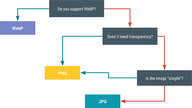
Related Topics
How to Create a Database in Android
Google Maps Fragment Returning Null Inside a Fragment
Error:Connectionresult{Statuscode=Internal_Error, Resolution=Null}
Replacing Glreadpixels with Egl_Khr_Image_Base for Faster Pixel Copy
How to Read Contacts in Android Using Realm
Start Activity with an Animation
Android-L Cardview Visual Touch Feedback
Oauth 2.0 Authorization for Linkedin in Android
Android Support Library Setup with Maven
Firebase Ontokenrefresh() Is Not Called
Image Share Intent Works for Gmail But Crashes Fb and Twitter
How to Tell If the Soft-Keyboard Is Shown
Android: How to Track Down the Origin of a Inflateexception
Most Memory Efficient Way to Resize Bitmaps on Android
How to Set the Focus (And Display the Keyboard) on My Edittext Programmatically