How to set dropdown arrow in spinner?
copy and paste this xml instead of your xml
<?xml version="1.0" encoding="UTF-8"?>
<RelativeLayout xmlns:android="http://schemas.android.com/apk/res/android"
    xmlns:tools="http://schemas.android.com/tools"
    android:layout_width="match_parent"
    android:layout_height="match_parent"
    android:background="@drawable/back1"
    android:paddingBottom="@dimen/activity_vertical_margin"
    android:paddingLeft="@dimen/activity_horizontal_margin"
    android:paddingRight="@dimen/activity_horizontal_margin"
    android:paddingTop="@dimen/activity_vertical_margin"
    tools:context=".MainActivity" >

    <LinearLayout
        android:id="@+id/linearLayout1"
        android:layout_width="wrap_content"
        android:layout_height="55dp"
        android:layout_alignParentLeft="true"
        android:layout_alignParentRight="true"
        android:layout_alignParentTop="true"
        android:layout_marginTop="20dp"
        android:background="@drawable/red">

        <Spinner
            android:id="@+id/spinner1"
            android:layout_width="match_parent"
            android:layout_height="match_parent"
            android:dropDownWidth="fill_parent"
            android:background="@android:drawable/btn_dropdown"
         />

    </LinearLayout>

    <EditText
        android:id="@+id/editText1"
        android:layout_width="wrap_content"
        android:layout_height="55dp"
        android:layout_alignLeft="@+id/linearLayout1"
        android:layout_alignRight="@+id/linearLayout1"
        android:layout_below="@+id/linearLayout1"
        android:layout_marginTop="25dp"
        android:background="@drawable/red"
        android:ems="10"
        android:hint="enter card number" >

        <requestFocus />
    </EditText>

    <LinearLayout
        android:id="@+id/linearLayout2"
        android:layout_width="wrap_content"
        android:layout_height="55dp"
        android:layout_alignLeft="@+id/editText1"
        android:layout_alignRight="@+id/editText1"
        android:layout_below="@+id/editText1"
        android:layout_marginTop="33dp"
        android:orientation="horizontal"
        android:background="@drawable/red">

        <Spinner
            android:id="@+id/spinner3"
            android:layout_width="72dp"
            android:layout_height="wrap_content"
            android:background="@android:drawable/btn_dropdown"
             />

        <Spinner
            android:id="@+id/spinner2"
            android:layout_width="72dp"
            android:layout_height="wrap_content"
            android:background="@android:drawable/btn_dropdown"
            />

        <EditText
            android:id="@+id/editText2"
            android:layout_width="22dp"
            android:layout_height="match_parent"
            android:layout_weight="0.18"
            android:ems="10"
            android:hint="enter cvv" />

    </LinearLayout>

    <LinearLayout
        android:id="@+id/linearLayout3"
        android:layout_width="wrap_content"
        android:layout_height="55dp"
        android:layout_alignParentLeft="true"
        android:layout_alignRight="@+id/linearLayout2"
        android:layout_below="@+id/linearLayout2"
        android:layout_marginTop="26dp"
        android:orientation="vertical"
        android:background="@drawable/red" >
    </LinearLayout>

    <Spinner
        android:id="@+id/spinner4"
        android:layout_width="15dp"
        android:layout_height="18dp"
        android:layout_alignBottom="@+id/linearLayout3"
        android:layout_alignLeft="@+id/linearLayout3"
        android:layout_alignRight="@+id/linearLayout3"
        android:layout_alignTop="@+id/linearLayout3"
        android:background="@android:drawable/btn_dropdown"
      />

    <Button
        android:id="@+id/button1"
        android:layout_width="wrap_content"
        android:layout_height="wrap_content"
        android:layout_alignParentLeft="true"
        android:layout_alignParentRight="true"
        android:layout_below="@+id/linearLayout3"
        android:layout_marginTop="18dp"
        android:text="Add Amount"
        android:background="@drawable/buttonsty"/>
</RelativeLayout>
Change Spinner dropdown icon
Try applying following style to your spinner using
style="@style/SpinnerTheme"
//Spinner Style:
<style name="SpinnerTheme" parent="android:Widget.Spinner">
    <item name="android:background">@drawable/bg_spinner</item>
</style>
//bg_spinner.xml
Replace the arrow_down_gray with your arrow
<?xml version="1.0" encoding="utf-8"?>
<selector xmlns:android="http://schemas.android.com/apk/res/android">

    <item>

        <layer-list>

            <item>
                <shape>
                    <gradient android:angle="90" android:endColor="#ffffff" android:startColor="#ffffff" android:type="linear" />

                    <stroke android:width="0.33dp" android:color="#0fb1fa" />

                    <corners android:radius="0dp" />

                    <padding android:bottom="3dp" android:left="3dp" android:right="3dp" android:top="3dp" />
                </shape>
            </item>

            <item android:right="5dp">

                <bitmap android:gravity="center_vertical|right" android:src="@drawable/arrow_down_gray" />

            </item>

        </layer-list>

    </item>

</selector>
How to set dropdown arrow from drawable in spinner?
Please use below code for add arrow with spinner:
<RelativeLayout
                android:layout_width="wrap_content"
                android:layout_height="@dimen/btn_height_common"
                android:layout_marginLeft="@dimen/_15sdp"
                android:layout_marginTop="@dimen/_5sdp"
                android:layout_marginRight="@dimen/_15sdp"
                android:background="@drawable/bg_editext">

                <Spinner
                    android:id="@+id/sp_gender"
                    android:layout_width="match_parent"
                    android:layout_height="match_parent"
                    android:background="@null"
                    android:entries="@array/gender"
                    android:fontFamily="@font/gotham_narrow_book"
                    android:overlapAnchor="false"
                    android:paddingLeft="@dimen/_10sdp"
                    android:paddingRight="@dimen/_10sdp"
                    android:textColor="@color/gray_text_color"
                    android:textSize="@dimen/normal_textsize" />

                <ImageView
                    android:layout_width="@dimen/_15sdp"
                    android:layout_height="@dimen/_15sdp"
                    android:layout_alignParentRight="true"
                    android:layout_centerVertical="true"
                    android:layout_marginRight="@dimen/_15sdp"
                    android:padding="@dimen/_2sdp"
                    android:src="@mipmap/ic_down_gray" />

            </RelativeLayout>
Output:

Android Spinner Dropdown arrow not displaying
This works for me, much simpler as well:
<Spinner
      android:id="@+id/spinner"
      android:layout_width="wrap_content"
      android:layout_height="wrap_content"
      android:theme="@style/ThemeOverlay.AppCompat.Light"
      android:spinnerMode="dropdown" />
And in your class file:
spinner = (Spinner) view.findViewById(R.id.spinner);
ArrayAdapter adapter = ArrayAdapter.createFromResource(this, R.array.spinner_data, android.R.layout.simple_spinner_dropdown_item);
adapter.setDropDownViewResource(android.R.layout.simple_spinner_dropdown_item);
spinner.setAdapter(adapter);
Hope this helps ;)
Spinner Dropdown Arrow
You have to remove the Imageview into your custom layout row_spinner.xml. In case, you don't need to create an arrow inside your custom layout, because if you do, it'll be created in each row like happened to you. For doing the same you showed us, you must change the Spinner style into your styles.xml.
For example:
<resources>

    <style name="SpinnerTheme" parent="android:Widget.Spinner">
        <item name="android:background">@drawable/spinner_background_holo_light</item>
        <item name="android:dropDownSelector">@drawable/list_selector_holo_light</item>
    </style>

    <style name="SpinnerTheme.DropDown">
        <item name="android:spinnerMode">dropdown</item>
    </style>

    <!-- Changes the spinner drop down item radio button style -->
    <style name="DropDownItemSpinnerTheme" parent="android:Widget.DropDownItem.Spinner">
        <item name="android:checkMark">@drawable/btn_radio_holo_light</item>
    </style>

    <style name="ListViewSpinnerTheme" parent="android:Widget.ListView">
        <item name="android:listSelector">@drawable/list_selector_holo_light</item>
    </style>

    <style name="ListViewSpinnerTheme.White" parent="android:Widget.ListView.White">
        <item name="android:listSelector">@drawable/list_selector_holo_light</item>
    </style>

    <style name="SpinnerItemTheme"
            parent="android:TextAppearance.Widget.TextView.SpinnerItem">
        <item name="android:textColor">#000000</item>
    </style>

</resources>
For further information take a look: http://androidopentutorials.com/android-how-to-get-holo-spinner-theme-in-android-2-x/
EDIT
selector_spinner.xml:
<?xml version="1.0" encoding="utf-8"?>
<selector xmlns:android="http://schemas.android.com/apk/res/android">

    <item>

        <layer-list>

            <item>
                <shape>
                    <gradient android:angle="90" android:endColor="#ffffff" android:startColor="#ffffff" android:type="linear" />

                    <stroke android:width="1dp" android:color="#504a4b" />

                    <corners android:radius="5dp" />

                    <padding android:bottom="3dp" android:left="3dp" android:right="3dp" android:top="3dp" />
                </shape>
            </item>

            <item>

                <bitmap android:gravity="bottom|right" android:src="@android:drawable/arrow_up_float" />

            </item>

        </layer-list>

    </item>

</selector>
styles.xml:
<resources>

    <!-- Base application theme. -->
    <style name="AppTheme" parent="android:Theme.Holo.Light.DarkActionBar">
        <item name="android:spinnerStyle">@style/SpinnerTheme</item>
    </style>

    <style name="SpinnerTheme" parent="android:Widget.Spinner">
        <item name="android:background">@drawable/selector_spinner</item>
    </style>

</resources>
At the end, the spinner will look like as 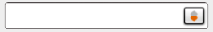
EDIT 2
The following code is into details_fragment_three.xml
<Spinner
    android:id="@+id/spinnerDate"
    android:layout_marginLeft="-8dp"
    android:layout_width="match_parent"
    android:layout_height="wrap_content"
    android:background="@drawable/spinner_item_drawable"/>
Change color of the drop down arrow of Spinner in XML
There are three ways to achieve that.
1. Through code:
In your xml, make sure your spinner has an id. Let's say we have a spinner with id "spinner".
In your code, add the following in your onCreate():
Spinner spinner = (Spinner) findViewById(R.id.spinner);
spinner.getBackground().setColorFilter(getResources().getColor(R.color.red), PorterDuff.Mode.SRC_ATOP);
where red is your defined color in colors.xml in the values folder.
2. Through xml:
For API 21+:
<Spinner
    android:layout_width="wrap_content"
    android:layout_height="wrap_content"
    android:backgroundTint="@color/red" />
or if you use the support library, you can use:
<android.support.v7.widget.AppCompatSpinner
    android:layout_width="wrap_content"
    android:layout_height="wrap_content"
    app:backgroundTint="@color/red" />
3. Through drawables:
You can use this online tool: http://android-holo-colors.com
This will generate custom drawables for any view you want with your preferred color. Make sure you select spinner, then download the resources.
How to set dropdown arrow in spinner with underline from image
You can draw line by xml code. like below
    <item >

    <layer-list>

        <item>
            <shape android:shape="rectangle" >
                <solid android:color="@android:color/transparent" />
                <!-- background color of box -->
            </shape>
        </item>
        <item
            android:left="-2dp"
            android:right="-2dp"
            android:top="-2dp">
            <shape>
                <solid android:color="@android:color/transparent" />

                <stroke
                    android:width="1dp"
                    android:color="#323232" />
                <!-- color of stroke -->
            </shape>
        </item>

        <item android:right="5dp">
            <bitmap android:gravity="center_vertical|right" android:src="@drawable/downlarrow" />

        </item>

    </layer-list>

   </item>
output looks something like this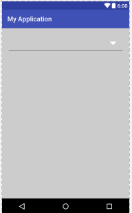
Related Topics
Flutter Does Not Find Android Sdk
Get My Wifi Ip Address Android
Hide Ics Back Home Task Switcher Buttons
Check Whether Activity Is Active
Activity Not Started, Its Current Task Has Been Brought to the Front
Receive Push Notifications on One Android App from Two Firebase Projects
Differencebetween Fragment and Fragmentactivity
Using Disklrucache in Android 4.0 Does Not Provide for Opencache Method
How to Automatically Restart a Service Even If User Force Close It
Android: Crop an Image After Taking It with Camera with a Fixed Aspect Ratio
Android: How Do Bluetooth Uuids Work
Using Android Intent.Action_Send for Sending Email
How to Set Shadow to a View in Android
How to Create Android Spinner Without Down Triangle on the Right Side of the Widget
Configuration with Name 'Default' Not Found. Android Studio
How to Make a Smaller Ratingbar
How to Create an Android Application in Android Studio That Uses the Google Maps API V2