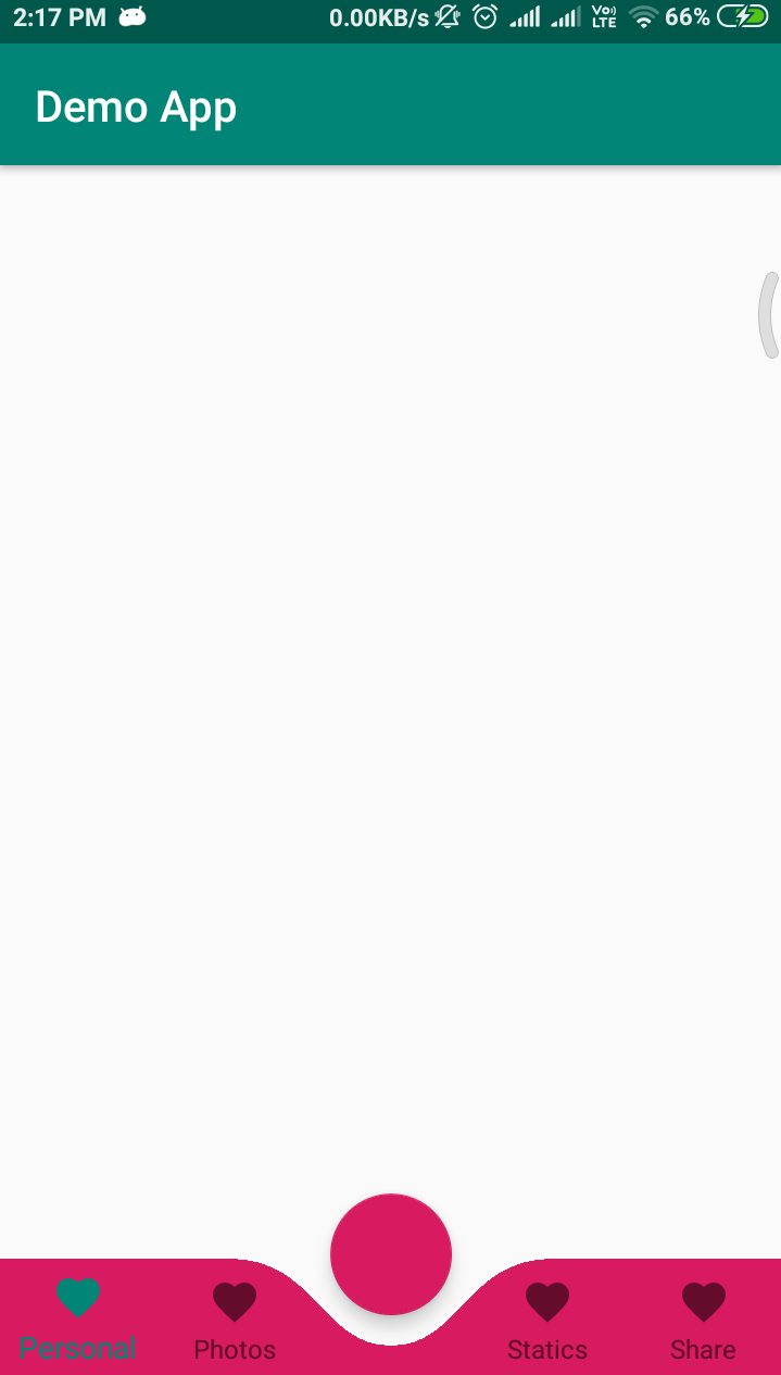
How to combine BottomAppBar + FAB with BottomNavigationView
First Way
Try this You can Create a CustomBottomNavigationView
Here is the good article for CustomBottomNavigationView
How I draw custom shapes in BottomNavigationView
SAMPLE CODE
import android.content.Context;
import android.graphics.*;
import android.support.design.widget.BottomNavigationView;
import android.support.v4.content.ContextCompat;
import android.util.AttributeSet;

public class CustomBottomNavigationView extends BottomNavigationView {

    private Path mPath;
    private Paint mPaint;

    /** the CURVE_CIRCLE_RADIUS represent the radius of the fab button */
    private final int CURVE_CIRCLE_RADIUS = 128 / 2;
    // the coordinates of the first curve
    private Point mFirstCurveStartPoint = new Point();
    private Point mFirstCurveEndPoint = new Point();
    private Point mFirstCurveControlPoint1 = new Point();
    private Point mFirstCurveControlPoint2 = new Point();

    //the coordinates of the second curve
    @SuppressWarnings("FieldCanBeLocal")
    private Point mSecondCurveStartPoint = new Point();
    private Point mSecondCurveEndPoint = new Point();
    private Point mSecondCurveControlPoint1 = new Point();
    private Point mSecondCurveControlPoint2 = new Point();
    private int mNavigationBarWidth;
    private int mNavigationBarHeight;

    public CustomBottomNavigationView(Context context) {
        super(context);
        init();
    }

    public CustomBottomNavigationView(Context context, AttributeSet attrs) {
        super(context, attrs);
        init();
    }

    public CustomBottomNavigationView(Context context, AttributeSet attrs, int defStyleAttr) {
        super(context, attrs, defStyleAttr);
        init();
    }

    private void init() {
        mPath = new Path();
        mPaint = new Paint();
        mPaint.setStyle(Paint.Style.FILL_AND_STROKE);
        mPaint.setColor(ContextCompat.getColor(getContext(),R.color.colorAccent));
        setBackgroundColor(Color.TRANSPARENT);
    }

    @Override
    protected void onLayout(boolean changed, int left, int top, int right, int bottom) {
        super.onLayout(changed, left, top, right, bottom);

    }

    @Override
    protected void onSizeChanged(int w, int h, int oldw, int oldh) {
        super.onSizeChanged(w, h, oldw, oldh);
        // get width and height of navigation bar
        // Navigation bar bounds (width & height)
        mNavigationBarWidth = getWidth();
        mNavigationBarHeight = getHeight();
        // the coordinates (x,y) of the start point before curve
        mFirstCurveStartPoint.set((mNavigationBarWidth / 2) - (CURVE_CIRCLE_RADIUS * 2) - (CURVE_CIRCLE_RADIUS / 3), 0);
        // the coordinates (x,y) of the end point after curve
        mFirstCurveEndPoint.set(mNavigationBarWidth / 2, CURVE_CIRCLE_RADIUS + (CURVE_CIRCLE_RADIUS / 4));
        // same thing for the second curve
        mSecondCurveStartPoint = mFirstCurveEndPoint;
        mSecondCurveEndPoint.set((mNavigationBarWidth / 2) + (CURVE_CIRCLE_RADIUS * 2) + (CURVE_CIRCLE_RADIUS / 3), 0);

        // the coordinates (x,y)  of the 1st control point on a cubic curve
        mFirstCurveControlPoint1.set(mFirstCurveStartPoint.x + CURVE_CIRCLE_RADIUS + (CURVE_CIRCLE_RADIUS / 4), mFirstCurveStartPoint.y);
        // the coordinates (x,y)  of the 2nd control point on a cubic curve
        mFirstCurveControlPoint2.set(mFirstCurveEndPoint.x - (CURVE_CIRCLE_RADIUS * 2) + CURVE_CIRCLE_RADIUS, mFirstCurveEndPoint.y);

        mSecondCurveControlPoint1.set(mSecondCurveStartPoint.x + (CURVE_CIRCLE_RADIUS * 2) - CURVE_CIRCLE_RADIUS, mSecondCurveStartPoint.y);
        mSecondCurveControlPoint2.set(mSecondCurveEndPoint.x - (CURVE_CIRCLE_RADIUS + (CURVE_CIRCLE_RADIUS / 4)), mSecondCurveEndPoint.y);

        mPath.reset();
        mPath.moveTo(0, 0);
        mPath.lineTo(mFirstCurveStartPoint.x, mFirstCurveStartPoint.y);

        mPath.cubicTo(mFirstCurveControlPoint1.x, mFirstCurveControlPoint1.y,
                mFirstCurveControlPoint2.x, mFirstCurveControlPoint2.y,
                mFirstCurveEndPoint.x, mFirstCurveEndPoint.y);

        mPath.cubicTo(mSecondCurveControlPoint1.x, mSecondCurveControlPoint1.y,
                mSecondCurveControlPoint2.x, mSecondCurveControlPoint2.y,
                mSecondCurveEndPoint.x, mSecondCurveEndPoint.y);

        mPath.lineTo(mNavigationBarWidth, 0);
        mPath.lineTo(mNavigationBarWidth, mNavigationBarHeight);
        mPath.lineTo(0, mNavigationBarHeight);
        mPath.close();
    }

    @Override
    protected void onDraw(Canvas canvas) {
        super.onDraw(canvas);
        canvas.drawPath(mPath, mPaint);
    }
}
Now use like this
<?xml version="1.0" encoding="utf-8"?>
<RelativeLayout xmlns:android="http://schemas.android.com/apk/res/android"
    xmlns:app="http://schemas.android.com/apk/res-auto"
    android:id="@+id/coordinatorlayout"
    android:layout_width="match_parent"
    android:layout_height="match_parent"
    android:orientation="vertical">

    <android.support.design.widget.FloatingActionButton
        android:id="@+id/fab"
        android:layout_width="wrap_content"
        android:layout_height="wrap_content"
        android:layout_alignParentBottom="true"
        android:layout_centerInParent="true"
        android:layout_marginBottom="30dp"
        android:clickable="true"
        android:focusable="true" />

    <neel.com.demo.CustomBottomNavigationView
        android:id="@+id/customBottomBar"
        android:layout_width="match_parent"
        android:layout_height="wrap_content"
        android:layout_alignParentBottom="true"
        android:background="@color/colorAccent"
        app:labelVisibilityMode="labeled" />

</RelativeLayout>
Activity
import android.support.v7.app.AppCompatActivity;
import android.os.Bundle;

public class MainActivity extends AppCompatActivity {

    @Override
    protected void onCreate(Bundle savedInstanceState) {
        super.onCreate(savedInstanceState);
        setContentView(R.layout.activity_main);

        CustomBottomNavigationView curvedBottomNavigationView = findViewById(R.id.customBottomBar);
        curvedBottomNavigationView.inflateMenu(R.menu.bottom_menu);
    }
}
OUTPUT
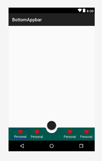
Second Way
    <androidx.coordinatorlayout.widget.CoordinatorLayout xmlns:android="http://schemas.android.com/apk/res/android"
    xmlns:app="http://schemas.android.com/apk/res-auto"
    android:layout_width="match_parent"
    android:layout_height="120dp"
    android:layout_gravity="bottom">

    <com.google.android.material.floatingactionbutton.FloatingActionButton
        android:id="@+id/fab"
        android:layout_width="wrap_content"
        android:layout_height="wrap_content"
        android:clickable="true"
        android:focusable="true"
        app:layout_anchor="@id/bar" />

    <com.google.android.material.bottomappbar.BottomAppBar
        android:id="@+id/bar"
        android:layout_width="match_parent"
        android:layout_height="58dp"
        android:layout_gravity="bottom"
        android:backgroundTint="@color/colorPrimaryDark">

        <LinearLayout
            android:layout_width="match_parent"
            android:layout_height="wrap_content"
            android:orientation="horizontal">

            <TextView
                style="?android:attr/borderlessButtonStyle"
                android:layout_width="0dp"
                android:layout_height="wrap_content"
                android:layout_weight="1"
                android:background="?android:attr/selectableItemBackground"
                android:drawableTop="@drawable/ic_favorite"
                android:gravity="center"
                android:orientation="vertical"
                android:text="Personal"
                android:textColor="#FFFFFF">

            </TextView>

            <TextView
                style="?android:attr/borderlessButtonStyle"
                android:layout_width="0dp"
                android:layout_height="wrap_content"
                android:layout_weight="1"
                android:background="?android:attr/selectableItemBackground"
                android:drawableTop="@drawable/ic_favorite"
                android:gravity="center"
                android:orientation="vertical"
                android:textColor="#FFFFFF"
                android:visibility="invisible">

            </TextView>

            <TextView
                style="?android:attr/borderlessButtonStyle"
                android:layout_width="0dp"
                android:layout_height="wrap_content"
                android:layout_weight="1"
                android:background="?android:attr/selectableItemBackground"
                android:drawableTop="@drawable/ic_favorite"
                android:gravity="center"
                android:orientation="vertical"
                android:text="Personal"
                android:textColor="#FFFFFF">

            </TextView>

            <TextView
                style="?android:attr/borderlessButtonStyle"
                android:layout_width="0dp"
                android:layout_height="wrap_content"
                android:layout_weight="1"
                android:background="?android:attr/selectableItemBackground"
                android:drawableTop="@drawable/ic_favorite"
                android:gravity="center"
                android:orientation="vertical"
                android:text="Personal"
                android:textColor="#FFFFFF">

            </TextView>

        </LinearLayout>

    </com.google.android.material.bottomappbar.BottomAppBar>

</androidx.coordinatorlayout.widget.CoordinatorLayout>
OUTPUT
Combine FAB in the Bottom Navigation View
you can do something like this.
<?xml version="1.0" encoding="utf-8"?>
<RelativeLayout xmlns:android="http://schemas.android.com/apk/res/android"
    xmlns:app="http://schemas.android.com/apk/res-auto"
    android:id="@+id/container"
    android:layout_width="match_parent"
    android:layout_height="match_parent"
    android:background="@color/grey_5">

    <LinearLayout
        android:layout_width="match_parent"
        android:layout_height="wrap_content"
        android:layout_alignParentBottom="true"
        android:orientation="vertical">

        <View
            android:layout_width="match_parent"
            android:layout_height="5dp"
            android:background="@drawable/bg_gradient_soft" />

        <LinearLayout
            android:layout_width="match_parent"
            android:layout_height="50dp"
            android:background="@android:color/white"
            android:orientation="horizontal">

            <LinearLayout
                android:layout_width="0dp"
                android:layout_height="match_parent"
                android:layout_weight="1"
                android:gravity="center"
                android:orientation="horizontal"
                android:padding="@dimen/spacing_medium">

                <ImageButton
                    android:id="@+id/map_button"
                    android:layout_width="?attr/actionBarSize"
                    android:layout_height="?attr/actionBarSize"
                    android:background="?attr/selectableItemBackgroundBorderless"
                    android:onClick="clickAction"
                    android:tint="@color/colorPrimary"
                    app:srcCompat="@drawable/ic_near_me" />

                <TextView
                    android:layout_width="wrap_content"
                    android:layout_height="wrap_content"
                    android:text="Map"
                    android:textAppearance="@style/Base.TextAppearance.AppCompat.Subhead"
                    android:textColor="@color/colorPrimary"
                    android:textStyle="bold" />

            </LinearLayout>

            <View
                android:layout_width="?attr/actionBarSize"
                android:layout_height="0dp" />

            <LinearLayout
                android:layout_width="0dp"
                android:layout_height="match_parent"
                android:layout_weight="1"
                android:gravity="center"
                android:padding="@dimen/spacing_medium">

                <ImageButton
                    android:id="@+id/list_button"
                    android:layout_width="?attr/actionBarSize"
                    android:layout_height="?attr/actionBarSize"
                    android:background="?attr/selectableItemBackgroundBorderless"
                    android:onClick="clickAction"
                    android:tint="@color/colorPrimary"
                    app:srcCompat="@drawable/ic_format_list_bulleted" />

                <TextView
                    android:layout_width="wrap_content"
                    android:layout_height="wrap_content"
                    android:text="List"
                    android:textAppearance="@style/Base.TextAppearance.AppCompat.Subhead"
                    android:textColor="@color/colorPrimary"
                    android:textStyle="bold" />

            </LinearLayout>

        </LinearLayout>

    </LinearLayout>

    <android.support.design.widget.FloatingActionButton
        android:id="@+id/add_button"
        android:layout_width="wrap_content"
        android:layout_height="wrap_content"
        android:layout_alignParentBottom="true"
        android:layout_centerInParent="true"
        android:layout_marginBottom="15dp"
        android:clickable="true"
        android:onClick="clickAction"
        android:tint="@android:color/white"
        app:backgroundTint="@color/colorPrimary"
        app:elevation="2dp"
        app:fabSize="normal"
        app:rippleColor="@color/deep_orange_400"
        app:srcCompat="@drawable/ic_add" />

</RelativeLayout>
Output

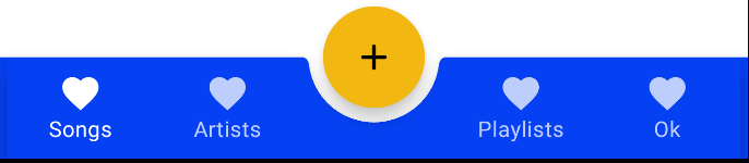
How to combine FAB with BottomAppBar without overlapping nav items?
The BottomNavigation is a Row and all the BottomNavigationItem are Box with the .weight(1f) modifier in the RowScope.
You can add an "empty" element in the middle of your Row or BottomNavigation with the same size of the BottomNavigationItem.
For example something like:
bottomBar = {
            BottomAppBar(cutoutShape = fabShape) {
                BottomNavigation {
                    items.forEachIndexed { index, item ->
                        if (index != 2){ //
                        BottomNavigationItem(
                            // your implementation
                        )} else {
                            //Empty BottomNavigationItem
                            BottomNavigationItem(
                                icon = {},
                                label = {  },
                                selected = false,
                                onClick = {  },
                                enabled = false
                            )
                        }
                    }
                }

            }
        },
Android : Add rounded corners to BottomAppBar with circular anchored FAB
You can use a standard BottomAppBar:
   <com.google.android.material.bottomappbar.BottomAppBar
        android:layout_margin="xxdp"
        app:fabAlignmentMode="center"
        app:fabCradleRoundedCornerRadius="2dp"
        app:fabCradleVerticalOffset="8dp"
        app:fabCradleMargin="8dp" />
and then change the ShapeAppearanceModel:
    BottomAppBar bottomAppBar = findViewById(R.id.bottomAppBar);
    MaterialShapeDrawable bottomBarBackground = (MaterialShapeDrawable) bottomAppBar.getBackground();
    bottomBarBackground.setShapeAppearanceModel(
            bottomBarBackground.getShapeAppearanceModel()
                    .toBuilder()
                    .setAllCorners(new RoundedCornerTreatment()).setAllCornerSizes(new RelativeCornerSize(0.5f))
                    .build());

Just a note about new RelativeCornerSize(0.5f): It changed in 1.2.0-beta01. Before it was new RelativeCornerSize(50)
How to create bottom navigation with floating action button
You have to add
    <com.google.android.material.floatingactionbutton.FloatingActionButton
        app:backgroundTint="@null"
        app:tint="@null"
        ../>
The default style tints the background and the icon.

Can't click on bottom half of FAB button(combine with CustomBottomNavigationBar)
Design it like this where the <nvlan.solocoding.exercisetraining.main.CustomBottomNavigationView> is in an inner layout. This is usually because when we use a third-party library they might not interact that well when using core android components.
So the safe way to use components such as these would be to keep them wrapped in different layouts such that they are not present in the same layout hierarchy level.
<RelativeLayout
 android:id="@+id/coordinator_layout_outer"
    android:layout_width="match_parent"
    android:layout_height="match_parent"
 <RelativeLayout
    android:id="@+id/coordinator_layout"
    android:layout_width="match_parent"
    android:layout_height="0dp"
    android:layout_weight="0.15"
    android:background="@color/grey_background"
    android:orientation="vertical">

    <nvlan.solocoding.exercisetraining.main.CustomBottomNavigationView
        android:id="@+id/custom_bottom_bar"
        android:layout_width="match_parent"
        android:layout_height="wrap_content"
        android:layout_alignParentBottom="true"
        android:elevation="0dp"
        app:itemTextColor="@color/bottom_nav_color"
        app:itemIconTint="@color/bottom_nav_color"
        tools:targetApi="lollipop" />
</RelativeLayout>
    <com.google.android.material.floatingactionbutton.FloatingActionButton
        app:backgroundTint="@color/bottom_navigation_pressed"
        android:id="@+id/map_button"
        android:layout_width="@dimen/_48sdp"
        android:layout_height="@dimen/_48sdp"
        android:layout_alignParentTop="true"
        android:layout_centerInParent="true"
        android:layout_marginBottom="@dimen/_15sdp"
        android:clickable="true"
        android:elevation="@dimen/_2sdp"
        android:contentDescription="@string/map"
        android:focusable="true"
         />

<RelativeLayout>
Related Topics
Cache.Properties (The System Cannot Find the File Specified)
Recyclerview Steals Focus When Inside a Nestedscrollview
Why Getcontext() in Fragment Sometimes Returns Null
How to Setcontentview in a Fragment
What Is the Default Font Family in Android
Android How to Programmatically Hide Launcher Icon
How to Build a Native (Command Line) Executable to Run on Android
Eclipse, Android, Scala Made Easy But Still Does Not Work
How to Avoid Delay in Android Gcm Messages/Change Heartbeat
Limit Height of Listview on Android
Error:Unexpected Lock Protocol Found in Lock File. Expected 3, Found 0
How to Iterate Through All Keys of Shared Preferences
Command Line "Android Update Sdk" on Headless Linux
Android Failed to Install Helloworld.Apk on Device (Null) Error
Pattern "One Activity, Multiple Views": Advantages and Disadvantages
Sending a File Using Bluetooth Obex Object Push Profile (Opp)
Justify Text in an Android App Using a Webview But Presenting a Textview-Like Interface