How to change DatePicker dialog color for Android 5.0
The reason why Neil's suggestion results in a fullscreen DatePicker is the choice of parent theme:
<!-- Theme.AppCompat.Light is not a dialog theme -->
<style name="DialogTheme" parent="**Theme.AppCompat.Light**">
    <item name="colorAccent">@color/blue_500</item>
</style>
Moreover, if you go this route, you have to specify the theme while creating the DatePickerDialog:
// R.style.DialogTheme
new DatePickerDialog(MainActivity.this, R.style.DialogTheme, new DatePickerDialog.OnDateSetListener() {
    @Override
    public void onDateSet(DatePicker view, int year, int monthOfYear, int dayOfMonth) {
        //DO SOMETHING
    }
}, 2015, 02, 26).show();
This, in my opinion, is not good. One should try to keep the styling out of java and inside styles.xml/themes.xml.
I do agree that Neil's suggestion, with a bit of change (changing the parent theme to say, Theme.Material.Light.Dialog) will get you the desired result. But, here's the other way:
On first inspection, we come across datePickerStyle which defines things such as: headerBackground(what you are trying to change), dayOfWeekBackground, and a few other text-colors and text-styles.
Overriding this attribute in your app's theme will not work. DatePickerDialog uses a separate theme assignable by the attribute datePickerDialogTheme. So, for our changes to take affect, we must override datePickerStyle inside an overriden datePickerDialogTheme.
Here we go:
Override datePickerDialogTheme inside your app's base theme:
<style name="AppBaseTheme" parent="android:Theme.Material.Light">
    ....
    <item name="android:datePickerDialogTheme">@style/MyDatePickerDialogTheme</item>
</style>
Define MyDatePickerDialogTheme. The choice of parent theme will depend on what your app's base theme is: it could be either Theme.Material.Dialog or Theme.Material.Light.Dialog:
<style name="MyDatePickerDialogTheme" parent="android:Theme.Material.Light.Dialog">
    <item name="android:datePickerStyle">@style/MyDatePickerStyle</item>
</style>
We have overridden datePickerStyle with the style MyDatePickerStyle. The choice of parent will once again depend on what your app's base theme is: either Widget.Material.DatePicker or Widget.Material.Light.DatePicker. Define it as per your requirements:
<style name="MyDatePickerStyle" parent="@android:style/Widget.Material.Light.DatePicker">
    <item name="android:headerBackground">@color/chosen_header_bg_color</item>
</style>
Currently, we are only overriding headerBackground which by default is set to ?attr/colorAccent (this is also why Neil suggestion works in changing the background). But there's quite a lot of customization possible:
dayOfWeekBackground
dayOfWeekTextAppearance
headerMonthTextAppearance
headerDayOfMonthTextAppearance
headerYearTextAppearance
headerSelectedTextColor
yearListItemTextAppearance
yearListSelectorColor
calendarTextColor
calendarSelectedTextColor
If you don't want this much control (customization), you don't need to override datePickerStyle. colorAccent controls most of the DatePicker's colors. So, overriding just colorAccent inside MyDatePickerDialogTheme should work:
<style name="MyDatePickerDialogTheme" parent="android:Theme.Material.Light.Dialog">
    <item name="android:colorAccent">@color/date_picker_accent</item>

    <!-- No need to override 'datePickerStyle' -->
    <!-- <item name="android:datePickerStyle">@style/MyDatePickerStyle</item> -->
</style>
Overriding colorAccent gives you the added benefit of changing OK & CANCEL text colors as well. Not bad.
This way you don't have to provide any styling information to DatePickerDialog's constructor. Everything has been wired properly:
DatePickerDialog dpd = new DatePickerDialog(this, new DatePickerDialog.OnDateSetListener() {
    @Override
    public void onDateSet(DatePicker view, int year, int monthOfYear, int dayOfMonth) {

    }
 }, 2015, 5, 22);

 dpd.show();
Android - Change color of DatePicker
Try this code,
styles.xml :
<resources xmlns:tools="http://schemas.android.com/tools">


    <style name="AppBaseTheme" parent="android:Theme.Light">
        <item name="colorPrimary">@color/colorPrimary</item>
        <item name="colorAccent">@color/colorAccent</item>
        <item name="android:datePickerStyle">@style/MyDatePickerStyle</item>
    </style>


    <style name="AppTheme" parent="AppBaseTheme"></style>

    <style name="MyDatePickerStyle" parent="@android:style/Widget.Material.Light.DatePicker" tools:targetApi="lollipop">
        <item name="android:headerBackground">@color/colorPrimary</item>
        <item name="android:calendarTextColor">@color/colorPrimaryDark</item>
        <item name="android:dayOfWeekBackground">@color/colorPrimaryDark</item>
        <item name="android:yearListSelectorColor">@color/colorAccent</item>
        <item name="android:datePickerMode">calendar</item>
        <item name="android:minDate">01/01/2000</item>
    </style>

</resources>
activity_main.xml :
<RelativeLayout xmlns:android="http://schemas.android.com/apk/res/android"
    xmlns:tools="http://schemas.android.com/tools"
    android:layout_width="match_parent"
    android:layout_height="match_parent"
    tools:context=".MainActivity" >

    <TextView
        android:id="@+id/textView1"
        android:layout_width="wrap_content"
        android:layout_height="wrap_content"
        android:layout_alignParentLeft="true"
        android:layout_alignParentTop="true"
        android:layout_marginLeft="50dp"
        android:layout_marginTop="36dp"
        android:text="Current Date:" />

    <Button
        android:id="@+id/button1"
        android:layout_width="wrap_content"
        android:layout_height="wrap_content"
        android:layout_alignParentBottom="true"
        android:layout_centerHorizontal="true"
        android:layout_marginBottom="140dp"
        android:text="Change Date" />

    <DatePicker
        android:id="@+id/datePicker1"
        android:layout_width="wrap_content"
        android:layout_height="wrap_content"
        android:layout_above="@+id/button1"
        android:layout_centerHorizontal="true"
        android:layout_marginBottom="30dp" />

</RelativeLayout>
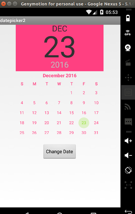
Also, i m attaching screenshot how it looks after applying style.
Change the text color of one of the buttons in DatePickerDialog?
You can get the Button from Dialog and modify it attributes using getButton(). See the example below. Get the button after calling .show()other wise it will give a null.
 final Calendar c = Calendar.getInstance();
            int mYear = c.get(Calendar.YEAR);
            int  mMonth = c.get(Calendar.MONTH);
            int mDay = c.get(Calendar.DAY_OF_MONTH);
            DatePickerDialog datePickerDialog = new DatePickerDialog(ConstarintsActivity.this,
                    (view, year, monthOfYear, dayOfMonth) -> {


                    }, mYear, mMonth, mDay);
            datePickerDialog.show();
            datePickerDialog.getButton(DatePickerDialog.BUTTON_NEGATIVE).setTextColor(Color.GREEN);
How fix color bottom panel DatePickerDialog
To set the DatePickerDialog bottom panel color, refer to this link:
Change Datepicker dialog color for Android 5.0
The three steps you need to do, in order, are:
) Override datePickerDialogTheme inside your app's base theme:
<style name="AppBaseTheme" parent="android:Theme.Material.Light">
        <item name="android:datePickerDialogTheme">@style/MyDatePickerDialogTheme</item>
    </style>
2.) Override colorAccent inside MyDatePickerDialogTheme
<style name="MyDatePickerDialogTheme" parent="android:Theme.Material.Light.Dialog">
    <item name="android:colorAccent">@color/date_picker_accent</item>

    <!-- No need to override 'datePickerStyle' -->
    <!-- <item name="android:datePickerStyle">@style/MyDatePickerStyle</item> -->
</style>
3.) Call it this way
DatePickerDialog dpd = new DatePickerDialog(this, new DatePickerDialog.OnDateSetListener() {
    @Override
    public void onDateSet(DatePicker view, int year, int monthOfYear, int dayOfMonth) {

    }
 }, 2015, 5, 22);

 dpd.show();
How to change the dialog's button colors for a Material Date picker
You can use:
builder.setTheme(R.style.MaterialCalendarTheme)
and then define:
  <style name="MaterialCalendarTheme" parent="ThemeOverlay.MaterialComponents.MaterialCalendar">

    <!-- Buttons -->
    <item name="buttonBarPositiveButtonStyle">@style/TextButton</item>
    <item name="buttonBarNegativeButtonStyle">@style/TextButton</item>
  </style>
  <style name="TextButton" parent="Widget.MaterialComponents.Button.TextButton.Dialog">
    <item name="android:textColor">@color/...</item>
    <item name="backgroundTint">@color/...</item>
  </style>
Related Topics
How to Use "Share Image Using" Sharing Intent to Share Images in Android
Android Camera Intent: How to Get Full Sized Photo
Show Compose Sms View in Android
Animate the Transition Between Fragments
Percentage Width in a Relativelayout
Set Up Device For Development (? No Permissions)
How to Customize a Progress Bar in Android
How to Force Use of Overflow Menu on Devices With Menu Button
How to Sign Android App With System Signature
Android Studio Doesn't See Device
Offline Speech Recognition in Android (Jellybean)
What Android Tools and Methods Work Best to Find Memory/Resource Leaks
How to Check If Alarmmanager Already Has an Alarm Set
Receiving Package Install and Uninstall Events
Communication Between Activity and Service
Check If Application Is Installed - Android
How to Dynamically Load a Library at Runtime from an Android Application