filling a circle gradually from bottom to top android
I created a Custom View class that will do what you want. There are four custom attributes that can be set in your layout xml:
fillColor, color - Sets the color of the fill area. Default isColor.WHITE.strokeColor, color - Sets the color of the bounding circle. Default isColor.BLACK.strokeWidth, float - Sets the thickness of the bounding circle. Default is1.0.value, integer: 0-100 - Sets the value for the fill area. Default is0.
Please note that these attributes must have the custom prefix in lieu of the android prefix in your layout xml. The root View should also contain the custom xml namespace. (See the example below.) The other standard View attributes - such as layout_width, background, etc. - are available.
First, the CircleFillView class:
public class CircleFillView extends View
{
    public static final int MIN_VALUE = 0;
    public static final int MAX_VALUE = 100;

    private PointF center = new PointF();
    private RectF circleRect = new RectF();
    private Path segment = new Path();
    private Paint strokePaint = new Paint();
    private Paint fillPaint = new Paint();

    private int radius;

    private int fillColor;
    private int strokeColor;
    private float strokeWidth;
    private int value;

    public CircleFillView(Context context)
    {
        this(context, null);
    }

    public CircleFillView(Context context, AttributeSet attrs)
    {
        super(context, attrs);

        TypedArray a = context.getTheme().obtainStyledAttributes(
            attrs,
            R.styleable.CircleFillView,
            0, 0);

        try
        {
            fillColor = a.getColor(R.styleable.CircleFillView_fillColor, Color.WHITE);
            strokeColor = a.getColor(R.styleable.CircleFillView_strokeColor, Color.BLACK);
            strokeWidth = a.getFloat(R.styleable.CircleFillView_strokeWidth, 1f);
            value = a.getInteger(R.styleable.CircleFillView_value, 0);
            adjustValue(value);
        }
        finally
        {
            a.recycle();
        }

        fillPaint.setColor(fillColor);
        strokePaint.setColor(strokeColor);
        strokePaint.setStrokeWidth(strokeWidth);
        strokePaint.setStyle(Paint.Style.STROKE);
    }

    public void setFillColor(int fillColor)
    {
        this.fillColor = fillColor;
        fillPaint.setColor(fillColor);
        invalidate();
    }

    public int getFillColor()
    {
        return fillColor;
    }

    public void setStrokeColor(int strokeColor)
    {
        this.strokeColor = strokeColor;
        strokePaint.setColor(strokeColor);
        invalidate();
    }

    public int getStrokeColor()
    {
        return strokeColor;
    }

    public void setStrokeWidth(float strokeWidth)
    {
        this.strokeWidth = strokeWidth;
        strokePaint.setStrokeWidth(strokeWidth);
        invalidate();
    }

    public float getStrokeWidth()
    {
        return strokeWidth;
    }

    public void setValue(int value)
    {
        adjustValue(value);
        setPaths();

        invalidate();
    }

    public int getValue()
    {
        return value;
    }

    private void adjustValue(int value)
    {
        this.value = Math.min(MAX_VALUE, Math.max(MIN_VALUE, value));
    }

    @Override
    protected void onSizeChanged(int w, int h, int oldw, int oldh)
    {
        super.onSizeChanged(w, h, oldw, oldh);

        center.x = getWidth() / 2;
        center.y = getHeight() / 2;
        radius = Math.min(getWidth(), getHeight()) / 2 - (int) strokeWidth;
        circleRect.set(center.x - radius, center.y - radius, center.x + radius, center.y + radius);

        setPaths();
    }

    private void setPaths()
    {
        float y = center.y + radius - (2 * radius * value / 100 - 1);
        float x = center.x - (float) Math.sqrt(Math.pow(radius, 2) - Math.pow(y - center.y, 2));

        float angle = (float) Math.toDegrees(Math.atan((center.y - y) / (x - center.x)));
        float startAngle = 180 - angle;
        float sweepAngle = 2 * angle - 180;

        segment.rewind();
        segment.addArc(circleRect, startAngle, sweepAngle);
        segment.close();
    }

    @Override
    protected void onDraw(Canvas canvas)
    {
        super.onDraw(canvas);

        canvas.drawPath(segment, fillPaint);
        canvas.drawCircle(center.x, center.y, radius, strokePaint);
    }
}
Now, for the custom xml attributes to work, you will need to put the following file in the /res/values folder of your project.
attrs.xml:
<resources>
    <declare-styleable name="CircleFillView" >
        <attr name="fillColor" format="color" />
        <attr name="strokeColor" format="color" />
        <attr name="strokeWidth" format="float" />
        <attr name="value" format="integer" />
    </declare-styleable>
</resources>
Following are the files for a simple demonstration app, where the CircleFillView's value is controlled with a SeekBar.
The layout file for our Activity, main.xml:
<LinearLayout xmlns:android="http://schemas.android.com/apk/res/android"
    xmlns:custom="http://schemas.android.com/apk/res/com.example.circlefill"
    android:layout_width="match_parent"
    android:layout_height="match_parent"
    android:gravity="center_horizontal"
    android:orientation="vertical" >

    <com.example.circlefill.CircleFillView
        android:id="@+id/circleFillView"
        android:layout_width="match_parent"
        android:layout_height="0dp"
        android:layout_weight="1"
        android:background="#ffffff"
        custom:fillColor="#6bcae2"
        custom:strokeColor="#75b0d0"
        custom:strokeWidth="20"
        custom:value="65" />

    <SeekBar android:id="@+id/seekBar"
        android:layout_width="match_parent"
        android:layout_height="wrap_content" />

</LinearLayout>
And, the MainActivity class:
public class MainActivity extends Activity
{
    CircleFillView circleFill;
    SeekBar seekBar;

    @Override
    public void onCreate(Bundle savedInstanceState)
    {
        super.onCreate(savedInstanceState);
        setContentView(R.layout.main);

        circleFill = (CircleFillView) findViewById(R.id.circleFillView);

        seekBar = (SeekBar) findViewById(R.id.seekBar);
        seekBar.setProgress(circleFill.getValue());
        seekBar.setOnSeekBarChangeListener(new OnSeekBarChangeListener()
            {
                @Override
                public void onProgressChanged(SeekBar seekBar, int progress, boolean fromUser)
                {
                    if (fromUser)
                        circleFill.setValue(progress);
                }

                @Override
                public void onStartTrackingTouch(SeekBar seekBar) {}

                @Override
                public void onStopTrackingTouch(SeekBar seekBar) {}
            }
        );
    }
}
And a screenshot of the demo app:
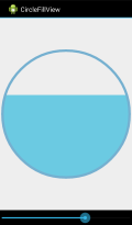
Android - Trying to gradually fill a circle bottom to top
pseudo would look something like this.
    for each pixel inside CircleBitmap {

        if (pixel.y is < Yboundary && pixelIsInCircle(pixel.x, pixel.y)) {
           CircleBitmap .setPixel(x, y, Color.rgb(45, 127, 0));
        }
    }
that may be slow, but it would work, and the smaller the circle the faster it would go.
just know the basics, bitmap width and height, for example 256x256, the circles radius, and to make things easy make the circle centered at 128,128. then as you go pixel by pixel, check the pixels X and Y to see if it falls inside the circle, and below the Y limit line.
then just use:
CircleBitmap .setPixel(x, y, Color.rgb(45, 127, 0));
edit: to speed things up, don't even bother looking at the pixels above the Y limit.
In Android - how can I fill a view or drawing by a specific percantage?
You can try using Arc here is the reference Arc Android Developers
and here is a great tutorial that might be of help to you: How to draw semicircle on Android Canvas.
other than that, would require a bit more of your code to help you out.
How to slowly fill background colour of a circle from the center with Animation in Android
Try the following
in your activity java
  circle2 = (ImageView) findViewById(R.id.circle2);
    ScaleAnimation fade_in =  new ScaleAnimation(0f, 1f, 0f, 1f,
    Animation.RELATIVE_TO_SELF, 0.5f, Animation.RELATIVE_TO_SELF, 0.5f);
    fade_in.setDuration(1000);     // animation duration in milliseconds
    fade_in.setFillAfter(true);    // If fillAfter is true, the transformation that this animation performed will persist when it is finished.
    circle2.startAnimation(fade_in);
activity xml
<?xml version="1.0" encoding="utf-8"?>
<FrameLayout xmlns:android="http://schemas.android.com/apk/res/android"

android:layout_width="match_parent"
android:layout_height="match_parent"
android:gravity="center_horizontal"
android:orientation="vertical"

>

<ImageView
    android:layout_width="200dp"
    android:layout_height="200dp"
    android:background="@drawable/circle" />

<ImageView
    android:id="@+id/circle2"
    android:layout_width="200dp"
    android:layout_height="200dp"
    android:background="@drawable/circle_two" />
</FrameLayout>
in your drawable circle.xml
<?xml version="1.0" encoding="utf-8"?>
<selector xmlns:android="http://schemas.android.com/apk/res/android">
<item android:state_pressed="true">
    <shape android:shape="oval">
        <solid android:color="@color/colorAccent" />
    </shape>
</item>
<item>
    <shape android:shape="oval">
        <solid android:color="@color/colorAccent" />
    </shape>
</item>
</selector>
similarly create circle2.xml
Android Layout Animations from bottom to top and top to bottom on ImageView click
I have solved my issue and now my animation works fine :)
if anyone needed just copy my code and xml file and have a happy coding :)
My Activity MainActivity:
import android.os.Bundle;
import android.app.Activity;
import android.content.Intent;
import android.view.Menu;
import android.view.View;
import android.view.View.OnClickListener;
import android.view.animation.Animation;
import android.view.animation.Animation.AnimationListener;
import android.view.animation.AnimationUtils;
import android.view.animation.TranslateAnimation;
import android.widget.Button;
import android.widget.ImageView;
import android.widget.RelativeLayout;

public class MainActivity extends Activity {

RelativeLayout rl_footer;
ImageView iv_header;
boolean isBottom = true;
Button btn1;

@Override
protected void onCreate(Bundle savedInstanceState) {
    super.onCreate(savedInstanceState);
    setContentView(R.layout.activity_main);
    rl_footer = (RelativeLayout) findViewById(R.id.rl_footer);
    iv_header = (ImageView) findViewById(R.id.iv_up_arrow);
    iv_header.setOnClickListener(new OnClickListener() {

        @Override
        public void onClick(View v) {
            // TODO Auto-generated method stub
            iv_header.setImageResource(R.drawable.down_arrow);
            iv_header.setPadding(0, 10, 0, 0);
            rl_footer.setBackgroundResource(R.drawable.up_manu_bar);
            if (isBottom) {
                SlideToAbove();
                isBottom = false;
            } else {
                iv_header.setImageResource(R.drawable.up_arrow);
                iv_header.setPadding(0, 0, 0, 10);
                rl_footer.setBackgroundResource(R.drawable.down_manu_bar1);
                SlideToDown();
                isBottom = true;
            }

        }
    });

}

public void SlideToAbove() {
    Animation slide = null;
    slide = new TranslateAnimation(Animation.RELATIVE_TO_SELF, 0.0f,
            Animation.RELATIVE_TO_SELF, 0.0f, Animation.RELATIVE_TO_SELF,
            0.0f, Animation.RELATIVE_TO_SELF, -5.0f);

    slide.setDuration(400);
    slide.setFillAfter(true);
    slide.setFillEnabled(true);
    rl_footer.startAnimation(slide);

    slide.setAnimationListener(new AnimationListener() {

        @Override
        public void onAnimationStart(Animation animation) {

        }

        @Override
        public void onAnimationRepeat(Animation animation) {
        }

        @Override
        public void onAnimationEnd(Animation animation) {

            rl_footer.clearAnimation();

            RelativeLayout.LayoutParams lp = new RelativeLayout.LayoutParams(
                    rl_footer.getWidth(), rl_footer.getHeight());
            // lp.setMargins(0, 0, 0, 0);
            lp.addRule(RelativeLayout.ALIGN_PARENT_TOP);
            rl_footer.setLayoutParams(lp);

        }

    });

}

public void SlideToDown() {
    Animation slide = null;
    slide = new TranslateAnimation(Animation.RELATIVE_TO_SELF, 0.0f,
            Animation.RELATIVE_TO_SELF, 0.0f, Animation.RELATIVE_TO_SELF,
            0.0f, Animation.RELATIVE_TO_SELF, 5.2f);

    slide.setDuration(400);
    slide.setFillAfter(true);
    slide.setFillEnabled(true);
    rl_footer.startAnimation(slide);

    slide.setAnimationListener(new AnimationListener() {

        @Override
        public void onAnimationStart(Animation animation) {

        }

        @Override
        public void onAnimationRepeat(Animation animation) {
        }

        @Override
        public void onAnimationEnd(Animation animation) {

            rl_footer.clearAnimation();

            RelativeLayout.LayoutParams lp = new RelativeLayout.LayoutParams(
                    rl_footer.getWidth(), rl_footer.getHeight());
            lp.setMargins(0, rl_footer.getWidth(), 0, 0);
            lp.addRule(RelativeLayout.ALIGN_PARENT_BOTTOM);
            rl_footer.setLayoutParams(lp);

        }

    });

}

@Override
public boolean onCreateOptionsMenu(Menu menu) {
    // Inflate the menu; this adds items to the action bar if it is present.
    getMenuInflater().inflate(R.menu.main, menu);
    return true;
}

 }
and my Xml activity_main:
 <?xml version="1.0" encoding="utf-8"?>
 <RelativeLayout xmlns:android="http://schemas.android.com/apk/res/android"
  android:id="@+id/rl_main"
  android:layout_width="match_parent"
  android:layout_height="match_parent"
  android:background="@drawable/autograph_bg" >

 <RelativeLayout
    android:id="@+id/rl_footer"
    android:layout_width="fill_parent"
    android:layout_height="70dp"
    android:layout_alignParentBottom="true"
    android:background="@drawable/down_manu_bar1" >

    <ImageView
        android:id="@+id/iv_new_file"
        android:layout_width="25dp"
        android:layout_height="25dp"
        android:layout_alignParentLeft="true"
        android:layout_centerVertical="true"
        android:layout_marginLeft="18dp"
        android:onClick="onNewFileClick"
        android:src="@drawable/file_icon" />

    <TextView
        android:id="@+id/tv_new_file"
        android:layout_width="wrap_content"
        android:layout_height="wrap_content"
        android:layout_alignLeft="@+id/iv_new_file"
        android:layout_below="@+id/iv_new_file"
        android:text="New"
        android:textColor="#ffffff" />

    <ImageView
        android:id="@+id/iv_insert"
        android:layout_width="25dp"
        android:layout_height="25dp"
        android:layout_alignTop="@+id/iv_new_file"
        android:layout_marginLeft="30dp"
        android:layout_toRightOf="@+id/iv_new_file"
        android:src="@drawable/insert_icon" />

    <TextView
        android:id="@+id/tv_insert"
        android:layout_width="wrap_content"
        android:layout_height="wrap_content"
        android:layout_alignLeft="@+id/iv_insert"
        android:layout_below="@+id/iv_insert"
        android:text="Insert"
        android:textColor="#ffffff" />

    <ImageView
        android:id="@+id/iv_up_arrow"
        android:layout_width="45dp"
        android:layout_height="45dp"
        android:layout_centerHorizontal="true"
        android:layout_centerVertical="true"
        android:paddingBottom="10dp"
        android:src="@drawable/up_arrow" />

    <ImageView
        android:id="@+id/iv_down_arrow"
        android:layout_width="45dp"
        android:layout_height="45dp"
        android:layout_centerHorizontal="true"
        android:layout_centerVertical="true"
        android:background="@drawable/down_arrow"
        android:paddingBottom="10dp"
        android:visibility="gone" />

    <ImageView
        android:id="@+id/iv_save"
        android:layout_width="25dp"
        android:layout_height="25dp"
        android:layout_alignTop="@+id/iv_insert"
        android:layout_marginLeft="30dp"
        android:layout_toRightOf="@+id/iv_up_arrow"
        android:src="@drawable/save" />

    <TextView
        android:id="@+id/tv_save"
        android:layout_width="wrap_content"
        android:layout_height="wrap_content"
        android:layout_alignLeft="@+id/iv_save"
        android:layout_alignParentBottom="true"
        android:text="Save"
        android:textColor="#ffffff" />

    <ImageView
        android:id="@+id/iv_settings"
        android:layout_width="25dp"
        android:layout_height="25dp"
        android:layout_alignTop="@+id/iv_save"
        android:layout_marginLeft="27dp"
        android:layout_toRightOf="@+id/tv_save"
        android:paddingTop="2dp"
        android:src="@drawable/icon_settings" />

    <TextView
        android:id="@+id/tv_settings"
        android:layout_width="wrap_content"
        android:layout_height="wrap_content"
        android:layout_alignParentBottom="true"
        android:layout_marginLeft="260dp"
        android:text="Settings"
        android:textColor="#ffffff" />
 </RelativeLayout>

 </RelativeLayout>
just create new android project and copy paste my code and have fun! :)
also remember in xml i have image view and his background images replace with yout own images thanks..
filling a circle gradually from bottom to top swift2
A view and a shape layer are definitely the wrang appraoch. You should take a look at UIGraphicsBeginImageContextWithOptions or for iOS 10 or newer UIGraphicsImageRenderer. For your problem: You should draw your circle twice. Something like that:
let size = CGSize(width: 200.0, height: 200.0)
UIGraphicsBeginImageContextWithOptions(size, true, 0)
let circlePath =
    UIBezierPath(arcCenter: CGPoint(x: 100, y: 100), radius: CGFloat(90), startAngle: CGFloat(9.4), endAngle:CGFloat(0), clockwise: false)

UIColor.white.fill()
UIRectFill(origin: CGPoint.zero, size: size)
// Drawing the background with a clipping
UIGraphicsPushContext(UIGraphicsGetCurrentContext())
UIColor(...).setFill()
UIRectClip(CGRect(x: 0.0, y:10.0 + 180.0 * (1.0 - percentage), width:size.width, height:size.height))
circlePath.fill()
// leave the subcontext to discard the clipping
UIGraphicsPopContext()
UIColor(...).setStroke()
circlePath.lineWidth = 10.0
circlePath.stroke()

// Keep the fruits of our labour
let image = UIGraphicsGetImageFromCurrentImageContext()
UIGraphicsEndImageContext()
Android - Fill Path with color partially
I used clipPath function available in Canvas to achieve what I needed. I draw the heart by above method and draw a rectangle over it, and I use the clipPathfunction to clip out the region that is outside the heart.
     public static double filled_amount = .90;
     path.moveTo(left_x_moveto, left_y_moveto);
     path.cubicTo(left_x1, left_y1, left_x2, left_y2, left_x3, left_y3);
     path.cubicTo(right_x2, right_y2, right_x1, right_y1, left_x_moveto, left_y_moveto);
     path.close();
     Rect rect = new Rect((int)(canvas.getWidth()*.10),(int)(canvas.getHeight()*filled_amount),(int) canvas.getWidth(), (int) canvas.getHeight());
        canvas.clipPath(path);
        paint.setColor(Color.WHITE);
        paint.setStyle(Paint.Style.FILL);
        canvas.drawPath(path, paint);
        canvas.drawRect(rect, rect_paint);
        heart_outline_paint.setColor(getResources().getColor(R.color.heart_outline_color)); // Change the boundary color
        heart_outline_paint.setStrokeWidth(15);
        heart_outline_paint.setStyle(Paint.Style.STROKE);
        canvas.drawPath(path, heart_outline_paint);
This will give me the desired result of filling the heart dynamically. Changing the value of filled_amount dynamically and calling invalidate() will make it look like the heart is being filled dynamically.
@Henry's answer might be a better one but this did the trick for me and I dont look deeply in to the edges so a bit of zig-zags here and there is all right.
Related Topics
Android Studio- Program Type Already Present: Com.Google.Android.Gms.Internal.Measurement.Zzwp
Copy Database File to Sdcard in Android
Android 4.4 Giving Err_Cache_Miss Error in Onreceivederror for Webview Back
Uploading Image from Android to Gcs
Firebase: How to Set Default Notification Channel in Android App
Android Repeat Action on Pressing and Holding a Button
Launching an Android Application from the Browser
How to Use the Speechrecognizer API Directly for Speech Input
Android Gcm (Push Notification): Device Doesn't Receive Notification If Application Is Stopped
Mediametadataretriever Setdatasource Throws Illegalargumentexception
Status Bar Turns White and Does Not Show Content Behind It
Hax Kernel Module Is Not Installed
How to Check If Running on UI Thread in Android
Data Directory Has No Read/Write Permission in Android
Android Studio Cannot Resolve R in Imported Project
Android Audiotrack Playing .Wav File, Getting Only White Noise
Application Content Goes Behind the Navigation Bar in Android L
How to Download a File from a Server and Save It in Specific Folder in Sd Card in Android