SwiftUI, shadow only for container
Add background and apply shadow to it, like in below example

  VStack {
    ...
  }
  .background(Color.white // any non-transparent background
    .shadow(color: Color.red, radius: 10, x: 0, y: 0)
  )
  .frame(width: geometry.size.width, height: geometry.size.height)
SwiftUI - How to show shadow only on top side?
Try using the mask(_:) modifier, as shown in this answer.
.background(
    Color.white // any non-transparent background
        .shadow(color: Color.red, radius: 10, x: 0, y: 0)
        .mask(Rectangle().padding(.top, -20)) /// here!
)
Result:

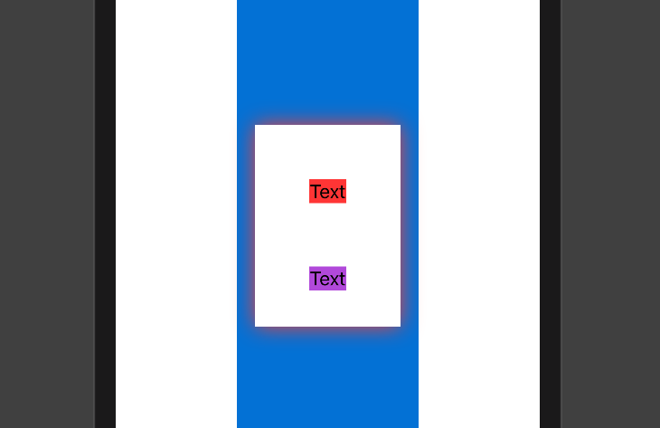
How to apply shadow to interior views in SwiftUI?
You can use clipped() here to fix this
VStack() {
    Text("Text")
        .background(Color.red)
        .padding()
        .padding()

    Text("Text")
        .background(Color.purple)
        .padding()
}
.padding()
.background(Color.white)

.clipped()
.shadow(color: Color.red, radius: 10, x: 0, y: 0)
Output:
Hope it is helpful :)
Subview have parent's shadow, even with a background
Certain modifiers, when placed on a stack, are inherited by all their children. For instance, if you have a stack containing a bunch of Text views, you can place one .font() modifier on the stack and they will all be modified.
It appears that .shadow() is one of those modifiers. As to why only one is inherited, I suspect that the designers of SwiftUI don't expect .shadow() to be called more than once on a particular view, and didn't test for that.
If you are just trying to get a colored line across the top and bottom of the view, maybe try something like
.background(Color.white)
.background(Color("tabShadow").offset(x: 0, y: -0.5))
.background(Color("tabShadow").offset(x: 0, y: 0.5))
Implementing Box-Shadow in SwiftUI
As far as I see there are two issues here to be fixed (although of course I don't have your colors and images):
ZStack {
    RoundedRectangle(cornerRadius: 27.5)
        .fill(Color.dropShadowColor)                // << here fill, not stroke !!
        .frame(width: 133, height: 56, alignment: .center)
        .shadow(color: .black, radius: 2, x: 0, y: 2)  // << no offset by x
    VStack {

        VStack {
            Image(imageName)
                .resizable()
                .scaledToFit()
        }
        .frame(height: 28, alignment: .center)
    }
    .frame(width: 133, height: 56, alignment: .center)
    .foregroundColor(.blue)
    .background(Color.loginButtonBackgroundColor)    // << should be opaque color !!
    .cornerRadius(27.5)
    .opacity(1)

}
How to make inner shadow in SwiftUI?
For this problem, I built a modifier for the View protocol and a extension, like below
View+innerShadow.swift
import SwiftUI

extension View {
    func innerShadow(color: Color, radius: CGFloat = 0.1) -> some View {
        modifier(InnerShadow(color: color, radius: min(max(0, radius), 1)))
    }
}

private struct InnerShadow: ViewModifier {
    var color: Color = .gray
    var radius: CGFloat = 0.1

    private var colors: [Color] {
        [color.opacity(0.75), color.opacity(0.0), .clear]
    }

    func body(content: Content) -> some View {
        GeometryReader { geo in
            content
                .overlay(LinearGradient(gradient: Gradient(colors: self.colors), startPoint: .top, endPoint: .bottom)
                    .frame(height: self.radius * self.minSide(geo)),
                         alignment: .top)
                .overlay(LinearGradient(gradient: Gradient(colors: self.colors), startPoint: .bottom, endPoint: .top)
                    .frame(height: self.radius * self.minSide(geo)),
                         alignment: .bottom)
                .overlay(LinearGradient(gradient: Gradient(colors: self.colors), startPoint: .leading, endPoint: .trailing)
                    .frame(width: self.radius * self.minSide(geo)),
                         alignment: .leading)
                .overlay(LinearGradient(gradient: Gradient(colors: self.colors), startPoint: .trailing, endPoint: .leading)
                    .frame(width: self.radius * self.minSide(geo)),
                         alignment: .trailing)
        }
    }

    func minSide(_ geo: GeometryProxy) -> CGFloat {
        CGFloat(3) * min(geo.size.width, geo.size.height) / 2
    }
}
And, for the inner shadow, you just need to add .innerShadow(color:radius)
ContentView.swift
import SwiftUI

struct ContentView: View {

    var body: some View {
        Rectangle()
            .foregroundColor(.green)
            .frame(width: 400, height: 300)
            .innerShadow(color: Color.black.opacity(0.3), radius: 0.05)
    }
}

struct ContentView_Previews: PreviewProvider {
    static var previews: some View {
        ContentView()
    }
}
How to give shadow with cornerRadius to a Button in SwiftUI
I would do it like this
Note: the last .padding is not important, depending on where and how the button will be placed, here is just for demo.

Button(action: {

}) {
    Text("SIGN IN")
        .font(.system(size: 17))
        .fontWeight(.bold)
        .foregroundColor(.green)
        .frame(minWidth: 0, maxWidth: .infinity)
        .padding()
        .background(
            RoundedRectangle(cornerRadius: 25)
                .fill(Color.white)
                .shadow(color: .gray, radius: 2, x: 0, y: 2)
    )
    .padding()
}
Related Topics
How to Hash a String to Sha512 in Swift
Updating Fetchedresultscontroller for Predicate Set by Uisearchbar
How to Detect If a Observable Has Not Emitted Any Events for Specific Time in Rxswift
How to Replace Limited Number of Occurrences in String
Swfitui List Make Scrolling Disabled
Removing a Closure from an Array
@Objc Redundancy When Having @Objcmembers Private Dynamic Var
Prevent Error "Funk" Sound in Event Monitor Os X
Using Vapor-Fluent to Upsert Models
Drawing a Gradient Color in an Arc with a Rounded Edge
Nspopover to Start in a Detached State
Draw Mkpointannotation with Title in Mksnapshot Image
Memory Problems When Switching Between Scenes Spritekit
Detect When Wkwebview Is Finished Loading
Programmatically Create an Nsviewcontroller Without an Xib in Swift 3
Swiftui MACos Commands (Menu Bar) and View
Swift Protocol with Associated Type - Type May Not Reference Itself as a Requirement