SwiftUI: Global Overlay That Can Be Triggered From Any View
It's quite easy - and entertaining - to build a "toast" in SwiftUI!
Let's do it!
struct Toast<Presenting>: View where Presenting: View {

    /// The binding that decides the appropriate drawing in the body.
    @Binding var isShowing: Bool
    /// The view that will be "presenting" this toast
    let presenting: () -> Presenting
    /// The text to show
    let text: Text

    var body: some View {

        GeometryReader { geometry in

            ZStack(alignment: .center) {

                self.presenting()
                    .blur(radius: self.isShowing ? 1 : 0)

                VStack {
                    self.text
                }
                .frame(width: geometry.size.width / 2,
                       height: geometry.size.height / 5)
                .background(Color.secondary.colorInvert())
                .foregroundColor(Color.primary)
                .cornerRadius(20)
                .transition(.slide)
                .opacity(self.isShowing ? 1 : 0)

            }

        }

    }

}
Explanation of the body:
GeometryReadergives us the preferred size of the superview , thus allowing the perfect sizing for ourToast.ZStackstacks views on top of each other.- The logic is trivial: if the toast is not supposed to be seen (
isShowing == false), then we render thepresentingview. If the toast has to be presented (isShowing == true), then we render thepresentingview with a little bit of blur - because we can - and we create our toast next. - The toast is just a
VStackwith aText, with custom frame sizing, some design bells and whistles (colors and corner radius), and a defaultslidetransition.
I added this method on View to make the Toast creation easier:
extension View {

    func toast(isShowing: Binding<Bool>, text: Text) -> some View {
        Toast(isShowing: isShowing,
              presenting: { self },
              text: text)
    }

}
And a little demo on how to use it:
struct ContentView: View {

    @State var showToast: Bool = false

    var body: some View {
        NavigationView {
            List(0..<100) { item in
                Text("\(item)")
            }
            .navigationBarTitle(Text("A List"), displayMode: .large)
            .navigationBarItems(trailing: Button(action: {
                withAnimation {
                    self.showToast.toggle()
                }
            }){
                Text("Toggle toast")
            })
        }
        .toast(isShowing: $showToast, text: Text("Hello toast!"))
    }

}
I used a NavigationView to make sure the view fills the entire screen, so the Toast is sized and positioned correctly.
The withAnimation block ensures the Toast transition is applied.
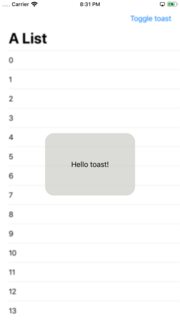
How it looks:
It's easy to extend the Toast with the power of SwiftUI DSL.
The Text property can easily become a @ViewBuilder closure to accomodate the most extravagant of the layouts.
To add it to your content view:
struct ContentView : View {
    @State private var liked: Bool = false

    var body: some View {
        VStack {
            LikeButton(liked: $liked)
        }
        // make it bigger by using "frame" or wrapping it in "NavigationView"
        .toast(isShowing: $liked, text: Text("Hello toast!"))
    }
}
How to hide the toast afte 2 seconds (as requested):
Append this code after .transition(.slide) in the toast VStack.
.onAppear {
    DispatchQueue.main.asyncAfter(deadline: .now() + 2) {
      withAnimation {
        self.isShowing = false
      }
    }
}
Tested on Xcode 11.1
Global view which blurry overlays other views and can be easily called
There are a couple of things that could be adjusted with your code.
- I'd make
Loada@StateObjecton a parent view so that theLoadingViewcan be conditionally displayed and not displayed all the time and just default to anEmptyView - In a
ZStack, the topmost view should be last -- you have it first. - You can use
.background(.ultraThinMaterial)
@main
struct TextLeadingApp: App {
    var body: some Scene {
        WindowGroup {
            ParentView()
        }
    }
}

struct ParentView : View {
    @StateObject private var load = Load()

    var body: some View {
        ZStack {
            ContentView()
            if load.loader > 0 {
                LoadingView()
            }
        }.environmentObject(load)
    }
}

class Load: ObservableObject {
    @Published var loader = 0

    func load() {
        loader += 1
    }
}

struct LoadingView: View {
    @EnvironmentObject var load: Load

    var body: some View {
        VStack {
            Text("LOADING")
        }
        .ignoresSafeArea()
        .frame(maxWidth: .infinity, maxHeight: .infinity)
        .background(.ultraThinMaterial)
    }
}

struct ContentView: View {
    @EnvironmentObject var load: Load

    var body: some View {
        NavigationView {
            Text("hi")
                .onTapGesture {
                    print("tapped")
                }
                .font(.system(size: 100, weight: .bold, design: .default))
                .foregroundColor(.orange)
                .toolbar {
                    Button("Load") {
                        load.load()
                    }
                }
                .navigationBarTitle(Text("A List"), displayMode: .large)
        }
        .navigationViewStyle(.stack)
    }
}
I've adjusted ContentView a bit, just to make the blur effect more obvious.
Update, with OP's request that only LoadingView responds to a change in the state, and not the parent view:
@main
struct TextLeadingApp: App {
    var body: some Scene {
        WindowGroup {
            ZStack {
                ContentView()
                LoadingView()
            }
            .environmentObject(Load())
        }
    }
}


class Load: ObservableObject {
    @Published var loader = 0

    func load() {
        loader += 1
    }
}

struct LoadingView: View {
    @EnvironmentObject var load: Load

    var body: some View {
        if load.loader > 0 {
            VStack {
                Text("LOADING")
            }
            .ignoresSafeArea()
            .frame(maxWidth: .infinity, maxHeight: .infinity)
            .background(.ultraThinMaterial)
        } else {
            EmptyView()
        }
    }
}
Transition issue on overlay
Try this
.overlay(
   VStack {
      if showFitnessForm {
        FitnessForm(...)
          .transition(transition)   // << here !!
      }
   }
   .animation(Animation.easeInOut(duration: 1.0), value: showFitnessForm)  // << here !!
)
*about diagoanal movement - I assume your view is in NavigationView, so look at this one Broken animation in NavigationView
Related Topics
Type Conversion When Using Protocol in Swift
Make Code With Firebase Asynchronous
Try, Try! & Try? What's the Difference, and When to Use Each
How to Silence a Warning in Swift
Swift5 Macos Imageresize Memory Issue
How to Access Nswindow from @Main App Using Only Swiftui
Remove Element from Collection During Iteration with Foreach
How to Access Program Arguments in Swift
Get Button Pressed Id on Swift Via Sender
Swift3 Optionals Chaining in If Conditions Bug
Projecting the Arkit Face Tracking 3D Mesh to 2D Image Coordinates
Swiftui Hierarchical Picker With Dynamic Data Crashes
Whats the Swift Animate Withduration Syntax
Module Compiled With Swift 3.0 Cannot Be Imported in Swift 3.0.1
Swift 3 Error:Argument Labels '(_:)' Do Not Match Any Available Overloads