SwiftUI create image slider with dots as indicators
There is no built-in method for this in SwiftUI this year. I'm sure a system-standard implementation will come along in the future.
In the short term, you have two options. As Asperi noted, Apple's own tutorials have a section on wrapping the PageViewController from UIKit for use in SwiftUI (see Interfacing with UIKit).
The second option is to roll your own. It's entirely possible to make something similar in SwiftUI. Here's a proof of concept, where the index can be changed by swipe or by binding:
struct PagingView<Content>: View where Content: View {

    @Binding var index: Int
    let maxIndex: Int
    let content: () -> Content

    @State private var offset = CGFloat.zero
    @State private var dragging = false

    init(index: Binding<Int>, maxIndex: Int, @ViewBuilder content: @escaping () -> Content) {
        self._index = index
        self.maxIndex = maxIndex
        self.content = content
    }

    var body: some View {
        ZStack(alignment: .bottomTrailing) {
            GeometryReader { geometry in
                ScrollView(.horizontal, showsIndicators: false) {
                    HStack(spacing: 0) {
                        self.content()
                            .frame(width: geometry.size.width, height: geometry.size.height)
                            .clipped()
                    }
                }
                .content.offset(x: self.offset(in: geometry), y: 0)
                .frame(width: geometry.size.width, alignment: .leading)
                .gesture(
                    DragGesture().onChanged { value in
                        self.dragging = true
                        self.offset = -CGFloat(self.index) * geometry.size.width + value.translation.width
                    }
                    .onEnded { value in
                        let predictedEndOffset = -CGFloat(self.index) * geometry.size.width + value.predictedEndTranslation.width
                        let predictedIndex = Int(round(predictedEndOffset / -geometry.size.width))
                        self.index = self.clampedIndex(from: predictedIndex)
                        withAnimation(.easeOut) {
                            self.dragging = false
                        }
                    }
                )
            }
            .clipped()

            PageControl(index: $index, maxIndex: maxIndex)
        }
    }

    func offset(in geometry: GeometryProxy) -> CGFloat {
        if self.dragging {
            return max(min(self.offset, 0), -CGFloat(self.maxIndex) * geometry.size.width)
        } else {
            return -CGFloat(self.index) * geometry.size.width
        }
    }

    func clampedIndex(from predictedIndex: Int) -> Int {
        let newIndex = min(max(predictedIndex, self.index - 1), self.index + 1)
        guard newIndex >= 0 else { return 0 }
        guard newIndex <= maxIndex else { return maxIndex }
        return newIndex
    }
}

struct PageControl: View {
    @Binding var index: Int
    let maxIndex: Int

    var body: some View {
        HStack(spacing: 8) {
            ForEach(0...maxIndex, id: \.self) { index in
                Circle()
                    .fill(index == self.index ? Color.white : Color.gray)
                    .frame(width: 8, height: 8)
            }
        }
        .padding(15)
    }
}
and a demo
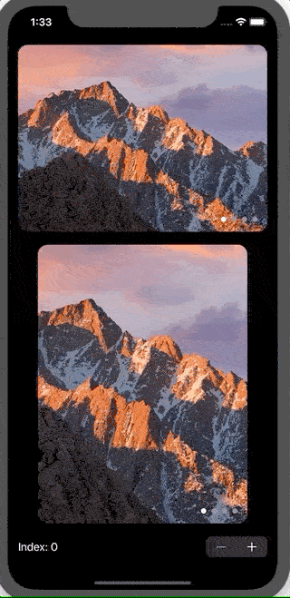
struct ContentView: View {
    @State var index = 0

    var images = ["10-12", "10-13", "10-14", "10-15"]

    var body: some View {
        VStack(spacing: 20) {
            PagingView(index: $index.animation(), maxIndex: images.count - 1) {
                ForEach(self.images, id: \.self) { imageName in
                    Image(imageName)
                        .resizable()
                        .scaledToFill()
                }
            }
            .aspectRatio(4/3, contentMode: .fit)
            .clipShape(RoundedRectangle(cornerRadius: 15))

            PagingView(index: $index.animation(), maxIndex: images.count - 1) {
                ForEach(self.images, id: \.self) { imageName in
                    Image(imageName)
                        .resizable()
                        .scaledToFill()
                }
            }
            .aspectRatio(3/4, contentMode: .fit)
            .clipShape(RoundedRectangle(cornerRadius: 15))

            Stepper("Index: \(index)", value: $index.animation(.easeInOut), in: 0...images.count-1)
                .font(Font.body.monospacedDigit())
        }
        .padding()
    }
}
Two notes:
- The GIF animation does a really poor job of showing how smooth the animation is, as I had to drop the framerate and compress heavily due to file size limits. It looks great on simulator or a real device
- The drag gesture in the simulator feels clunky, but it works really well on a physical device.
change TabView indicator SwiftUI
you need to use UIkit
 init() {
    UIPageControl.appearance().currentPageIndicatorTintColor = .red
    UIPageControl.appearance().pageIndicatorTintColor = UIColor.black.withAlphaComponent(0.2)
    }
Page Controller changes but Carousel does not SwiftUI
Update this method inside the Carousel view.
func updateUIView(_ uiView: UIScrollView, context: Context) {
  uiView.setContentOffset(CGPoint(x: width * CGFloat(page), y: uiView.contentOffset.y), animated: true)
}
Adding dots to bottom of UIPageViewController screen
When you use UIPageViewController the dots should be visible by default. I guess you have a white background and the dots are also white, so you just don't see them.
Try to change dots color:
Swift 4/5:
var appearance = UIPageControl.appearance(whenContainedInInstancesOf: [UIPageViewController.self])
appearance.pageIndicatorTintColor = UIColor.red
appearance.currentPageIndicatorTintColor = UIColor.red
Swift 3:
var appearance = UIPageControl.appearanceWhenContainedIn(UIPageViewController.self, nil)
appearance.pageIndicatorTintColor = UIColor.red
appearance.currentPageIndicatorTintColor = UIColor.red
If it doesn't help, make sure that you are using UIPageViewControllerTransitionStyleScroll transition style.
Also, make sure to implement this methods from the UIPageViewControllerDataSource: presentationCount(for:) and presentationIndex(for:).
Add border for dots in UIPageControl
That is not possible with the current properties available for UIPageControl. But you can do by integrating any third party page control which mimic the functionality of iOS UIPageControl.
Other answer has applied a patch. I highly disagreed with that solution.
Related Topics
Swiftui Hierarchical Picker With Dynamic Data Crashes
How String Comparison Happens in Swift
Propagate an Optional Through a Function (Or Init) in Swift
Previewprovider and Observedobject Properties
Xcode 7.3.1 Hangs on "Copying Swift Standard Libraries"
Setting the Timelineprovider Refresh Interval For Widget
Nsfontattributedstring Worked Before Xcode 6.1
Swift Cross Compile to Single Linux Binary
Change the Value That Is Being Set in Variable's Willset Block
Swift Alternative to Performselectoronmainthread
What Are the Rules for Spaces in Swift
Swift: Change the Cell's Uibutton Image with Tableview Didselect Method
How to Convert Any Generic Numeric into a Double
Compress Image in iOS 12. How Will This Code Be Updated
How to Cycle Through the Entire Alphabet with Swift While Assigning Values
How to Get the Index of the Element in the List in Swiftui When the List Is Populated with the Array