how to create a circle with rounded ends for each quadrant
Here's another set of code where the paths that are generated have rounded ends, but each arc segment is a filled path rather than being a single stroked segment. This should allow the paths to have collisions without the end caps overlapping.
import UIKit
import SpriteKit
import PlaygroundSupport

let radius = CGFloat(100)

let sceneSize = CGSize(width: 640, height: 480)
let sceneView = SKView(frame: CGRect(origin: CGPoint.zero, size: sceneSize))

let scene = SKScene(size: sceneSize)
scene.backgroundColor = UIColor.black

let topRightPath = arcSegment(radius: radius, strokeWidth: 18, gapWidth: 25)

let topRightPathNode = SKShapeNode(path: topRightPath)
topRightPathNode.fillColor = SKColor.white
topRightPathNode.position = CGPoint(x: 320, y: 240)
topRightPathNode.lineWidth = 0
scene.addChild(topRightPathNode)

var reflectOnY = CGAffineTransform(scaleX: 1.0, y: -1.0)
let bottomRightPath = topRightPath.copy(using: &reflectOnY)!
let bottomRightPathNode = SKShapeNode(path: bottomRightPath)
bottomRightPathNode.fillColor = SKColor.orange
bottomRightPathNode.position = CGPoint(x: 320, y: 240)
bottomRightPathNode.lineWidth = 0
scene.addChild(bottomRightPathNode)

var reflectOnX = CGAffineTransform(scaleX: -1.0, y: 1.0)
let bottomLeftPath = bottomRightPath.copy(using: &reflectOnX)!
let bottomLeftPathNode = SKShapeNode(path: bottomLeftPath)
bottomLeftPathNode.fillColor = SKColor.green
bottomLeftPathNode.position = CGPoint(x: 320, y: 240)
bottomLeftPathNode.lineWidth = 0
scene.addChild(bottomLeftPathNode)

let topLeftPath = bottomLeftPath.copy(using: &reflectOnY)!
let topLeftPathNode = SKShapeNode(path: topLeftPath)
topLeftPathNode.fillColor = SKColor.blue
topLeftPathNode.position = CGPoint(x: 320, y:240)
topLeftPathNode.lineWidth = 0
scene.addChild(topLeftPathNode)

sceneView.presentScene(scene)

PlaygroundPage.current.liveView = sceneView
PlaygroundPage.current.needsIndefiniteExecution = true

func arcSegment( radius: CGFloat,
                 strokeWidth: CGFloat,
                 gapWidth: CGFloat) -> CGPath
{
    let halfStrokeWidth = strokeWidth / 2.0
    let outerRadius = radius + halfStrokeWidth
    let innerRadius = radius - halfStrokeWidth
    let halfGap = gapWidth / 2.0

    let outerStartAngle = CGFloat(atan2(sqrt(outerRadius * outerRadius - halfGap * halfGap), halfGap))
    let outerEndAngle = CGFloat(atan2(halfGap, sqrt(outerRadius * outerRadius - halfGap * halfGap)))

    let innerStartAngle = CGFloat(atan2(halfGap, sqrt(innerRadius * innerRadius - halfGap * halfGap)))
    let innerEndAngle = CGFloat(atan2(sqrt(innerRadius * innerRadius - halfGap * halfGap), halfGap))

    let leftEndAngle = CGFloat(atan2(sqrt(radius * radius - halfGap * halfGap), halfGap))

    let leftEndCapPoint = CGPoint(x: radius * cos(leftEndAngle),
                                  y: radius * sin(leftEndAngle))
    let rightEndCapPoint = CGPoint(x: leftEndCapPoint.y,
                                   y: leftEndCapPoint.x)

    let path = CGMutablePath()

    path.addArc(center: CGPoint.zero,
                radius: outerRadius,
                startAngle: outerStartAngle,
                endAngle: outerEndAngle,
                clockwise: true)

    path.addArc(center: rightEndCapPoint,
                radius: halfStrokeWidth,
                startAngle : 0,
                endAngle : CGFloat.pi,
                clockwise: true)

    path.addArc(center: CGPoint.zero, radius: innerRadius, startAngle: innerStartAngle, endAngle: innerEndAngle, clockwise: false)

    path.addArc(center: leftEndCapPoint,
                radius: halfStrokeWidth,
                startAngle : 3.0 * CGFloat.pi / 2.0,
                endAngle : CGFloat.pi / 2.0,
                clockwise: true)

    path.closeSubpath()

    return path
}
How to reduce the size each circle quadrant to produce gaps
Below is some code that when pasted into a iOS Playground generates a picture that I think matches your description.
In order to get the sides to remain parallel to the axes in the place where there are gaps, you have to do a little math to figure out what the points are. Then you have to draw the outline of the shape you want instead of relying on the stroke width added by the drawing system. The math is not too complicated if you're familiar with Trigonometry, but your question suggested that you might be OK.
import UIKit
import SpriteKit
import PlaygroundSupport

let radius = CGFloat(100)

let sceneSize = CGSize(width: 640, height: 480)
let sceneView = SKView(frame: CGRect(origin: CGPoint.zero, size: sceneSize))

let scene = SKScene(size: sceneSize)
scene.backgroundColor = UIColor.black

let topRightPath = arcSegment(center: CGPoint.zero, radius: radius, strokeWidth: 18, gapWidth: 18)

let topRightPathNode = SKShapeNode(path: topRightPath)
topRightPathNode.fillColor = SKColor.white
topRightPathNode.lineWidth = 0
topRightPathNode.position = CGPoint(x: 320, y: 240)
scene.addChild(topRightPathNode)

var reflectOnY = CGAffineTransform(scaleX: 1.0, y: -1.0)
let bottomRightPath = topRightPath.copy(using: &reflectOnY)!
let bottomRightPathNode = SKShapeNode(path: bottomRightPath)
bottomRightPathNode.fillColor = SKColor.orange
bottomRightPathNode.lineWidth = 0
bottomRightPathNode.position = CGPoint(x: 320, y: 240)
scene.addChild(bottomRightPathNode)

var reflectOnX = CGAffineTransform(scaleX: -1.0, y: 1.0)
let bottomLeftPath = bottomRightPath.copy(using: &reflectOnX)!
let bottomLeftPathNode = SKShapeNode(path: bottomLeftPath)
bottomLeftPathNode.fillColor = SKColor.green
bottomLeftPathNode.lineWidth = 0
bottomLeftPathNode.position = CGPoint(x: 320, y: 240)
scene.addChild(bottomLeftPathNode)

let topLeftPath = bottomLeftPath.copy(using: &reflectOnY)!
let topLeftPathNode = SKShapeNode(path: topLeftPath)
topLeftPathNode.fillColor = SKColor.blue
topLeftPathNode.lineWidth = 0
topLeftPathNode.position = CGPoint(x: 320, y:240)
scene.addChild(topLeftPathNode)

sceneView.presentScene(scene)

PlaygroundPage.current.liveView = sceneView
PlaygroundPage.current.needsIndefiniteExecution = true

func arcSegment(center : CGPoint,
                radius: CGFloat,
                strokeWidth: CGFloat,
                gapWidth: CGFloat) -> CGPath
{
    let halfStrokeWidth = strokeWidth / 2.0
    let outerRadius = radius + halfStrokeWidth
    let innerRadius = radius - halfStrokeWidth
    let halfGap = gapWidth / 2.0

    let outerStartAngle = CGFloat(atan2(sqrt(outerRadius * outerRadius - halfGap * halfGap), halfGap))
    let outerEndAngle = CGFloat(atan2(halfGap, sqrt(outerRadius * outerRadius - halfGap * halfGap)))

    let innerStartAngle = CGFloat(atan2(halfGap, sqrt(innerRadius * innerRadius - halfGap * halfGap)))
    let innerEndAngle = CGFloat(atan2(sqrt(innerRadius * innerRadius - halfGap * halfGap), halfGap))

    let path = CGMutablePath()

    path.addArc(center: center, radius: outerRadius, startAngle: outerStartAngle, endAngle: outerEndAngle, clockwise: true)
    // Quartz 2D will assume a "moveTo" here
    path.addArc(center: center, radius: innerRadius, startAngle: innerStartAngle, endAngle: innerEndAngle, clockwise: false)
    path.closeSubpath()

    return path
}
How to create circle with four quarters
Easily...using borders and a rotation.
.circle {

  margin: 1em auto;

  border-radius: 50%;

  width: 40px;

  height: 40px;

  box-sizing: border-box;

  border-width: 20px;

  border-style: solid;

  border-color: red green blue yellow;

  transform: rotate(45deg);

}
<div class="circle"></div>Rounding the edges of a stroke in bezier path circle in swift
Assuming you are using a CAShapeLayer to draw this, just set the lineCap, e.g.:
layer.lineCap = .round
How does this CSS produce a circle?
How does a border of 180 pixels with height/width-> 0px become a circle with a radius of 180 pixels?
Let's reformulate that into two questions:
Where do width and height actually apply?
Let's have a look at the areas of a typical box (source):
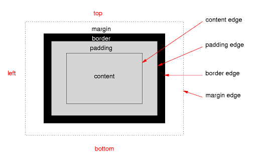
The height and width apply only on content, if the correct box model is being used (no quirks mode, no old Internet Explorer).
Where does border-radius apply?
The border-radius applies on the border-edge. If there is neither padding nor border it will directly affect your content edge, which results in your third example.
What does this mean for our border-radius/circle?
This means that your CSS rules result in a box that only consists of a border. Your rules state that this border should have a maximum width of 180 pixels on every side, while on the other hand it should have a maximum radius of the same size:
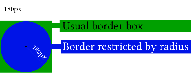
In the picture, the actual content of your element (the little black dot) is really non-existent. If you didn't apply any border-radius you would end up with the green box. The border-radius gives you the blue circle.
It gets easier to understand if you apply the border-radius only to two corners:
#silly-circle{
    width:0; height:0;
    border: 180px solid red;
    border-top-left-radius: 180px;
    border-top-right-radius: 180px;
}
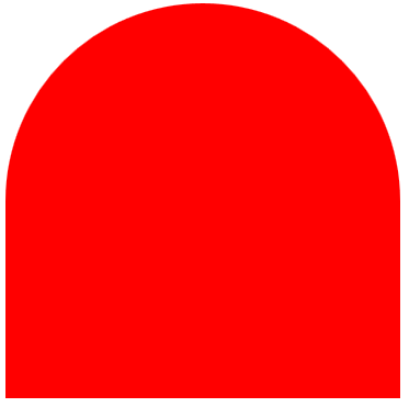
Since in your example the size and radius for all corners/borders are equal you get a circle.
Further resources
References
- W3C: CSS Backgrounds and Borders Module Level 3 (esp. 5. Rounded Corners)
Demonstrations
- Please open the demo below, which shows how the
border-radiusaffects the border (think of the inner blue box as the content box, the inner black border as the padding border, the empty space as the padding and the giant red border as the, well, border). Intersections between the inner box and the red border would usually affect the content edge.
var all = $('#TopLeft, #TopRight, #BottomRight, #BottomLeft');

all.on('change keyup', function() {

  $('#box').css('border' + this.id + 'Radius', (this.value || 0) + "%");

  $('#' + this.id + 'Text').val(this.value + "%");

});

$('#total').on('change keyup', function() {

  $('#box').css('borderRadius', (this.value || 0) + "%");

  $('#' + this.id + 'Text').val(this.value + "%");

  all.val(this.value);

  all.each(function(){$('#' + this.id + 'Text').val(this.value + "%");})

});
#box {
margin:auto;
width: 32px;
height: 32px;
border: 100px solid red;
padding: 32px;
transition: border-radius 1s ease;
-moz-transition: border-radius 1s ease;
-webkit-transition: border-radius 1s ease;
-o-transition: border-radius 1s ease;
-ms-transition: border-radius 1s ease;
}
#chooser{margin:auto;}
#innerBox {
width: 100%;
height: 100%;
border: 1px solid blue;
}<script src="https://ajax.googleapis.com/ajax/libs/jquery/2.1.1/jquery.min.js"></script>
<div id="box">
<div id="innerBox"></div>
</div>
<table id="chooser">
<tr>
<td><label for="total">Total</label></td>
<td><input id="total" value="0" type="range" min="0" max="100" step="1" /></td>
<td><input readonly id="totalText" value="0" type="text" /></td>
</tr>
<tr>
<td><label for="TopLeft">Top-Left</label></td>
<td><input id="TopLeft" value="0" type="range" min="0" max="100" step="1" /></td>
<td><input readonly id="TopLeftText" value="0" type="text" /></td>
</tr>
<tr>
<td><label for="TopRight">Top right</label></td>
<td><input id="TopRight" value="0" type="range" min="0" max="100" step="1" /></td>
<td><input readonly id="TopRightText" value="0" type="text" /></td>
</tr>
<tr>
<td><label for="BottomRight">Bottom right</label></td>
<td><input id="BottomRight" value="0" type="range" min="0" max="100" step="1" /></td>
<td><input readonly id="BottomRightText" value="0" type="text" /></td>
</tr>
<tr>
<td><label for="BottomLeft">Bottom left</label></td>
<td><input id="BottomLeft" value="0" type="range" min="0" max="100" step="1" /></td>
<td><input readonly id="BottomLeftText" value="0" type="text" /></td>
</tr>
<caption><code>border-radius</code> values. All values are in percent.</caption>
</table>
<p>This demo uses a box with a <code>width/height</code> of 32px, a <code>padding</code> of 32px, and a <code>border</code> of 100px.</p>How to draw a circle sector in CSS?
CSS and Multiple Background Gradients
Rather than trying to draw the green portion, you could draw the white portions instead:
pie {
    border-radius: 50%;
    background-color: green;
}

.ten {
    background-image:
        /* 10% = 126deg = 90 + ( 360 * .1 ) */
        linear-gradient(126deg, transparent 50%, white 50%),
        linear-gradient(90deg, white 50%, transparent 50%);
}
pie {
  width: 5em;
  height: 5em;
  display: block;
  border-radius: 50%;
  background-color: green;
  border: 2px solid green;
  float: left;
  margin: 1em;
}

.ten {
  background-image: linear-gradient(126deg, transparent 50%, white 50%), linear-gradient(90deg, white 50%, transparent 50%);
}

.twentyfive {
  background-image: linear-gradient(180deg, transparent 50%, white 50%), linear-gradient(90deg, white 50%, transparent 50%);
}

.fifty {
  background-image: linear-gradient(90deg, white 50%, transparent 50%);
}

/* Slices greater than 50% require first gradient
   to be transparent -> green */

.seventyfive {
  background-image: linear-gradient(180deg, transparent 50%, green 50%), linear-gradient(90deg, white 50%, transparent 50%);
}

.onehundred {
  background-image: none;
}
<pie class="ten"></pie>
<pie class="twentyfive"></pie>
<pie class="fifty"></pie>
<pie class="seventyfive"></pie>
<pie class="onehundred"></pie>It is possible to obtain a perfect svg circle from parts?
Maybe I'm misunderstanding but using this CSS does a perfect circle with your arcs :
svg{position:fixed;}
#svg3{left:-72px; top:88px;}
#svg4{left:88px; top:88px;}
http://jsfiddle.net/LtLafp2r/3/
Ps: there is a bug in rendering path arcs in Chrome : check this question
CSS: Circle with four colors and only one div
Since you listed CSS3, you could do this with just borders and a rotation transformation to "fix" the alignment:
div {
    border-radius: 50px;
    border-style: solid;
    border-width: 50px;
    border-bottom-color: red;
    border-left-color: green;
    border-right-color: blue;
    border-top-color: yellow;
    height: 0px;
    width: 0px;

    /* To ratate */
    -webkit-transform: rotate(45deg);
    -moz-transform: rotate(45deg);
    -ms-transform: rotate(45deg);
    -o-transform: rotate(45deg);
    transform: rotate(45deg);
}
http://jsfiddle.net/k8Jj9/
Related Topics
Connecting Hc-05 with iPhone Se iOS(V11.0)
Why Mark Something Final in Swift Except for Architectural Considerations
Deep Copy of Cmimagebuffer or Cvimagebuffer
How How to Perform Multiple Alamofire Requests That Are Finished One After Another
Retrieving an Array from Firebase
How to Avoid Duplicate Key Error in Swift When Iterating Over a Dictionary
Take a Full Screenshot for All Webview in Swift
Using "Codable" to Set Property Values Doesn't Work Through Inheritance
How to Use View Controller (Calendarkit) in Swiftui Application
Swift Nsusernotification Doesn't Show While App Is Active
Error with Parse Query Findobjectsinbackgroundwithblock
Saving Dictionary into Nsuserdefaults
Swift - Writing a Byte Stream to File
Swift Callkit Sometimes Can't Activate Loudspeaker After Received Call (Only Incoming Call)
Swift 'Unable to Dequeue a Cell with Identifier Intervalcellidentifier
How to Add a Left Bar Button Without Overriding the Natural Back Button
Swift 1.2 Not Working with Same Function Name and Different Parameter