iOS Different Font Sizes within Single Size Class for Different Devices
Edit: I don't recommend this anymore. This approach doesn't scale well when new devices come out. Use a combination of dynamic font sizes and size classes-specific fonts.
Say a new iPhone model comes out, if you are using Auto Layout and Size Classes you don't have to fix all the constraints manually to make your app compatible with this newer device. However, you can still set the font size of the UILabel using the following code:
if UIScreen.mainScreen().bounds.size.height == 480 {
    // iPhone 4
    label.font = label.font.fontWithSize(20)
} else if UIScreen.mainScreen().bounds.size.height == 568 {
    // IPhone 5
    label.font = label.font.fontWithSize(20)
} else if UIScreen.mainScreen().bounds.size.width == 375 {
    // iPhone 6
    label.font = label.font.fontWithSize(20)
} else if UIScreen.mainScreen().bounds.size.width == 414 {
    // iPhone 6+
    label.font = label.font.fontWithSize(20)
} else if UIScreen.mainScreen().bounds.size.width == 768 {
    // iPad
    label.font = label.font.fontWithSize(20)
}
How to set different font sizes for different devices using Xcode Storyboard?
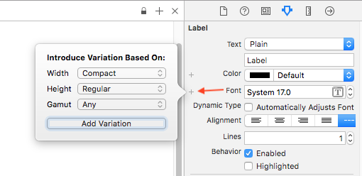
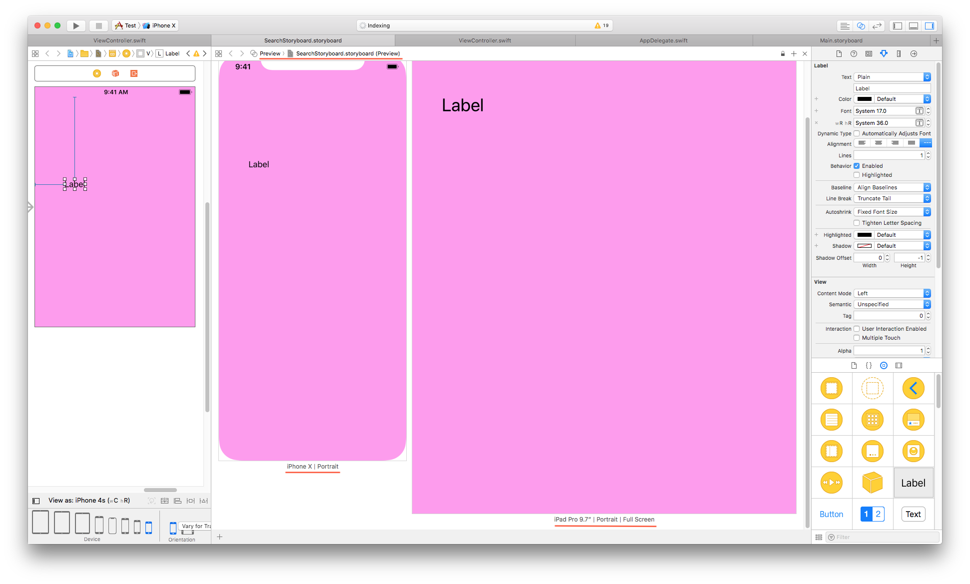
Use Size-Class and add size variation for fonts from Attribute Inspector of Label property.
Here are different possible variations, you can set with Size class:
Try this:
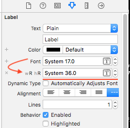
Here is (result) preview of font-size variation, in iPhone and iPad
Update
The result you are expecting, may not be possible using IB (Storyboard) but you can try it with following programmatic solution:
extension UIDevice {


    enum DeviceType: String {
        case iPhone4_4S = "iPhone 4 or iPhone 4S"
        case iPhones_5_5s_5c_SE = "iPhone 5, iPhone 5s, iPhone 5c or iPhone SE"
        case iPhones_6_6s_7_8 = "iPhone 6, iPhone 6S, iPhone 7 or iPhone 8"
        case iPhones_6Plus_6sPlus_7Plus_8Plus = "iPhone 6 Plus, iPhone 6S Plus, iPhone 7 Plus or iPhone 8 Plus"
        case iPhoneX = "iPhone X"
        case unknown = "iPadOrUnknown"
    }

    var deviceType: DeviceType {
        switch UIScreen.main.nativeBounds.height {
        case 960:
            return .iPhone4_4S
        case 1136:
            return .iPhones_5_5s_5c_SE
        case 1334:
            return .iPhones_6_6s_7_8
        case 1920, 2208:
            return .iPhones_6Plus_6sPlus_7Plus_8Plus
        case 2436:
            return .iPhoneX
        default:
            return .unknown
        }
    }
}

// Get device type (with help of above extension) and assign font size accordingly.
let label = UILabel()

let deviceType = UIDevice.current.deviceType

switch deviceType {

case .iPhone4_4S:
    label.font = UIFont.systemFont(ofSize: 10)

case .iPhones_5_5s_5c_SE:
    label.font = UIFont.systemFont(ofSize: 12)

case .iPhones_6_6s_7_8:
    label.font = UIFont.systemFont(ofSize: 14)

case .iPhones_6Plus_6sPlus_7Plus_8Plus:
    label.font = UIFont.systemFont(ofSize: 16)

case .iPhoneX:
    label.font = UIFont.systemFont(ofSize: 18)

default:
    print("iPad or Unkown device")
    label.font = UIFont.systemFont(ofSize: 20)

}
How to set different variation depends on different iPhone devices?
You should use Auto Layout & constraints to automatically calculate the position of elements based on the screen size and defined rules.
I'm not entirely sure what the view should look like across all devices but I will give an example. Since you have 3 textfields and 1 button next to each other, you can put them in a vertical stackview and then put that stackview within another stackview along with the image and apply the constraint directly to the parent stackview. For example, center it in the view.
So it will look like this:
- View
- Vertical Stackview - Apply H/W center constraint on this
Image
Vertical Stackview
- Textfield
- Textfield
- Textfield
- Button
- Vertical Stackview - Apply H/W center constraint on this
By using two stackviews you can then define one spacing between the input elements and have a larger space between the Image and the inputs stackview.
This video seems like it is a good introduction to constraints.
Override font size for 3.5 inch iOS devices
Override didSet for the font property.
class MyLabel : UILabel {

    private func shouldShrinkFont() -> Bool {
        let size = UIScreen.mainScreen().bounds.size
        // This check works regardless of orientation.
        return size.width + size.height == 480 + 320
    }

    override var font: UIFont! {
        didSet {
            if shouldShrinkFont() {
                super.font = UIFont(name: "Score Board", size: font.pointSize - 10)
            }
        }
    }

}
Related Topics
How to Map Over The Values of Zip2
How to Assign a Generic Function to a Variable
How to Declare Swift Generic for Enums of Particular Type
Does Swift Allow Code Blocks Without Conditions/Loops to Reduce Local Variable Scope
Swiftycam Capture Session Is Not Running
Sizing a UIpickerview Inside a UIalertview
How Is Commoncrypto Used in Swift3
Crash Casting Wknsurlrequest As? Other Type
Macos Security Scoped Url Bookmark for Folder
Get Path of a File in a Data Set Located in Assets.Xcassets
Include Dictionary or Array Value in Swift String with Backslash Notation
Why This Line Is Not Covered? Xcode Code Coverage
Nscalendar in Swift - Init Can Return Nil, But Isn't Optional
Table View Cells Changing Colors When Scrolling Swift
How to Detect If The User Was Deleted from Firebase Auth
Convert/Wrap Swift Struct as Nsvalue for Caanimation Purposes
Xcode Issue: Library Not Loaded: @Rpath/Libswiftappkit.Dylib