Add a border with cornerRadius to an Image in SwiftUI Xcode beta 5
SwiftUI 1.0
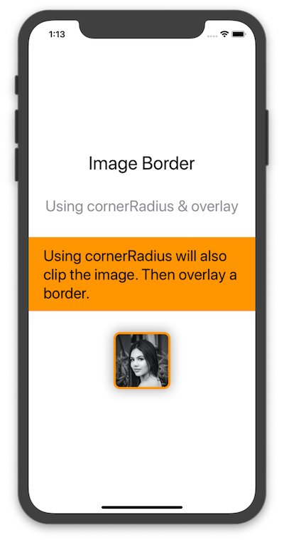
Using cornerRadius & overlay Modifiers
Here is another way in which we can use a cornerRadius modifier (which clips the view) and then overlay a stroke with a color.
VStack(spacing: 40) {
    Text("Image Border").font(.largeTitle)
    Text("Using cornerRadius & overlay").font(.title).foregroundColor(.gray)
    Text("Using cornerRadius will also clip the image. Then overlay a border.")
        .frame(minWidth: 0, maxWidth: .infinity)
        .font(.title)
        .padding()
        .background(Color.orange)
        .foregroundColor(.black)

    Image("profile")
        .cornerRadius(10)
        .overlay(RoundedRectangle(cornerRadius: 10)
            .stroke(Color.orange, lineWidth: 4))
        .shadow(radius: 10)
}
Result
Add a circular image view with corner radius for an image in swiftUI
This is not the simplest thing to come up with. Use this struct as a separate view. It will return the image properly sized on the circle.
struct ImageOnCircle: View {

    let icon: String
    let radius: CGFloat
    let circleColor: Color
    let imageColor: Color // Remove this for an image in your assets folder.
    var squareSide: CGFloat {
        2.0.squareRoot() * radius
    }

    var body: some View {
        ZStack {
            Circle()
                .fill(circleColor)
                .frame(width: radius * 2, height: radius * 2)

            // Use this implementation for an SF Symbol
            Image(systemName: icon)
                .resizable()
                .aspectRatio(1.0, contentMode: .fit)
                .frame(width: squareSide, height: squareSide)
                .foregroundColor(imageColor)

            // Use this implementation for an image in your assets folder.
//            Image(icon)
//                .resizable()
//                .aspectRatio(1.0, contentMode: .fit)
//                .frame(width: squareSide, height: squareSide)
        }
    }
}
Button border with corner radius in Swift UI
Try it like this: Instead of setting the cornerRadius to the Button use an overlay for the inside View:
Edit: If you have a background for the button you also need to apply the cornerRadius to the background.
    Button(action: {
        print("sign up bin tapped")
    }) {
        Text("SIGN UP")
            .frame(minWidth: 0, maxWidth: .infinity)
            .font(.system(size: 18))
            .padding()
            .foregroundColor(.white)
            .overlay(
                RoundedRectangle(cornerRadius: 25)
                    .stroke(Color.white, lineWidth: 2)
        )
    }
    .background(Color.yellow) // If you have this
    .cornerRadius(25)         // You also need the cornerRadius here
Works for me. Let me know if it helps!
SwiftUI edges visible after using overlay
Your view will not be tappable through overlay, even with transparency, so the solution is to use clip shape and background as shown below

struct DemoRoundRectView: View {
    var body: some View {
        Text("DEMO")
            .frame(width: 100, height: 50)
            .background(Color.gray.opacity(0.2))
            .clipShape(RoundedRectangle(cornerRadius: 10)) // clip corners
            .background(
                RoundedRectangle(cornerRadius: 10) // stroke border
                    .stroke(Color.gray.opacity(0.2), lineWidth: 1)
            )
    }
}
How to round edges of UILabel with Swift
Assuming you have added a backgroundColor to your label otherwise there would be no way to tell if it had edges, you can use QuartzCore to round the edges of a label.
import QuartzCore

yourLabel.layer.backgroundColor  = UIColor.redColor().CGColor
yourLabel.layer.cornerRadius = 5
yourLabel.layer.masksToBounds = true
SwiftUI Image clipsToBounds
You can use the .clipped() modifier, which results in an effect similar to UIView.clipsToBounds:
Image("large")
    .resizable()
    .aspectRatio(contentMode: .fill)
    .frame(width: 80, height: 80, alignment: .center)
    .border(Color.black)
    .clipped() // Equal to clipsToBounds = true
How to select a Picker with MenuPickerStyle outside of the label text
Use Picker(selection:label:content:), which takes a View as the label: argument. Put everything you want as the tappable view inside the label: argument, like so:
var body: some View {

    Picker(selection: $selectedOption, label:

            HStack {
                Rectangle()
                    .foregroundColor(Color(.systemBackground))
                    .frame(height: 40)
                Image(systemName: "chevron.down")
                    .padding(EdgeInsets(top: 0, leading: 0, bottom: 0, trailing: 8))
            }
            .overlay(
                RoundedRectangle(cornerRadius: 5)
                    .stroke(Color.black, lineWidth: 1)
            )
            .overlay(
                Text("Picker Option \(selectedOption)")
            )
            .padding(EdgeInsets(top: 0, leading: 16, bottom: 0, trailing: 16))
    ) {
        ForEach(options, id: \.self) { option in
            Text("Picker Option \(option)")
        }
    }
    .pickerStyle(MenuPickerStyle())
}
Update: The above code doesn’t work in Xcode 13 beta 5. Hopefully it’s a bug, but if not, here is a workaround: put the Picker in a Menu!
var body: some View {

    Menu {
        Picker("picker", selection: $selectedOption) {
            ForEach(options, id: \.self) { option in
                Text("Picker Option \(option)")
            }
        }
        .labelsHidden()
        .pickerStyle(InlinePickerStyle())

    } label: {

        HStack {
            Rectangle()
                .foregroundColor(Color(.systemBackground))
                .frame(height: 40)
            Image(systemName: "chevron.down")
                .padding(EdgeInsets(top: 0, leading: 0, bottom: 0, trailing: 8))
        }
        .overlay(
            RoundedRectangle(cornerRadius: 5)
                .stroke(Color.black, lineWidth: 1)
        )
        .overlay(
            Text("Picker Option \(selectedOption)")
        )
        .padding(EdgeInsets(top: 0, leading: 16, bottom: 0, trailing: 16))
    }
}
Related Topics
Monitoring App Switching on Os X
Swift Access to Variable Length Array
Create View Based Nstableview Programmatically Using Bindings in Swift
Wrapping a Generic Method in a Class Extension
Cross Platform Aes Encryption Between iOS and Kotlin/Java Using Apples Cryptokit
Dynamic/Runtime Dispatch in Swift, or "The Strange Way Structs Behave in One Man's Opinion"
Uitextview Change Text Color of Specific Text
How to Load My Own Reality Composer Scene into Realitykit
How to Handle Hash Collisions for Dictionaries in Swift
How to Set Exit Code Value for a Command Line Utility in Swift
How to Use a Variadic Closure in Swift
How to Loop Through an Array from the Second Element in Elegant Way Using Swift
How Should You Handle Closure Arguments for Uialertaction
How to Create a Multi Line Text Field in Swiftui for MACos
Injecting a New Stylesheet into a Website via Uiwebview Using iOS8 Swift Xcode 6
Find Multiple Quoted Words in a String with Regex
Can't Form Range with End < Start Check Range Before Doing for Loop