Shrink DIV to text that's wrapped to its max-width?
It's not the prettiest solution but it should do the trick. The logic is to count the length of each word and use that to work out what the longest line is that will fit before being forced to wrap; then apply that width to the div. Fiddle here: http://jsfiddle.net/uS6cf/50/
Sample html...
<div class="wrapper">
    <div class="shrunken">testing testing</div>
</div>

<div class="wrapper">
    <div class="shrunken fixed">testing testing</div>
</div>

<div class="wrapper">
    <div class="shrunken">testing</div>
</div>

<div class="wrapper">
    <div class="shrunken fixed">testing</div>
</div>

<div class="wrapper">
    <div class="shrunken" >testing 123 testing </div>
</div>

<div class="wrapper">
    <div class="shrunken fixed" >testing 123 testing </div>
</div>
And the javacript (relying on jQuery)
$.fn.fixWidth = function () {
    $(this).each(function () {
        var el = $(this);
        // This function gets the length of some text
        // by adding a span to the container then getting it's length.
        var getLength = function (txt) {
            var span = new $("<span />");
            if (txt == ' ')
                span.html(' ');
            else
                span.text(txt);
            el.append(span);
            var len = span.width();
            span.remove();
            return len;
        };
        var words = el.text().split(' ');
        var lengthOfSpace = getLength(' ');
        var lengthOfLine = 0;
        var maxElementWidth = el.width();
        var maxLineLengthSoFar = 0;
        for (var i = 0; i < words.length; i++) {
            // Duplicate spaces will create empty entries.
            if (words[i] == '')
                continue;
            // Get the length of the current word
            var curWord = getLength(words[i]);
            // Determine if adding this word to the current line will make it break
            if ((lengthOfLine + (i == 0 ? 0 : lengthOfSpace) + curWord) > maxElementWidth) {
                // If it will, see if the line we've built is the longest so far
                if (lengthOfLine > maxLineLengthSoFar) {
                    maxLineLengthSoFar = lengthOfLine;
                    lengthOfLine = 0;
                }
            }
            else // No break yet, keep building the line
                lengthOfLine += (i == 0 ? 0 : lengthOfSpace) + curWord;
        }
        // If there are no line breaks maxLineLengthSoFar will be 0 still.
        // In this case we don't actually need to set the width as the container
        // will already be as small as possible.
        if (maxLineLengthSoFar != 0)
            el.css({ width: maxLineLengthSoFar + "px" });
    });
};

$(function () {
    $(".fixed").fixWidth();
});
Wrapped text expanding a div, despite using display:inline-block and setting a max-width
A jQuery Assisted Solution
What you need cannot be done with CSS alone, but it is relatively easy to do so using jQuery.
Since #mySpan in an inline element, its width will be exactly the width of the text before any of the lines wrap.
Use jQuery to probe the length of the inner span and use that value to set the width of the parent element.
Depending on the max-length of the parent block and the distribution of word lengths in the text, you may still get some ugly white space on the ragged right edge of the block.
Regardless, this is a useful trick to keep in mind.
$('#myDiv').innerWidth($('#mySpan').innerWidth());#myDiv { background-color: red; max-width: 410px;}#mySpan { background-color: yellow;}<script src="https://ajax.googleapis.com/ajax/libs/jquery/2.1.1/jquery.min.js"></script><div id="myDiv"> <span id="mySpan">Here is some text. Why does a wrapped word create space and where the word would have been on the previous line?</span></div>Can I make a div shrink to text-width like a button?
Simply set a width on the <div> of fit-content:
div,button {  background-color: #FFA;  display: block;  margin: auto}
div {  width: fit-content;  text-align: center;}
<div>Center me</div><button>I Center Magically</button>div does not shrink when it wraps the text
After some frustrating hours of research it turned out that angular flex-layout has lots of issues, especially related to the flex-basis and min/max-width: #748, #438, #689, #737, #729, #884
My conclusion to not to use fxFlex at all, but rely on the css flex properties.
With pure css it's easy to do what I expect: Fixed Stackblitz example
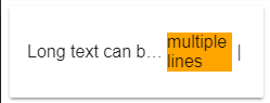
Relevant code for the middle item:
<div style="background-color: orange; flex: 1 1 70px; min-width: 60px">multiple lines</div>
Related Topics
Check If Event Is Triggered by a Human
Highlight Text Range Using JavaScript
How to Test If a Variable Does Not Equal Either of Two Values
Obtain Form Input Fields Using Jquery
Jquery Document.Ready VS Self Calling Anonymous Function
How to Programmatically Force an Onchange Event on an Input
How to Delete Document from Firestore Using Where Clause
Regex.Test V.S. String.Match to Know If a String Matches a Regular Expression
How to Find the Array Index with a Value
Is There a Good JavaScript Minifier
Javascript: How to Validate Dates in Format Mm-Dd-Yyyy
Prevent Text Selection After Double Click
React Hooks - Right Way to Clear Timeouts and Intervals
Calling JavaScript Function in Iframe
How to Find JavaScript Variable by Its Name
Cryptic "Script Error." Reported in JavaScript in Chrome and Firefox
What Advantages Does Using (Function(Window, Document, Undefined) { ... })(Window, Document) Confer