Dynamically inject shared styles in polymer element (polymer 1.2.3)
I used something like this successfully to inject styles dynamically
var myDomModule = document.createElement('style', 'custom-style');
myDomModule.setAttribute('include', 'mySharedStyleModuleName');
Polymer.dom(sliderElem.root).appendChild(myDomModule);
The style-module 'mySharedStyleModuleName' needs to be imported somewhere (like index.html).
See also https://github.com/Polymer/polymer/issues/2681 about issues I run into with this approach and https://stackoverflow.com/a/34650194/217408 for more details
custom-style vs shared-styles in polymer
A <dom-module id="my-shared-styles"> declares a reusable style module hat you can import into elements or <style is="custom-style"> tags.
Use in a custom element
<dom-module id="my-element>
  <template>
    <style include="my-shared-styles"></style>
    ...
  </template>
</dom-module>
or in the <style> tag outside a custom element (for example in <head>)
<head>
  <style is="custom-style" include="my-shared-styles"></style>
</head>
<style is="custom-style"> is only required when you want to use Polymer CSS features (CSS variables and mixins) in a style element that is not inside a <dom-module>. Inside <dom-module> just <style> is enough.
Update shared styles with JavaScript application wide in Polymer 2.0
The shared style is not a Polymer element, so it should not extend Polymer.Element and should not have a <script> tag. It should be defined like this:
shared-styles.html
<link rel="import" href="../bower_components/polymer/polymer-element.html">

<!-- shared styles for all views -->
<dom-module id="shared-styles">
  <template>
    <style>
      :host {
        --app-primary-color: #2196F3;
      }
    </style>
  </template>
</dom-module>
Then, call this.updateStyles in the root element (e.g., <my-app>) to apply a global style in Polymer 2.0. Note that all elements under <my-app> would inherit the newly specified styles.
Example
Here are instructions using Polymer CLI's polymer-2-starter-kit template:
Install the bleeding edge Polymer CLI (
npm install polymer-cli@next), required for thepolymer-2-starter-kittemplate.Run:
mkdir polymer-2-shared-styles-demo
cd polymer-2-shared-styles-demo
polymer init polymer-2-starter-kit
In
src/my-app.html, add a<button>to the menu, which will change the value of--app-primary-color:<template>
<app-drawer-layout fullbleed>
<!-- Drawer content -->
<app-drawer id="drawer" slot="drawer">
<app-toolbar>Menu</app-toolbar>
<!-- **** LINE 77: Add button below **** -->
<button on-click="_changeAppColor">Change app color</button>
<script>
class MyApp extends Polymer.Element {
/* *** LINE 130: Define button-click handler below **** */
_changeAppColor() {
this.updateStyles({'--app-primary-color': 'red'});
}In
src/shared-styles.html, change.circle'sbackgroundto use--app-primary-color:.circle {
/* *** LINE 33: Use --app-primary-color below **** */
background: var(--app-primary-color, #ddd);Run
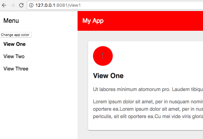
polymer serve -oto open the starter kit in the default browser.Click the button in the menu to change the color of the toolbar and the circles in each page. It should look like this:
GitHub project
How to style inner elements of custom Polymer element using external styles?
To enable styling points, use CSS variables/mixins.
Add a
<style>tag to your element's template:<dom-module id="polymer-button">
<template>
<style>
.button {
@apply --my-button-mixin;
}
.button.big {
@apply --my-button-big-mixin;
}
</style>
...
</template>
</dom-module>Specify the mixin in a container element:
<dom-module id="x-foo">
  <template>
    <style>
      polymer-button {
        --my-button-mixin: {
          background: red;
          color: white;
        };
      }
    </style>
    <polymer-button label="Red button"></polymer-button>
  </template>
</dom-module>
...or in
index.html:<body>
<custom-style>
<style>
polymer-button {
--my-button-mixin: {
background: red;
color: white;
};
}
</style>
</custom-style>
<polymer-button label="Red button"></polymer-button>
</body>
codepen (Polymer 1)
codepen (Polymer 2)
Can't get shared-styles to work in Polymer when in different folder
Right guys, sorry if my question was confusing.
The issue was indeed related to polymer server --open only getting the files that are in the component folder, therefore ignoring the styles in a different folder.
The way I fixed it was by creating a shortcut to the outside folder inside the component folder, and then just normally inserting the style like this:
<link rel="import" href="shared-styles/shared-styles.html">
Hope it helps someone!
Related Topics
Reading Non-Inline CSS Style Info from JavaScript
Example of How to Load Static CSS Files from Node_Modules Using Webpack
Manipulating CSS with JavaScript
Refused to Load the Script Because It Violates the Following Content Security Policy Directive
Phonegap - Save Image from Url into Device Photo Gallery
Viable Options for Running Nodejs on Android (Aug 2017)
Detect iOS Version Less Than 5 with JavaScript
JavaScript Console.Log() in an iOS Uiwebview
iOS Wkwebview Not Showing JavaScript Alert() Dialog
Error: No Firebase App '[Default]' Has Been Created - Call Firebase App.Initializeapp()
How to Have a Host and Container Read/Write the Same Files with Docker
Include a JavaScript File in Shiny App
Web Worker Settings for Chrome
Batch File > JavaScript > Winscp > Check If File Exists
Rails 4: Disable Turbolinks in a Specific Page
How to Execute JavaScript in Ruby Written Webdriver Test
Clientheight/Clientwidth Returning Different Values on Different Browsers