Dynamically arrange some elements around a circle
Here's some code that should help you:
var numElements = 4,
    angle = 0
    step = (2*Math.PI) / numElements;
for(var i = 0; i < numElements.length; i++) {
    var x = container_width/2 + radius * Math.cos(angle);
    var y = container_height/2 + radius * Math.sin(angle);
    angle += step;
}
It is not complete but should give you a good start.
Update: Here's something that actually works:
var radius = 200; // radius of the circle
var fields = $('.field'),
    container = $('#container'),
    width = container.width(),
    height = container.height(),
    angle = 0,
    step = (2*Math.PI) / fields.length;
fields.each(function() {
    var x = Math.round(width/2 + radius * Math.cos(angle) - $(this).width()/2),
        y = Math.round(height/2 + radius * Math.sin(angle) - $(this).height()/2);
    $(this).css({
        left: x + 'px',
        top: y + 'px'
    });
    angle += step;
});
Demo: http://jsfiddle.net/ThiefMaster/LPh33/
Here's an improved version where you can change the element count.
Positioning divs in a circle using JavaScript
First of all, the equation for a co-ordinate on a circle is simply:
(x, y) = (r * cos(θ), r * sin(θ))
where, r is the radius of a circle and θ is the angle in radians.
The reason why your code is creating an eccentric ellipse is because when you assign the .top and .left CSS values, you are not considering that it will actually take the top-left corner as its reference. I've fixed your code and now it creates a perfect circle.
Changes made to your code:
Added an array
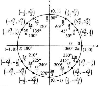
thetathat holds all the angles.var theta = [0, Math.PI / 6, Math.PI / 4, Math.PI / 3, Math.PI / 2, 2 * (Math.PI / 3), 3 * (Math.PI / 4), 5 * (Math.PI / 6), Math.PI, 7 * (Math.PI / 6), 5 * (Math.PI / 4), 4 * (Math.PI / 3), 3 * (Math.PI / 2), 5 * (Math.PI / 3), 7 * (Math.PI / 4), 11 * (Math.PI / 6)];The image below shows all the angles I've used.
Added an array
colorsthat holds different colors.var colors = ['red', 'green', 'purple', 'black', 'orange', 'yellow', 'maroon', 'grey', 'lightblue', 'tomato', 'pink', 'maroon', 'cyan', 'magenta', 'blue', 'chocolate', 'DarkSlateBlue'];Made changes to your trigonometric equations.
circleArray[i].posx = Math.round(radius * (Math.cos(theta[i]))) + 'px';
circleArray[i].posy = Math.round(radius * (Math.sin(theta[i]))) + 'px';
Changed the way
.topand.leftare assigned.circleArray[i].style.top = ((mainHeight / 2) - parseInt(circleArray[i].posy.slice(0, -2))) + 'px';
circleArray[i].style.left = ((mainHeight / 2) + parseInt(circleArray[i].posx.slice(0, -2))) + 'px';where
mainHeightis the height of the#maindiv.
[1] 16 divs
Demo on Fiddle
var setup = function() { var radius = 150; var main = document.getElementById('main'); var mainHeight = parseInt(window.getComputedStyle(main).height.slice(0, -2)); var theta = [0, Math.PI / 6, Math.PI / 4, Math.PI / 3, Math.PI / 2, 2 * (Math.PI / 3), 3 * (Math.PI / 4), 5 * (Math.PI / 6), Math.PI, 7 * (Math.PI / 6), 5 * (Math.PI / 4), 4 * (Math.PI / 3), 3 * (Math.PI / 2), 5 * (Math.PI / 3), 7 * (Math.PI / 4), 11 * (Math.PI / 6)]; var circleArray = []; var colors = ['red', 'green', 'purple', 'black', 'orange', 'yellow', 'maroon', 'grey', 'lightblue', 'tomato', 'pink', 'maroon', 'cyan', 'magenta', 'blue', 'chocolate', 'DarkSlateBlue']; for (var i = 0; i < 16; i++) { var circle = document.createElement('div'); circle.className = 'circle number' + i; circleArray.push(circle); circleArray[i].posx = Math.round(radius * (Math.cos(theta[i]))) + 'px'; circleArray[i].posy = Math.round(radius * (Math.sin(theta[i]))) + 'px'; circleArray[i].style.position = "absolute"; circleArray[i].style.backgroundColor = colors[i]; circleArray[i].style.top = ((mainHeight / 2) - parseInt(circleArray[i].posy.slice(0, -2))) + 'px'; circleArray[i].style.left = ((mainHeight / 2) + parseInt(circleArray[i].posx.slice(0, -2))) + 'px'; main.appendChild(circleArray[i]); }};setup();div#main { height: 300px; width: 300px; position: absolute; margin: 0 auto; transform: translate(-50%, -50%); top: 50%; left: 50%;}div.circle { position: absolute; width: 20px; height: 20px; border: 2px solid black; border-radius: 50%;}body { margin: 0 auto; background: papayawhip;}<div id="main"></div>How do I position circles in a circle with css/bootstrap?
Without translate and transform, you can even position by just using top,left,'bottom' and 'right'.
Make sure to use
pxas it will break if you use%values.
You need to do some modifications as per your image.
// .deg1 {//   transform: rotate(270deg) translate(6em) rotate(-270deg);// } /* 1 */// .deg2 {//   transform: translate(6em);// } /* 2 */// .deg3 {//   transform: rotate(45deg) translate(6em) rotate(-45deg);// } /* 3 */// .deg4 {//   transform: rotate(135deg) translate(6em) rotate(-135deg);// } /* 4 */// .deg5 {//   transform: translate(-6em);// } /* 5 */// .deg6 {//   transform: rotate(225deg) translate(6em) rotate(-225deg);// } /* 6 */.circle-container {  position: relative;  width: 24em;  height: 24em;  padding: 2.8em;  border-radius: 50%;  margin: 1.75em auto 0;}
.circle-container a {  display: block;  position: absolute;  top: 50%;  left: 50%;  width: 4em;  height: 4em;  margin: -2em;}
img {  border-radius: 400px;  width: 100px;}
.center img {}
.deg1 img {  position: relative;  top: 100px;}
.deg2 img {  position: relative;  bottom: 100px;}
.deg3 img {  position: relative;  top: 50px;  left: 85px;}
.deg4 img {  position: relative;  top: 50px;  right: 85px;}
.deg5 img {  position: relative;  bottom: 50px;  right: 85px;}
.deg6 img {  position: relative;  bottom: 50px;  left: 85px;}
<div class='circle-container'> <a href='#' class='center'><img src="https://encrypted-tbn0.gstatic.com/images?q=tbn:ANd9GcSp33aj-dlpojFqHXLPAQlQ9FH-su46mPBwEvFgi97RzuKoC0f1" %></a> <a href='#' class='deg2'><img src="https://encrypted-tbn0.gstatic.com/images?q=tbn:ANd9GcSp33aj-dlpojFqHXLPAQlQ9FH-su46mPBwEvFgi97RzuKoC0f1" %></a> <a href='#' class='deg3'><img src="https://encrypted-tbn0.gstatic.com/images?q=tbn:ANd9GcSp33aj-dlpojFqHXLPAQlQ9FH-su46mPBwEvFgi97RzuKoC0f1" %></a> <a href='#' class='deg4'><img src="https://encrypted-tbn0.gstatic.com/images?q=tbn:ANd9GcSp33aj-dlpojFqHXLPAQlQ9FH-su46mPBwEvFgi97RzuKoC0f1" %></a> <a href='#' class='deg5'><img src="https://encrypted-tbn0.gstatic.com/images?q=tbn:ANd9GcSp33aj-dlpojFqHXLPAQlQ9FH-su46mPBwEvFgi97RzuKoC0f1" %></a> <a href='#' class='deg6'><img src="https://encrypted-tbn0.gstatic.com/images?q=tbn:ANd9GcSp33aj-dlpojFqHXLPAQlQ9FH-su46mPBwEvFgi97RzuKoC0f1" %></a> <a href='#' class='deg1'><img src="https://encrypted-tbn0.gstatic.com/images?q=tbn:ANd9GcSp33aj-dlpojFqHXLPAQlQ9FH-su46mPBwEvFgi97RzuKoC0f1" %></a></div>Position icons into circle
2020 solution
Here's a more modern solution I use these days.
I start off by generating the HTML starting from an array of images. Whether the HTML is generated using PHP, JS, some HTML preprocessor, whatever... this matters less as the basic idea behind is the same.
Here's the Pug code that would do this:
//- start with an array of images, described by url and alt text
- let imgs = [
-   {
-       src: 'image_url.jpg',
-       alt: 'image alt text'
-   } /* and so on, add more images here */
- ];
- let n_imgs = imgs.length;
- let has_mid = 1; /* 0 if there's no item in the middle, 1 otherwise */
- let m = n_imgs - has_mid; /* how many are ON the circle */
- let tan = Math.tan(Math.PI/m); /* tangent of half the base angle */

.container(style=`--m: ${m}; --tan: ${+tan.toFixed(2)}`)
    - for(let i = 0; i < n_imgs; i++)
        a(href='#' style=i - has_mid >= 0 ? `--i: ${i}` : null)
          img(src=imgs[i].src alt=imgs[i].alt)
The generated HTML looks as follows (and yes, you can write the HTML manually too, but it's going to be a pain to make changes afterwards):
<div class="container" style="--m: 8; --tan: 0.41">
  <a href='#'>
    <img src="image_mid.jpg" alt="alt text"/>
  </a>
  <a style="--i: 1">
    <img src="first_img_on_circle.jpg" alt="alt text"/>
  </a>
  <!-- the rest of those placed on the circle -->
</div>
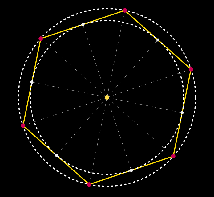
In the CSS, we decide on a size for the images, let's say 8em. The --m items are positioned on a circle and it's if they're in the middle of the edges of a polygon of --m edges, all of which are tangent to the circle.
If you have a hard time picturing that, you can play with this interactive demo which constructs the incircle and circumcircle for various polygons whose number of edges you pick by dragging the slider.
This tells us that the size of the container must be twice the radius of the circle plus twice half the size of the images.
We don't yet know the radius, but we can compute it if we know the number of edges (and therefore the tangent of half the base angle, precomputed and set as a custom property --tan) and the polygon edge. We probably want the polygon edge to be a least the size of the images, but how much we leave on the sides is arbitrary. Let's say we have half the image size on each side, so the polygon edge is twice the image size. This gives us the following CSS:
.container {
  --d: 6.5em; /* image size */
  --rel: 1; /* how much extra space we want between images, 1 = one image size */
  --r: calc(.5*(1 + var(--rel))*var(--d)/var(--tan)); /* circle radius */
  --s: calc(2*var(--r) + var(--d)); /* container size */
  position: relative;
  width: var(--s); height: var(--s);
  background: silver /* to show images perfectly fit in container */
}

.container a {
  position: absolute;
  top: 50%; left: 50%;
  margin: calc(-.5*var(--d));
  width: var(--d); height: var(--d);
  --az: calc(var(--i)*1turn/var(--m));
  transform:
    rotate(var(--az))
    translate(var(--r))
    rotate(calc(-1*var(--az)))
}

img { max-width: 100% }
See the old solution for an explanation of how the transform chain works.
This way, adding or removing an image from the array of images automatically arranges the new number of images on a circle such that they're equally spaced out and also adjusts the size of the container. You can test this in this demo.
OLD solution (preserved for historical reasons)
Yes, it is very much possible and very simple using just CSS. You just need to have clear in mind the angles at which you want the links with the images (I've added a piece of code at the end just for showing the angles whenever you hover one of them).
You first need a wrapper. I set its diameter to be 24em (width: 24em; height: 24em; does that), you can set it to whatever you want. You give it position: relative;.
You then position your links with the images in the center of that wrapper, both horizontally and vertically. You do that by setting position: absolute; and then top: 50%; left: 50%; and margin: -2em; (where 2em is half the width of the link with the image, which I've set to be 4em - again, you can change it to whatever you wish, but don't forget to change the margin in that case).
You then decide on the angles at which you want to have your links with the images and you add a class deg{desired_angle} (for example deg0 or deg45 or whatever). Then for each such class you apply chained CSS transforms, like this:
.deg{desired_angle} {
   transform: rotate({desired_angle}) translate(12em) rotate(-{desired_angle});
}
where you replace {desired_angle} with 0, 45, and so on...
The first rotate transform rotates the object and its axes, the translate transform translates the object along the rotated X axis and the second rotate transform brings back the object into position.
The advantage of this method is that it is flexible. You can add new images at different angles without altering the current structure.
CODE SNIPPET
    .circle-container {
        position: relative;
        width: 24em;
        height: 24em;
        padding: 2.8em;
        /*2.8em = 2em*1.4 (2em = half the width of a link with img, 1.4 = sqrt(2))*/
        border: dashed 1px;
        border-radius: 50%;
        margin: 1.75em auto 0;
    }
    .circle-container a {
        display: block;
        position: absolute;
        top: 50%; left: 50%;
        width: 4em; height: 4em;
        margin: -2em;
    }
    .circle-container img { display: block; width: 100%; }
    .deg0 { transform: translate(12em); } /* 12em = half the width of the wrapper */
    .deg45 { transform: rotate(45deg) translate(12em) rotate(-45deg); }
    .deg135 { transform: rotate(135deg) translate(12em) rotate(-135deg); }
    .deg180 { transform: translate(-12em); }
    .deg225 { transform: rotate(225deg) translate(12em) rotate(-225deg); }
    .deg315 { transform: rotate(315deg) translate(12em) rotate(-315deg); }
<div class='circle-container'>
<a href='#' class='center'><img src='image.jpg'></a>
<a href='#' class='deg0'><img src='image.jpg'></a>
<a href='#' class='deg45'><img src='image.jpg'></a>
<a href='#' class='deg135'><img src='image.jpg'></a>
<a href='#' class='deg180'><img src='image.jpg'></a>
<a href='#' class='deg225'><img src='image.jpg'></a>
<a href='#' class='deg315'><img src='image.jpg'></a>
</div>Arrange DIV in circle and rotate them facing outwards
Note that rot depends on angle, except angle is in radians.
DRY, so either convert from angle to rot:
// The -90 (degrees) makes the text face outwards.
var rot = angle * 180 / Math.PI - 90;
Or just use angle when setting the style (but use radians as a unit), and drop rot's declaration:
// The -0.5*Math.PI (radians) makes the text face outwards.
elem.style.MozTransform = "rotate("+(angle-0.5*Math.PI)+"rad)";
Related Topics
Check If Object Is a Jquery Object
Fulfill (Don't Resolve) Promise with Another Promise
How to Log All Events Fired by an Element in Jquery
Triggering a JavaScript Click() Event at Specific Coordinates
Google Maps API V3 - Multiple Markers on Exact Same Spot
How to Smoothly Scroll to an Element in Pure JavaScript
App.Settings - the Angular Way
Getting the User Id from a Database Trigger in Cloud Functions for Firebase
Generate Unique Number Within Range (0 - X), Keeping a History to Prevent Duplicates
How to Communicate Between Popup.Js and Background.Js in Chrome Extension
Node.Js Tail-Call Optimization: Possible or Not
How to Find a Number in a String Using JavaScript
Semicolon Before Self-Invoking Function
Method for Streaming Data from Browser to Server via Http
Incorrect Result in JavaScript Calculation