Add Buttons to Tabs and Tab area JavaFX
To have iconed Buttons on the Tabs:
The setGraphic method of Tabcan be used to add any Nodeto be displayed on the Tab. A Button can be added as it is a Node.
After this a fully functional button is present, but it does not display any icon. Button also has the setGraphic method which works the same, therefore an ImageView can be added to display an Image on the Button.
To have control Buttons on the top-right corner of the tab-area:
These buttons can be placed on the TabPane, rather than inside the TabPane. For this you can use an AnchorPane to anchor the Buttons to the top-right corner.
Example:
public class ButtonedTabPane extends Application {
    @Override
    public void start(Stage primaryStage) {
        BorderPane root = new BorderPane();
        TabPane tabPane = new TabPane();
        tabPane.setTabClosingPolicy(TabPane.TabClosingPolicy.UNAVAILABLE);

        // HBox of control buttons
        HBox hbox = new HBox();
        hbox.getChildren().addAll(createTabButton("min.png"), createTabButton("max.png"));

        // Anchor the controls
        AnchorPane anchor = new AnchorPane();
        anchor.getChildren().addAll(tabPane, hbox);
        AnchorPane.setTopAnchor(hbox, 3.0);
        AnchorPane.setRightAnchor(hbox, 5.0);
        AnchorPane.setTopAnchor(tabPane, 1.0);
        AnchorPane.setRightAnchor(tabPane, 1.0);
        AnchorPane.setLeftAnchor(tabPane, 1.0);
        AnchorPane.setBottomAnchor(tabPane, 1.0);

        // Create some tabs
        Tab tab = new Tab("Files");
        tab.setGraphic(createTabButton("files.png"));
        ((Button) tab.getGraphic()).setOnAction(e -> System.out.println("I'll show the list of files!"));
        tabPane.getTabs().add(tab);

        tab = new Tab("Network");
        tab.setGraphic(createTabButton("network.png"));
        ((Button) tab.getGraphic()).setOnAction(e -> System.out.println("I'll show the network!"));
        tabPane.getTabs().add(tab);

        root.setCenter(anchor);
        Scene scene = new Scene(root, 400, 400);
        scene.getStylesheets().add(getClass().getResource("style.css").toExternalForm());
        primaryStage.setScene(scene);
        primaryStage.show();
    }

    private Button createTabButton(String iconName) {
        Button button = new Button();
        ImageView imageView = new ImageView(new Image(getClass().getResource(iconName).toExternalForm(),
                16, 16, false, true));
        button.setGraphic(imageView);
        button.getStyleClass().add("tab-button");
        return button;
    }

    public static void main(String[] args) {
        launch(args);
    }
}
The only thing left to remove the default background and borders from the Buttons. This can be done by inserting the following CSS selectors into your CSS stylesheet.
style.css
.tab-button {
    -fx-border-width: 0;
    -fx-background-radius: 0;
    -fx-background-color: transparent;
    -fx-content-display: graphic-only;
}

.tab-button:hover {
    -fx-background-color: white;
}
The result:

Buttons in TabPane using JavaFX
After looking at the question and answer of "Add Buttons to Tabs and Tab area JavaFX", it was not difficult to adapt it that it works with a FXML file.
<AnchorPane prefHeight="600.0" prefWidth="800.0" xmlns="http://javafx.com/javafx/8.0.65" xmlns:fx="http://javafx.com/fxml/1" fx:controller="mypackage.Controller">
    <children>
        <TabPane tabClosingPolicy="UNAVAILABLE" AnchorPane.topAnchor="0.0" AnchorPane.rightAnchor="0.0" AnchorPane.leftAnchor="0.0" AnchorPane.bottomAnchor="0.0">
            <tabs>
                /* the code for the tabs goes here */
            </tabs>
        </TabPane>
        <HBox AnchorPane.topAnchor="1.0" AnchorPane.rightAnchor="5.0">
            <children>
                <Button text="Export..." />
                <Button text="Generate" />
            </children>
        </HBox>
    </children>
</AnchorPane>
The result is shown in the picture below.
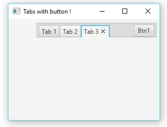
Add a button to the right of tabpane
Using javafx.scene.layout.AnchorPane you can group your tabpages and button into same layout
Refer code below,
import javafx.application.Application;
import javafx.scene.Scene;
import javafx.scene.control.Button;
import javafx.scene.control.Tab;
import javafx.scene.control.TabPane;
import javafx.scene.layout.AnchorPane;
import javafx.stage.Stage;

public class JavaFXTest6 extends Application {

    @Override
    public void start(Stage primaryStage) {
        final AnchorPane root = new AnchorPane();
        final TabPane tabs = new TabPane();
        final Button addButton = new Button("Btn1");
        addButton.setPrefWidth(41);
        addButton.setPrefHeight(15);

        AnchorPane.setTopAnchor(tabs, 5.0);
        AnchorPane.setLeftAnchor(tabs, 5.0);
        AnchorPane.setRightAnchor(tabs, 5.0);
        AnchorPane.setTopAnchor(addButton, 10.0);
        AnchorPane.setRightAnchor(addButton, 10.0);
        tabs.setStyle("-fx-padding: 2 0 0 50;");

        Tab tab = new Tab("Tab 1");
        Tab tab1 = new Tab("Tab 2");
        Tab tab2 = new Tab("Tab 3");

        tabs.getTabs().add(tab);
        tabs.getTabs().add(tab1);
        tabs.getTabs().add(tab2);

        root.getChildren().addAll(tabs, addButton);

        final Scene scene = new Scene(root, 300, 200);
        primaryStage.setTitle("Tabs with button !");
        primaryStage.setScene(scene);
        primaryStage.show();

    }

    public static void main(String[] args) {
        launch(args);
    }
}
-----------------out put will be like this --------------------
How to add close button to all tabs but one in JavaFX?
plusTab.setClosable(false);
I did a simple skim of the documentation. Will this work?
How to create a “add tab“button in JAVAFX?
Your code should look similar to the code below.
This example uses a button above the TabPane.
public class TabPaneSample extends Application {
    public static void main(String[] args) {
        launch(args);
    }

    @Override
    public void start(Stage stage) {
        TabPane tabPane = new TabPane();

        VBox layout = new VBox(10); // VBox with spacing of 10. Button sits above TabPane
        layout.getChildren().addAll(newTabButton(tabPane), tabPane); // Adding button and TabPane to VBox

        stage.setScene(new Scene(layout));
        stage.show();
    }

    // Button that adds a new tab and selects it
    private Button newTabButton(TabPane tabPane) {
        Button addTab = new Button("Create Tab");
        addTab.setOnAction(event -> {
            tabPane.getTabs().add(new Tab("New Tab")); // Adding new tab at the end, so behind all the other tabs
            tabPane.getSelectionModel().selectLast(); // Selecting the last tab, which is the newly created one
        });
        return addTab;
    }
}
If you want it to be like in a browser, this code should do it.
This uses the an empty tab at the end, which acts like a button. You can add an icon like + instead of the text in the tab label.
public class TabPaneSample extends Application {
    public static void main(String[] args) {
        launch(args);
    }

    @Override
    public void start(Stage stage) {
        TabPane tabPane = new TabPane();

        tabPane.getTabs().add(newTabButton(tabPane));

        stage.setScene(new Scene(tabPane));
        stage.show();
    }

    // Tab that acts as a button and adds a new tab and selects it
    private Tab newTabButton(TabPane tabPane) {
        Tab addTab = new Tab("Create Tab"); // You can replace the text with an icon
        addTab.setClosable(false);
        tabPane.getSelectionModel().selectedItemProperty().addListener((observable, oldTab, newTab) -> {
            if(newTab == addTab) {
                tabPane.getTabs().add(tabPane.getTabs().size() - 1, new Tab("New Tab")); // Adding new tab before the "button" tab
                tabPane.getSelectionModel().select(tabPane.getTabs().size() - 2); // Selecting the tab before the button, which is the newly created one
            }
        });
        return addTab;
    }
}
JavaFX layouts in a Tab
As mentioned by Kleopatra, it is the choice of layout(s) that makes the difference. In your case, you want the content to be filled with the available space in the tab. The layout StackPane has this default behavior of extending to available space of its parent node.
And for your information, the tab content region is already a StackPane which extends to the full available space. So it is your choice of layout and the appropriate properties will allow your content to fill the space.
For your reference, I have mentioned few layouts below. All the below layouts behave the same way. Please have a look of the appropriate properties that we set to behave as we want.
import javafx.application.Application;
import javafx.geometry.Insets;
import javafx.geometry.Pos;
import javafx.geometry.Rectangle2D;
import javafx.scene.Scene;
import javafx.scene.control.*;
import javafx.scene.layout.*;
import javafx.stage.Screen;
import javafx.stage.Stage;

public class TestFX extends Application {
    @Override
    public void start(Stage stage) throws Exception {
        TabPane tPane = new TabPane();
        tPane.setStyle("-fx-background-color : pink;");
        tPane.getStyleClass().add("floating"); // Found this tip on SO already, if you remove it the tab won't fill the screen anymore.
        tPane.getTabs().add(new Tab("Test Tab1", new TestTabFX1()));
        tPane.getTabs().add(new Tab("Test Tab2", new TestTabFX2()));
        tPane.getTabs().add(new Tab("Test Tab3", new TestTabFX3()));

        Rectangle2D scrnRect = Screen.getPrimary().getVisualBounds();
        stage.setX(scrnRect.getMinX() + scrnRect.getWidth() / 2);
        stage.setY(scrnRect.getMinY());
        stage.setWidth(scrnRect.getWidth() / 2);
        stage.setHeight(scrnRect.getHeight());

        Scene scene = new Scene(tPane);
        stage.setTitle("Test Tabs");
        stage.setScene(scene);
        stage.show();
    }

    public static void main(String args[]) {
        launch(args);
    }

    // EXTENDING STACKPANE : Has the default feature to fill the available space.
    class TestTabFX1 extends StackPane {
        public TestTabFX1() {
            TextField serverURL = new TextField("http://localhost:9090");
            Button startServer = new Button("Start");
            Button stopServer = new Button("Stop");
            Button testServer = new Button("Test");
            TextArea serverDetails = new TextArea();
            VBox.setVgrow(serverDetails, Priority.ALWAYS);

            HBox top = new HBox(10d, new Label("Server URL:"), serverURL, startServer, stopServer, testServer);
            top.setAlignment(Pos.CENTER);

            VBox tab = new VBox(top, serverDetails);
            tab.setSpacing(10);
            tab.setPadding(new Insets(10));
            getChildren().addAll(tab);
        }
    }

    // EXTENDING VBOX : By using VGrow, you can make the layout to fill the available space
    class TestTabFX2 extends VBox {
        public TestTabFX2() {
            TextField serverURL = new TextField("http://localhost:9090");
            Button startServer = new Button("Start");
            Button stopServer = new Button("Stop");
            Button testServer = new Button("Test");
            TextArea serverDetails = new TextArea();
            VBox.setVgrow(serverDetails, Priority.ALWAYS);

            HBox top = new HBox(10d, new Label("Server URL:"), serverURL, startServer, stopServer, testServer);
            top.setAlignment(Pos.CENTER);

            setSpacing(10);
            setPadding(new Insets(10));
            getChildren().addAll(top, serverDetails);
        }
    }

    // EXTENDING GRIDPANE : By using column/row constraints, you can make the layout to fill the available space.
    class TestTabFX3 extends GridPane {
        public TestTabFX3() {
            TextField serverURL = new TextField("http://localhost:9090");
            Button startServer = new Button("Start");
            Button stopServer = new Button("Stop");
            Button testServer = new Button("Test");
            TextArea serverDetails = new TextArea();

            HBox top = new HBox(10d, new Label("Server URL:"), serverURL, startServer, stopServer, testServer);
            top.setAlignment(Pos.CENTER);

            addRow(0, top);
            addRow(1,serverDetails);

            ColumnConstraints cc = new ColumnConstraints();
            cc.setHgrow(Priority.ALWAYS);
            cc.setFillWidth(true);
            getColumnConstraints().add(cc);

            RowConstraints rc1 = new RowConstraints();
            RowConstraints rc2 = new RowConstraints();
            rc2.setVgrow(Priority.ALWAYS);
            rc2.setFillHeight(true);
            getRowConstraints().addAll(rc1,rc2);

            setVgap(10);
            setPadding(new Insets(10));
        }
    }
}
Fill all the TabPane width with tabs in JavaFx
Potential approaches
Three possible solutions:
Style the existing tabs the way you want using CSS.
- As you have seen this is difficult.
- It is also brittle if the default tab styles and skin implementations change in future versions.
Create a new TabPaneSkin and associated CSS.
- This is potentially less brittle as now you have your own skin implementation.
- However the existing TabPaneSkin implementation is really complex and even trivial customization of it is very, very difficult.
Implement your own custom layout, controls, and CSS for managing switching panes.
- This is very stable as you are just relying on the basic standard public controls like buttons and layout panes.
- This is extremely customizable as you are starting with a blank slate and then adding the functionality you desire.
- The TabPane control has lots of in-built functionality around menus, dragging tabs, adding tabs, animating tabs, keyboard input support, etc.
- In a custom implementation, you will lose all of this additional functionality.
- But, you probably don't need or want that additional functionality anyway for many applications.
- If you actually do need the additional functionality, then use either of the first two approaches, otherwise I suggest you use this approach.
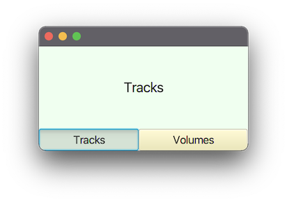
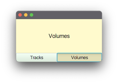
Custom pane switch implementation
Structure
VBox(contentPane, controlPane)
contentPane contains your switchable panes and is set to:
VBox.setVgrow(contentPane, Priority.ALWAYS);controlPane provides the tab switching buttons:
HBox(new RadioButton("Tracks"), new RadioButton("Volumes"));
When a radio button is actioned, the contentPane is replaced by the appropriate pane for the button.
RadioButtons are used rather than ToggleButtons, so that, when a toggle group is assigned to the buttons, only one is selectable at a time.
The radio buttons have their radio-button style removed and are styled like toggle buttons (via CSS) so they appear a bit more like a standard button.
Example Code
This example inlines the CSS rather than supplying a separate file, it also uses the fx:root construct. You could have a separate CSS file and not use the fx:root construct if you wish.
The fx:root and inline CSS constructs lack some useful tool support. If these features are not used, you get nicer WYSIWYG viewing in scene builder and improved intelligent editing in your IDE.
pom.xml
<?xml version="1.0" encoding="UTF-8"?>
<project xmlns="http://maven.apache.org/POM/4.0.0"
         xmlns:xsi="http://www.w3.org/2001/XMLSchema-instance"
         xsi:schemaLocation="http://maven.apache.org/POM/4.0.0 https://maven.apache.org/xsd/maven-4.0.0.xsd">
    <modelVersion>4.0.0</modelVersion>

    <groupId>com.example</groupId>
    <artifactId>mixer</artifactId>
    <version>1.0-SNAPSHOT</version>
    <name>mixer</name>

    <properties>
        <project.build.sourceEncoding>UTF-8</project.build.sourceEncoding>
    </properties>

    <dependencies>
        <dependency>
            <groupId>org.openjfx</groupId>
            <artifactId>javafx-controls</artifactId>
            <version>17.0.2</version>
        </dependency>
        <dependency>
            <groupId>org.openjfx</groupId>
            <artifactId>javafx-fxml</artifactId>
            <version>17.0.2</version>
        </dependency>
    </dependencies>

    <build>
        <plugins>
            <plugin>
                <groupId>org.apache.maven.plugins</groupId>
                <artifactId>maven-compiler-plugin</artifactId>
                <version>3.8.1</version>
                <configuration>
                    <source>17</source>
                    <target>17</target>
                </configuration>
            </plugin>
        </plugins>
    </build>
</project>
module-info.java
module com.example.mixer {
    requires javafx.controls;
    requires javafx.fxml;

    opens com.example.mixer to javafx.fxml;
    exports com.example.mixer;
}
MixerApp.java
package com.example.mixer;

import javafx.application.Application;
import javafx.scene.Scene;
import javafx.stage.Stage;

public class MixerApp extends Application {
    @Override
    public void start(Stage stage) {
        stage.setScene(new Scene(new Mixer()));
        stage.show();
    }

    public static void main(String[] args) {
        launch(args);
    }
}
Mixer.java
package com.example.mixer;

import javafx.fxml.*;
import javafx.scene.control.*;
import javafx.scene.layout.*;

import java.io.IOException;
import java.util.Map;

public class Mixer extends VBox {

    private final Map<Toggle, Pane> paneMap;

    private static final String CSS = """
        data:text/css,
        .mixer {
             tracks-color: honeydew;
             volumes-color: lemonchiffon;
        }
        .tracks-pane {
             -fx-background-color: tracks-color;
             -fx-font-size: 20px;
        }
        .volumes-pane {
             -fx-background-color: volumes-color;
             -fx-font-size: 20px;
        }
        .tracks-pane-selector {
             -fx-base: tracks-color;
             -fx-font-size: 16px;
        }
        .volumes-pane-selector {
             -fx-base: volumes-color;
             -fx-font-size: 16px;
        }
        """;

    public Mixer() {
        FXMLLoader fxmlLoader = new FXMLLoader(getClass().getResource("mixer.fxml"));
        fxmlLoader.setRoot(this);
        fxmlLoader.setController(this);

        try {
            fxmlLoader.load();
        } catch (IOException exception) {
            throw new RuntimeException(exception);
        }

        getStylesheets().add(CSS);

        // we want the pane selectors styled as toggle-buttons rather than radio-buttons,
        // so we remove their radio styles.
        tracksPaneSelector.getStyleClass().remove("radio-button");
        volumesPaneSelector.getStyleClass().remove("radio-button");

        StackPane tracksPane = new StackPane(new Label("Tracks"));
        tracksPane.getStyleClass().add("tracks-pane");

        StackPane volumesPane = new StackPane(new Label("Volumes"));
        volumesPane.getStyleClass().add("volumes-pane");

        paneMap = Map.of(
                tracksPaneSelector, tracksPane,
                volumesPaneSelector, volumesPane
        );

        displaySelectedPane();
        paneToggleGroup.selectedToggleProperty().addListener((observable, oldValue, newValue) ->
                displaySelectedPane()
        );
    }

    private void displaySelectedPane() {
        contentPane.getChildren().setAll(
                paneMap.get(paneToggleGroup.getSelectedToggle())
        );
    }

    // FXML fields generated from skeleton.

    @FXML
    private StackPane contentPane;

    @FXML
    private HBox paneControls;

    @FXML
    private ToggleGroup paneToggleGroup;

    @FXML
    private RadioButton tracksPaneSelector;

    @FXML
    private RadioButton volumesPaneSelector;
}
mixer.fxml
<?xml version="1.0" encoding="UTF-8"?>

<?import java.lang.String?>
<?import javafx.scene.control.RadioButton?>
<?import javafx.scene.control.ToggleGroup?>
<?import javafx.scene.layout.HBox?>
<?import javafx.scene.layout.StackPane?>
<?import javafx.scene.layout.VBox?>

<fx:root fx:id="mixerLayout" maxHeight="-Infinity" maxWidth="-Infinity" minHeight="-Infinity" minWidth="-Infinity" prefHeight="150.0" prefWidth="300.0" styleClass="mixer" type="VBox" xmlns="http://javafx.com/javafx/17" xmlns:fx="http://javafx.com/fxml/1">
   <children>
      <StackPane fx:id="contentPane" VBox.vgrow="ALWAYS" />
      <HBox fx:id="paneControls">
         <children>
            <RadioButton fx:id="tracksPaneSelector" maxWidth="1.7976931348623157E308" mnemonicParsing="false" selected="true" text="Tracks" HBox.hgrow="SOMETIMES">
               <toggleGroup>
                  <ToggleGroup fx:id="paneToggleGroup" />
               </toggleGroup>
               <styleClass>
                  <String fx:value="toggle-button" />
                  <String fx:value="tracks-pane-selector" />
               </styleClass>
            </RadioButton>
            <RadioButton fx:id="volumesPaneSelector" maxWidth="1.7976931348623157E308" mnemonicParsing="false" text="Volumes" toggleGroup="$paneToggleGroup" HBox.hgrow="SOMETIMES">
               <styleClass>
                  <String fx:value="toggle-button" />
                  <String fx:value="volumes-pane-selector" />
               </styleClass>
            </RadioButton>
         </children>
      </HBox>
   </children>
</fx:root>
JavaFX: Adding a new tab from a tab controller
Your code doesn't work because you are not calling createTeamTab(...) on the controller: you are calling it on another instance of MainWindowController that you created. (The fields annotated @FXML are initialized in the controller instance by the FXMLLoader when the FXML is loaded: for fairly obvious reasons they will not be set to the same values in arbitrary other instances of the same class.) You need to get a reference to the controller you are using for the main tab, and pass it a reference to the main controller.
You didn't tell us the class name for the controller of mainTab.fxml: I will assume it is MainTabController (so just change it to whatever class name you actually use).
In MainWindowController, do:
public class MainWindowController {

    @FXML
    private TabPane mainTabPane;

    @FXML
    // fx:id of the fx:include with "Controller" appended
    private MainTabController mainWindowTabController ;

    public void initialize() {
        mainWindowTabController.setMainWindowController(this);
    }

    public void createTeamTab(Team team) {
        mainTabPane.getTabs().add(new Tab(team.getTeamName()));

    }
}
and then in MainTabController do
public class MainWindowController {

    private MainWindowController mainWindowController ;

    public void setMainWindowController(MainWindowController mainWindowController) {
        this.mainWindowController = mainWindowController ;
    }

    @FXML
    public void handleSubmit() {
        String teamName = teamNameTextField.getText();
        Roster roster = rosterComboBox.getValue();
        int startWeek = spinner.getValue();
        Team newTeam = new Team(teamName, startWeek, roster);
        TeamData.addTeam(newTeam);
        mainWindowController.createTeamTab(newTeam);

    }

}
Related Topics
Detecting a Long Press in Android
Custom Listview Click Issue on Items in Android
How to Deserialise a Subclass in Firebase Using Getvalue(Subclass.Class)
How to Get Chromedriver Process Pid Using Java
Seeing Too Many Lsof Can't Identify Protocol
Command Working in Terminal, But "No Closing Quote" Error When Used Process.Exec
How to Install Java Application to My Linux System
Gson Typetoken with Dynamic Arraylist Item Type
How to Use Swingworker in Java
Format Float to N Decimal Places
How to Whitelist App in Doze Mode Android 6.0
How to Kill a Linux Process in Java with Sigkill Process.Destroy() Does Sigterm
Java.Lang.Runtime Exception "Cannot Run Program"
Is There an Java API Viewer on Command Line Like Man for C and Ri for Ruby