Two Buttons inside HStack taking action of each other
Need to use onTapGesture instead of action like this way.
Button(action: {}) {
    Text("watch")
}
.frame(minWidth: 0, maxWidth: .infinity)
.background(Color.red)
.onTapGesture {
    print("watch")
}
SwiftUI: buttons inside a HStack cause the overall HStack to exceed the bounds
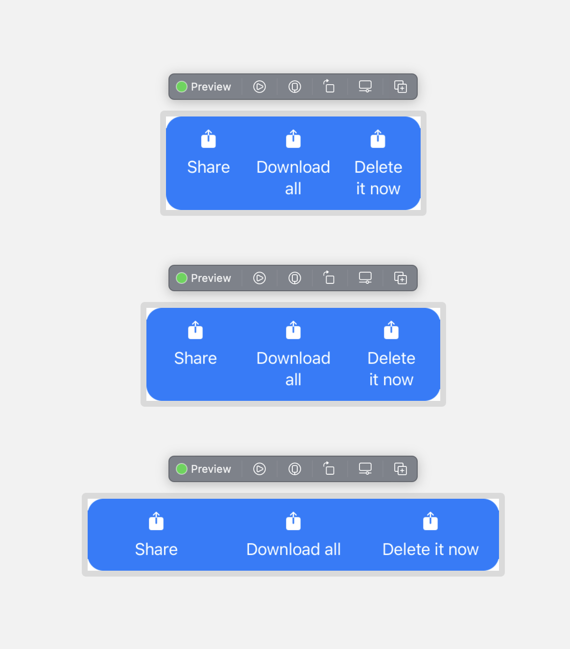
Your fixedSize() was making it draw the HStack outside of it's bounds. You want the Texts to fill the available space, then SwiftUI will try to break on the words. If the container is too small it will break within the words so you need to be aware of this, 260 is about the smallest it can go with this font size.
Here's what I came up with, modified to be runnable with an SF symbol. You need some padding in between texts otherwise they will be right up against each other at some sizes of the container.
struct TransferDetailsButtonsView: View {
    enum ButtonType: Hashable {
        case share
        case download
        case delete

        fileprivate var imageName: String {
            switch self {
            case .share:
                return "square.and.arrow.up.fill"
            case .download:
                return "square.and.arrow.up.fill"
            case .delete:
                return "square.and.arrow.up.fill"
            }
        }

        fileprivate var title: String {
            switch self {
            case .share:
                return "Share"
            case .download:
                return "Download all"
            case .delete:
                return "Delete it now"
            }
        }
    }

    /// The button types you want to show
    var buttonTypes: [ButtonType] = [.share, .download, .delete]

    /// The action for the buttons
    var action: (ButtonType) -> Void = { _ in }

    var body: some View {
        HStack(alignment: .top, spacing: 0) {
            ForEach(buttonTypes, id: \.self) { button in
                Button {
                    action(button)
                } label: {
                    VStack(spacing: 8) {
                        Image(systemName: button.imageName)
                        Text(button.title)
                            .frame(maxWidth: .infinity)
                    }
                }
                .padding(.horizontal, 4)
            }
        }
        .padding(.vertical, 12)
        .foregroundColor(.white)
        .background(RoundedRectangle(cornerRadius: 16).fill(.blue))
    }
}
SwiftUI - Multiple Buttons in a List row
You need to use BorderlessButtonStyle() or PlainButtonStyle().
    List([1, 2, 3], id: \.self) { row in
        HStack {
            Button(action: { print("Button at \(row)") }) {
                Text("Row: \(row) Name: A")
            }
            .buttonStyle(BorderlessButtonStyle())

            Button(action: { print("Button at \(row)") }) {
                Text("Row: \(row) Name: B")
            }
            .buttonStyle(PlainButtonStyle())
        }
    }
SwiftUI Multiple Buttons with Popovers in HStack Behavior
Normally you'd use popover(item:content:), but you'll get an error... even the example in the documentation crashes.
*** Terminating app due to uncaught exception 'NSGenericException', reason: 'UIPopoverPresentationController (<UIPopoverPresentationController: 0x14a109890>) should have a non-nil sourceView or barButtonItem set before the presentation occurs.'
What I came up with instead is to use a singular @State presentingItem: Item? in ContentView. This ensures that all the popovers are tied to the same State, so you have full control over which ones are presented and which ones aren't.
But, .popover(isPresented:content:)'s isPresented argument expects a Bool. If this is true it presents, if not, it will dismiss. To convert presentingItem into a Bool, just use a custom Binding.
Binding(
    get: { presentingItem == item }, /// present popover when `presentingItem` is equal to this view's `item`
    set: { _ in presentingItem = nil } /// remove the current `presentingItem` which will dismiss the popover
)
Then, set presentingItem inside each button's action. This is the part where things get slightly hacky - I've added a 0.5 second delay to ensure the current displaying popover is dismissed first. Otherwise, it won't present.
if presentingItem == nil { /// no popover currently presented
    presentingItem = item /// dismiss that immediately, then present this popover
} else { /// another popover is currently presented...
    presentingItem = nil /// dismiss it first
    DispatchQueue.main.asyncAfter(deadline: .now() + 0.5) {
        presentingItem = item /// present this popover after a delay
    }
}
Full code:
/// make equatable, for the `popover` presentation logic
struct Item: Equatable {
    let id = UUID()
    var name: String
}

struct ContentView: View {

    @State var presentingItem: Item? /// the current presenting popover
    let items = [
        Item(name: "item1"),
        Item(name: "item2"),
        Item(name: "item3")
    ]

    var body: some View {
        HStack {
            MyGreatItemView(presentingItem: $presentingItem, item: items[0])
            MyGreatItemView(presentingItem: $presentingItem, item: items[1])
            MyGreatItemView(presentingItem: $presentingItem, item: items[2])
        }
        .padding(300)
    }
}

struct MyGreatItemView: View {
    @Binding var presentingItem: Item?
    let item: Item /// this view's item

    var body: some View {
        Button(action: {
            if presentingItem == nil { /// no popover currently presented
                presentingItem = item /// dismiss that immediately, then present this popover
            } else { /// another popover is currently presented...
                presentingItem = nil /// dismiss it first
                DispatchQueue.main.asyncAfter(deadline: .now() + 0.5) {
                    if presentingItem == nil { /// extra check to ensure no popover currently presented
                        presentingItem = item /// present this popover after a delay
                    }
                }
            }
        }) {
            Text(item.name)
        }

        /// `get`: present popover when `presentingItem` is equal to this view's `item`
        /// `set`: remove the current `presentingItem` which will dismiss the popover
        .popover(isPresented: Binding(get: { presentingItem == item }, set: { _ in presentingItem = nil }) ) {
            PopoverView(item: item)
        }
    }
}

struct PopoverView: View {
    let item: Item /// no need for @State here
    var body: some View {
        print("new PopoverView")
        return Text("View for \(item.name)")
    }
}
Result:

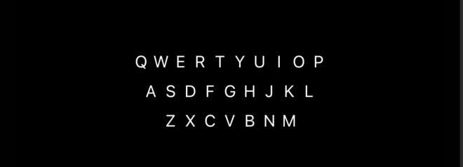
SwiftUI making buttons closer to each other horizontally in an HStack
The first easy thing to do is get rid of your padding() modifier that is adding extra padding to each button.
I'm assuming, given that it's a keyboard view that you want all of your keys to be the same width. You can use a PreferenceKey to store the maximum width needed to fit a certain letter and then use that for each Button, making it only as large as needed:
struct KeyboardView: View {
    @State private var keyWidth : CGFloat = 0

    let KeyboardStack = [["Q", "W", "E", "R", "T", "Y", "U", "I", "O", "P"],
                         ["A", "S", "D", "F", "G", "H", "J", "K", "L"],
                         ["Z", "X", "C", "V", "B", "N", "M"]]

    var body: some View {
        VStack(spacing: 9) {
            ForEach(KeyboardStack.indices) { row in
                let num = KeyboardStack[row].indices
                HStack(spacing: 0) {
                    ForEach(num) { column in
                        Button(action: {}) {
                            Text(KeyboardStack[row][column])
                                .font(.system(size: 15, weight: .regular, design: .default))
                                .foregroundColor(.white)
                                .buttonStyle(PlainButtonStyle())
                                .frame(width: keyWidth)
                                .background(GeometryReader {
                                    Color.clear.preference(key: KeyWidthKey.self,
                                                           value: $0.frame(in: .local).size.height)
                                })
                                .contentShape(Rectangle())
                        }
                    }
                }.onPreferenceChange(KeyWidthKey.self) { keyWidth = $0 }

            }
        }
    }
}

struct KeyWidthKey: PreferenceKey {
    static var defaultValue: CGFloat { 0 }
    static func reduce(value: inout Value, nextValue: () -> Value) {
        value = max(value, nextValue())
    }
}
Note that this solution will continue to work if you change the font size, as it is not dependent on a hard-coded frame size for each key.
SwiftUI - Two buttons in a List
Set the button style to something different from the default, e.g., BorderlessButtonStyle()
struct Test: View {
  var body: some View {
    NavigationView {
      List {
        ForEach([
          "Line 1",
          "Line 2",
        ], id: \.self) {
          item in
          HStack {
            Text("\(item)")
            Spacer()
            Button(action: { print("\(item) 1")}) {
              Text("Button 1")
            }
            Button(action: { print("\(item) 2")}) {
              Text("Button 2")
            }
          }
        }
        .onDelete { _ in }
        .buttonStyle(BorderlessButtonStyle())
      }
      .navigationBarItems(trailing: EditButton())
    }
    .accentColor(.red)
  }
}
Related Topics
How to Cancel Usernotifications
How to Properly Add Child View Controller in iOS 8 with Swift
iOS Autolayout - Frame Size Not Set in Viewdidlayoutsubviews
How to Add Firebase to Today Extension iOS
Uisegmentedcontrol iOS 13 Clear Color
How to Add a Custom Separator to Uitableviewcell
Map Url Parameters to Objects Using Restkit
How to Add Navigation Interface After Create a Tab Bar Controller Programmatically (Swift)
Nsurlcache Does Not Clear Stored Responses in iOS8
Confirm Back Button on Uinavigationcontroller
Phimageresultisdegradedkey/Phimagefileurlkey Is Not Found
Programmatically Checking If a Passcode Lock Is Set
How to Create a Uiimage with Uibezierpath
How to Show Specific Language Keyboard When User Input Values in Uitextfield in iPhone App