How to specify size for iPhone 6/7 customised edge-to-edge image?
It seems to me that a lot of these answers want to address how to constrain the imageView, where I think you are concerned with loading the correct media file? I would come up with my own future extensible solution, something like this:
"UIImage+DeviceSpecificMedia.h" - (a category on UIImage)
Interface:
#import <UIKit/UIKit.h>

typedef NS_ENUM(NSInteger, thisDeviceClass) {

    thisDeviceClass_iPhone,
    thisDeviceClass_iPhoneRetina,
    thisDeviceClass_iPhone5,
    thisDeviceClass_iPhone6,
    thisDeviceClass_iPhone6plus,

    // we can add new devices when we become aware of them

    thisDeviceClass_iPad,
    thisDeviceClass_iPadRetina,


    thisDeviceClass_unknown
};

thisDeviceClass currentDeviceClass();

@interface UIImage (DeviceSpecificMedia)

+ (instancetype )imageForDeviceWithName:(NSString *)fileName;

@end
Implementation:
#import "UIImage+DeviceSpecificMedia.h"

thisDeviceClass currentDeviceClass() {

    CGFloat greaterPixelDimension = (CGFloat) fmaxf(((float)[[UIScreen mainScreen]bounds].size.height),
                                                    ((float)[[UIScreen mainScreen]bounds].size.width));

    switch ((NSInteger)greaterPixelDimension) {
        case 480:
            return (( [[UIScreen mainScreen]scale] > 1.0) ? thisDeviceClass_iPhoneRetina : thisDeviceClass_iPhone );
            break;
        case 568:
            return thisDeviceClass_iPhone5;
            break;
        case 667:
            return thisDeviceClass_iPhone6;
            break;
        case 736:
            return thisDeviceClass_iPhone6plus;
            break;
        case 1024:
            return (( [[UIScreen mainScreen]scale] > 1.0) ? thisDeviceClass_iPadRetina : thisDeviceClass_iPad );
            break;
        default:
            return thisDeviceClass_unknown;
            break;
    }
}

@implementation UIImage (deviceSpecificMedia)

+ (NSString *)magicSuffixForDevice
{
    switch (currentDeviceClass()) {
        case thisDeviceClass_iPhone:
            return @"";
            break;
        case thisDeviceClass_iPhoneRetina:
            return @"@2x";
            break;
        case thisDeviceClass_iPhone5:
            return @"-568h@2x";
            break;
        case thisDeviceClass_iPhone6:
            return @"-667h@2x"; //or some other arbitrary string..
            break;
        case thisDeviceClass_iPhone6plus:
            return @"-736h@3x";
            break;

        case thisDeviceClass_iPad:
            return @"~ipad";
            break;
        case thisDeviceClass_iPadRetina:
            return @"~ipad@2x";
            break;

        case thisDeviceClass_unknown:
        default:
            return @"";
            break;
    }
}

+ (instancetype )imageForDeviceWithName:(NSString *)fileName
{
    UIImage *result = nil;
    NSString *nameWithSuffix = [fileName stringByAppendingString:[UIImage magicSuffixForDevice]];

    result = [UIImage imageNamed:nameWithSuffix];
    if (!result) {
        result = [UIImage imageNamed:fileName];
    }
    return result;
}

@end
Images.xcassets taking wrong image for the iPhone 6?
This is ridiculous from apple.
There is no any specific place where you can put the iPhone 6 images. you have to do with the condition.
Why does iPhone 6 use @2x image assets?
iPhone 6 uses @2x image assets and not R4 or something else because apple didn't provide suitable APIs for background images!
The most direct way now is to create 2 assets and programatically load them :(
Check this out: How to specify size for iPhone 6/7 customised edge-to-edge image?
iPhone 6 - Using precisely sized images through naming convention
I am making an assumption that the naming convention is the following:
retina display, > iPhone 4s
image_name@2x~iphone.png
retina display iPhone 6 plus:
image_name@3x~iphone.png
Note: iPhone 6 plus is not 3 x the original sized screen. It is 2.34 so what I mean when you are creating 1 to 1 pixel assets of 44x44 actual pixels, is 88x88 on a retina then 103x103 on an iPhone 6 plus. But you should be using the extra screen size for a different UI/UX rather than just scaling up the size of your elements.
The way to maintain a non scaling of existing sizes would be fixed autolayout on those image resources, making sure those images are constrained by the x1 size. Like if your image was at x1 32pixels squared:
UIImageView *imageView= [[UIImageView alloc] initWithFrame:CGRectZero];
imageView.translatesAutoresizingMaskIntoConstraints = NO;
imageView.image=[UIImage imageNamed:@"your_image"];
[self addConstraints:[NSLayoutConstraint constraintsWithVisualFormat:@"H:|[image(32)]" options:0 metrics:0 views:@{@"image":@(imageView)]];
[self addConstraints:[NSLayoutConstraint constraintsWithVisualFormat:@"V:|[image(32)]" options:0 metrics:0 views:@{@"image":@(imageView)]];
And use your @2x @3x images, the issue is if apple doesn't have a @3x named image for a resource it will upscale the next best thing the @2x image. SO there might not be a way to avoid that easily. I sort of wish apple would remove the base x1 sizing now that there phones are different resolutions. I would prefer a one to one pxiel measurement convention.
Work it like Apple wants you to, use autolayout as a convention. Above should keep the image the same, I am getting an iPhone plus later so will test it out.
How to convert frame based on device screen size?
You can use these two methods to get server and device specific CGRect.
- (CGFloat) convertServerXorWidthValueToDeviceValueXorWidth:(CGFloat)sValue {
    CGFloat currentWidth = [UIScreen mainScreen].bounds.size.width;
    CGFloat value = ceilf((currentWidth * sValue) / 1080);
    return value;
}

- (CGFloat) convertServerYorHeightValueToDeviceValueYorHeight:(CGFloat)sValue {
    CGFloat currentHeight = [UIScreen mainScreen].bounds.size.height;
    CGFloat value = ceilf((currentHeight * sValue) / 1920);
    return value;
}
Hope this will help you.
Framing images properly with new @3x frames
Yeah, that's a bit confusing at a first glance.
The point of having @2x both for iPhone 4/4s/5/5s and iPhone 6 is the equality of DPI of those screens (326 ppi).
On the other hand, your need of having different images for these iPhones is specific for your app design and you have the following solutions:
- Use stretchable image created with
-resizableImageWithCapInsets:and make image looking good both for 110pt and 129pt - Or if it's impossible use different images depending on the device app is running on. You can use your method
+getDevice(or similar) to determine what image you should load (-568h@2xor-667h@2x).
For more info and handy UIImage category see this answer https://stackoverflow.com/a/26684508/753878
Specify Different width to 'View' for iPhone and iPad Xcode 9
You need to disable the aspect ratio constraint for IPad and create a suitable one for it like this
1- Un install the aspect ratio constraint , click the + icon near installed from the popup select Regular for width and height , then click add variation
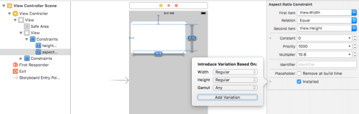
2- And un Check it for RR
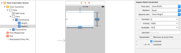
3- Select any IPad device in the bottom Bar , click vary for traits and make the new aspect ratio constraint as you want then click Done varying 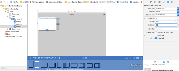
By this you have 2 different constraints for the aspect ratio when you run the app in IPhone or Ipad , Note: you can do it for any constraint you want
Related Topics
Uiview Hide/Show with Animation
Dismissmodalviewcontrolleranimated Deprecated
Swift Default Alertviewcontroller Breaking Constraints
Swift: Can't Get Nsdate Dateformatter Right
How to Disable Caching in Alamofire
Presentviewcontroller from Custom Tablecell in Xib
Remove Println() for Release Version iOS Swift
Autoshrink on a Uilabel with Multiple Lines
Core Data: Do Child Contexts Ever Get Permanent Objectids for Newly Inserted Objects
Ibeacon Notification When the App Is Not Running
iOS 7 Status Bar Collides with Navigationbar
Date to Milliseconds and Back to Date in Swift
Uiscreen Mainscreen Bounds Returning Wrong Size
How to Get the Udid in iOS 6 and iOS 7
Restoring Animation Where It Left Off When App Resumes from Background