How to fill a circle color by percentage value?
Your problem is that you are not drawing the full path - an arc alone will not do it. You need to start the path at the centre, and draw the straight edges of the segment as well as the arc. Here it is in Playground - I have tried to keep as much as possible to your style, but have introduced the parameters proportion which is your percentage, and startAngle which is the orientation of the segment.
import UIKit
let roundView = UIView(frame:CGRect(x: 100, y: 100, width: 250, height: 250))
roundView.backgroundColor = UIColor.white
roundView.layer.cornerRadius = roundView.frame.size.width / 2
// vary this to move the start of the arc
let startAngle = -CGFloat.pi / 2 // This corresponds to 12 0'clock
// vary this to vary the size of the segment, in per cent
let proportion = CGFloat(80)
let centre = CGPoint (x: roundView.frame.size.width / 2, y: roundView.frame.size.height / 2)
let radius = roundView.frame.size.width / 2
let arc = CGFloat.pi * 2 * proportion / 100 // i.e. the proportion of a full circle
// Start a mutable path
let cPath = UIBezierPath()
// Move to the centre
cPath.move(to: centre)
// Draw a line to the circumference
cPath.addLine(to: CGPoint(x: centre.x + radius * cos(startAngle), y: centre.y + radius * sin(startAngle)))
// NOW draw the arc
cPath.addArc(withCenter: centre, radius: radius, startAngle: startAngle, endAngle: arc + startAngle, clockwise: true)
// Line back to the centre, where we started (or the stroke doesn't work, though the fill does)
cPath.addLine(to: CGPoint(x: centre.x, y: centre.y))
// n.b. as @MartinR points out `cPath.close()` does the same!
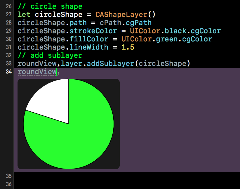
// circle shape
let circleShape = CAShapeLayer()
circleShape.path = cPath.cgPath
circleShape.strokeColor = UIColor.black.cgColor
circleShape.fillColor = UIColor.green.cgColor
circleShape.lineWidth = 1.5
// add sublayer
roundView.layer.addSublayer(circleShape)
roundView
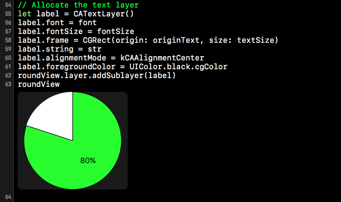
Bonus - add a text label
The OP threw a couple of curved balls after my initial answer, including orienting the segment (implemented above) and labelling the segment with the percentage, which really should have been a separate question, however, it's not an unreasonable thing to want to do on a pie-chart, so here its is...
// Bonus - add text layer
// choose your font
let fontSize = CGFloat(20)
let font = UIFont.systemFont(ofSize: fontSize)
let attributes = [NSFontAttributeName: font]
// Format the string
let str = String(format: "%3.0f%%", proportion)
// Calculate the text size
let textSize = str.size(attributes: attributes)

// Assume the centre of the text is half way along the bisector of the segment
let halfAngle = startAngle + arc / 2
let centreText = CGPoint(x: centre.x + radius * cos(halfAngle) / 2, y: centre.y + radius * sin(halfAngle) / 2)
// calculate the the lower left of the label given the size
let originText = CGPoint(x: centreText.x - textSize.width / 2, y: centreText.y - textSize.height / 2)
// Allocate the text layer
let label = CATextLayer()
label.font = font
label.fontSize = fontSize
label.frame = CGRect(origin: originText, size: textSize)
label.string = str
label.alignmentMode = kCAAlignmentCenter
label.foregroundColor = UIColor.black.cgColor
roundView.layer.addSublayer(label)
roundView
Filling a circle border by percent
For first linear part, you can use linear-gradient:(270deg,...) for filling 50% of the circle.
For other linear part, you can increase the angle (270°+) to fill more than 50% of the circle (360° or 0° = 75% of the circle ... 90° = 100% of the circle)
For example: linear-gradient(270deg, black 50%, transparent 50%), linear-gradient(0deg, black 50%, lightgray 50%) combination creates a circle with a lightgray background, filled with seventy-five percent black color. (snippet below)
.circle {  position: relative;  top: 5px;  left: 5px;  text-align: center;  width: 100px;  height: 100px;  border-radius: 100%;  background-color: #ffffff;}
.circle-border {  position: relative;  text-align: center;  width: 110px;  height: 110px;  margin-left: 30%;  border-radius: 100%;  background-color: #E53B3B;  background: linear-gradient(270deg, black 50%, transparent 50%), linear-gradient(0deg, black 50%, lightgray 50%)}
<div class="circle-border"> <div class="circle"> </div></div>calculate percentage in progress circle
To have the progress circle redraw when the values are changed simply call the drawProgress() function within the input event handler.
Also note that there's a couple of other improvements you can make to the code:
- remove nested document.ready
- delegate is deprecated, use on instead
$('#percent').text()should be$('#percent').val(), and I would assume1000in the condition on that line should be100instead.
jQuery($ => {
  $('#submitClick').click(function() {
    var val = parseInt($('#percent').val());
    drawProgress(val / 100);
  }).trigger('click');

  $(".tags").on('input', function() {
    // needlessly using 2 loops here, amended
    //var calculated_total_sum = $(this).find(".ingredient:checked").map((i, el) => parseFloat($(el).closest("div").find(".txtCal").val())).get().reduce((a, b) => a + b) || 0;
    var calculated_total_sum = 0;
    $(this).find('div:has(.ingredient:checked) .txtCal').each((i, el) => calculated_total_sum += parseFloat(el.value));

    $("#percent")
      .val(calculated_total_sum)
      .css('color', parseFloat($("#percent").val()) > 1000 ? 'red' : 'green');

    drawProgress(calculated_total_sum / 100);
  });

  // ingrédients allergènes
  $('div.tags').on('change', 'input:checkbox', function() {
    $(this).parent().nextAll().slice(0, 2).hide().val('0');
    var list = $('.results > li').hide();

    $('input:checked').each(function() {
      list.filter('.' + $(this).attr('rel')).show();
      $(this).parent().nextAll().slice(0, 2).show();
    });
  }).find('input:checkbox').change();

  $(".tags").on('input', '.txtCal', function() {
    var calculated_total_sum = 0;
    $(".tags .txtCal").each(function() {
      var get_textbox_value = $(this).val();
      if ($.isNumeric(get_textbox_value)) {
        calculated_total_sum += parseFloat(get_textbox_value);
      }
    });
    $("#percent").val(calculated_total_sum);
  });

  var svg;

  function drawProgress(end) {
    d3.select("svg").remove()
    if (svg) {
      svg.selectAll("*").remove();
    }
    var wrapper = document.getElementById('radialprogress');
    var start = 0;

    var colours = {
      fill: '#FF0000',
      track: '#555555',
      text: '#00C0FF',
      stroke: '#FFFFFF',
    }

    var radius = 80;
    var border = 12;
    var strokeSpacing = 4;
    var endAngle = Math.PI * 2;
    var formatText = d3.format('.0%');
    var boxSize = radius * 2;
    var count = end;
    var progress = start;
    var step = end < start ? -0.01 : 0.01;

    //Define the circle
    var circle = d3.svg.arc()
      .startAngle(0)
      .innerRadius(radius)
      .outerRadius(radius - border);

    //setup SVG wrapper
    svg = d3.select(wrapper)
      .append('svg')
      .attr('width', boxSize)
      .attr('height', boxSize);

    // ADD Group container
    var g = svg.append('g')
      .attr('transform', 'translate(' + boxSize / 2 + ',' + boxSize / 2 + ')');

    //Setup track
    var track = g.append('g').attr('class', 'radial-progress');
    track.append('path')
      .attr('fill', colours.track)
      .attr('stroke', colours.stroke)
      .attr('stroke-width', strokeSpacing + 'px')
      .attr('d', circle.endAngle(endAngle));

    //Add colour fill
    var value = track.append('path')
      .attr('fill', colours.fill)
      .attr('stroke', colours.stroke)
      .attr('stroke-width', strokeSpacing + 'px');

    //Add text value
    var numberText = track.append('text')
      .attr('fill', colours.text)
      .attr('text-anchor', 'middle')
      .attr('dy', '.5rem');

    //update position of endAngle
    value.attr('d', circle.endAngle(endAngle * end));
    //update text value
    numberText.text(formatText(end));
  }
});
<div class="tags">
<div>
<label><input type="checkbox" checked rel="ingredient-1" class="ingredient"> ingredient 1 </label><br><input type="text" class='txtCal' /><br>
</div>
<div>
<label><input type="checkbox" checked rel="ingredient-2" class="ingredient"> ingredient 2 </label><br><input type="text" class='txtCal' /><br>
</div>
<div>
<label><input type="checkbox" checked rel="ingredient-3" class="ingredient"> ingredient 3 </label><br><input type="text" class='txtCal' /><br>
</div>
<span><b>TOTAL :</b></span><b><span id="total_sum_value"></span></b>
<label for="percent">Type a percent!</label>
<input id="percent" name="percent" value="0">
<button id='submitClick' name='submitButton'>Render</button>
<div id="radialprogress"></div>
</div>
<ul class="results">
<li class="ingredient-1 ingredient-3">Alpha isomethylionone</li>
<li class="ingredient-1">Amyl cinnamal (Jasmonal A)</li>
<li class="ingredient-1">Amylcinnamyl alcohol</li>
<li class="ingredient-1">Anisyl alcohol</li>
<li class="ingredient-1 ingredient-2">Benzyl alcohol</li>
<li class="ingredient-1 ingredient-2 ingredient-3">Benzyl benzoate</li>
<li class="ingredient-2">Benzyl cinnamate</li>
<li class="ingredient-2">Benzyl salicylate</li>
<li class="ingredient-2">Butylphenyl methylpropional (Lilial)</li>
<li class="ingredient-2 ingredient-3">Cinnamal</li>
<li class="ingredient-3">Cinnamyl alcohol</li>
<li class="ingredient-3">Citral</li>
<li class="ingredient-3">Citronellol</li>
<li class="ingredient-3">Coumarin</li>
</ul>
<script src="https://cdnjs.cloudflare.com/ajax/libs/d3/3.4.11/d3.min.js"></script>
<script src="https://ajax.googleapis.com/ajax/libs/jquery/2.1.1/jquery.min.js"></script>is it possible to make SVG circle fill color from bottom to top based on percentage?
you could use a gradient with stop-opacity to do this.
you would add two "middle" stops with opacity 0 and 1 respectively an set the offset of both to the percentage you need.
<svg xmlns="http://www.w3.org/2000/svg" viewBox="0 0 100 100" width="200" height="200"> <linearGradient id="lg" x1="0.5" y1="1" x2="0.5" y2="0"> <stop offset="0%" stop-opacity="1" stop-color="royalblue"/> <stop offset="40%" stop-opacity="1" stop-color="royalblue"/> <stop offset="40%" stop-opacity="0" stop-color="royalblue"/> <stop offset="100%" stop-opacity="0" stop-color="royalblue"/> </linearGradient> <circle cx="50" cy="50" r="45" fill="url(#lg)" stroke="crimson" stroke-width="5"/></svg>How to make a percentage circle using using html and css only with percentage written inside
I think this codepen link might help you by Andre Firchow. Although it uses SCSS
HTML
<div class="wrapper">
  <div class="c100 p99 blue">
      <span>90%</span>
      <div class="slice">
        <div class="bar"></div>
        <div class="fill"></div>
      </div>
  </div>
  <div class="c100 p75 pink">
      <span>75%</span>
      <div class="slice">
        <div class="bar"></div>
        <div class="fill"></div>
      </div>
  </div>
  <div class="c100 p70 green">
      <span>70%</span>
      <div class="slice">
        <div class="bar"></div>
        <div class="fill"></div>
      </div>
  </div>
  <div class="c100 p85 orange">
      <span>85%</span>
      <div class="slice">
        <div class="bar"></div>
        <div class="fill"></div>
      </div>
  </div>
</div>
CSS
// Compass utilities
@import "compass";
@import url('https://fonts.googleapis.com/css?family=Titillium+Web:200,200i,300,300i,400,400i,600,600i,700,700i,900');

body {
    font-family: "Titillium Web", sans-serif;
    margin: 0 auto;
}

// VARS
$circle-width: 0.09em;
$circle-width-hover: 0.07em;

// colors default
$primary-color: #000000; // czarny
$secondary-color: #dfe8ed; //szary bcg
$bg-color: #ffffff; //srodkowy bezowy

// colors customized
$primary-color-blue: #30bae7;
$primary-color-green: #15c7a8;
$primary-color-orange: #eb7d4b;
$primary-color-pink: #d74680;
$primary-color-span: #3c4761;

// CIRCLE
// classes 2 extend
.rect-auto{
    clip: rect(auto, auto, auto, auto);
}

.pie {
    position: absolute;
    border: $circle-width solid $primary-color;
    width: 1 - (2 * $circle-width);
    height: 1 - (2 * $circle-width);
    clip: rect(0em, 0.5em, 1em, 0em);
    border-radius: 50%;
    @include rotate(0deg);
}

.pie-fill {
    @include rotate(180deg);
}
.wrapper {
  width: 1200px;
  margin: 0 auto;
}

// main
.c100 {

    *, *:before, *:after {
        @include box-sizing(content-box);
    }

    position: relative;
    font-size: 160px;
    width: 1em;
    height: 1em;
    border-radius: 50%;
    float: left;
    margin: 0.4em;
    background-color: $secondary-color;

    // centered value inside circle
    > span {
        position: absolute;
        width: 100%;
        z-index: 1;
        left: 0;
        top: 0;
        width: 5em;
        line-height: 5em;
        font-size: 0.2em;
        color: $primary-color-span;
        display: block;
        text-align: center;
        white-space: nowrap;
        @include transition-property(all);
        @include transition-duration(0.2s);
        @include transition-timing-function(ease-out);
    }

    // background inside the circle
    &:after{
        position: absolute;
        top: $circle-width;
        left: $circle-width;
        display: block;
        content: " ";
        border-radius: 50%;
        background-color: $bg-color;
        width: 1 - (2 * $circle-width);
        height: 1 - (2 * $circle-width);
        @include transition-property(all);
        @include transition-duration(0.2s);
        @include transition-timing-function(ease-in);

    }

    // the slice (mask)
    .slice {
        position: absolute;
        width: 1em;
        height: 1em;
        clip: rect(0em, 1em, 1em, 0.5em);
    }

    // circle to show the status
    .bar {
        @extend .pie;
    }

    // loop to create all needed elements automatically
    @for $j from 51 through 100 {

        &.p#{$j} .slice {
            @extend .rect-auto;
        }

        &.p#{$j} .bar:after{
            @extend .pie-fill;
        }

        &.p#{$j} .fill{
            @extend .pie;
            @extend .pie-fill;
        }

    }

    // loop to rotate all 100 circles
    @for $j from 1 through 100 {
        &.p#{$j} .bar {
            @include rotate((360/100*$j) + deg);
        }
    }

    // hover styles
    &:hover{

        cursor: default;

        > span {
            width: 3.33em;
            line-height: 3.33em;
            font-size: 0.3em;
            color: $primary-color-span;
        }

        &:after{
            top: $circle-width-hover;
            left: $circle-width-hover;
            width: 1 - (2 * $circle-width-hover);
            height: 1 - (2 * $circle-width-hover);
        }

    }

    // blue
    &.blue{

        .bar, .fill { border-color: $primary-color-blue !important;}

        &:hover{
            > span { color: $primary-color-span;}
        }

    }

    // pink skin
    &.pink{

        .bar, .fill { border-color: $primary-color-pink !important;}

        &:hover{
            > span { color: $primary-color-span;}
        }

    }

    // green skin
    &.green{

        .bar, .fill { border-color: $primary-color-green !important;}

        &:hover{
            > span { color: $primary-color-span;}
        }

    }

    // orange skin
    &.orange{

        .bar, .fill { border-color: $primary-color-orange !important;}

        &:hover{
            > span { color: $primary-color-span;}
        }

    }

}
Related Topics
Programmatically Set Uipageviewcontroller Transition Style to Scroll
How to Handle Oauth-Style Log Ins with Imessage Apps in iOS 10, Xcode 8
How Parsing Firebase Fdatasnapshot JSON Data in Swift
How to Apply Multiple Masks to Uiview
How to Convert This Opengl Pointer Math to Swift
Swift - Parse a String Which Contains a Url
Uiview Rounded Corner - Swift 2.0
How to Get Multiple Buttons from a Single Tableviewcell
How Is This Slide-Up Menu from the iPhone Messages App Implemented
Swift Select All Photos from Specific Photos Album
Using Cloud Code with the Parse Server and Heroku
Get All List of Uiviewcontrollers in iOS Swift
-[Uithreadsafenode Canperformaction:Withsender:]: Unrecognized Selector Sent to Instance
Setcollectionviewlayout' Animation Broken When Also Changing Collection View Frame
Custom Uitoolbar Too Close to the Home Indicator on iPhone X
Double Tap Necessary to Select Tableview Item with Search Bar