Why everything word-wrap inside an absolute element nested inside a float or inline-block element
An element with position:absolute has a shrink-to-fit behavior. you can notice the same think if you write a long sentence and it will break on each word:
<div style="display:inline-block;position: relative">
  <div style="position:absolute">
    aaaa bbb ccc ddd  eee fff
  </div>
</div>
How position absolute and fixed block elements get their dimension?
Here is the Specification detailing how you can find the width/height of any element: https://www.w3.org/TR/CSS21/visudet.html
From there you can read for absolute element that:
The constraint that determines the used values for these elements is:
'left' + 'margin-left' + 'border-left-width' + 'padding-left' + 'width' + 'padding-right' + 'border-right-width' + 'margin-right' + 'right' = width of containing block
Then
If all three of 'left', 'width', and 'right' are 'auto': First set any 'auto' values for 'margin-left' and 'margin-right' to 0. Then, if the 'direction' property of the element establishing the static-position containing block is 'ltr' set 'left' to the static position and apply rule number three below; otherwise, set 'right' to the static position and apply rule number one below.
And the rule number three:
'width' and 'right' are 'auto' and 'left' is not 'auto', then the width is shrink-to-fit . Then solve for 'right'
The rule number one is also similar
And if you continue reading you will find how to calculate the shrink-to-fit width. You will also notice that the same shrink-to-fit algorithm apply to float and inline-block element
Also note that fixed element is a particular case of absolute so the same rule applies. The only difference is the containing block
Fixed positioning is a subcategory of absolute positioning. The only difference is that for a fixed positioned box, the containing block is established by the viewport. ref
You can also see that block elements follow almost the same constraint (without left/right) but the rules are different:
The following constraints must hold among the used values of the other properties:
'margin-left' + 'border-left-width' + 'padding-left' + 'width' + 'padding-right' + 'border-right-width' + 'margin-right' = width of containing block
Then
If 'width' is set to 'auto', any other 'auto' values become '0' and 'width' follows from the resulting equality.
This will make width = width of containing block
An important difference between inline-block element is that absolute element will not take the width of their content like we may think. This happen in most of the case due to the constraint explained above but check the below example:
.container {
 clear:left;
 margin:5px;
}
<div class="container" style="float:left;position:relative;">
<div style="display:inline-block; background: red;"> 1 1 1 1 1 1 </div>
</div>
<div class="container" style="float:left;position:relative;">
<div style="position: absolute; background: red;"> 1 1 1 1 1 1 </div>
</div>Why do absolute elements stack up on each other instead of stacking one after the other?
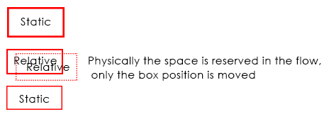
Well you have some weird wishes here so let me explain you what those positions really mean in CSS and how they work, using position: relative; is just like using static position, the difference is making an element position: relative;, you will be able to use top, right, bottom and left properties, though the element will move, but physically it will be in the document flow..
Coming to position: absolute;, when you make any element position: absolute;, it gets out of the document flow, hence, it has nothing to do with any other element, so in your example
you have .col1, .col2 {position: absolute;} which are positioned absolute and since both are out of the document flow, they will overlap... Because they are already nested under position: absolute; parent i.e .container and since no width is assigned, it will take the minimal width and hence, your elements overlap, if you cannot change your CSS(which according to me doesn't make any sense why you can't change) still if you want, than you can do is this..
Demo (Without removing any of your position property) And this is really dirty
For the s characters, it will be at the top as your container element is out of the flow, and hence, no height will be considered in the document flow, unless and until you wrap that s in some element, and bring it down with, margin padding or CSS Positioning.
CSS Positions Explained
As I commented, here are few examples of how CSS Positioning actually works, to start with, there are 4 values for position property i.e static which is the default one, relative, absolute and fixed, so starting with static, nothing to learn much here, elements just stackup one below the other unless they are floated or made display: inline-block. With static positioning, top, right, bottom and left won't work.
Demo
Coming to position: relative; I've already explained you in general, it's nothing but same as static, it stacks up on other element, it is in the document flow, but you can tweak the elements position using top, right, bottom and left, physically, the element stays in the flow, only position of the element is changed.
Demo 2
Now comes absolute which generally many fails to understand, when making an element absolute it gets out of the document flow, and hence it stays independent, it has nothing to do with other elements positioning unless it's overlapped by other position: absolute element which can be fixed using z-index to change the stack level. The main thing to remember here is to have a position: relative; container so that your absolute positioned element is relative to that relative positioned element, else your element will fly out in the wild.
It's worth noting that position: absolute; element when positioned absolute; inside an absolute positioned parent element, than it is relative to that element and not relative to the grand parent element which may be positioned relative
Demo 3 (Without position: relative; container)
Demo 4 (With position: relative; container)
Last is position fixed, this is same as absolute but it flows along when you scroll, it's out of the document flow, but it scrolls, also, position: fixed; element cannot be relative to any container element having any type of position, not even relative, position fixed element is always relative to the viewport, so designers use position: absolute; when they want to have a fixed position behavior but relative to parent and tweak the top property onScroll.
Demo 5
Why are the results of img width different in some browsers? Who is correct?
This will probably not answer the question but I will try to explain what is happening with chrome and why both can be correct.
First, you should notice that the same happen even if you consinder inline-block element or float as they are also shrink-to-fit elements
<div style="display:inline-block;"> <img src="https://i.imgur.com/iQ2rVup.jpg" style="width:100%;height:100px;" /></div><br><div style="float:left;"> <img src="https://i.imgur.com/iQ2rVup.jpg" style="width:100%;height:100px;" /></div>Why Float is better than position:relative and absolute while we can make layout quickly with position?
float will not break the document flow -- also, it will position any element it uses the best it can fit in the container width -- say I have 5 x 200px divs in a 800px width container, the last 5th will go in a "new line" below the other ones -- using position:relative will make you need to calculate when it needs to break yourself, and it won't break correctly since the display will either be block and go over the whole width or it will be inline-block or inline which won't render the same way for divs as block would and would pretty much mess up the document flow & layout.
It depends on what you want to do: position:relative is used to move the element a bit aside from it's natural location, whereas float will make it pop to the left-most or right-most position in the parent element. position:absolute will let you position it relative to the nearest positioned ancestor (instead of positioned relative to the viewport, like fixed).
However; if an absolute positioned element has no positioned ancestors, it uses the document body, and moves along with page scrolling.
CSS block-level vs inline container issue
What you are seeing is expected behavior.
The reason this is occurring is because the red div element is a block level element by default. Thus, in its current state, it will always appear on a new line regardless of whether it has a defined width or has floating sibling elements.
By floating or absolutely positioning an element, you are essentially removing it from the flow of the document, rendering display:block ineffective. Therefore you can solve this by either floating the red div element, or adding display:inline-block to it. (example)
jsFiddle example
.red {
    width: 200px;
    background: red;
    height: 140px;
    float: left;
}
Span use max width before line break
In such case, use a big negative margin
.container1 {
  position: absolute;
  max-width: 300px;
  margin-right:-100vmax
}

.container {
  position: absolute;
}
<div class="container">
<div class="container1">
<span>
Lorem ipsum dolor sit amet, consectetur adipiscing elit. Cras dignissim purus et arcu ultrices posuere. Quisque tempus elementum facilisis. Duis vitae enim eu erat elementum dapibus vitae ac eros. Pellentesque faucibus pretium leo in accumsan. Nulla ullamcorper mollis dolor, euismod.
</span>
</div>
</div>CSS: display:inline-block and positioning:absolute
When you use position:absolute;, the element is taken out of the normal page flow. Therefore it no longer affects the layout of its container element. So the container element does not take into account its height, so if there's nothing else to set the height, then the container will be zero height.
Additionally, setting display:inline-block; does not make any sense for an element that is position:absolute;. Again, this is because absolute positioning takes the element out of the page flow. This is at odds with inline-block, which only exists to affect how the element fits into the page flow. All elements that are position:absolute; are automatically treated as display:block, since that's the only logical display mode for absolute positioning.
If you need absolute positioning, then the only solution to your height problem is to set the height of the container box.
However, I suspect that you could do without the absolute positioning.
It looks like what you're trying to do is position the second <span> in each block to a fixed position in the block, so that they line up.
This is a classic CSS problem. In the "bad-old-days", web designers would have done it using a table, with fixed widths on the table cells. This obviously isn't the answer for today's web designers, but it is something that causes a lot of questions.
There are a number of ways to do it using CSS.
The easiest is to set both the <span> elements to display:inline-block;, and give them both a fixed width.
eg:
<div class='section'>
    <span class="element-left">some text</span>
    <span class="element-right">some text</span>
</div>
with the following CSS:
.section span  {display:inline-block;}
.element-left  {width:200px;}
.element-right {width:150px;}
[EDIT]after question has been updated
Here's how I would achieve what you're asking now:
<div class='section'>
    <span class="element-left"><span class='indent-0'>some text</span></span>
    <span class="element-right">some text</span>
</div>
<div class='section'>
    <span class="element-left"><span class='indent-1'>some text</span></span>
    <span class="element-right">some text</span>
</div>
<div class='section'>
    <span class="element-left"><span class='indent-2'>some text</span></span>
    <span class="element-right">some text</span>
</div>
with the following CSS:
.section span  {display:inline-block;}
.element-left  {width:200px;}
.indent-1 {padding:10px;}
.indent-2 {padding:20px;}
.element-right {width:150px;}
A small amount of extra markup, but it does achieve the effect you want.
Related Topics
Table Columns, Setting Both Min and Max Width with CSS
How to Create a Round Arrow with Only HTML and CSS
Making a Div Fit The Initial Screen
Aligning Elements Left, Center and Right in Flexbox
How Put Percentage Width into HTML Canvas (No CSS)
What HTML/CSS Attributes Are Mail Safe
Is There a Web Service for Converting HTML to Pdf
Svg Fill Animation for The Given Path
Cordova List All Files from Application Directory (Www)
How to Detect Click Outside of an Element in Angular
What Is The Order of Loading The CSS Files in a HTML Page
Why Base Tag Does Not Work for Relative Paths
What Does an Entry "Action=''" in HTML Form Mean
How to Get Horizontal Scroll Bar in Select Box in Ie
How to Restrict My Input Type="File" to Accept Only Png Image Files Not Working in Firefox