Why do Firefox and Opera ignore max-width inside of display: table-cell?
The w3.org spec states that max-width does not apply to inline elements, so you will get inconsistent behavior across browsers. I'm not sure of your intended outcome, but you may achieve it if you set div img { display:block } and then align the img and p tags with floats instead of standard inline.
HTML5 display table nested divs not working with Firefox & Opera
This seems to make everything render consistently across IE, FireFox, and Chrome:
<!DOCTYPE html>
<html style="min-width:100%;min-height:100%;height:100%;width:100%">
<body style="margin:0;min-width:100%;min-height:100%;height:100%;width:100%">
<div style="display:table;width:100%;height:100%;min-width:100%;min-height:100%;">
    <div style="display:table-row;background:red;">
        <div style="display:table-cell">A</div>
    </div>
    <div style="display:table-row;background:green;">
        <div style="display:table-cell;background:yellow;width:100%;height:100%;">B</div>
    </div>
    <div style="display:table-row;background:blue;height:50px;">
        <div style="display:table-cell">C</div>
    </div>
</div>
</body>
</html>
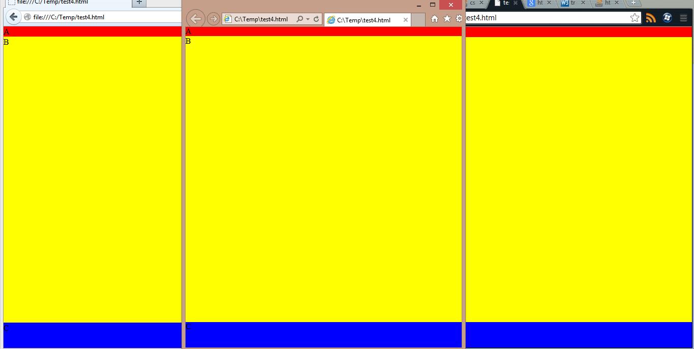
The only difference is I added display:table-cell divs within each table-row. It will have a 50px tall "C" row, a minimal "A" row, and the rest filled with a yellow "B" row.
It looks like you can simply get away with just changing that inner "B" div from display:block to display:table-cell, but I think it's best practice to always have a table-cell within your table-row (I could be wrong?).
Screenshot of all 3 browsers with my modifications:
EDIT:
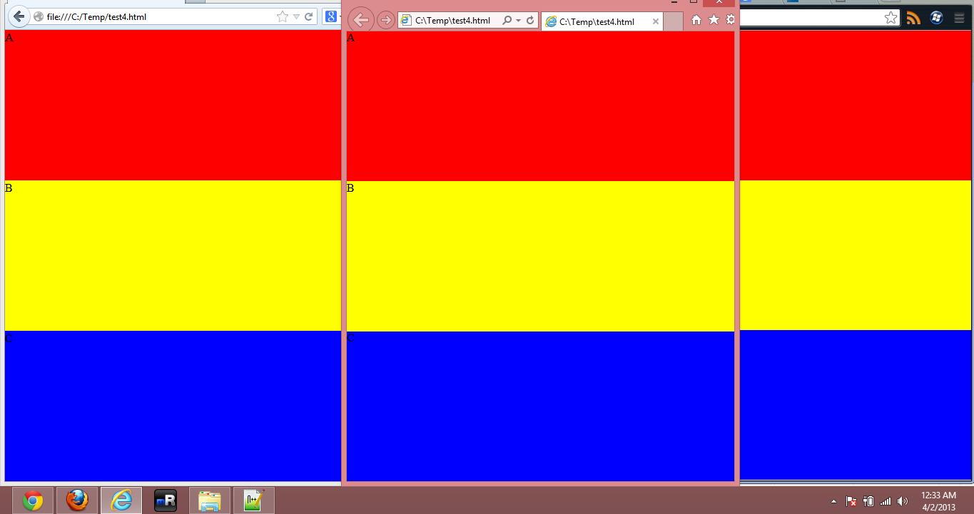
If you're trying to get your rows to have equal height, you can use this markup:
<!DOCTYPE html>
<html style="min-width:100%;min-height:100%;height:100%;width:100%">
<body style="margin:0;min-width:100%;min-height:100%;height:100%;width:100%">
<div style="display:table;width:100%;height:100%;min-width:100%;min-height:100%;">
    <div style="display:table-row;background:red;height:33%">
        <div style="display:table-cell">A</div>
    </div>
    <div style="display:table-row;background:green;height:33%">
        <div style="display:table-cell;background:yellow;">B</div>
    </div>
    <div style="display:table-row;background:blue;height:33%;">
        <div style="display:table-cell">C</div>
    </div>
</div>
</body>
</html>
height:100% inside table-cell not working on Firefox and IE
For height:100% to work, all parent containers must be height:100%. If you notice, your .table-cell styles do not have height:100%.
Adding this style fixes the issue in Firefox:
.table-cell {
    display:table-cell;
    vertical-align: middle;
    width:100%;
    height:100%;
}
As an alternative, adding the image to your HTML rather than as a CSS background-image might also work.
body, html {    margin:0;    padding:0;    height:100%;}.table {    display:table;    width:100%;    height:100%;}.table-cell {    display:table-cell;    vertical-align: middle;    width:100%;}.content {    height: 100%;    display: block;    overflow: hidden;    position: relative;    background-size:cover;}
.content img {    width:100%;    height:100%;}
<div class="table"> <div class="table-cell"> <div class="content"> <img src="http://spaceinimages.esa.int/var/esa/storage/images/esa_multimedia/images/2012/11/solar_eclipse_corona/12092636-3-eng-GB/Solar_eclipse_corona_node_full_image.jpg"/> </div> </div></div>Max width in percentage inside table-cell display container
Inspiration : This answer
What you need to do is to put your wrapper div (the one with display: table-cell) inside another div that has display: table and table-layout: fixed. That makes both Firefox and Opera respect the max-width rule.
<div style="display: table; table-layout: fixed;  width: 500px;">
  <div style="display: table-cell;">
    <img src="http://www.planwallpaper.com/static/images/b807c2282ab0a491bd5c5c1051c6d312_k4PiHxO.jpg" style="max-width: 90%">
  </div>
</div>
Fiddle
Table not responsive in Firefox, Works in Chrome
Check this demo jsfiddle
You use max-width, but actually It's meaning original image size. that's why not working on firefox. you should modify max-width to width and assign 100% to work on all browser.
CSS
 img {
    width: 100%;  // before: max-width: 100%;
    display: block;
}
Hope this help you!
an Li element is out of the div in firefox but iside the div in chrome?
Your <li> elements are display: table-cell (from Bootstrap).
Your <img> elements are max-width: 100% (from your style.css).
The w3.org spec states that max-width does not apply to inline elements, so you will get inconsistent behavior across browsers.
See this answer: Why do Firefox and Opera ignore max-width inside of display: table-cell?
You can put width: 100% instead.
Related Topics
Difference Between Position:Sticky and Position:Fixed
How to "Crop" a Rectangular Image into a Square with CSS
What's the Purpose of the HTML "Nonce" Attribute for Script and Style Elements
Div Width 100% Minus Fixed Amount of Pixels
How to Show Dots ("...") in a Span with Hidden Overflow
How to Prevent the Scrollbar Overlaying Content in Ie10
Bootstrap Right Column on Top on Mobile View
How to Link HTML Pages in Same or Different Folders
How to Rotate a <Div> 90 Degrees
Making Text Background Transparent But Not Text Itself
Change the Color of a Bullet in a HTML List
How to Properly Use H1 in HTML5
Can You Take a "Screenshot" of the Page Using Canvas
How to Make a Chevron Arrow Using CSS