Why do absolute elements stack up on each other instead of stacking one after the other?
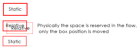
Well you have some weird wishes here so let me explain you what those positions really mean in CSS and how they work, using position: relative; is just like using static position, the difference is making an element position: relative;, you will be able to use top, right, bottom and left properties, though the element will move, but physically it will be in the document flow..
Coming to position: absolute;, when you make any element position: absolute;, it gets out of the document flow, hence, it has nothing to do with any other element, so in your example
you have .col1, .col2 {position: absolute;} which are positioned absolute and since both are out of the document flow, they will overlap... Because they are already nested under position: absolute; parent i.e .container and since no width is assigned, it will take the minimal width and hence, your elements overlap, if you cannot change your CSS(which according to me doesn't make any sense why you can't change) still if you want, than you can do is this..
Demo (Without removing any of your position property) And this is really dirty
For the s characters, it will be at the top as your container element is out of the flow, and hence, no height will be considered in the document flow, unless and until you wrap that s in some element, and bring it down with, margin padding or CSS Positioning.
CSS Positions Explained
As I commented, here are few examples of how CSS Positioning actually works, to start with, there are 4 values for position property i.e static which is the default one, relative, absolute and fixed, so starting with static, nothing to learn much here, elements just stackup one below the other unless they are floated or made display: inline-block. With static positioning, top, right, bottom and left won't work.
Demo
Coming to position: relative; I've already explained you in general, it's nothing but same as static, it stacks up on other element, it is in the document flow, but you can tweak the elements position using top, right, bottom and left, physically, the element stays in the flow, only position of the element is changed.
Demo 2
Now comes absolute which generally many fails to understand, when making an element absolute it gets out of the document flow, and hence it stays independent, it has nothing to do with other elements positioning unless it's overlapped by other position: absolute element which can be fixed using z-index to change the stack level. The main thing to remember here is to have a position: relative; container so that your absolute positioned element is relative to that relative positioned element, else your element will fly out in the wild.
It's worth noting that position: absolute; element when positioned absolute; inside an absolute positioned parent element, than it is relative to that element and not relative to the grand parent element which may be positioned relative
Demo 3 (Without position: relative; container)
Demo 4 (With position: relative; container)
Last is position fixed, this is same as absolute but it flows along when you scroll, it's out of the document flow, but it scrolls, also, position: fixed; element cannot be relative to any container element having any type of position, not even relative, position fixed element is always relative to the viewport, so designers use position: absolute; when they want to have a fixed position behavior but relative to parent and tweak the top property onScroll.
Demo 5
Why do images with absolute positioning and 0 top offset stack vertically?
images all have the clip css property
The clip CSS property defines a visible portion of an element. The
clip property applies only to absolutely positioned elements — that
is, elements with position:absolute or position:fixed.
https://developer.mozilla.org/en-US/docs/Web/CSS/clip
clip is a property that take an images and display only the part between given coordinate
.dotted-border {
        border: dotted;
        position: relative;
        width: 536px;
        height: 350px;
      }

      #top-left, #middle, #bottom-right {
        position: absolute;
        top: 0;
        left:280px;
    }


.dotted-border img {
   position:absolute;
  clip: rect(119px, 255px, 229px, 80px);
}
<p class="dotted-border">
<img src="https://developer.mozilla.org/@api/deki/files/3613/=hut.jpg" title="Original graphic">
</p>Why do 2 elements with display: inline-block; position: absolute; overlap over each other instead of being right next to each other?
Elements with position absolute are not in a normal flow. Document flow is the arrangement of page elements, as defined by CSS positioning statements, and the order of HTML elements. this is to say, how each Definition takes up space and how other elements position themselves accordingly. Take a look: https://soulandwolf.com.au/blog/what-is-document-flow/#:~:text=by%20John%20Rosato,other%20elements%20position%20themselves%20accordingly. and this https://developer.mozilla.org/en-US/docs/Web/CSS/CSS_Flow_Layout/In_Flow_and_Out_of_Flow
Why absolute positioned element looks at its sibling element?
position:absolute; looks for the nearest element with position:relative/absolute, and makes his position, based on that element.
In your case, as you have position:relative in the image, the "Irene" text will be placed at the top left corner of the image.
For "Irene" to be at the top left of the document, you either apply position:fixed, wich is based on the browser window, or remove all the position:absolute/relative that are above the "Irene" element.
Why using absolute position causes the div to be on top?
This is how the painting order works. As described here you have the following order:
- For all its in-flow, non-positioned, block-level descendants in tree order: If the element is a block, list-item, or other block
equivalent:
In this step you will print the background and border of the h1 element
- Otherwise: first for the element, then for all its in-flow, non-positioned, block-level descendants in tree order:
In this complex step you will print the content of the h1 element
All positioned, opacity or transform descendants, in tree order that fall into the following categories:
- All positioned descendants with 'z-index: auto'
And in this step you will print the positioned element #back; thus it will be on the top of h1 even if in the DOM it's before.
In other words, we first consider the in-flow elements then the postioned ones. Of course, changing z-index and/or other properties will affect the order because more steps can be consider.
For example adding a negative z-index to #back will trigger this rule:
- Stacking contexts formed by positioned descendants with negative z-indices (excluding 0) in z-index order (most negative first) then
tree order.
This will make the #back to be behind since h1 is printed later in the step (4) and (7).
Adding position:relative (or absolute or fixed) to h1 will make it a positioned element so like #back it will trigger the (8) and in this case the tree order will decide.
You may also notice that both background and content are printed in 2 different steps and this may also lead to some non intuitive painting behavior.
CSS - position: absolute is stacking images
If each element with .center has position: absolute then you need to set position: relative on the parent (.tiktok)
.container {
  height: 100%;
  width: 100%;
  overflow-y: scroll;
  scroll-snap-type: mandatory;
  scroll-snap-points-y: repeat(3rem);
  scroll-snap-type: y mandatory;
  position: relative;
  z-index: 1;
  border: none;
}

.blurredImg {
  width: 100%;
  height: 100%;
  filter: blur(8px);
  -webkit-filter: blur(8px);
}

.tiktok {
  height: 100%;
  width: 100%;
  background-color: black;
  scroll-snap-align: start;

  /* Added by me */
  position: relative;
}

.center {
  margin: auto;
  position: absolute;
  top: 50%;
  left: 50%;
  -ms-transform: translate(-50%, -50%);
  transform: translate(-50%, -50%);
  border-radius: 50%;
  border: 10px solid white;
}
<section class="container">
<div class="tiktok">
<img src="https://picsum.photos/200" class="blurredImg">
<img src="https://picsum.photos/200" class="center">
</div>
<div class="tiktok">
<img src="https://picsum.photos/200" class="blurredImg">
<img src="https://picsum.photos/200" class="center">
</div>
<div class="tiktok">
<img src="https://picsum.photos/200" class="blurredImg">
<img src="https://picsum.photos/200" class="center">
</div>
</section>Elements stacking over each other instead of transitioning in spring react
There was a little problem in useTransition. It was exit instead of leave. It fixed the stacking over each other thing for me.
  const transitions = useTransition(current, item => item.key, {
    from: { position: "absolute", opacity: 0 },
    enter: { opacity: 1 },
    leave: { opacity: 0 }
  });
Now you can wrap the transition.map with another div with gridRow attribute to prevent your layout disruption. It needs further styling, but you can build on this I think:
  <div style={{ gridRow: "2", position: "relative", width: "100%" }}>
    {transitions.map(({ item, props, key }) => (
      <animated.div key={key} style={props}>
        <QuoteParagraph>
          <Quote>
            <FaQuoteLeft />
          </Quote>
          {item.quote}
          <Quote>
            <FaQuoteRight />
          </Quote>
        </QuoteParagraph>
        <QuotePerson>-{item.client}</QuotePerson>
      </animated.div>
    ))}
  </div>
full example: https://codesandbox.io/s/mutable-waterfall-w8wvd?file=/src/App.js
Stacking DIVs on top of each other?
Position the outer div however you want, then position the inner divs using absolute. They'll all stack up.
.inner { position: absolute;}<div class="outer"> <div class="inner">1</div> <div class="inner">2</div> <div class="inner">3</div> <div class="inner">4</div></div>Related Topics
Onclick on Option Tag Not Working on Ie and Chrome
How to Change Bootstrap 3 Column Order on Mobile Layout
Is ≪Img≫ Element Block Level or Inline Level
Freeze the Top Row For an HTML Table Only (Fixed Table Header Scrolling)
What Is the Correct Value For the Disabled Attribute
Why Are Nested Anchor Tags Illegal
Adding a Favicon to a Static HTML Page
Maintain Aspect Ratio of Div But Fill Screen Width and Height in Css
Scraping Data from Website Using Vba
How to Apply Hovering on HTML Area Tag
Draw on Html5 Canvas Using a Mouse
Using HTML and Local Images Within Uiwebview
Make Absolute Positioned Div Expand Parent Div Height
Display a Div Width 100% With Margins
Make a Grid Item Span to the Last Row/Column in Implicit Grid