Responsive CSS Trapezoid Shape
There are many different ways to create the trapezoid shape and each have their own benefits and downfalls.
Below is a comprehensive list of the various ways and all should be responsive.
CSS Border
The most well supported of all the answers. It is supportwed way back to IE and across all other browsers both on the desktop and mobile.
- border - CSS | MDN
#trapezoid { border-left: 20vw solid red; border-top: 5vw solid transparent; border-bottom: 5vw solid transparent; width: 0; height: 10vw;}<div id="trapezoid"></div>CSS Trapezoid shape with text and borders
That's how you can do it on SVG
<svg viewBox="0 0 624 55" xmlns="http://www.w3.org/2000/svg"> <path d="M9,10 609,10 609,26 10,45z" fill="#0894CC" stroke="#000" stroke-width="2"/> <text x="30" y="33" style="font-family: sans-serif; font-size: 16px; fill: #fff; text-transform: uppercase;font-weight: 700;">destacados</text></svg>Dynamic & Responsive Trapezoid Text Div
If you do all the values in em then the pseudo-element border triangle will react to changes in font size.
.box { background-color: #000; color: white; display: inline-block; position: relative; line-height: 2em; padding: 0 1em; margin: 0 2em; vertical-align: top;}.box:before { content: ''; border: 1em solid transparent; border-right-color: #000; border-bottom-color: #000; width: 0px; height: 0px; position: absolute; right: 100%; top: 0;}.larger { font-size: 24px;}<div class="box">Standard</div><div class="box larger">I'm larger</div>Trapezoid div in CSS
Here is a way to create a trapzoid like div.
This uses the ::before and ::after pseudo elements
.example { margin: 20px 0px; position: relative; display: inline-block; width: 200px; height: 200px; background-color: gray; color: white; font-size: 2rem;}.example::before { content: ""; position: absolute; top: -20px; border-top: 20px solid transparent; border-left: 0px solid transparent; border-right: 200px solid gray; border-bottom: 0px solid gray;}.example::after { content: ""; position: absolute; bottom: -20px; border-bottom: 20px solid transparent; border-left: 0px solid transparent; border-right: 200px solid gray; border-top: 0px solid gray;}<div class="example"> <p>Example</p></div>How do I create trapezoid div with centered text?
The easiest way to get text in a trapezoid involves the clip-path property.
Something like this should work for your case:
clip-path: polygon(0% 0%, 100% 0%, 90% 100%, 10% 100%);
This property allow you to control the shape of your element's background.
here's the snippet with your code updated:
.parentView {  display: flex;  border: 1px dotted red;  flex-direction: column;  align-items: center;  height: 100vh;  justify-content: space-between;  background: #000;}
.trapezoid {  background: #fff;  width: 50%;  display: flex;  justify-content: center;  clip-path: polygon(0% 0%, 100% 0%, 90% 100%, 10% 100%);}
.welcomeText {  color: red;  display: flex;}
<div class="parentView"> <div class="trapezoid"> <h1 class="welcomeText"> Welcome </h1> </div></div>CSS3 Full Width Trapezoid / Polygon with text?
You have already good answers
To give another try. I have opted to fix your current attempt.
Basically the problem is that the background should be on the pseudo instead of on the base
h2.test-text {  color: #FFF;  padding: 5px;  font-size: 30px;  line-height: 1;  width: 100%;  text-align: center;  position: relative;}
h2.test-text:before {  content: "";  position: absolute;  border: none;  top: -0px;  bottom: -50%;  left: 0px;  right: 0px;  z-index: -1;  background: #000;  transform: perspective(20em) rotateX(-45deg);  transform-origin: top;}
<h2 class="test-text">Check out what our Clients are Saying</h2>Can CSS create a multi-colored trapezoid?
The CSS approach: transformation and gradient
You can achieve the shape with tranksform: perspective and a linear-gradient. The gradient can also create the line in the middle. For the outer line, just use a border and adjust its width on the four sides according to your needs.
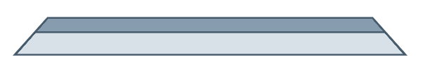
Here is a working example:
.trapezoid {  width: 500px;  height: 50px;  transform: perspective(5px) rotateX(1deg);  margin: 50px;  background: linear-gradient(to bottom, #889cb0, #889cb0 40%, #465b6c 40%, #465b6c 45%, #d8e0e8 45%);  border-top: 3px solid #465b6c;  border-bottom: 2px solid #465b6c;  border-right: 4px solid #465b6c;  border-left: 4px solid #465b6c;}
.flipped {  transform: perspective(5px) rotateX(-1deg);  background: linear-gradient(to top, #889cb0, #889cb0 40%, #465b6c 40%, #465b6c 45%, #d8e0e8 45%);  border-top-width: 2px;  border-bottom-width: 3px;}
<div class="trapezoid"></div><div class="trapezoid flipped"></div>How to draw a trapezium/trapezoid with css3?
You can use some CSS like this:
#trapezoid { border-bottom: 100px solid red; border-left: 50px solid transparent; border-right: 50px solid transparent; height: 0; width: 100px;}<div id="trapezoid"></div>How to resize trapezoid in CSS when browser window resize
You can't apply percentage units to border but you can achieve your aim with vw units :
1/100th of the width of the v+iewport. (source : MDN)
DEMO
body { position:relative; height:500px; margin:0; padding:0;}#personal { position:relative; background-color: red; width:100%; height:100%;}#floor { position:absolute; top:10px; border-bottom: 300px solid black; border-left: 19vw solid transparent; border-right: 19vw solid transparent; height: 10%; width: 60vw;}<body> <div id="personal"> <div id="floor"></div> </div></body>How do I turn the trapezoid opposite?
Your best option is to use pseudo elements so you dont have to use absolute positioning on the text element.
Using both :before and :after will help create the desired shape. The borders are also transparent so you don't have to worry about background images being coloured over.
#trapezoid { width: 260px; height: 190px; background: red; margin-left: 45px; position: relative;}#trapezoid:before { content: ''; border-right: 45px solid red; border-bottom: 190px solid transparent; position: absolute; left: -45px; top: 0;}#trapezoid:after { content: ''; border-left: 45px solid red; border-bottom: 190px solid transparent; position: absolute; right: -45px; top: 0;}<div id="trapezoid"> Text in here</div>Related Topics
Pure CSS Multi-Level Drop-Down Menu
Using CSS :Before and :After Pseudo-Elements With Inline Css
Why Does the Checkbox Stay Checked When Reloading the Page
CSS Background Image Not Loading
What Is It When a Link Has a Pound "#" Sign in It
Easier Way to Create Circle Div Than Using an Image
What Is the Meaning of ? (Question Mark) in a Url String
How to Auto-Format/Indent Xml/HTML in Notepad++
Hide Horizontal Scrollbar on an Iframe
Colspan/Rowspan For Elements Whose Display Is Set to Table-Cell
Displaying Unicode Symbols in Html
Is the 'Type' Attribute Necessary For ≪Script≫ Tags
Html Table With Horizontal Scrolling (First Column Fixed)
How to Change Font-Family of Drop Down's List Item
How to Center an Element in the Middle of the Browser Window