input / button elements not shrinking in a flex container
An input element, unlike a div, comes with a default width.
Here's a simple illustration of this setting:
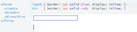
The browser automatically gives the input a width.
input {  border: 1px solid blue;  display: inline;}
div {  border: 1px solid red;  display: inline;}
<form> <input> <br><br> <div></div></form>How to make input inside flexbox size to available space?
This is because the input has a default width bigger than 100px. Add min-width:0 to the input to fix this:
div{  display:flex;  width:100px;  position:relative;  border:solid 1px #000;}
input{  flex:1;  display:block;  border:none;  min-width:0;}
<div> <input type="number"> <button>OK</button></div>Why don't flex items shrink past content size?
The Automatic Minimum Size of Flex Items
You're encountering a flexbox default setting.
A flex item cannot be smaller than the size of its content along the main axis.
The defaults are...
min-width: automin-height: auto
...for flex items in row-direction and column-direction, respectively.
You can override these defaults by setting flex items to:
min-width: 0min-height: 0overflow: hidden(or any other value, exceptvisible)
Flexbox Specification
4.5. Automatic Minimum Size of Flex
ItemsTo provide a more reasonable default minimum size for flex items, this
specification introduces a newautovalue as the initial value of
themin-widthandmin-heightproperties defined in CSS 2.1.
With regard to the auto value...
On a flex item whose
overflowisvisiblein the main axis, when specified on the flex item’s main-axis min-size property, specifies an automatic minimum size. It otherwise computes to0.
In other words:
- The
min-width: autoandmin-height: autodefaults apply only whenoverflowisvisible. - If the
overflowvalue is notvisible, the value of the min-size property is0. - Hence,
overflow: hiddencan be a substitute formin-width: 0andmin-height: 0.
and...
- The minimum sizing algorithm applies only on the main axis.
- For example, a flex item in a row-direction container does not get
min-height: autoby default. - For a more detailed explanation see this post:
- min-width rendering differently in flex-direction: row and flex-direction: column
You've applied min-width: 0 and the item still doesn't shrink?
Nested Flex Containers
If you're dealing with flex items on multiple levels of the HTML structure, it may be necessary to override the default min-width: auto / min-height: auto on items at higher levels.
Basically, a higher level flex item with min-width: auto can prevent shrinking on items nested below with min-width: 0.
Examples:
- Flex item is not shrinking smaller than its content
- Fitting child into parent
- white-space css property is creating issues with flex
Browser Rendering Notes
Chrome vs. Firefox / Edge
Since at least 2017, it appears that Chrome is either (1) reverting back to the
min-width: 0/min-height: 0defaults, or (2) automatically applying the0defaults in certain situations based on a mystery algorithm. (This could be what they call an intervention.) As a result, many people are seeing their layout (especially desired scrollbars) work as expected in Chrome, but not in Firefox / Edge. This issue is covered in more detail here: flex-shrink discrepancy between Firefox and ChromeIE11
As noted in the spec, the
autovalue for themin-widthandmin-heightproperties is "new". This means that some browsers may still render a0value by default, because they implemented flex layout before the value was updated and because0is the initial value formin-widthandmin-heightin CSS 2.1. One such browser is IE11. Other browsers have updated to the newerautovalue as defined in the flexbox spec.
Revised Demo
.container {  display: flex;}
.col {  min-height: 200px;  padding: 30px;  word-break: break-word}
.col1 {  flex: 1;  background: orange;  font-size: 80px;  min-width: 0;   /* NEW */}
.col2 {  flex: 3;  background: yellow}
.col3 {  flex: 4;  background: skyblue}
.col4 {  flex: 4;  background: red}
<div class="container"> <div class="col col1">Lorem ipsum dolor</div> <div class="col col2">Lorem ipsum dolor</div> <div class="col col3">Lorem ipsum dolor</div> <div class="col col4">Lorem ipsum dolor</div></div>Input doesn't respect flex container width
The reason it works in IE is because it picks up the flex-basis: 100%, but it shouldn't.
The reason it overflows in Chrome (and should in IE), is that a flex item can't by default be smaller than its content since its min-width is set to auto, and in this case form elements, such as input, have a default width set using the browsers built it style sheet.
The reason min-width: 0 works, is when set to 0 the flex item will, since its flex-shrink value is 1 (the default), be allowed to shrink, and does to adjust to its parent's width.
Stack snippet
.input-with-button {  display: flex;  width: 100px;  border: 5px solid blue;  margin-bottom: 10px;}
.input-with-button input {  flex-basis: 100%;  min-width: 0;                        /*  added  */}
<div class='input-with-button'> <div>Test</div></div>
<div class='input-with-button'> <input></div>Why input tag flex doesn't work?Overflow layout instead of evenly sizing?
Input has its default min-width which is auto so that reason only flex not able to resize it.
so you have to overwrite it with min-width:0.
input { min-width: 0;}<div style="display: flex; width: 300px; background: red; padding: 5px;"> <input style="flex: 1;"> <input style="flex: 1;"> <input style="flex: 1;"> <input style="flex: 1;"></div>Flex box ignoring width if input in flexitem
Flexbox items has a min-width that defaults to auto, which means they won't shrink below their contents width.
In this case your input element has a default width set in the user agent style sheet, which then dictate the size of the flex item.
Give the ele a min-width: 0 and it will work as expected.
.wrapper {  width: 200px;  display: -webkit-flex;  display: flex;  -webkit-align-items: center;  align-items: center;  -webkit-justify-content: center;  justify-content: center;  flex-direction: row;}
.ele {  display: -webkit-flex;  display: flex;  -webkit-align-items: center;  align-items: center;  -webkit-justify-content: center;  justify-content: center;  flex-direction: row;  flex: 3;  min-width: 0;}
.ele1 {  flex: 1;}
.ele input {  display: inline;  max-width: 100%;}
<div class="wrapper"> <div class="ele ele3" style="background-color: red;"> <input type="number" value="9999" /> </div> <div class="ele ele1" style="background-color: green;"> 2 </div> <div class="ele ele3" style="background-color: yellow;"> <input type="number" value="9999" /> </div></div>flexbox form not filling up full width of available space
Ok I figured it out you do it on the child
.form-container {
  background-color: red;
}

.search-form {
  display: flex;
  align-items: flex-start;
}

.sesrch-form label {
  flex-grow: 1;
}
<div class="form-container">
  <form role="search" method="get" class="search-form" action="/">
    <label>
      <span class="screen-reader-text">Test form</span>
      <input type="search" class="search-field" placeholder="field" value="search" name="s" title="search input" />
    </label>
    <input type="submit" class="search-submit button" value="search" />
  </form>
</div>
Why does the width of my input grow so much?
Thanks to one of @Michael_B's comments, I managed to identify the issue. Browsers set a minimum width to input tags.
- input / button elements not shrinking in a flex container
- Why doesn't the <input> element respect min-width?
I applied width: 0 on the input and the width scaled down to the value I was expecting.
Related Topics
Linking to Another HTML Page in Google Apps Script
Onclick on Option Tag Not Working on Ie and Chrome
How to Change Bootstrap 3 Column Order on Mobile Layout
Is ≪Img≫ Element Block Level or Inline Level
Freeze the Top Row For an HTML Table Only (Fixed Table Header Scrolling)
What Is the Correct Value For the Disabled Attribute
Using Sections in Editor/Display Templates
Center a Div Horizontally and Vertically
How to Target a Specific Column or Row in CSS Grid Layout
Open Link in New Tab or Window
Draw on Html5 Canvas Using a Mouse
Using HTML and Local Images Within Uiwebview
Why Are Bootstrap Tabs Displaying Tab-Pane Divs With Incorrect Widths When Using Highcharts
Can You Provide Examples of Parsing Html
Last Margin/Padding Collapsing in Flexbox/Grid Layout
How to Vertically Align Text Inside a Flexbox
How to Set the Margin or Padding as Percentage of Height of Parent Container