How to draw a trapezium/trapezoid with css3?
You can use some CSS like this:
#trapezoid { border-bottom: 100px solid red; border-left: 50px solid transparent; border-right: 50px solid transparent; height: 0; width: 100px;}<div id="trapezoid"></div>Creating a trapezium in CSS and/or HTML
you could do this "by hand"
html:
<canvas id="polygon" />
javascript
var polygon = document.getElementById('polygon').getContext('2d');
polygon.fillStyle = '#f00';
polygon.beginPath();
polygon.moveTo(0, 0);
polygon.lineTo(90,50);
polygon.lineTo(70, 70);
polygon.lineTo(0, 90);
polygon.closePath();
polygon.fill();
this doesn't make shure it's convex and it has no parallel lines. You have to put in the correct coordinates.
Fiddle: http://jsfiddle.net/8t4rZ/
Quadrilateral Trapezoid in CSS
You can do this with :before pseudo element on each div.
#container { margin-left: 100px; width: 200px; right: 20px;}.three-bars,.red,.orange,.blue { color: white; height: 50px; margin: 10px; padding: 10px; float: right; font-size: 20px; text-align: right; position: relative;}.red { width: 100px; background-color: #da3421;}.orange { width: 150px; background-color: #ec9a4c;}.blue { width: 200px; background-color: #5ab7c4;}a > div:before { content: ''; position: absolute; left: 0; top: 0; width: 0; height: 0; border-style: solid; border-width: 0 0 70px 70px; border-color: transparent transparent black; transform: translateX(-100%);}.red:before { border-color: transparent transparent #da3421;}.orange:before { border-color: transparent transparent #ec9a4c;}.blue:before { border-color: transparent transparent #5ab7c4;}<div id="container"> <a class="page-scroll" href="#red "> <div class="red"> <p>=FIRST-</p> </div> </a> <a class="page-scroll" href="#orange"> <div class="orange"> <p>--SECOND--</p> </div> </a> <a class="page-scroll" href="#blue"> <div class="blue"> <p>--- THIRDBOX ---</p> </div> </a></div>How to make a trapezium with a border
You can use pseudo-element and use perspective on parent to create that shape as background.
body { background: lightblue;}div { width: 150px; height: 40px; padding: 20px; display: flex; align-items: center; justify-content: center; position: relative; -webkit-perspective: 130px; perspective: 130px; margin: 50px;}div:after { position: absolute; width: 100%; height: 100%; background: lightgreen; border: 1px solid white; content: ''; left: 0; top: 0; z-index: -1; -webkit-transform: rotateX(20deg) rotateY(0deg); transform: rotateX(20deg) rotateY(0deg);}<div>Some text</div>Can CSS create a multi-colored trapezoid?
The CSS approach: transformation and gradient
You can achieve the shape with tranksform: perspective and a linear-gradient. The gradient can also create the line in the middle. For the outer line, just use a border and adjust its width on the four sides according to your needs.
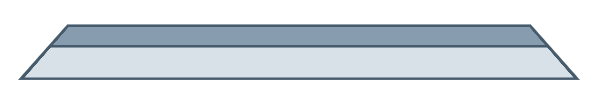
Here is a working example:
.trapezoid {  width: 500px;  height: 50px;  transform: perspective(5px) rotateX(1deg);  margin: 50px;  background: linear-gradient(to bottom, #889cb0, #889cb0 40%, #465b6c 40%, #465b6c 45%, #d8e0e8 45%);  border-top: 3px solid #465b6c;  border-bottom: 2px solid #465b6c;  border-right: 4px solid #465b6c;  border-left: 4px solid #465b6c;}
.flipped {  transform: perspective(5px) rotateX(-1deg);  background: linear-gradient(to top, #889cb0, #889cb0 40%, #465b6c 40%, #465b6c 45%, #d8e0e8 45%);  border-top-width: 2px;  border-bottom-width: 3px;}
<div class="trapezoid"></div><div class="trapezoid flipped"></div>CSS Trapezoid Button With Solid Border
Try the following code:
OPTION 1: PURE CSS
The logic of this approach is to add a thick border-bottom and a thick transparent border-right to achieve a tab effect;
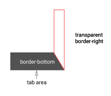
- PROS: very minimal styling and very easy to understand.
- CONS: very limited in terms of customisation (i.e. can't add border to the tab)
.tabs {  display: flex;  flex-direction: row;}
.tab {    height: 0;    width: 120px;    border-bottom: 50px solid #CCCCCC;    border-right: 20px solid transparent;    border-top-left-radius: 5px;    box-sizing: border-box;    display: block;}
.tab:not(:first-child) {    margin-left: -10px;    z-index: 0;}
.tab .label{  padding: 15px;  text-align: center;  color: #444444;}
.active {  border-bottom: 50px solid #444444;  z-index: 10;}.active .label{  color: #ffffff;}
<div class="tabs"><div class="tab active"><div class="label">TAB 1</div></div><div class="tab"><div class="label">TAB 2</div></div><div class="tab"><div class="label">TAB 3</div></div></div>Responsive CSS Trapezoid Shape
There are many different ways to create the trapezoid shape and each have their own benefits and downfalls.
Below is a comprehensive list of the various ways and all should be responsive.
CSS Border
The most well supported of all the answers. It is supportwed way back to IE and across all other browsers both on the desktop and mobile.
- border - CSS | MDN
#trapezoid { border-left: 20vw solid red; border-top: 5vw solid transparent; border-bottom: 5vw solid transparent; width: 0; height: 10vw;}<div id="trapezoid"></div>Trapezoid div in CSS
Here is a way to create a trapzoid like div.
This uses the ::before and ::after pseudo elements
.example { margin: 20px 0px; position: relative; display: inline-block; width: 200px; height: 200px; background-color: gray; color: white; font-size: 2rem;}.example::before { content: ""; position: absolute; top: -20px; border-top: 20px solid transparent; border-left: 0px solid transparent; border-right: 200px solid gray; border-bottom: 0px solid gray;}.example::after { content: ""; position: absolute; bottom: -20px; border-bottom: 20px solid transparent; border-left: 0px solid transparent; border-right: 200px solid gray; border-top: 0px solid gray;}<div class="example"> <p>Example</p></div>How to draw a trapezium/trapezoid with react-native?
try this out
var Trapezoid = React.createClass({
 render: function() {
return (
  <View style={styles.trapezoid} />
 )
}
})

trapezoid: {
 width: 200,
 height: 0,
 borderBottomWidth: 100,
 borderBottomColor: 'red',
 borderLeftWidth: 50,
 borderLeftColor: 'transparent',
 borderRightWidth: 50,
 borderRightColor: 'transparent',
 borderStyle: 'solid'
}
for more such shapes checkout https://codedaily.io/tutorials/22/The-Shapes-of-React-Native
Related Topics
Ellipsis For Overflow Text in Dropdown Boxes
Html5 Canvas and Anti-Aliasing
Use CSS Gradient Over Background Image
Where Does Persistent File System Storage Store with Chrome
Why Is My Textarea Higher Up Than Its Neighbor
How to Securely Use Google API Keys
:Nth-Child(Even/Odd) Selector with Class
How to Allow Only One Radio Button to Be Checked
Html: Changing Colors of Specific Words in a String of Text
I Have Position But Z Index Is Not Working
Align Labels in Form Next to Input
Expand Div to Max Width When Float:Left Is Set
Bootstrap - Align Button to the Bottom of Card
How to Have Two Fixed Width Columns With One Flexible Column in the Center