How to crop a rectangular image into a square with CSS?
Assuming they do not have to be in IMG tags...
HTML:
<div class="thumb1">
</div>
CSS:
.thumb1 {
  background: url(blah.jpg) 50% 50% no-repeat; /* 50% 50% centers image in div */
  width: 250px;
  height: 250px;
}

.thumb1:hover { YOUR HOVER STYLES HERE }
EDIT: If the div needs to link somewhere just adjust HTML and Styles like so:
HTML:
<div class="thumb1">
<a href="#">Link</a>
</div>
CSS:
.thumb1 {
  background: url(blah.jpg) 50% 50% no-repeat; /* 50% 50% centers image in div */
  width: 250px;
  height: 250px;
}

.thumb1 a {
  display: block;
  width: 250px;
  height: 250px;
}

.thumb1 a:hover { YOUR HOVER STYLES HERE }
Note this could also be modified to be responsive, for example % widths and heights etc.
How to center and crop an image to always appear in square shape with CSS?
jsFiddle Demo
div {
    width: 250px;
    height: 250px;
    overflow: hidden;
    margin: 10px;
    position: relative;
}
img {
    position: absolute;
    left: -1000%;
    right: -1000%;
    top: -1000%;
    bottom: -1000%;
    margin: auto;
    min-height: 100%;
    min-width: 100%;
}
<div>
<img src="https://i.postimg.cc/TwFrQXrP/plus-2.jpg" />
</div>CSS - How to crop an image to a square, if it's already square then resize it
METHOD 1
Will work for horizontal rectangle images (larger in width), if you need vertical images you can change height:100% for width:100%
HTML
<div class="img-container">
    <img src="http://lorempixel.com/250/250" />
</div>
CSS
.img-container {
    width: 90px;
    height: 90px;
    overflow: hidden;
}
.img-container img {
    height: 100%;
}
Example fiddle First image is resized, second is cropped
METHOD 2
Works for all image sizes
HTML
<div class="img" style="background-image:url('http://lorempixel.com/250/250')"></div>
CSS
.img{
    width: 90px;
    height: 90px;
    background-size: cover;
}
Example fiddle
How do I make images display as a square?
This really has nothing to do with Django or Bootstrap. You'll want to set your images as backgrounds on .image so they can be cropped to square.
<div class="image" style="background-image: url(/{{competition.image.url}});" ></div>
Also make sure you have CSS applied to fill the element with the background image:
.card .image {
    background-size: cover;
}
You could also try to force the image to stretch to 100% of the height of .image and hide the horizontal overflow, but the background approach is simpler.
How to center crop an image (<img>) in fluid width container
When It Works
You might have a container that holds some content such as two <div>s that are 50% wide each, sitting next to each other. For this example, we can illustrate just one child of the container: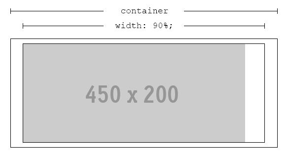
We'll name outer rectangle .container, the inner rectangle .content and the image img. This arrangement is perfectly fine, as long as .content is always wider than img.
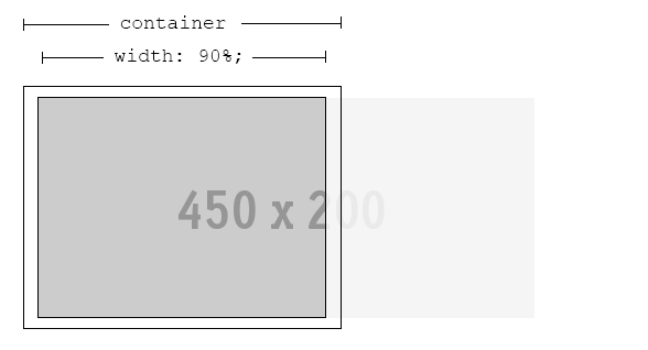
When It Breaks
Since we're dealing with percentages and probably working with a responsive design, this may not always be the case. If .content is ever thinner than img, cropping will occur:
The Problem
If the most interesting part of img is in the center, we need to get the browser to crop both edges evenly - leaving the best part of it visible, no matter what width of .content is.
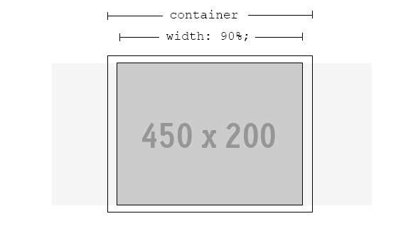
The Solution
Fortunately, a solution is possible. Even better, no extra markup is required.
.content {
    width: 90%; /* or whatever is required */
    text-align: center; /* ensures the image is always in the h-middle */
    overflow: hidden; /* hide the cropped portion */
}

img {
    position: relative; /* allows repositioning */
    left: 100%; /* move the whole width of the image to the right */
    margin-left: -200%; /* magic! */
}
CSS scale and square center crop image
You can do this easily in CSS if you use background-image.
.thumb {
    display: inline-block;
    width: 200px;
    height: 200px;
    margin: 5px;
    border: 3px solid #c99;
    background-position: center center;
    background-size: cover;
}
In this fiddle, first image is 400x800, second image is 800x400:
http://jsfiddle.net/samliew/tx7sf
Force Images to be square and centered in css
try like this
.img-container {
  position:relative;
}

.img-container img {
  position:absolute;
  margin:auto;
  top:0;
  right:0;
  left:0;
  bottom:0;
  max-height:100%;
  max-width:100%;
}
JS Fiddle
Related Topics
Do You Need to Close Meta and Link Tags in HTML
Question Mark Characters Display Within Text. Why Is This
What Do Square Brackets in Class Names Mean
Angular4 - Scrolling to Anchor
Bootstrap Row and Col Explanation
How Position Absolute and Fixed Block Elements Get Their Dimension
Inline Svg Vs Svg File Performance
Is It Correct to Use Div Inside Form
Making Href (Anchor Tag) Request Post Instead of Get
Accessibility: Recommended Alt-Text Convention for Svg and Mathml
Margin Collapsing with Floated Element, Why There Is an Extra Margin Added
Text-Decoration Not Working for Visited State Link
CSS Calc Viewport Units Workaround
CSS: Outline-Offset Alternative for Ie
Why Use Definition Lists (Dl,Dd,Dt) Tags for HTML Forms Instead of Tables