CSS stacking div with variable height on two columns
Short of nesting your divs in columns:
<div class="left-column">
    <div class="infoBox">...</div>
    <div class="infoBox">...</div>
</div>
<div class="right-column">
    <div class="infoBox">...</div>
    <div class="infoBox">...</div>
</div>
you could try jQuery Masonry. Here's a fiddle demonstrating its use.
Two floated columns - one fixed, one loose width
Have a look at this.
There aren't any demos, but I've used tutorials from this guy before so I assume it works fine. I gather from the article that the main content is liquid. The side content may also be liquid, but I think you can just give it a fixed width and leave it at that. The trick here is to place the main content first.
Two columns, left with fixed width, right with dynamic width
You can do it with CSS. The trick is to use a float (the left div) and a non-floating div (the right one). Also the left (floating) div, needs to have a minimum height, otherwise the right (non-floating) div will take the space of the left column if the left doesn't have any content.
EDIT: The right <div> should also have the following rules:
overflow: hidden;
display: block;
The overflow: hidden makes the right div behave as a column, otherwise its content would flow around the left div.
Note that the #wrapper doesn't need a width because the default width of a <div> is 100% (since you said it will take the full width of the browser window), and also remove its margins.
Here's an example (I changed the <section> to <div> for the sake of the non HTML5 browsers but it works the same).
I placed background colours to distinguish all the elements.
http://jsfiddle.net/pmv3s/1/
Here is the full screen version: http://fiddle.jshell.net/pmv3s/1/show/light/
The CSS:
#wrapper {
    padding: 40px 0;
    overflow: hidden;
    background-color: red;
    min-height: 5px;
}
#list {
    float: left;
    width: 200px;
    background-color: green;
    overflow: hidden;
    min-height: 100px;
}
#grid {
    display: block;
    float: none;
    background-color: blue;
    min-height: 100px;
    overflow: hidden;
}
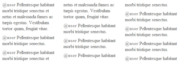
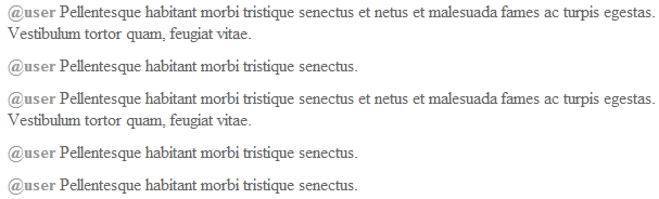
Display 3-column layout with variable-height content in fixed height box?
Using just CSS, columns appear to be the best way.
demo
HTML
Each tweet is just a pair of <strong> usernames, and <p> tweet bodies. Change these to whatever you like, but make sure to change the CSS to match.
<div class="threecol">
<strong>@someone</strong>
<p>Pellentesque habitant morbi tristique senectus et netus et malesuada fames ac turpis egestas. Vestibulum tortor quam, feugiat vitae.</p>
<strong>@nextuser</strong>
<p>...</p>
</div>
CSS
This CSS is for the container. Other than your specificiations (width, height, hidden overflow) it just adds the column settings.
.threecol {
  height: 200px;
  width: 600px;
  margin: auto;
  overflow: hidden;
  -webkit-column-count: 3;
  -moz-column-count: 3;
  column-count: 3;
}
This is just for your style where you want the tweets to fall into line with the @names.
p {
  display: inline;
  width: 30%;
}
This causes a line break between a <p> and the following tweet.
p:after {
  display: block;
  content: '';
  margin: 10px 0;
}
Browser Compatibility
For this simple setup, it should work fine on most browsers. For old browsers, they'll just have everything stacked, which will still look okay, and show almost as many tweets.
Problems
- A tweet could cut be cut off if it wraps into the (hidden) fourth column.
- jQuery reports incorrect top/left and (seemingly incorrect) width/height for elements in columns.
- This is based on a draft of a W3 standard, and the syntax is subject to change. That said, it probably won't change much at this point.
Alternatives
You could search for a Masonry plugin, and hide elements whose bottom is below its container's bottom. Probably the best solution for fixed height containers.
Stacking divs with variable height in 2 columns like Facebook Timeline
I worked on this last night and found a rather simple way to do.
Compare the bottom position of the left column and the right column, append the new li element to the side with smaller value, which can be done by th e following way:
var last_left_post = $('.left:last');
var last_right_post = $('.right:last');
var left_position = 0;
var right_position = 0;

left_position = last_left_post.height() + last_left_post.offset().top;
right_position = last_right_post.height() + last_right_post.offset().top;

if(left_position<=right_position){
    $('#timeline').append('<li class="left"></li>');
}else{
    $('#timeline').append('<li class="right"></li>');
}
.left and .right using the same css as you do.
2 column div layout: right column with fixed width, left fluid
Remove the float on the left column.
At the HTML code, the right column needs to come before the left one.
If the right has a float (and a width), and if the left column doesn't have a width and no float, it will be flexible :)
Also apply an overflow: hidden and some height (can be auto) to the outer div, so that it surrounds both inner divs.
Finally, at the left column, add a width: auto and overflow: hidden, this makes the left column independent from the right one (for example, if you resized the browser window, and the right column touched the left one, without these properties, the left column would run arround the right one, with this properties it remains in its space).
Example HTML:
<div class="container">
    <div class="right">
        right content fixed width
    </div>
    <div class="left">
        left content flexible width
    </div>
</div>
CSS:
.container {
height: auto;
overflow: hidden;
}
.right {
width: 180px;
float: right;
background: #aafed6;
}
.left {
float: none; /* not needed, just for clarification */
background: #e8f6fe;
/* the next props are meant to keep this block independent from the other floated one */
width: auto;
overflow: hidden;
}
Example here: http://jsfiddle.net/jackJoe/fxWg7/
Multiple fixed-width columns don't fit side-by-side
Because you have border, and your divs not 300px. Your divs are 302px.
Just add box-sizing: border-box to your divs.
 #c1, #c2, #c3 {
  float: left;
  width: 300px;
  height: 50px;
  margin: 10px;
  border: 1px dashed black;
  box-sizing: border-box;
}
Here is JSFiddle demo
CSS: two floating div columns with equal height, with vertically split right div
I have CSS solution, as JS is not do-able..
Example: here
all "columns" are inline blocks forced not to wrap, that way you can vertically align them all, then the 3rd "column" (bottom right) is slotted into place via a negative margin
Related Topics
Div with Triangle at the Bottom with Background Image
Line Height Issue with Inline-Block Elements
Make Two Parallel '<Div>' Colums the Same Height
Vertical Align Block Level Element Inside a Block Level Element
Aligning Two Flex Items: One to the Top, the Other Centered
Generate Scroll Bar for Overflow to the Left
How to Add a Background Image on Top of a Previous Background Image
Why Is There Vertical Scroll on the Main Container
How to Save a File from a Website as PDF
Responsive Image Align Center Bootstrap 3
How to Tidy Up an HTML File's Indentation in Vi
How to Insert Spaces/Tabs in Text Using HTML/Css
Fixed Positioned Header Persists on Desktop But Not on Mobile
How to Underline All Rows in Textarea
Some Elements Missing While Downloading from Httpwebrequest
How to Make an Upvote/Downvote Button
Absolute Positioning Ignoring Padding
Internet Explorer Doesn't Recognise the 'Html' CSS Background Image Tag