Difference Between HTML LINK Media and CSS Media Queries
Regarding the stylesheet download, here is what the current spec draft says:
User agents should re-evaluate media queries in response to changes in the user environment, for example if the device is tiled from landscape to portrait orientation, and change the behavior of any constructs dependent on those media queries accordingly.
This means you can’t just evaluate each media-query and then download the appropriate stylesheets because the environment can change, causing the re-evaluation of these media-queries. I think it could be optimized, but for now all browsers download all stylesheets, regardless of media-queries.
For your second question, specs don’t mention any difference between HTML- and CSS-declared media-queries. Nested media-queries are allowed since CSS3, and putting @media-rules in a stylesheet which is already tagged with media="…" should be the same as a pure CSS nested media-query.
CSS Media Queries -> Link vs @media
You can have a large number of specific files modularized quite nicely and extremely specifically depending on what device is being targeted, and only the files you need will be retrieved.
This (the emphasized portion) is a very common misconception about stylesheets loaded via media queries in <link> elements. (What you said about modularization of files still holds true.)
All files will be loaded regardless of the media queries being applied to <link> elements. A file is not loaded only when a media query is met, because there is no guarantee that the browser won't meet it (or even stop meeting it) when some of its properties change while viewing the same page.
For instance if you rotate a mobile device from portrait to landscape, it would stop matching (orientation: portrait) and start matching (orientation: landscape). It needs to make sure the styles in the latter are ready to apply as it switches to that format, so the styles have to be loaded beforehand.
The HTML5 spec for the <link> element does not make any mention of how the media attribute should determine whether or not a resource should be loaded. The Media Queries spec doesn't define how style sheets should be loaded with respect to media queries, however it does state this in a note:
User agents are expected, but not required, to re-evaluate and re-layout the page in response to changes in the user environment, for example if the device is tilted from landscape to portrait mode.
Is it best to group similar media queries at the end of the CSS or to just keep them separated within the CSS?
Media queries were introduced in CSS3 are used for responsive CSS over different media types. Since usually the CSS code itself is applied for describing the presentation of the document or page, responsiveness is a separate feature altogether, so usually they are kept separate at the end of the CSS formatting codes. However, let me answer this question by stating the usage of both of the formats mentioned in the question.
At the end of code
Most templates of CSS available online usually keep their media queries at the bottom of the entire code making it easier to access and work with the responsiveness feature. Whenever the focus is more on "chasing device-widths" then this type of coding practice helps.
As observed, this allows to group together many basic CSS attributes that are applied over many elements.
Also, considering the cascading nature of CSS, the styling below usually (not always, refer this to know more) overwrites the styling present above. With @media queries present at the bottom of the stylesheet, it allows easy overwriting of relevant styles present above.
Finally ,as mentioned by @rguttersohn, media queries along with @keyframes are kept at the end with @keyframes usually above @media. This makes coding cleaner and easier to comprehend by others as well.
Below relevant styling counterparts
If styling is more layout-centric, it's highly useful to place @media queries next to their styling counterparts. This allows ease in editing the style and its corresponding @media query both in a single go.
This does mean that there is slightly more code, but these too can be cut down by grouping at breakpoints and section ends.
This type of styling is rarely seen in templates available online, however it's an ongoing trend.
To Summarize: I personally am of the opinion to keep all of the @media queries together at the bottom, but if I had to divide the labor of styling, I would opt for keeping the styles and @media queries together.
Also, given the broad and opinionated scope of this question, I think no answer can determined as right or wrong. I hope this answer brings enough light and information to the question.
Media=All vs Media=Screen
media="all"    // Used for all media type devices ( its default under html 5)
media="screen" // Used for computer screens(default value  for html 4.01)
Good read
7.3 Recognized media types
Is there no difference between No media and media=“all” in css link?
Media Queries, which one is the better way and why?
Clearly one would prefer to group the media query versions of the CSS rules together with the non-media query versions, so they can be managed together. For example, if I write separate CSS for each component, I would usually want both media query versions and non-media query versions of the rules for that component to be in the file for that component. When I add and modify rules, I would prefer to do that in one place, rather than two or more.
If it bothers you that you have to write the media query again and again, which is a valid concern from the standpoint of maintaining your code when changing breakpoints, consider using a preprocessor such as postCSS which allows you to define aliases for media queries. For instance, this plugin would allow you to write
@custom-media --small-viewport (max-width: 30em);

@media (--small-viewport) {
  /* styles for small viewport */
}
What is the utility of the media attribute in the Link tag?
An advantage of using the media attribute in a link tag that was not mentioned is that by including styles this way we can avoid CSS render blocking.
Let's say I have a page that the very basic style is set inline, but I also have styles for tablet (768px) in an external file and some others styles that are only applied on tablets.
I have recorded the rendering process for both cases with media attribute in link tag and without with Google Chrome DevTools. In order to see this working, I have added network throttling to Slow 3G and CPU slow down to (20x slowndown)
This is the first version not using media attribute in the link tag:
<!DOCTYPE html>
<html lang="en">
<head>
  <meta charset="UTF-8">
  <meta name="viewport" content="width=device-width, initial-scale=1.0">
  <title>Document</title>
  <link href="http://demo.wpthemego.com/themes/sw_emarket/wp-content/cache/wpfc-minified/228b2c494ae153cae7dd875ddf3b1a2f/1503393313index.css" rel="stylesheet">
  <link href="https://www.youtube.com/yts/cssbin/player-vflSoLyqv/www-player-webp.css" rel="stylesheet">
  <style>
    h1 {
      background: yellow;
      color: black;
      font-size: 2rem;
      font-weight: lighter;
    }
  </style>
</head>
<body>
  <h1>blocked render</h1>
</body>
</html>
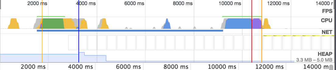
The stats:
- First render at 1100ms
- The style rendering is deferred until all css are downloaded and parsed (CSS render blocking)
The second version using media attribute:
<!DOCTYPE html>
<html lang="en">
<head>
  <meta charset="UTF-8">
  <meta name="viewport" content="width=device-width, initial-scale=1.0">
  <title>Document</title>
  <link media="(min-width: 768px)" href="http://demo.wpthemego.com/themes/sw_emarket/wp-content/cache/wpfc-minified/228b2c494ae153cae7dd875ddf3b1a2f/1503393313index.css" rel="stylesheet">
  <link media="(min-width: 768px)" href="https://www.youtube.com/yts/cssbin/player-vflSoLyqv/www-player-webp.css" rel="stylesheet">
  <style>
    h1 {
      background: yellow;
      color: black;
      font-size: 2rem;
      font-weight: lighter;
    }
  </style>
</head>
<body>
  <h1>Not render blocked under 768px</h1>
</body>
</html>
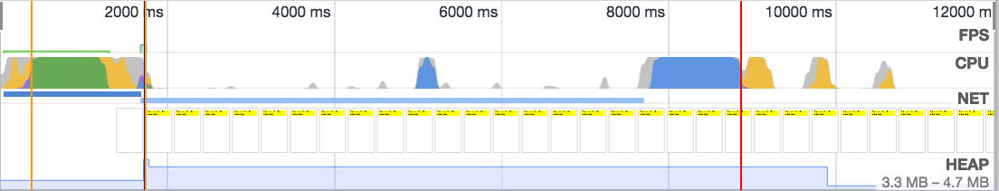
The stats:
- First render at 2000ms
- The style is rendered because the browser knows that the links tags are only applied to screens wider than
728px
So using media attribute helps us to prevent render blocking and improve the critical rendering path. For further information please read the article in Developers Google Render Blocking CSS
Media queries: Overriding CSS rules vs defining screen specific CSS rules
<link> tags with unmatched media queries are download with low priority so that they don't block page rendering, but are still downloaded in order to be available in case media properties change (for example by rotating a smartphone or by zooming out a desktop browser). There is an advantage in having separate stylesheets for different media types, but there is also a disadvantage in creating multiple HTTP requests.
Media blocks inside a stylesheet are already downloaded and I would assume that they are compiled anyway, so it's not really the same as a media query in the tag. But if a certain set of rules is only relevant to a certain width and is always overriden in wider screens, it makes sense to tell the browser that by encapsulating it inside a media query. It's not just about the original page rendering but about any change to the window or to the DOM that requires a redraw - the less rules the browser would need to evaluate, the faster it would be.
Is there no difference between No media and media=all in css link?
In HTML 4.01, the default value is screen.
In HTML5, the default value has been changed to all.
Therefore, it depends on the doctype declaration you use in your page. Never mind, user agents get confused about standards anyway; see Knu's comment. (I bet this is why they changed it to all in HTML5.)
Then again, this only really matters if you're supporting user agents that don't present pages on digital screens, or display any visual information for that matter.
Media query in HTML link is not linking to separate CSS file
This is due to the order in which you are linking the CSS files.
You need the mobile.css classes to override the ones specified in stylesheet.css, so include it second.
<link rel='stylesheet'  href='stylesheet.css' />
<link rel='stylesheet' media='screen and (max-width: 700px)' href='mobile.css' />
Related Topics
CSS: Display:Block; Vs Display:Table;
Chrome/Safari Display Border Around Image
Put Search Icon Near Textbox Using Bootstrap
Why Does Perspective Changes Fixed Position in CSS
Poor Anti-Aliasing of Text Drawn on Canvas
Gmail Displaying Gaps Between Images
How to Stop <Div> Tags Interfering with Counters
Special Character Not Displaying as Expected
How to Use Nth-Child for Styling with a Table with Rowspan
Right Align Text Within Bootstrap 4 Breadcrumbs
CSS Styles Not Applied Properly,If Use Doctype
CSS I Want a Div to Be on Top of Everything
How to Select Multiple Elements in The Chrome Developer Tools Elements Panel