Change the color of glyphicons to blue in some- but not at all places using Bootstrap 2
Finally I found answer myself. To add new icons in 2.3.2 bootstrap we have to add Font Awsome css in you file. After doing this we can override the styles with css to change the color and size.
<link href="http://netdna.bootstrapcdn.com/font-awesome/3.2.1/css/font-awesome.css" rel="stylesheet">
CSS
.brown{color:#9b846b}
If we want change the color of icon then just add brown class and icon will turn in brown color. It also provide icon of various size.
HTML
<p><i class="icon-camera-retro icon-large brown"></i> icon-camera-retro</p> <!--brown class added-->
<p><i class="icon-camera-retro icon-2x"></i> icon-camera-retro</p>
<p><i class="icon-camera-retro icon-3x"></i> icon-camera-retro</p>
<p><i class="icon-camera-retro icon-4x"></i> icon-camera-retro</p>
How to change color of bootstrap glyphicon?
Use color
 <button type="button"
      class="btn btn-info btn-lg" ng-click="serverFiles()"
      style="margin-left: 10px; color:#FF0000;">
          <span class="glyphicon glyphicon-folder-close"></span></button>
But remember that it is desirable to avoid the use of inline style is better use classes or references based on external css configuration items
 <button type="button"
      class="btn btn-info btn-lg mybtn-blue" ng-click="serverFiles()"
      style="margin-left: 10px;">
          <span class="glyphicon glyphicon-folder-close"></span></button>
edn for external css
.mybtn-blue {
   color: blue;
}
change bootstrap colors glyphicons
You don't need jQuery for this at all - just CSS. You can also get rid of your :before styling, and add a custom class to the glyphicon like so:
<a href='#' ><span class="glyphicon glyphicon-thumbs-up custom"></span></a>
and then add styling to .custom and then .custom:active for the click-styling:
.custom{
  color:#7f8c8d;
  opacity:0.7;
}

.custom:active{
  color:red
}
Here is a working example: http://www.bootply.com/IAjESfRw0T
How to apply custom color to glyficon icon embed within a link styled with Boostratp 3.3.x?
You need to add color in a tag. like this:
table th a {
   color: gray;
}
table th a {
   color: gray;
}
<link rel="stylesheet" href="https://maxcdn.bootstrapcdn.com/bootstrap/3.3.7/css/bootstrap.min.css" />
<div class="container-fluid">
<table class="table table-striped" id="contacts">
<thead>
<tr>
<th scope="col">Lastname
<a href="?order_by=lastname&direction=desc">
<!-- This needs to be black/grey with a lower font-size -->
<span class="glyphicon glyphicon-triangle-top glyphicon-size-sm" aria-hidden=true></span>
</a>
<a href="?order_by=lastname&direction=asc">
<span class="glyphicon glyphicon-triangle-bottom glyphicon-size-sm" aria-hidden=true></span>
</a>
</th>
<th scope="col">Firstname
<a href="?order_by=firstname&direction=desc">
<!-- This needs to be black/grey with a lower font-size -->
<span class="glyphicon glyphicon-triangle-top glyphicon-size-sm" aria-hidden=true></span>
</a>
<a href="?order_by=firstname&direction=asc" class="btn btn-default btn-xs">
<!-- This needs to be black/grey with a lower font-size -->
<span class="glyphicon glyphicon-triangle-bottom glyphicon-size-sm" aria-hidden=true></span>
</a>
</th>
</tr>
</thead>
<tbody>
<!-- content here -->
</tbody>
</table>
</div>Can I add color to bootstrap icons only using CSS?
Yes, if you use Font Awesome with Bootstrap! The icons are slightly different, but there are more of them, they look great at any size, and you can change the colors of them.
Basically the icons are fonts and you can change the color of them just with the CSS color property. Integration instructions are at the bottom of the page in the provided link.
Edit: Bootstrap 3.0.0 icons are now fonts!
As some other people have also mentioned with the release of Bootstrap 3.0.0, the default icon glyphs are now fonts like Font Awesome, and the color can be changed simply by changing the color CSS property. Changing the size can be done via font-size property.
Change accordion button collapsed icon color in Bootstrap 5
Because it is a background-image (using the bootstrap icons) that is set in the ::after pseudo element, so change the image
Update - (based on OP comment)
It replaces the icon with the image. How do I change the color of the existing image (icon)?
So use the same background-image and change the fill to #fff
Note that SVG URL is encoded by boostrap
.accordion-button.collapsed {
  background: blue
}

.accordion-button.collapsed::after {
  background-image: url("data:image/svg+xml,%3csvg xmlns='http://www.w3.org/2000/svg' viewBox='0 0 16 16' fill='%23fff'%3e%3cpath fill-rule='evenodd' d='M1.646 4.646a.5.5 0 0 1 .708 0L8 10.293l5.646-5.647a.5.5 0 0 1 .708.708l-6 6a.5.5 0 0 1-.708 0l-6-6a.5.5 0 0 1 0-.708z'/%3e%3c/svg%3e");
}
<!-- CSS only -->
<link href="https://cdn.jsdelivr.net/npm/bootstrap@5.0.0-beta2/dist/css/bootstrap.min.css" rel="stylesheet" integrity="sha384-BmbxuPwQa2lc/FVzBcNJ7UAyJxM6wuqIj61tLrc4wSX0szH/Ev+nYRRuWlolflfl" crossorigin="anonymous">
<div class="accordion" id="accordionExample">
<div class="accordion-item">
<h2 class="accordion-header" id="headingOne">
<button class="accordion-button" type="button" data-bs-toggle="collapse" data-bs-target="#collapseOne" aria-expanded="true" aria-controls="collapseOne">
Accordion Item #1
</button>
</h2>
<div id="collapseOne" class="accordion-collapse collapse show" aria-labelledby="headingOne" data-bs-parent="#accordionExample">
<div class="accordion-body">
<strong>This is the first item's accordion body.</strong> It is hidden by default, until the collapse plugin adds the appropriate classes that we use to style each element. These classes control the overall appearance, as well as the showing and
hiding via CSS transitions. You can modify any of this with custom CSS or overriding our default variables. It's also worth noting that just about any HTML can go within the <code>.accordion-body</code>, though the transition does limit overflow.
</div>
</div>
</div>
<div class="accordion-item">
<h2 class="accordion-header" id="headingTwo">
<button class="accordion-button collapsed" type="button" data-bs-toggle="collapse" data-bs-target="#collapseTwo" aria-expanded="false" aria-controls="collapseTwo">
Accordion Item #2
</button>
</h2>
<div id="collapseTwo" class="accordion-collapse collapse" aria-labelledby="headingTwo" data-bs-parent="#accordionExample">
<div class="accordion-body">
<strong>This is the second item's accordion body.</strong> It is hidden by default, until the collapse plugin adds the appropriate classes that we use to style each element. These classes control the overall appearance, as well as the showing
and hiding via CSS transitions. You can modify any of this with custom CSS or overriding our default variables. It's also worth noting that just about any HTML can go within the <code>.accordion-body</code>, though the transition does limit overflow.
</div>
</div>
</div>
<div class="accordion-item">
<h2 class="accordion-header" id="headingThree">
<button class="accordion-button collapsed" type="button" data-bs-toggle="collapse" data-bs-target="#collapseThree" aria-expanded="false" aria-controls="collapseThree">
Accordion Item #3
</button>
</h2>
<div id="collapseThree" class="accordion-collapse collapse" aria-labelledby="headingThree" data-bs-parent="#accordionExample">
<div class="accordion-body">
<strong>This is the third item's accordion body.</strong> It is hidden by default, until the collapse plugin adds the appropriate classes that we use to style each element. These classes control the overall appearance, as well as the showing and
hiding via CSS transitions. You can modify any of this with custom CSS or overriding our default variables. It's also worth noting that just about any HTML can go within the <code>.accordion-body</code>, though the transition does limit overflow.
</div>
</div>
</div>
</div>How to style inside of glyphicon?
Generally speaking, you can't really modify any icon or glyph itself any more than you can slightly alter the presentation of the character 'R'. Icons are just glyphs or characters for a given font.
However, all elements can have both a both a color and background-color property. So, in this case, you can just add a background color to the glyphicon element, which will apply a white rectangular background. In this particular instance, if you'd like the background to 'hug' closer to the icon which happens to be a circle, you can apply a border-radius of 50% to turn the element into a circle. So you can accomplish like this:
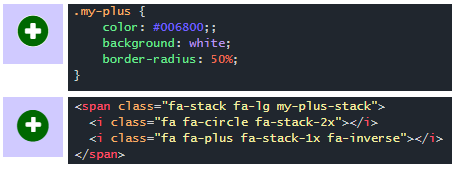
.my-plus {
    color: #006800;;
    background: white;
    border-radius: 50%;
}
Alternatively, you could compose icons by stacking two or more icons together.
You can stack icons natively in Font-Awesome or by adding a little CSS to Bootstrap's Glyphicons:
<span class="fa-stack fa-lg">
  <i class="fa fa-circle fa-stack-2x"></i>
  <i class="fa fa-plus fa-stack-1x fa-inverse"></i>
</span>
Demo in jsFiddle
How do I change Bootstrap 3's glyphicons to white?
You can just create your own .white class and add it to the glyphicon element.
.white, .white a {
  color: #fff;
}
<i class="glyphicon glyphicon-home white"></i>
Related Topics
How to Center Content in a Bootstrap Column
Why Is a Trailing Punctuation Mark Rendered at The Start with Direction:Rtl
How to Vertical Center Text Next to an Image in HTML/CSS
Set Div to Have Its Siblings Width
CSS - Border Where Only Half of a Border Is Visible
What Is The Browser-Default Background Color When Selecting Text
Force Youtube Embed to Start in 720P
Change Color of One Character in a Text Box HTML/CSS
How to Handle Xml/HTML in Git Feature Branch Workflow
How to Make a Div with Irregular Shapes with CSS3 and HTML5
Set CSS Border to End in a 90 Instead of a 45 Degree Angle
HTML + CSS: Numbered List with Numbers Inside of Circles
How to Add The Text "On" and "Off" to Toggle Button
How to Style the Arrow of <Details> <Summary> Elements