Border with a transparent centred arrow
There are two methods to achieve this using CSS3. One is using skewX on pseudo-elements while the other is using rotate on pseudo-elements. Both the methods are also responsive.
Using Skew:
This method is adapted from web-tiki's answer in this thread. It basically uses two pseudo-elements (with roughly 50% width of the container) that are skewed in opposite directions and positioned appropriately to arrive at the arrow shape. The shapes have borders where as the background is set to transparent meaning the pseudo-elements would produce a bottom border + downward arrow effect. The arrow fill would always be transparent (or body color) in this sample.
body {

  background: rgb(245, 242, 242);

}

.bordered {

  position: relative;

  height: 200px;

  width: 200px;

  margin: 10px;

  line-height: 200px;

}

.bordered:after,

.bordered:before {

  position: absolute;

  content: ' ';

  height: 8px;

  width: 50%;

  bottom: 0px;

}

.bordered:before {

  left: 0px;

  border-top: 1px solid gray;

  border-right: 1px solid gray;

  transform-origin: left bottom;

  transform: skewX(45deg);

}

.bordered:after {

  right: 0px;

  border-top: 1px solid gray;

  border-left: 1px solid gray;

  transform-origin: right bottom;

  transform: skewX(-45deg);

}

.bordered img {

  width: 150px;

  padding: 25px;

  vertical-align: middle;

}

/* Just for demo */

.bordered {

  transition: all 1s;

  text-align: center;

}

.bordered:hover {

  height: 250px;

  width: 250px;

  line-height: 250px;

}
<!-- library included only to avoid browser prefixes -->
<script src="https://cdnjs.cloudflare.com/ajax/libs/prefixfree/1.0.7/prefixfree.min.js"></script>
<div class="bordered">
<img src="http://i.imgur.com/0Xqum3A.png" />
</div>transparent shape with arrow in upper corner
You can do it like in the below snippet. The method used to achieve the shape is as given below:
- The main
divelement only has a top, bottom and left border. The right border is nullified because the element and its arrows needs to be transparent. With a transparent arrow, if a right border is present that would also get displayed. - The arrow on the right is achieved using a
skewed element placed with respect to the right edge of the shape. - The right border of the shape is achieved by using another pseudo-element whose size is the same as the height of the whole container - height of the arrow pseudo-element. This element is positioned with respect to the bottom right of the shape.
You can adjust the height and border-radius as required. I have set the positioning such that even a change in height/width of parent would not affect it.
div.shape {

  position: relative;

  width: 300px;

  height: 100px;

  padding: 4px;

  margin-top: 20px;

  border: 2px solid gray;

  border-right: none; /* not required as the shape needs to be transparent */

  border-radius: 8px; /* not required as the right border is done through pseudo element */

  border-top-right-radius: 0px;

  border-bottom-right-radius: 0px;

}

div.shape:before {

  position: absolute;

  content: '';

  top: -2px; /* equal to border top of parent - no need to change*/

  right: -6px; /* for positioning - no need to change*/

  height: 15%; /* should be changed depending on height of arrow */

  width: 10%; /* should be changed depending on width of arrow */

  border-top: 2px solid gray;

  border-right: 3px solid gray; /* thicker border because skew makes it thin */

  /* to achieve the arrow like shape */

  -webkit-transform-origin: bottom right;

  -webkit-transform: skew(-45deg);

  -moz-transform: skew(-45deg);

  transform: skew(-45deg);

}

div.shape:after {

  position: absolute;

  content: '';

  right: -6px; /* for positioning - no need to change*/

  height: 85%; /* height of parent - height of arrow */

  width: 2%; /* no need to change */

  bottom: -2px; /* equal to border bottom of parent - no need to change*/

  border-right: 2px solid gray;

  border-bottom: 2px solid gray;

  border-bottom-right-radius: 8px; /* for producing curve on bottom right */

}

/* Just for demo */

body {

  background: -webkit-linear-gradient(0deg, crimson, indianred, purple);

  background: -moz-linear-gradient(90deg, crimson, indianred, purple);

  background: linear-gradient(90deg, crimson, indianred, purple);

}
<div class="shape">
Lorem Ipsum Dolor Sit Amet...
</div>Need only border for arrow not color
I'd use before, after and transform skew. Gives you more flexibility.
.arrow{

position:relative;

display:inline-block;

min-width:100px;

padding-left:1rem;padding-right:1rem;

text-align:center;

line-height:2;

min-height:2rem;

}

.arrow:before,.arrow:after{

  content:" ";

  z-index:-1;

  display:block;

  position:absolute;

  left:0;

  top:-1px;

  border:2px solid red;

  height:50%;

  width:100%;

}

.arrow:before{

 border-bottom:0;

 transform:skewX(45deg);

}

.arrow:after{

 border-top:0;

 top:50%;

 transform:skewX(-45deg);

}

.left:before{ transform:skewX(-45deg);}

.left:after{transform:skewX(45deg);}

.blue:before,.blue:after{border-color:blue;}

.bgpink:before,.bgpink:after{background-color: pink}
<div class="arrow"></div>
<br/>
<br/>
<br/>
<div class="arrow left"> to the left </div>
<br/>
<br/>
<br/>
<div class="arrow left blue"> and change border color </div>
<br/>
<br/>
<br/>
<div class="arrow left blue bgpink"> and change bg color too </div>Inside transparent arrow on the top
As stated in the question, your case is a bit different from the example that was provided by web-tiki. In the example that you were referring to, the border with the transparent cut was included as the bottom border for the image whereas you need it as the top border of the plain text area.
The expected output can be achieved with the same skew technique described in that answer. However, it needs to be tweaked a bit to match your case.
- First thing is, the skewed pseudo-elements (that produce the border) should be added to the container of plain text area and not the top section which holds the image. This part you have already done correctly.
- Next, you need to position the border such that even with the border the height of your text container will be equal to the other two images placed by its side. For this, you need to position the elements that form the border within the plain text container (
top: 0%) instead of above it (bottom: 100%in your code). - Then, if the text container has a non-transparent background, you need to clip it such that it is not present behind the elements that is creating the border effect. This can be achieved by adding a
padding-topon the text container equal to theheightof the border pseudo-elements and then settingbackground-clip: content-boxto it. - Finally, you need to move the entire bottom part up by the same number of pixels as the height of the border in order for the top image to be seen through the transparent cut out area. This can be done by adding a negative
margin-topto the bottom container.
Putting it altogether your code should be similar to the below snippet to achieve the effect that you need. (Note: Your fiddle has way too much code and so I have created a simpler sample for the demo).
.section {

  height: 200px;

  width: 500px;

  background: url(http://lorempixel.com/500/200/nature/3);

}

.bottom-container {

  margin-top: -15px;

  height: 100px;

  width: 500px;

}

.text,

.middle-image,

.right-image {

  float: left;

  height: 100%;

  width: calc(100% / 3);

}

.middle-image {

  background: url(http://lorempixel.com/200/100/nature/2);

}

.right-image {

  background: url(http://lorempixel.com/250/100/nature/1);

}

.text {

  position: relative;

  box-sizing: border-box;

  height: 100%;

  padding-top: 15px;

  text-align: center;

  line-height: 85px;

  background: #F7F7F7; /* Just for demo */

  background-clip: content-box; /* needed only if your background is not transparent */

  overflow: hidden;

}

.text:after,

.text:before {

  position: absolute;

  content: '';

  top: 0px;

  height: 15px;

  background: rgb(215,182,115);

}

.text:before {

  left: 0px;

  width: 25%;

  transform-origin: left bottom;

  transform: skew(45deg);

}

.text:after {

  right: 0px;

  width: 75%;

  transform-origin: right bottom;

  transform: skew(-45deg);

}
<!-- prefix free library to avoid browser prefixes in CSS -->
<script src="https://cdnjs.cloudflare.com/ajax/libs/prefixfree/1.0.7/prefixfree.min.js"></script>
<section class="section">
</section>
<div class="bottom-container">
<div class="text">Some text</div>
<div class="middle-image"></div>
<div class="right-image"></div>
</div>Border around arrows
you may use gradients and background size to draw parts of arrow and bits of border:
body {

  margin: 20px;

  font-family: Helvetica;

  background: #d4f2ff;

}

#crumbs {

  text-align: center;


}

#crumbs ul {

  list-style: none;

  display: inline-table;

  min-width:960px

}

#crumbs ul li {

  float:left;;

}

#crumbs ul li a {

  float: left;

  height: 50px;

  background: linear-gradient(to right, transparent 1.2em, #3498db 1.2em);

  /* leave some blank bg to draw arrow */

  text-align: center;

  padding: 30px 40px 0 80px;

  position: relative;

  margin: 0 10px 0 0;

  border-top: 2px solid orange;

  border-bottom: 2px solid orange;

  font-size: 20px;

  text-decoration: none;

  color: #fff;

}

li+li {

  position: relative;

  margin-left: 7px;

}

li+li a:before {

  content: '';

  position: absolute;

  width: 3em;

  top: 0px;

  bottom: 0px;

  left: calc(-1em - 5px);

  background: linear-gradient(60deg, #3498db 1.2em, orange 1.25em,orange calc(1.2em + 3px), transparent calc(1.2em + 4px), transparent calc(2.2em - 3px), orange calc(2.2em - 2px), orange 2.2em, #3498db 2.35em)top no-repeat, linear-gradient(120deg, #3498db 1.2em, orange 1.25em,orange calc(1.2em + 3px), transparent calc(1.2em + 4px), transparent calc(2.2em - 3px), orange calc(2.2em - 2px), orange 2.2em, #3498db 2.35em)bottom left no-repeat;

  /* 2  gradients drawing end of arrow , borders and begining of next arrow */

  background-size: 100% 50%

}

li  a {/* smoothen a bit corners */

  border-radius:3px;

}

#crumbs ul li:first-child a {

  border-top-left-radius: 10px;

  border-bottom-left-radius: 10px;

  border-left: 2px solid orange;

  background: #3498db;/* draww full bg there is no arrows before that one */

}

#crumbs ul li:last-child a {

  padding-right: 80px;

  border-top-right-radius: 10px;

  border-bottom-right-radius: 10px;

  border-right: 2px solid orange;

}

/* next is updates of gradients colors and bg for hover state */

#crumbs ul li:hover a:before {

 background: linear-gradient(60deg, #3498db 1.2em, orange 1.25em,orange calc(1.2em + 3px), transparent calc(1.2em + 4px), transparent calc(2.2em - 3px), orange calc(2.2em - 2px), orange 2.2em,  #fa5ba5  2.35em)top no-repeat, linear-gradient(120deg, #3498db 1.2em, orange 1.25em,orange calc(1.2em + 3px), transparent calc(1.2em + 4px), transparent calc(2.2em - 3px), orange calc(2.2em - 2px), orange 2.2em,  #fa5ba5 2.35em)bottom left no-repeat;

  background-size: 100% 50%

}

#crumbs ul li:hover +li a:before {

 background: linear-gradient(60deg, #fa5ba5 1.2em, orange 1.25em,orange calc(1.2em + 3px), transparent calc(1.2em + 4px), transparent calc(2.2em - 3px), orange calc(2.2em - 2px), orange 2.2em,  #3498db  2.35em)top no-repeat, linear-gradient(120deg, #fa5ba5 1.2em, orange 1.25em,orange calc(1.2em + 3px), transparent calc(1.2em + 4px), transparent calc(2.2em - 3px), orange calc(2.2em - 2px), orange 2.2em,  #3498db 2.35em)bottom left no-repeat;

  background-size: 100% 50%

}

#crumbs ul li:hover a {

  background: linear-gradient(to right, transparent 1.2em, #fa5ba5 1.2em);

}

#crumbs ul li:first-child:hover a {

  background: #fa5ba5;

}
<div id="crumbs">
<ul>
<li><a href="#1">One</a></li>
<li><a href="#2">Two</a></li>
<li><a href="#3">Three</a></li>
<li><a href="#4">Four</a></li>
<li><a href="#5">Five</a></li>
</ul>
</div>Background border view with up-arrow triangle | React Native
Add 2 triangle one for background color and one for border color
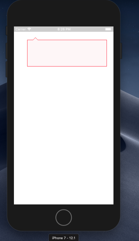
Complete code
import React, { Component } from "react";
import { View, StyleSheet } from "react-native";

export default class Dashboard extends Component {
  render() {
    return (
      <View style={styles.box}>
        <View style={styles.triangle} />
        <View style={styles.triangle2} />
      </View>
    );
  }
}

const styles = StyleSheet.create({
  box: {
    width: 300,
    height: 100,
    backgroundColor: "#fef6f7",
    position: "relative",
    margin: 50,
    borderColor: "red",
    borderWidth: 1
  },
  triangle: {
    width: 10,
    height: 10,
    position: "absolute",
    top: -10,
    left: 20,
    borderLeftWidth: 10,
    borderLeftColor: "transparent",
    borderRightWidth: 10,
    borderRightColor: "transparent",
    borderBottomWidth: 10,
    borderBottomColor: "red"
  },
  triangle2: {
    width: 10,
    height: 10,
    position: "absolute",
    top: -10,
    left: 21,
    borderLeftWidth: 9,
    borderLeftColor: "transparent",
    borderRightWidth: 9,
    borderRightColor: "transparent",
    borderBottomWidth: 9,
    borderBottomColor: "#fef6f7"
  }
});
Link with border and down triangle transparent
The shape given in question is a bit complex to achieve with full transparency because of the area cut by the arrow having to be transparent too. Because of this, the techniques that are generally used for creating such tool-tip like shapes cannot be used as-is here. However, there is a still a way to achieve it using CSS and it is as follows:
- Use the parent
hgroupfor the shape with borders on top, left and right and addborder-radius. Don't add any border to the bottom because then cutting the space for the arrow would be tough. - Use two pseudo elements (
:beforeand:after) which have the same height as the parent but lesser width such that they produce a tiny gap when positioned absolutely with respect to parent. Addborder-bottomalone to these pseudo-elements. - Add a pseudo-element for the arrow on the arrow-down element (
a) and create the arrow usingrotate(45deg)transforms instead of using the border trick. The transform method is very helpful for creating transparent arrows. Position this arrow again absolutely with respect to the parent. - As we are dealing with transforms, triangle shapes etc the position values need to be calculated based on Math theorems.
* {

  box-sizing: border-box;

}

.container {

  height: 300px;

  width: 500px;

  background: url(http://lorempixel.com/500/300/nature/2);

  padding: 10px;

}

#subheader {

  position: relative;

  width: 400px;

  height: auto;

  border: 1px solid black;

  border-bottom: none;

  border-radius: 12px;

  padding: 10px;

}

.arrow-down{

  display: inline-block;

}

.arrow-down:after {

  position: absolute;

  content: '';

  bottom: -10px;  /* half the height of the element */

  left: 50px;  /* some aribitrary position */

  height: 20px;

  width: 20px;

  transform: rotate(45deg);

  transform-origin: 50% 50%;  /* rotate around center which is at 60px from left */

  border-right: 1px solid black;

  border-bottom: 1px solid black;

}

#subheader:after {

  position: absolute;

  content: '';

  left: 74px;  /* center point of arrow + 1/2 of hypotenuse */

  height: 100%;

  width: calc(100% - 74px);  /* 100% - value of left */

  bottom: 0px;

  border-bottom: 1px solid black;

  border-bottom-right-radius: inherit;  /* same border-radius as parent */

}

#subheader:before {

  position: absolute;

  content: '';

  height: 100%;

  width: 46px;  /* center point of arrow - 1/2 of hypotenuse */

  left: 0px;

  bottom: 0px;

  border-bottom: 1px solid black;

  border-bottom-left-radius: inherit;  /* same border-radius as parent */

}
<div class='container'>
<hgroup id="subheader">
<h1>lorem ipsum</h1>
<h2>ipsum lorem</h2>
<a href="#" class="arrow-down">Read More</a>
</hgroup>
</div>CSS: How to attach an arrow to a div and make it overlap the border
CSS solution:
http://jsfiddle.net/wn7JN/
.bubble
{
position: relative;
width: 400px;
height: 250px;
padding: 0px;
background: #FFFFFF;
border: #000 solid 1px;
-webkit-border-radius: 10px;
-moz-border-radius: 10px;
border-radius: 10px;
}

.bubble:after
{
content: "";
position: absolute;
bottom: -25px;
left: 175px;
border-style: solid;
border-width: 25px 25px 0;
border-color: #FFFFFF transparent;
display: block;
width: 0;
z-index: 1;
}

.bubble:before
{
content: "";
position: absolute;
top: 250px;
left: 174px;
border-style: solid;
border-width: 26px 26px 0;
border-color: #000 transparent;
display: block;
width: 0;
z-index: 0;
}
Related Topics
How to Properly Display German Characters in HTML
Change Background Image Opacity
Open a Direct File on the Hard Drive from Firefox (File:///)
How to Add a Margin Between Bootstrap Columns Without Wrapping
Changing Variable Dynamically (At Runtime) via Less and CSS
CSS Not Modifying Link Properties
How Is Bootstrap V4 Loading _Reboot.Scss
How to Center a Container in My HTML/Css
Flexbox with Fixed Header and Footer and Scrollable Content
Table Headers Position:Sticky and Border Issue
How to Cut a Circular Part from an Image
How to Set the Thumbnail Image on HTML5 Video
CSS Two Columns of Lists - Responsive Merge into One Column
How to Get a Div Centered with Another Div on the Right of It