Vertical Text in Wpf TextBlock
Nobody has yet mentioned the obvious and trivial way to stack the letters of an arbitrary string vertically (without rotating them) using pure XAML:
<ItemsControl
  ItemsSource="Text goes here, or you could use a binding to a string" />
This simply lays out the text vertically by recognizing the fact that the string is an IEnumerable and so ItemsControl can treat each character in the string as a separate item. The default panel for ItemsControl is a StackPanel, so the characters are laid out vertically.
Note: For precise control over horizontal positioning, vertical spacing, etc, the ItemContainerStyle and ItemTemplate properties can be set on the ItemsControl.
Text vertical alignment in WPF TextBlock
A Textblock itself can't do vertical alignment
The best way to do this that I've found is to put the textblock inside a border, so the border does the alignment for you.
<Border BorderBrush="{x:Null}" Height="50">
    <TextBlock TextWrapping="Wrap" Text="Some Text" VerticalAlignment="Center"/>
</Border>
Note: This is functionally equivalent to using a grid, it just depends how you want the controls to fit in with the rest of your layout as to which one is more suitable
WPF: how to write text in a different direction?
In order to rotate your text at 90 degrees, I believe that you will need to use the LayoutTransform instead of the RenderTransform:
<TextBlock Text="FootRoller" HorizontalAlignment="Center" VerticalAlignment="Center">
    <TextBlock.LayoutTransform>
        <RotateTransform Angle="-90"/>
    </TextBlock.LayoutTransform>
</TextBlock>
The difference is when the transform will be applied. Using the LayoutTransform, the text will be rotated before the layout pass and this will be important in your case. I imagine that using the RenderTransform will rotate your TextBlock, but as it does that after the layout pass, it would not show it all... this is because it was measured for size before it was rotated.
You can find out full details from the Transforms Overview page on MSDN. From the linked page:
LayoutTransform – A transform that is applied before the layout pass. After the transform is applied, the layout system processes the transformed size and position of the element.
RenderTransform – A transform that modifies the appearance of the element but is applied after the layout pass is complete. By using the RenderTransform property instead of the LayoutTransform property, you can obtain performance benefits.
Center text vertically (TextBlock)
You should have a play with these two properties. In your case you are probably more interested in TextLineBounds.
<TextBlock Text="80" FontSize="40" TextLineBounds="Tight" OpticalMarginAlignment="TrimSideBearings" />
Update
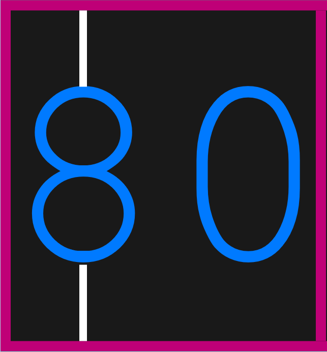
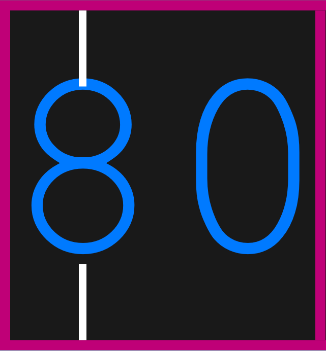
I am not sure if your screenshot is 100% accurate. I have used your code to produce the following pictures. Note I have scaled them up by 10 times.
<Grid Width="41" HorizontalAlignment="Left" Padding="0" BorderThickness="0,0,1,0" BorderBrush="#FFBF0077">
    <TextBlock x:Name="TextBlockLocalScore" TextLineBounds="Full" Text="80" FontFamily="Courier New" FontSize="36" Foreground="#FF007AFF" TextAlignment="Center" VerticalAlignment="Center" HorizontalAlignment="Center" />
    <Rectangle UseLayoutRounding="False" HorizontalAlignment="Center" Fill="White" Height="10" VerticalAlignment="Top" Width="1" Margin="-21,0,0,0" />
    <Rectangle UseLayoutRounding="False" HorizontalAlignment="Center" Fill="White" Height="10" VerticalAlignment="Bottom" Width="1" Margin="-21,0,0,0" />
</Grid>
With TextLineBounds set to Tight
With TextLineBounds set to Full
Yes, on the first one, there's still a tiny little gap (about 0.3 epx) between the bottom edge of number 8 and the Line, but this is mostly due to layout rounding and effective pixel snapping. I don't think it's noticeable to human eyes. :)
P.S. You cannot purely rely on checking the visuals from Blend Designer as sometimes the artboard doesn't get updated on time to give you the correct result. You should always run your app and check from there.
Centering text vertically and horizontally in TextBlock and PasswordBox in windows store app
TextAlignment is for horizontal alignment. TextBlock itself doesn't suport vertical alignment.
I suggest put a border around it and let border do vertical alignment:
<Border BorderBrush="{x:Null}" Height="50">
    <TextBlock Text="Your text" VerticalAlignment="Center"/>
</Border>
Or other way would be using height and set padding within textblock.
For password box use in WPF:
<PasswordBox HorizontalContentAlignment="Center" VerticalContentAlignment="Center" />
For Silverlight you will need to extract the actual template of passwordbox (use blend it allows you to edit template and copy that) then you can change the members (on ContentElement which is of type Border) with template binding like:
HorizontalAlignment="{TemplateBinding HorizontalContentAlignment}" VerticalAlignment="{TemplateBinding VerticalContentAlignment}"
You can get the template also at this msdn link.
For passworbox in Silverlight update password box style in your xaml as this:
        <ControlTemplate x:Key="ValidationToolTipTemplate">
        <Grid x:Name="Root" Margin="5,0" RenderTransformOrigin="0,0" Opacity="0">
            <Grid.RenderTransform>
                <TranslateTransform x:Name="xform" X="-25"/>
            </Grid.RenderTransform>
            <VisualStateManager.VisualStateGroups>
                <VisualStateGroup Name="OpenStates">
                    <VisualStateGroup.Transitions>
                        <VisualTransition GeneratedDuration="0"/>
                        <VisualTransition To="Open" GeneratedDuration="0:0:0.2">
                            <Storyboard>
                                <DoubleAnimation Storyboard.TargetName="xform" Storyboard.TargetProperty="X" To="0" Duration="0:0:0.2">
                                    <DoubleAnimation.EasingFunction>
                                        <BackEase Amplitude=".3" EasingMode="EaseOut"/>
                                    </DoubleAnimation.EasingFunction>
                                </DoubleAnimation>
                                <DoubleAnimation Storyboard.TargetName="Root" Storyboard.TargetProperty="Opacity" To="1" Duration="0:0:0.2"/>
                            </Storyboard>
                        </VisualTransition>
                    </VisualStateGroup.Transitions>
                    <VisualState x:Name="Closed">
                        <Storyboard>
                            <DoubleAnimation Storyboard.TargetName="Root" Storyboard.TargetProperty="Opacity" To="0" Duration="0"/>
                        </Storyboard>
                    </VisualState>
                    <VisualState x:Name="Open">
                        <Storyboard>
                            <DoubleAnimation Storyboard.TargetName="xform" Storyboard.TargetProperty="X" To="0" Duration="0"/>
                            <DoubleAnimation Storyboard.TargetName="Root" Storyboard.TargetProperty="Opacity" To="1" Duration="0"/>
                        </Storyboard>
                    </VisualState>
                </VisualStateGroup>
            </VisualStateManager.VisualStateGroups>

            <Border Margin="4,4,-4,-4" Background="#052A2E31" CornerRadius="5"/>
            <Border Margin="3,3,-3,-3" Background="#152A2E31" CornerRadius="4"/>
            <Border Margin="2,2,-2,-2" Background="#252A2E31" CornerRadius="3"/>
            <Border Margin="1,1,-1,-1" Background="#352A2E31" CornerRadius="2"/>

            <Border Background="#FFDC000C" CornerRadius="2"/>
            <Border CornerRadius="2">
                <TextBlock
              UseLayoutRounding="false"
              Foreground="White" Margin="8,4,8,4" MaxWidth="250" TextWrapping="Wrap" Text="{Binding (Validation.Errors)[0].ErrorContent}"/>
            </Border>
        </Grid>
    </ControlTemplate>
    <Style TargetType="PasswordBox">
        <Setter Property="BorderThickness" Value="1" />
        <Setter Property="Background" Value="#FFFFFFFF" />
        <Setter Property="Foreground" Value="#FF000000" />
        <Setter Property="Padding" Value="2" />
        <Setter Property="BorderBrush">
            <Setter.Value>
                <LinearGradientBrush EndPoint="0.5,1" StartPoint="0.5,0">
                    <GradientStop Color="#FFA3AEB9" Offset="0"/>
                    <GradientStop Color="#FF8399A9" Offset="0.375"/>
                    <GradientStop Color="#FF718597" Offset="0.375"/>
                    <GradientStop Color="#FF617584" Offset="1"/>
                </LinearGradientBrush>
            </Setter.Value>
        </Setter>
        <Setter Property="Template">
            <Setter.Value>
                <ControlTemplate TargetType="PasswordBox">
                    <Grid x:Name="RootElement">
                        <VisualStateManager.VisualStateGroups>
                            <VisualStateGroup x:Name="CommonStates">
                                <VisualState x:Name="Normal" />
                                <VisualState x:Name="MouseOver">
                                    <Storyboard>
                                        <ColorAnimation Storyboard.TargetName="MouseOverBorder" Storyboard.TargetProperty="(Border.BorderBrush).(SolidColorBrush.Color)" To="#FF99C1E2" Duration="0"/>
                                    </Storyboard>
                                </VisualState>
                                <VisualState x:Name="Disabled">
                                    <Storyboard>
                                        <DoubleAnimation Storyboard.TargetName="DisabledVisualElement" Storyboard.TargetProperty="Opacity" To="1" Duration="0"/>
                                    </Storyboard>
                                </VisualState>
                            </VisualStateGroup>
                            <VisualStateGroup x:Name="FocusStates">
                                <VisualState x:Name="Focused">
                                    <Storyboard>
                                        <DoubleAnimation Storyboard.TargetName="FocusVisualElement" Storyboard.TargetProperty="Opacity" To="1" Duration="0"/>
                                    </Storyboard>
                                </VisualState>
                                <VisualState x:Name="Unfocused">
                                    <Storyboard>
                                        <DoubleAnimation Storyboard.TargetName="FocusVisualElement" Storyboard.TargetProperty="Opacity" To="0" Duration="0"/>
                                    </Storyboard>
                                </VisualState>
                            </VisualStateGroup>
                            <VisualStateGroup x:Name="ValidationStates">
                                <VisualState x:Name="Valid"/>
                                <VisualState x:Name="InvalidUnfocused">
                                    <Storyboard>
                                        <ObjectAnimationUsingKeyFrames Storyboard.TargetName="ValidationErrorElement" Storyboard.TargetProperty="Visibility">
                                            <DiscreteObjectKeyFrame KeyTime="0" >
                                                <DiscreteObjectKeyFrame.Value>
                                                    <Visibility>Visible</Visibility>
                                                </DiscreteObjectKeyFrame.Value>
                                            </DiscreteObjectKeyFrame>
                                        </ObjectAnimationUsingKeyFrames>
                                    </Storyboard>
                                </VisualState>
                                <VisualState x:Name="InvalidFocused">
                                    <Storyboard>
                                        <ObjectAnimationUsingKeyFrames Storyboard.TargetName="ValidationErrorElement" Storyboard.TargetProperty="Visibility">
                                            <DiscreteObjectKeyFrame KeyTime="0" >
                                                <DiscreteObjectKeyFrame.Value>
                                                    <Visibility>Visible</Visibility>
                                                </DiscreteObjectKeyFrame.Value>
                                            </DiscreteObjectKeyFrame>
                                        </ObjectAnimationUsingKeyFrames>
                                        <ObjectAnimationUsingKeyFrames Storyboard.TargetName="validationTooltip" Storyboard.TargetProperty="IsOpen">
                                            <DiscreteObjectKeyFrame KeyTime="0" >
                                                <DiscreteObjectKeyFrame.Value>
                                                    <sys:Boolean>True</sys:Boolean>
                                                </DiscreteObjectKeyFrame.Value>
                                            </DiscreteObjectKeyFrame>
                                        </ObjectAnimationUsingKeyFrames>
                                    </Storyboard>
                                </VisualState>
                            </VisualStateGroup>
                        </VisualStateManager.VisualStateGroups>

                        <Border x:Name="Border" BorderThickness="{TemplateBinding BorderThickness}" CornerRadius="1" Opacity="1" Background="{TemplateBinding Background}" BorderBrush="{TemplateBinding BorderBrush}">
                            <Border x:Name="MouseOverBorder" BorderThickness="1" BorderBrush="Transparent">
                                <Border x:Name="ContentElement" Margin="{TemplateBinding Padding}" HorizontalAlignment="{TemplateBinding HorizontalContentAlignment}" VerticalAlignment="{TemplateBinding VerticalContentAlignment}"/>
                            </Border>
                        </Border>
                        <Border x:Name="DisabledVisualElement" Background="#A5F7F7F7" BorderBrush="#A5F7F7F7" BorderThickness="{TemplateBinding BorderThickness}" Opacity="0" IsHitTestVisible="False"/>
                        <Border x:Name="FocusVisualElement" BorderBrush="#FF6DBDD1" BorderThickness="{TemplateBinding BorderThickness}" Margin="1" Opacity="0" IsHitTestVisible="False"/>
                        <Border x:Name="ValidationErrorElement" BorderThickness="1" CornerRadius="1" BorderBrush="#FFDB000C" Visibility="Collapsed">
                            <ToolTipService.ToolTip>
                                <ToolTip x:Name="validationTooltip" Template="{StaticResource ValidationToolTipTemplate}" Placement="Right"
                                       PlacementTarget="{Binding RelativeSource={RelativeSource TemplatedParent}}"
                                       DataContext="{Binding RelativeSource={RelativeSource TemplatedParent}}">
                                    <ToolTip.Triggers>
                                        <EventTrigger RoutedEvent="Canvas.Loaded">
                                            <EventTrigger.Actions>
                                                <BeginStoryboard>
                                                    <Storyboard>
                                                        <ObjectAnimationUsingKeyFrames Storyboard.TargetName="validationTooltip" Storyboard.TargetProperty="IsHitTestVisible">
                                                            <DiscreteObjectKeyFrame KeyTime="0" >
                                                                <DiscreteObjectKeyFrame.Value>
                                                                    <sys:Boolean>true</sys:Boolean>
                                                                </DiscreteObjectKeyFrame.Value>
                                                            </DiscreteObjectKeyFrame>
                                                        </ObjectAnimationUsingKeyFrames>
                                                    </Storyboard>
                                                </BeginStoryboard>
                                            </EventTrigger.Actions>
                                        </EventTrigger>
                                    </ToolTip.Triggers>
                                </ToolTip>
                            </ToolTipService.ToolTip>
                            <Grid Width="12" Height="12" HorizontalAlignment="Right" Margin="1,-4,-4,0" VerticalAlignment="Top" Background="Transparent">
                                <Path Margin="1,3,0,0" Data="M 1,0 L6,0 A 2,2 90 0 1 8,2 L8,7 z" Fill="#FFDC000C"/>
                                <Path Margin="1,3,0,0" Data="M 0,0 L2,0 L 8,6 L8,8" Fill="#ffffff"/>
                            </Grid>
                        </Border>
                    </Grid>
                </ControlTemplate>
            </Setter.Value>
        </Setter>
    </Style>
Then your PasswordBox can have alignment as such:
<PasswordBox HorizontalContentAlignment="Center" VerticalContentAlignment="Center"/>
How do I create a vertical text block without using an ItemsControl?
Despite the controversy if it's a duplicate or not, there may be a way to achieve vertical text on a very low level, involving a GlyphRun. I haven't tested that in detail, but what i know is, you would have to
create a GlyphRun with the IsSideways property set to true, meaning
all character will be rotated 90° counter-clockwise,get a DrawingContext and push (via PushTransform) a 90° clockwise RotateTransform onto it,
draw the GlyphRun to the DrawingContext.
A simple way to get an appropriate DrawingContext would be to override UIElement.OnRender.
Note: GlyphRun's constructor has 13 arguments, but the last 6 may be null :-)
How to rotate Text in WPF by keeping the Auto-Sizing function
Use a LayoutTransform instead of a RenderTransform. It gets applied during the layout pass, not during rendering.
Vertical alignment of Label inside TextBlock is wrong
You can use the Run inline element for data binding text.
Starting in the .NET Framework 4, the Text property of the Run object is a dependency property, which means that you can bind the Text property to a data source.
It also has properties for styling the text, like FontWeight, no need for <Bold> here.
<TextBlock HorizontalAlignment="Left" TextWrapping="Wrap"
 VerticalAlignment="Top" Height="99" Width="339" Grid.RowSpan="3">
    The user is <Bold>responsible</Bold> for
    <Run Text="{Binding YourProperty}" FontWeight="Bold"/> vehicles
</TextBlock>
The result looks like this:

As a general note on the issue: The elements inside TextBlock should be inline elements. Here is an article that has links to other inline elements that could be useful to you, like span that allows for grouping other inline elements and applying styles or to them.
- How to: Manipulate Flow Content Elements through the Inlines Property
WPF has two fundamental base types, UIElement and ContentElement. While a TextBlock and Label are UIElements, the content of TextBlock are inlines, which are ContentElements. That is why the alignment is off, they serve very different purposes. You can read up more on the differences and concepts here:
- Base Element APIs in WPF Classes
- UIElement
UIElementis a base class for WPF core level implementations building on Windows Presentation Foundation (WPF) elements and basic presentation characteristics. - ContentElement
Provides a WPF core-level base class for content elements. Content elements are designed for flow-style presentation, using an intuitive markup-oriented layout model and a deliberately simple object model.
- Flow Document Overview
WPF textbox selection vertical centering or alignment
Probably I should have touched on the cause of the difference between top and bottom spaces of font glyphs. In short, the top space is reserved to draw symbols (diaeresis) above alphabetic characters.
The following code produces the TextBox shown below.
<Grid Margin="10">
    <Grid.ColumnDefinitions>
        <ColumnDefinition Width="1*"/>
        <ColumnDefinition Width="1*"/>
    </Grid.ColumnDefinitions>
    <TextBox Grid.ColumnSpan="2"
             Text="0ay/AÁÊÑÖ 0ay/AÁÊÑÖ"
             FontFamily="Verdana" FontSize="36"
             Padding="3"/>

    <Rectangle Grid.Column="0"
               Stroke="DarkViolet" StrokeThickness="1" StrokeDashArray="1 3"
               VerticalAlignment="Center" HorizontalAlignment="Stretch"/>
    <Rectangle Grid.Column="1"
               Stroke="Red" StrokeThickness="1" StrokeDashArray="1 3"
               VerticalAlignment="Center" Margin="0,3,0,0" HorizontalAlignment="Stretch"/>
</Grid>
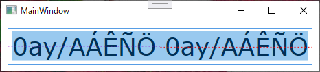
The area highlighted blue is the font area and the purple dotted line is the actual vertical center of font. If there were no symbol, you may think the red dotted line is the vertical center but it is not true. The font glyphs are slightly aligned to the bottom to accomodate spaces for symbols.
Setting VerticalContentAlignment="Center" can adjust the vertical alignment of the font inside TextBox but can not change the placement of font glyphs inside the font itself. Therefore, I think the only way to make font glyphs (except symbols) shown truly at the vertical center of TextBox is to move the font by arbitary length so as to offset the difference inside font.
Please note that the difference inside font may vary depending on each font and if the height of top space is cut out and if the text which has these symbols is typed, these symbols can be hidden.
That said, you can adjust the inner padding by setting Padding property as follows.
<TextBox Padding="0,-2,0,0" ClipToBounds="True" ... />
Or you can lower the space between font griph and padding by setting the line height of inner text if you do not mind it affects the spacing between multiples lines.
<TextBox Padding="2" FontSize="16"
         TextBlock.LineHeight="18" TextBlock.LineStackingStrategy="BlockLineHeight" ... />
Edit: Add explanation and alternative suggestion to respond to OP's comment.
Related Topics
How to Create a Dictionary of Generic Types
How to Recognize If a String Contains Unicode Chars
Avoiding Null Reference Exceptions
Wpf Combobox: Different Template in Textbox and Drop-Downlist
Trace Listener to Write to a Text Box (Wpf Application)
How to Dynamically Switch Web Service Addresses in .Net Without a Recompile
Raise an Event of a Class from a Different Class in C#
String.Equals() Not Working as Intended
How to Clear Browser Cache on Browser Back Button Click in MVC4
C# Help Reading Foreign Characters Using Streamreader
Does Dispose Still Get Called When Exception Is Thrown Inside of a Using Statement
Monitor a Process's Network Usage
Multiple JSONproperty Name Assigned to Single Property
Detect Windows Font Size (100%, 125%, and 150%)
Launching Process in C# Without Distracting Console Window
Get Screen Resolution in Win10 Uwp App
What's the Difference Between Double Quotes and Single Quote in C#