Validation Error Style in WPF, similar to Silverlight
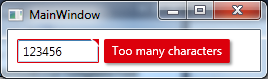
I studied the Silverlight version of the Validation Error Template and created a WPF version of it which looks like this
Added an animated GIF at the bottom of the post but after I finished it I noticed that it might be annoying because of the moving mouse in it. Let me know if I should remove it.. :)
I used a MultiBinding with a BooleanOrConverter to show the "tooltip-error" when the TextBox has Keyboard focus or the Mouse is over the upper right corner. For the fade-in animation I used a DoubleAnimation for the Opacity and a ThicknessAnimation with a BackEase/EaseOut EasingFunction for the Margin
Useable like this
<TextBox Validation.ErrorTemplate="{StaticResource errorTemplateSilverlightStyle}" />
errorTemplateSilverlightStyle
<ControlTemplate x:Key="errorTemplateSilverlightStyle">
    <StackPanel Orientation="Horizontal">
        <Border BorderThickness="1" BorderBrush="#FFdc000c" CornerRadius="0.7"
                VerticalAlignment="Top">
            <Grid>
                <Polygon x:Name="toolTipCorner"
                         Grid.ZIndex="2"
                         Margin="-1"
                         Points="6,6 6,0 0,0"
                         Fill="#FFdc000c"
                         HorizontalAlignment="Right"
                         VerticalAlignment="Top"
                         IsHitTestVisible="True"/>
                <Polyline Grid.ZIndex="3"
                          Points="7,7 0,0" Margin="-1" HorizontalAlignment="Right"
                          StrokeThickness="1.5"
                          StrokeEndLineCap="Round"
                          StrokeStartLineCap="Round"
                          Stroke="White"
                          VerticalAlignment="Top"
                          IsHitTestVisible="True"/>
                <AdornedElementPlaceholder x:Name="adorner"/>
            </Grid>
        </Border>
        <Border x:Name="errorBorder" Background="#FFdc000c" Margin="1,0,0,0"
                Opacity="0" CornerRadius="1.5"
                IsHitTestVisible="False"
                MinHeight="24" MaxWidth="267">
            <Border.Effect>
                <DropShadowEffect ShadowDepth="2.25"
                                  Color="Black"
                                  Opacity="0.4"
                                  Direction="315"
                                  BlurRadius="4"/>
            </Border.Effect>
            <TextBlock Text="{Binding ElementName=adorner,
                                      Path=AdornedElement.(Validation.Errors)[0].ErrorContent}"
                       Foreground="White" Margin="8,3,8,3" TextWrapping="Wrap"/>
        </Border>
    </StackPanel>
    <ControlTemplate.Triggers>
        <DataTrigger Value="True">
            <DataTrigger.Binding>
                <MultiBinding Converter="{StaticResource BooleanOrConverter}">
                    <Binding ElementName="adorner" Path="AdornedElement.IsKeyboardFocused" />
                    <Binding ElementName="toolTipCorner" Path="IsMouseOver"/>
                </MultiBinding>
            </DataTrigger.Binding>
            <DataTrigger.EnterActions>
                <BeginStoryboard x:Name="fadeInStoryboard">
                    <Storyboard>
                        <DoubleAnimation Duration="00:00:00.15"
                                         Storyboard.TargetName="errorBorder"
                                         Storyboard.TargetProperty="Opacity"
                                         To="1"/>
                        <ThicknessAnimation Duration="00:00:00.15"
                                            Storyboard.TargetName="errorBorder"
                                            Storyboard.TargetProperty="Margin"
                                            FillBehavior="HoldEnd"
                                            From="1,0,0,0"
                                            To="5,0,0,0">
                            <ThicknessAnimation.EasingFunction>
                                <BackEase EasingMode="EaseOut" Amplitude="2"/>
                            </ThicknessAnimation.EasingFunction>
                        </ThicknessAnimation>
                    </Storyboard>
                </BeginStoryboard>
            </DataTrigger.EnterActions>
            <DataTrigger.ExitActions>
                <StopStoryboard BeginStoryboardName="fadeInStoryboard"/>
                <BeginStoryboard x:Name="fadeOutStoryBoard">
                    <Storyboard>
                        <DoubleAnimation Duration="00:00:00"
                                         Storyboard.TargetName="errorBorder"
                                         Storyboard.TargetProperty="Opacity"
                                         To="0"/>
                    </Storyboard>
                </BeginStoryboard>
            </DataTrigger.ExitActions>
        </DataTrigger>
    </ControlTemplate.Triggers>
</ControlTemplate>
BooleanOrConverter
public class BooleanOrConverter : IMultiValueConverter
{
    public object Convert(object[] values, Type targetType, object parameter, System.Globalization.CultureInfo culture)
    {
        foreach (object value in values)
        {
            if ((bool)value == true)
            {
                return true;
            }
        }
        return false;
    }
    public object[] ConvertBack(object value, Type[] targetTypes, object parameter, System.Globalization.CultureInfo culture)
    {
        throw new NotSupportedException();
    }
}
What effective alternatives are there to UI validation error visualization than stock I*DataErrorInfo?
In the XamGrid case, I implemented INotifyDataErrorInfo as in "the pattern", but instead of listening for notifications, I just checked the backing error collection in a conditional cell formatter.
wpf error template - red box still visible on collapse of an expander
Rather than doing any binding, you could place an AdornerDecorator around the elements inside of your expander. You see, the validation error template is placed on the adorner layer that way it shows up on top of everything else. That's ultimately what your problem is. Even though your text box is not visible because the expander is closed, the error template is still on the adorner layer.
I believe you can fix this with the following xaml:
<Expander Header="Blah Blah Blah">
   <AdornerDecorator>
      <TextBox Name="TextBox"
               Validation.ErrorTemplate="{DynamicResource TextBoxErrorTemplate}"
               Text="{Binding Path=Blah,
                              UpdateSourceTrigger=PropertyChanged,
                              ValidatesOnDataErrors=True}" />
   </AdornerDecorator>
</Expander>
This creates an adorner layer specifically for within the expander. When the expander is closed the AdornerDecorator also gets hidden and so should everything on it.
Change Error Title in Silverlight
The Validation Summary has a Header property. You could simply set it in XAML or Codebehind and completely overwrite it.
If you need a bit more control, then override the HeaderTemplate. The default is too long to past here, but the important part is:
<DataTemplate x:Key="myNewAndImprovedErrorHeaderThanksToMiguel">
   <!--There's a border, stackpanel and other funky, but irrelevant tags-->
   <TextBlock Padding="4,1,0,0" Text="{Binding}" Foreground="#FFFFFFFF" FontWeight="Bold"/>
</DataTemplate/>
Now, you could simply use a converter for the Text to slightly modify it. The Binding's value will by default contain the text "# Error".
Silverlight DataGrid validation show validation error for all objects|properties
I haven't succeeded with a TextBlock control, so I used a disabled TextBox
You can change the template of the TextBox, I mean to remove border and to set its background really transparent.

<sdk:DataGrid AutoGenerateColumns="False" ItemsSource="{Binding Items}" IsReadOnly="False" SelectionMode="Single">
    <sdk:DataGrid.Columns>
        <sdk:DataGridTextColumn Header="Title" Binding="{Binding Title}"/>
        <sdk:DataGridTemplateColumn Header="Link" Width="100">
            <sdk:DataGridTemplateColumn.CellTemplate>
                <DataTemplate>
                    <TextBox Text="{Binding Link, Mode=TwoWay}" Margin="2"
                             IsEnabled="False" BorderThickness="0" Background="Transparent"/>
                </DataTemplate>
            </sdk:DataGridTemplateColumn.CellTemplate>
            <sdk:DataGridTemplateColumn.CellEditingTemplate>
                <DataTemplate>
                    <TextBox Text="{Binding Link, Mode=TwoWay}" Margin="2"/>
                </DataTemplate>
            </sdk:DataGridTemplateColumn.CellEditingTemplate>
        </sdk:DataGridTemplateColumn>
    </sdk:DataGrid.Columns>
</sdk:DataGrid>
about silverlight textbox validation
here you can find how you can style the validation tooltip:
Silverlight: How to style the validation tooltip?
This can solve your problem.
In addition you could disable the validation on your binding. How do you validate your input? If you have set the NotifyOnValidationError and the ValidatesOnExceptions to true, remove it (it is false by default). Or if you use validation via INotifyDataErrorInfo you have to set the ValidatesOnNotifyDataErrors to false (this is true by default).
Hope this helps.
BR,
TJ
wpf error template - red box still visible on collapse of an expander
Rather than doing any binding, you could place an AdornerDecorator around the elements inside of your expander. You see, the validation error template is placed on the adorner layer that way it shows up on top of everything else. That's ultimately what your problem is. Even though your text box is not visible because the expander is closed, the error template is still on the adorner layer.
I believe you can fix this with the following xaml:
<Expander Header="Blah Blah Blah">
   <AdornerDecorator>
      <TextBox Name="TextBox"
               Validation.ErrorTemplate="{DynamicResource TextBoxErrorTemplate}"
               Text="{Binding Path=Blah,
                              UpdateSourceTrigger=PropertyChanged,
                              ValidatesOnDataErrors=True}" />
   </AdornerDecorator>
</Expander>
This creates an adorner layer specifically for within the expander. When the expander is closed the AdornerDecorator also gets hidden and so should everything on it.
Related Topics
Filter/Search Using Multiple Fields - ASP.NET MVC
What Represents a Double in SQL Server
How to Specify Proxy Credentials in Your Web.Config
What Is the Correct Performance Counter to Get CPU and Memory Usage of a Process
Compare Equality Between Two Objects in Nunit
Simplest Way to Do a Fire and Forget Method in C# 4.0
Using Case/Switch and Gettype to Determine the Object
Facebook/ Twitter with Dotnetopenauth
Why Does Resharper Want to Use 'Var' for Everything
Posting JSON Data to ASP.NET MVC
How to Flatten Nested Objects with Linq Expression
How to Update Values into Appsetting.JSON
Cannot Set Some Http Headers When Using System.Net.Webrequest
Transactionscope VS Transaction in Linq to SQL
Linq Select Objects in List Where Exists in (A,B,C)
404 Error After Adding Web API to an Existing MVC Web Application
How to Compare Only Date Without Time in Datetime Types in Linq to SQL with Entity Framework