How to create and connect custom user buttons/controls with lines using windows forms
Ok. This is a slight modification of the example I created for A similar requirement
My intention is to show that winforms is no longer an option for anyone who needs a serious UI.
The original sample was created in 3 man hours.
You might be surprised to know that the container that holds all these items (both nodes and connectors) is actually a ListBox.
Things worth noting:
- The "NodeXX" text is contained within a
Thumbcontrol, which enables clicking and dragging. - The connectors can also be selected and show a nice animation when they are.
- The left panel allows edition of the currently selected object's values.
- The functionality of the UI is completely decoupled from the data that comprises it. Therefore all this nodes and connectors are simple classes with simple
intanddoubleproperties that can be loaded/saved from a DB or whatever other data source. - If you dislike the way click sequences are done do draw nodes and connectors, that can be perfectly adapted to your needs.
- WPF rules.
Edit:
Second version, this time much more similar to your original screenshot:

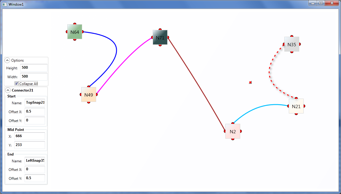
- I added the concept of
SnapSpotinto the equation. These are the little red semi-circles you see around the nodes, which are actually what theConnectors are tied to. I also changed the
ConnectorDataTemplate to use aQuadraticBezierSegmentbased onConnector.Start.Location,
Connector.MidPoint, and
Connector.End.Location
This allows curved lines to be used as connectors, not just straight lines.
- There's a little red-square-shaped
Thumbthat will appear when you select (click) on aConnector, (visible in the screenshot) that will allow you to move theMidPointof the curve. - You can also manipulate that value by rolling the mouse wheel when hovering the
TextBoxesunder "Mid Point" in the left panel. - The "Collapse All"
CheckBoxallows to toggle between full and small boxes, as shown in the screenshot. - The
SnapSpots have anOffsetXOffsetYbetween 0 and 1 that corresponds to their position relative to the parentNode. These are not limited to 4 and could actually be any number of them perNode. - The
ComboBoxesandButtonshave no functionality, but it's just a matter of creating the relevant properties and Commands in theNodeclass and bind them to that.
Edit2:
Updated download link with a much nicer version.
Edit 10/16/2014: Since a lot of people seem to be interested in this, I uploaded the source to GitHub.
Creating a custom button control
In this case, you can use a UserControl. This is easier than creating a custom control, which requires to derive a control from an existing control and to enhance it. In VS right click on your project and choose "Add" > "New Item...". In the Windows Forms section select "User Control". Give it the name "TicTacToeUserControl". You can design the user control much like designing a form. It will then automatically appear in to Toolbox of the current project and be ready to be dropped on a form.
UPDATE
Here some more explanations. Place a TableLayoutPanel on the UserControl. Change Dock to Fill. Add a row and a column in order to have three of both and change their size mode to Percent and change these values to 33.33. Add a button to each table field from left to right and then top down in order to have buttons names "button1", "button2" etc. in reading order. Save the user control (my VS had a glitch at this point and I had to start all over).
Create this class that we will use as event argument for our button click event
public class ButtonClickedEventArgs : EventArgs
{
    public ButtonClickedEventArgs(TicTacToeUserControl userControl, Button button,
                                  int buttonNumber, int row, int column)
    {
        UserControl = userControl;
        Button = button;
        ButtonNumber = buttonNumber;
        Row = row;
        Column = column;
    }

    public TicTacToeUserControl UserControl { get; private set; }
    public Button Button { get; private set; }
    public int ButtonNumber { get; private set; }
    public int Row { get; private set; }
    public int Column { get; private set; }
}
Change the code of the user control to make it look like this
[DefaultEvent("ButtonClicked")]
public partial class TicTacToeUserControl : UserControl
{
    public event EventHandler<ButtonClickedEventArgs> ButtonClicked;

    public TicTacToeUserControl()
    {
        InitializeComponent();
    }

    private void button_Click(object sender, EventArgs e)
    {
        OnButtonClicked((Button)sender);
    }

    private void OnButtonClicked(Button button)
    {
        var eh = ButtonClicked;
        if (eh != null) {
            int buttonNumber =
                Int32.Parse(button.Name.Substring(button.Name.Length - 1));
            int row = (buttonNumber - 1) / 3;
            int col = (buttonNumber - 1) % 3;
            eh(this,
               new ButtonClickedEventArgs(this, button, buttonNumber, row, col));
        }
    }
}
Select the event handler "button_Click" for the click event of all your buttons in the properties window switched to Event (the flash symbol). Don't create a new one for each button. Hit F6 (compile)
Your control is ready and can be dropped onto a form from the tools window. Resize it as desired. Double click on it. Because of the DefaultEventAttribute that we specified for the form, VS will automatically create this event handler
private void ticTacToeUserControl1_ButtonClicked(object sender,
                                                 ButtonClickedEventArgs e)
{
}
Add this code line to it in order to test the user control
    MessageBox.Show(e.UserControl.Name + " " + e.Button.Name + " " +
                    e.ButtonNumber + " " + e.Row + " " + e.Column);
NOTE: This does not actually create a new control, it just creates a template
creating a custom layout/button
Here's a starter UserControl using a TableLayoutPanel:
- Click on Project --> Add User Control --> Type in a Name (I used
"TriButton") --> Add Button. - Add a TableLayout Panel and set its
Dock Property to Fill. - Click the "..." in the Columns Property. Set Column1 to 25%, and leave Column2 at 50%. *This will make Column 1 take up 1/3 of the Width, and Column2 take up 2/3 of the Width because 50 is twice as big as 25.
- Add a Button (button1) in the Top Left Cell of the TableLayout
Panel. Set its Dock Property to Fill, and its RowSpan Property to 2. - Add a Button (button2) in the Top Right Cell of the TableLayoutPanel. Set its Dock Property to Fill.
- Add a Button (button3) in the Bottom Right Cell of the TableLayoutPanel. Set its Dock Property to Fill.
Try resizing the UserControl to see how it behaves:
Compile or run the app and the new UserControl should appear at the Top of your ToolBox.
You'll need to add appropriate Properties if you want to be able to get/set the Button values from outside the UserControl, and it might be a good idea to give the UserControl custom Button Click events.
Alternate approach
Here's an example of creating the layout as a background image for the button:

public partial class Form1 : Form
{

    public Form1()
    {
        InitializeComponent();
    }

    private void button1_Click(object sender, EventArgs e)
    {
        Size sz = new Size(300, 150);
        TriButton btn = new TriButton(sz, textBox1.Text, textBox2.Text, dateTimePicker1.Value);
        flowLayoutPanel1.Controls.Add(btn);
    }

}

public class TriButton : Button
{

    private String ID;
    private String Information;
    private DateTime Date;

    public TriButton(Size initialSize, String ID, String Information, DateTime Date)
    {
        this.ID = ID;
        this.Information = Information;
        this.Date = Date;
        this.Size = initialSize;
        this.SizeChanged += TriButton_SizeChanged;
        this.CreateBackgroundImage();
        this.Text = "";
        this.FlatStyle = System.Windows.Forms.FlatStyle.Popup;
        this.BackgroundImageLayout = ImageLayout.None;
        this.TextImageRelation = System.Windows.Forms.TextImageRelation.Overlay;
    }

    private void TriButton_SizeChanged(object sender, EventArgs e)
    {
        this.CreateBackgroundImage();
    }

    private void CreateBackgroundImage()
    {
        Bitmap bmp = new Bitmap(this.ClientRectangle.Width, this.ClientRectangle.Height);
        Rectangle A = new Rectangle(new Point(0, 0), new Size(this.ClientRectangle.Width / 3, this.ClientRectangle.Height));
        Rectangle B = new Rectangle(new Point(A.Right, 0), new Size(this.ClientRectangle.Width - A.Width, this.ClientRectangle.Height / 2));
        Rectangle C = new Rectangle(new Point(A.Right, B.Bottom), new Size(B.Width, B.Height));
        using(Graphics g = Graphics.FromImage(bmp))
        {
            g.Clear(this.BackColor);
            using (Pen p = new Pen(SystemColors.ActiveBorder))
            {
                g.DrawRectangle(p, A);
                g.DrawRectangle(p, B);
                g.DrawRectangle(p, C);
            }
            StringFormat sf = new StringFormat();
            sf.Alignment = StringAlignment.Center;
            sf.LineAlignment = StringAlignment.Center;
            using (Brush b = new SolidBrush(this.ForeColor))
            {
                g.DrawString(this.ID, this.Font, b, A, sf);
                g.DrawString(this.Information, this.Font, b, B, sf);
                g.DrawString(this.Date.ToShortDateString(), this.Font, b, C, sf);
            }
        }
        this.BackgroundImage = bmp;
    }

}
How to draw straight line between two controls in a user control?
The Visual Basic Power Pack contains a DataRepeater, and some shapes (oval, rectangle..) including a line. See this link.
It is called "Visual Basic" Power Pack, but it can be used in a C# project without any hassle.
Look at the DataRepeater, not only it will help you to fill your panel with custom controls as items, but it contains what you need to put a line between them.
How can I create a control that connects two list items with lines?
Agree with HighCore - take a look at the Canvas in WPF. You can also do this in WinForms using GDI+. Basically, you need to define your endpoints - could be by click, or by border of the listItem. Then, you store a collection of lines that link them. When your listItems change position, you need to adjust the line on the canvas.
How do I create command link buttons (with multiple lines of text) in VB.NET?
The button shown in the screenshot is actually one used throughout the Aero UI. It's a custom style of button called a "command link", and it can be easily applied to a standard Button control.
Unfortunately, the WinForms libraries don't expose this functionality via a simple property, but that's easily fixable with a bit of P/Invoke.
The style you're looking for is called BS_COMMANDLINK. According to the documentation, this style:
Creates a command link button that behaves like a
BS_PUSHBUTTONstyle button, but the command link button has a green arrow on the left pointing to the button text. A caption for the button text can be set by sending theBCM_SETNOTEmessage to the button.
Here's a little custom button control class that extends the standard WinForms Button control, and implements the "command link" style as a property you can configure in the designer or through code.
A couple of things to note about the code:
The
FlatStyleproperty must always be set toFlatStyle.System, which forces the use of the standard Windows API Button control, rather than one drawn by WinForms code. This is required for theBS_COMMANDLINKstyle to work (because it's only supported by the native controls), and it produces a better looking button control (with throbbing effects, etc.) anyway. To force this, I've overridden theFlatStyleproperty and set a default value.The
CommandLinkproperty is how you toggle on and off the "command link" style. It's off by default, giving you a standard button control, so you can replace all of the button controls in your application with this one, if you want, just for convenience. When you turn the property on (set it toTrue), then you get a fancy, multiline command link button.The command link button's caption is the same caption as is displayed on a standard button. However, caption button also support a "description" on the second line. This is configurable through another property, called
CommandLinkNote, after the WinAPI message,BCM_SETNOTE. When you have the button configured as a standard button control (CommandLink = False), the value of this property is ignored.
Imports System.Windows.Forms
Imports System.ComponentModel
Imports System.Runtime.InteropServices

Public Class ButtonEx : Inherits Button

    Private _commandLink As Boolean
    Private _commandLinkNote As String

    Public Sub New() : MyBase.New()
        'Set default property values on the base class to avoid the Obsolete warning
        MyBase.FlatStyle = FlatStyle.System
    End Sub

    <Category("Appearance")> _
    <DefaultValue(False)> _
    <Description("Specifies this button should use the command link style. " & _
                 "(Only applies under Windows Vista and later.)")> _
    Public Property CommandLink As Boolean
        Get
            Return _commandLink
        End Get
        Set(ByVal value As Boolean)
            If _commandLink <> value Then
                _commandLink = value
                Me.UpdateCommandLink()
            End If
        End Set
    End Property

    <Category("Appearance")> _
    <DefaultValue("")> _
    <Description("Sets the description text for a command link button. " & _
                 "(Only applies under Windows Vista and later.)")> _
    Public Property CommandLinkNote As String
        Get
            Return _commandLinkNote
        End Get
        Set(value As String)
            If _commandLinkNote <> value Then
                _commandLinkNote = value
                Me.UpdateCommandLink()
            End If
        End Set
    End Property

    <Browsable(False)> <EditorBrowsable(EditorBrowsableState.Never)> _
    <DebuggerBrowsable(DebuggerBrowsableState.Never)> _
    <Obsolete("This property is not supported on the ButtonEx control.")> _
    <DefaultValue(GetType(FlatStyle), "System")> _
    Public Shadows Property FlatStyle As FlatStyle
        'Set the default flat style to "System", and hide this property because
        'none of the custom properties will work without it set to "System"
        Get
            Return MyBase.FlatStyle
        End Get
        Set(ByVal value As FlatStyle)
            MyBase.FlatStyle = value
        End Set
    End Property

#Region "P/Invoke Stuff"
    Private Const BS_COMMANDLINK As Integer = &HE
    Private Const BCM_SETNOTE As Integer = &H1609

    <DllImport("user32.dll", CharSet:=CharSet.Unicode, SetLastError:=False)> _
    Private Shared Function SendMessage(ByVal hWnd As IntPtr, ByVal msg As Integer, ByVal wParam As IntPtr, _
                                        <MarshalAs(UnmanagedType.LPWStr)> ByVal lParam As String) As IntPtr
    End Function

    Private Sub UpdateCommandLink()
        Me.RecreateHandle()
        SendMessage(Me.Handle, BCM_SETNOTE, IntPtr.Zero, _commandLinkNote)
    End Sub

    Protected Overrides ReadOnly Property CreateParams As CreateParams
        Get
            Dim cp As CreateParams = MyBase.CreateParams

            If Me.CommandLink Then
                cp.Style = cp.Style Or BS_COMMANDLINK
            End If

            Return cp
        End Get
    End Property
#End Region

End Class
How to create a Custom Image Button, made of three individual buttons and add event handler
If I understand well, you want to publish the Click events of your inner buttons.
Solution 1
This simply publishes the inner click event.
public event EventHandler Button1Click
{
    add { button1.Click += value; }
    remove { button1.Click -= value; }
}
Solution 2
If you want some control over the invoking, do it like this:
public MultiButtons()
{
    InitializeComponents();
    button1.Click += ButtonClick;
    button2.Click += ButtonClick;
    button3.Click += ButtonClick;
}

// this handles all of your clicks
private void ButtonClick(object sender, EventArgs e)
{
    if (sender == button1)
        OnButton1Click(EventArgs.Empty);
    // TODO: the other buttons...
}

public event EventHandler Button1Click;

protected virtual void OnButton1Click(EventArgs e)
{
    var handler = Button1Click;
    if (handler != null)
        handler(this, e);
    else
        // you can call some default action if there is no event subscription
        DefaultButton1Click();
}
Update: I have just seen your comment:
I need a custom Image button with Three sections and on each section click i want to invoke an event which will perform some operation.
Just create three separate buttons next to each other and draw them in the Paint as if they were a single button. Then you can use one of the solutions above.
C# user control as a custom panel
Have a look here
How to make a UserControl object acts as a control container design-time by using Visual C#
But if you only need extended Panel functionality its better to inherit directly from Panel.
Related Topics
Is There Any Significant Difference Between Using If/Else and Switch-Case in C#
Conditionally Change CSS Class in Razor View
My Algorithm to Calculate Position of Smartphone - Gps and Sensors
How to Run Servicestack on Linux/Mono
Cross-Platform File Name Handling in .Net Core
Cannot Run ASP.NET 5 from Docker
Convert Ienumerable to Datatable
Assign Bitmapimage from Resources.Resx to Image.Source
How to Find the Number of Cpu Cores Via .Net/C#
.Net Httpclient. How to Post String Value
Calculate the Number of Business Days Between Two Dates
Asp.Net MVC: Custom Validation by Dataannotation
Reflection: How to Invoke Method With Parameters