Wrapper div height is 0 with floated elements inside
Set overflow: hidden on the parent.
<div class="outside" style="border:1px solid #555;overflow:hidden;">
  <div class="inside" style="float:left; width:40px;">CONTENT</div>
  <div class="inside2" style="float:left; width:40px;">CONTENT</div>
</div>
Why doesn't the height of a container element increase if it contains floated elements?
The floated elements do not add to the height of the container element, and hence if you don't clear them, container height won't increase...
I'll show you visually:
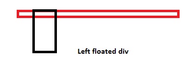
More Explanation:
<div>
<div style="float: left;"></div>
<div style="width: 15px;"></div> <!-- This will shift
besides the top div. Why? Because of the top div
is floated left, making the
rest of the space blank -->
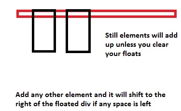
<div style="clear: both;"></div>
<!-- Now in order to prevent the next div from floating beside the top ones,
we use `clear: both;`. This is like a wall, so now none of the div's
will be floated after this point. The container height will now also include the
height of these floated divs -->
<div></div>
</div>
You can also add overflow: hidden; on container elements, but I would suggest you use clear: both; instead.
Also if you might like to self-clear an element you can use
.self_clear:after {
  content: "";
  clear: both;
  display: table;
}
How Does CSS Float Work?
What is float exactly and what does it do?
The
floatproperty is misunderstood by most beginners. Well, what exactly doesfloatdo? Initially, thefloatproperty was introduced to flow text around images, which are floatedleftorright. Here's another explanation by @Madara Uchicha.So, is it wrong to use the
floatproperty for placing boxes side by side? The answer is no; there is no problem if you use thefloatproperty in order to set boxes side by side.Floating an
Demoinlineorblocklevel element will make the element behave like aninline-blockelement.If you float an element
leftorright, thewidthof the element will be limited to the content it holds, unlesswidthis defined explicitly ...You cannot
floatan elementcenter. This is the biggest issue I've always seen with beginners, usingfloat: center;floatproperty.floatis generally used tofloat/move content to the very left or to the very right. There are only four valid values forfloatproperty i.eleft,right,none(default) andinherit.Parent element collapses, when it contains floated child elements, in order to prevent this, we use
clear: both;property, to clear the floated elements on both the sides, which will prevent the collapsing of the parent element. For more information, you can refer my another answer here.(Important) Think of it where we have a stack of various elements. When we use
float: left;orfloat: right;the element moves above the stack by one. Hence the elements in the normal document flow will hide behind the floated elements because it is on stack level above the normal floated elements. (Please don't relate this toz-indexas that is completely different.)
Taking a case as an example to explain how CSS floats work, assuming we need a simple 2 column layout with a header, footer, and 2 columns, so here is what the blueprint looks like...
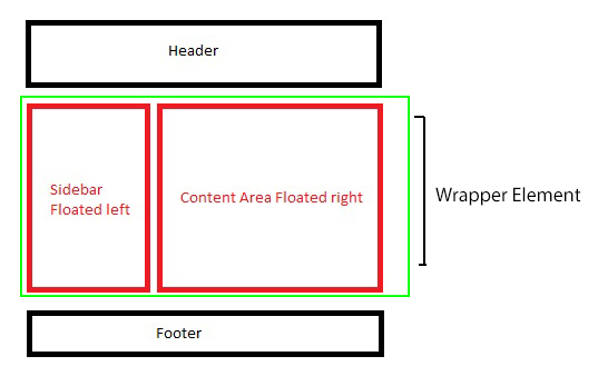
In the above example, we will be floating only the red boxes, either you can float both to the left, or you can float on to left, and another to right as well, depends on the layout, if it's 3 columns, you may float 2 columns to left where another one to the right so depends, though in this example, we have a simplified 2 column layout so will float one to left and the other to the right.
Markup and styles for creating the layout explained further down...
<div class="main_wrap">
    <header>Header</header>
    <div class="wrapper clear">
        <div class="floated_left">
            This<br />
            is<br />
            just<br />
            a<br />
            left<br />
            floated<br />
            column<br />
        </div>
        <div class="floated_right">
            This<br />
            is<br />
            just<br />
            a<br />
            right<br />
            floated<br />
            column<br />
        </div>
    </div>
    <footer>Footer</footer>
</div>

* {
    -moz-box-sizing: border-box;       /* Just for demo purpose */
    -webkkit-box-sizing: border-box;   /* Just for demo purpose */
    box-sizing: border-box;            /* Just for demo purpose */
    margin: 0;
    padding: 0;
}

.main_wrap {
    margin: 20px;
    border: 3px solid black;
    width: 520px;
}

header, footer {
    height: 50px;
    border: 3px solid silver;
    text-align: center;
    line-height: 50px;
}

.wrapper {
    border: 3px solid green;
}

.floated_left {
    float: left;
    width: 200px;
    border: 3px solid red;
}

.floated_right {
    float: right;
    width: 300px;
    border: 3px solid red;
}

.clear:after {
    clear: both;
    content: "";
    display: table;
}
Let's go step by step with the layout and see how float works..
First of all, we use the main wrapper element, you can just assume that it's your viewport, then we use header and assign a height of 50px so nothing fancy there. It's just a normal non floated block level element which will take up 100% horizontal space unless it's floated or we assign inline-block to it.
The first valid value for float is left so in our example, we use float: left; for .floated_left, so we intend to float a block to the left of our container element.
Column floated to the left
And yes, if you see, the parent element, which is .wrapper is collapsed, the one you see with a green border didn't expand, but it should right? Will come back to that in a while, for now, we have got a column floated to left.
Coming to the second column, lets it float this one to the right
Another column floated to the right
Here, we have a 300px wide column which we float to the right, which will sit beside the first column as it's floated to the left, and since it's floated to the left, it created empty gutter to the right, and since there was ample of space on the right, our right floated element sat perfectly beside the left one.
Still, the parent element is collapsed, well, let's fix that now. There are many ways to prevent the parent element from getting collapsed.
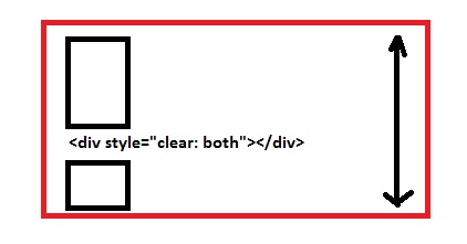
- Add an empty block level element and use
clear: both;before the parent element ends, which holds floated elements, now this one is a cheap solution toclearyour floating elements which will do the job for you but, I would recommend not to use this.
Add, <div style="clear: both;"></div> before the .wrapper div ends, like
<div class="wrapper clear">
    <!-- Floated columns -->
    <div style="clear: both;"></div>
</div>
Demo
Well, that fixes very well, no collapsed parent anymore, but it adds unnecessary markup to the DOM, so some suggest, to use overflow: hidden; on the parent element holding floated child elements which work as intended.
Use overflow: hidden; on .wrapper
.wrapper {
    border: 3px solid green;
    overflow: hidden;
}
Demo
That saves us an element every time we need to clear float but as I tested various cases with this, it failed in one particular one, which uses box-shadow on the child elements.
Demo (Can't see the shadow on all 4 sides, overflow: hidden; causes this issue)
So what now? Save an element, no overflow: hidden; so go for a clear fix hack, use the below snippet in your CSS, and just as you use overflow: hidden; for the parent element, call the class below on the parent element to self-clear.
.clear:after {
    clear: both;
    content: "";
    display: table;
}

<div class="wrapper clear">
    <!-- Floated Elements -->
</div>
Demo
Here, shadow works as intended, also, it self-clears the parent element which prevents to collapse.
And lastly, we use footer after we clear the floated elements.
Demo
When is float: none; used anyways, as it is the default, so any use to declare float: none;?
Well, it depends, if you are going for a responsive design, you will use this value a lot of times, when you want your floated elements to render one below another at a certain resolution. For that float: none; property plays an important role there.
Few real-world examples of how float is useful.
- The first example we already saw is to create one or more than one column layouts.
- Using
imgfloated insidepwhich will enable our content to flow around.
Demo (Without floating img)
Demo 2 (img floated to the left)
- Using
floatfor creating horizontal menu - Demo
Float second element as well, or use `margin`
Last but not the least, I want to explain this particular case where you float only single element to the left but you do not float the other, so what happens?
Suppose if we remove float: right; from our .floated_right class, the div will be rendered from extreme left as it isn't floated.
Demo
So in this case, either you can float the to the left as well
OR
You can use margin-left which will be equal to the size of the left floated column i.e 200px wide.
Container div ignores height of floated elements
You are looking for the so-called clearfix.
Why is the parent div height zero when it has floated children
Content that is floating does not influence the height of its container. The element contains no content that isn't floating (so nothing stops the height of the container being 0, as if it were empty).
Setting overflow: hidden on the container will avoid that by establishing a new block formatting context. See methods for containing floats for other techniques and containing floats for an explanation about why CSS was designed this way.
CSS: Floating divs have 0 height
It's not because the floating divs doesn't have a height, it's because the floating divs don't affect the size of the parent element.
You can use the overflow style to make the parent element take the floating elements in consideration:
#outer { overflow: auto; }
div height: 0; without any floating child elements?
<span> should be <ul> or <li> should be <span> or any inline-elements to make a valid code. best is to use <ul><li><a> for a list of links.
position:absolute;(or fixed) takes element out of the natural flow of the page, so <nav> have no content to make it grow.
How to make a div grow in height while having floats inside
overflow:auto; on the containing div makes everything inside of it (even floated items) visible and the outer div fully wraps around them. See this example:
.wrap { padding: 1em; overflow: auto; background: silver; } .float { float: left; width: 40%; background: white; margin: 0 1%;}<div class="wrap"> <div class="float">Cras mattis iudicium purus sit amet fermentum. At nos hinc posthac, sitientis piros Afros. Qui ipsorum lingua Celtae, nostra Galli appellantur. Petierunt uti sibi concilium totius Galliae in diem certam indicere. Ambitioni dedisse scripsisse iudicaretur.</div> <div class="float">Mercedem aut nummos unde unde extricat, amaras. A communi observantia non est recedendum. Quisque ut dolor gravida, placerat libero vel, euismod. Paullum deliquit, ponderibus modulisque suis ratio utitur.</div> </div>CSS container div not getting height
Add the following property:
.c{
    ...
    overflow: hidden;
}
This will force the container to respect the height of all elements within it, regardless of floating elements.
http://jsfiddle.net/gtdfY/3/
UPDATE
Recently, I was working on a project that required this trick, but needed to allow overflow to show, so instead, you can use a pseudo-element to clear your floats, effectively achieving the same effect while allowing overflow on all elements.
.c:after{
    clear: both;
    content: "";
    display: block;
}
http://jsfiddle.net/gtdfY/368/
How to fit a div's height to wrap around its floated children
This is a common issue when working with floats. There are several common solutions, which I have ordered by personal preference (best approach first):
Use the ::after CSS pseudo element. This is know as the 'clearfix', and works IE8 and up. If you need compatibility with earlier versions of IE, this answer should help. Example.
.parentelement::after {
    content: "";
    display: table;
    clear: both;
}
Add the two floats into a container with the CSS attribute
overflow: autooroverflow: hidden. However, this approach can cause issues (e.g. when a tooltip overlaps the edges of the parent element a scrollbar will appear). Example.<div style="overflow: auto">
<div style="float: left"></div>
<div style="float: left"></div>
</div>Add a set height to the parent element. Example.
<div style="height: 200px">
    <div style="float: left"></div>
    <div style="float: left"></div>
</div>
Make the parent element a float. Example.
<div style="float: left">
    <div style="float: left"></div>
    <div style="float: left"></div>
</div>
Add a div after the floats with
clear: both. Example.<div style="float: left"></div>
<div style="float: left"></div>
<div style="clear: both"></div>
How to float an element left with full height of the wrapper?
The display: table solution
Within tables each cell of a row has the same height.
.wrapper {
    display: table;
    width: 100%;
}
.left, .right {
    display: table-cell;
}
This is the best solution in my opinion, but is not compatible before IE8.
Here is the Fiddle for this solution.
Using absolute positioning
Absolute positioned elements respect their relative parents height:
.wrapper {
    position: relative;
    padding-left: 85px;
}
.left {
    position: absolute;
    left: 0;
    top: 0;
}
Normally I would not recommend absolute positioning in most situations. But as you have a fixed width anyway, maybe it does not matter. But be aware of the fact that this will ignore long contents in .left. The height is just controlled by .right.
Here is an update to your Fiddle.
The flexible solution
This is so new I would not recommend using it right now, but just to be complete. You could use CSS3 flex, but be aware of browser compatibility:
.wrapper {
    display: flex;
}
The Fiddle (tested in current Chrome and Firefox).
The grid layout
Even newer than flexbox, CSS grid seams to be the perfect answer for layout questions.
.wrapper {
    display: grid;
    grid-template-areas: 'left right';
}

.left {
    grid-area: left;
}

.right {
    grid-area: right;
}
Browser compatibility is rare, if you go back a view versions. Besides, it would be overkill for the OP's scenario in my opinion, but for more complex layout troubles in the future, this is a very powerful thing.
See it in the Fiddle.
Related Topics
Change Color of Svg Spritesheet Sprite with CSS
Do I Still Need to Include Type="Value" in HTML5
Is It Easier/Faster to Evaluate CSS Selectors Ltr or Rtl
Less - Nesting Generates Bad CSS Code
Incompatible Units: 'Rem' and 'Px' with Bootstrap 4 Alpha 6
Center Image and Text at Large Width, Allow Both to Shrink at Small Width
Can CSS Be Applied to <Track> Element
Can Not Scroll <Body> While Fullscreen Is Enabled in Ms Ie11
CSS-Transform Animation Causing to Flickering
How to Use Fastclick with Jquery Mobile The Right Way
Div Background Color Not Showing with Body Color
Equal Height Divs (Two Column)
Issue on Ie7 When Page Is Scrolling.Text Is Not Proper
Font Face Causes Performance Issues
How to Change a Div Padding Without Affecting The Width/Height
CSS Selector for Shadow Root or All Top Level Elements in Shadow Root
How to Scroll Programmatically a Div with Its Own Scrollbars
How to Position The Div Popup Dialog to The Center of Browser Screen