What is the default style of the blue focus outline in Chrome?
To answer the question, Webkit browsers use outline: 5px auto -webkit-focus-ring-color;. On Macs -webkit-focus-ring-color is blue rgb(94, 158, 214) (or #5E9ED6), but on Windows and Linux it’s gold rgb(229, 151, 0) (or #E59700) (ref).
While I understand your desire for consistency, users generally only use one browser, and are used to their browser’s default styles. Note that unless you plan to change every instance of :focus you’ll end up with inconsistency for e.g. keyboard users. Pros and cons eh!
If you define outline styles and want to ‘revert’ back to the default User Agent styles on :focus, this will help
.myClass:focus {

  outline: 1px dotted #212121;

  outline: 5px auto -webkit-focus-ring-color;

}
Chrome default focus outline
Try this:
* {
    outline-color: lime;
}
Remove blue border from css custom-styled button in Chrome
Doing this is not recommended as it regresses the accessibility of your site; for more info, see this post.
That said, if you insist, this CSS should work:
button:focus {outline:0;}
Check it out or JSFiddle: http://jsfiddle.net/u4pXu/
Or in this snippet:
button.launch {

background-color: #F9A300;

border: none;

height: 40px;

padding: 5px 15px;

color: #ffffff;

font-size: 16px;

font-weight: 300;

margin-top: 10px;

margin-right: 10px;

}

button.launch:hover {

cursor: pointer;

background-color: #FABD44;

}

button.launch {

background-color: #F9A300;

border: none;

height: 40px;

padding: 5px 15px;

color: #ffffff;

font-size: 16px;

font-weight: 300;

margin-top: 10px;

margin-right: 10px;

}

button.launch:hover {

cursor: pointer;

background-color: #FABD44;

}

button.change {

background-color: #F88F00;

border: none;

height: 40px;

padding: 5px 15px;

color: #ffffff;

font-size: 16px;

font-weight: 300;

margin-top: 10px;

margin-right: 10px;

}

button.change:hover {

cursor: pointer;

background-color: #F89900;

}

button:active {

outline: none;

border: none;

}

button:focus {outline:0;}
<button class="launch">Launch with these ads</button>
<button class="change">Change</button>How to remove focus border (outline) around text/input boxes? (Chrome)
This border is used to show that the element is focused (i.e. you can type in the input or press the button with Enter). You can remove it with outline property, though:
textarea:focus, input:focus{
    outline: none;
}
You may want to add some other way for users to know what element has keyboard focus though for usability.
Chrome will also apply highlighting to other elements such as DIV's used as modals. To prevent the highlight on those and all other elements as well, you can do:
*:focus {
    outline: none;
}
⚠️ Accessibility warning
Please notice that removing outline from input is an accessibility bad practice. Users using screen readers will not be able to see where their pointer is focused at. More info at a11yproject
Remove default focus outline and change to different color
It's a box-shadow style applied on focus.
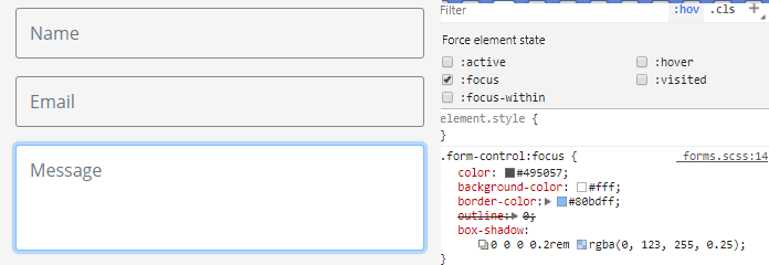
add this code to remove it:
.form-control:focus {
   box-shadow:none;
}
You may add !important depending on your CSS order:
Related Topics
CSS Floats, Change Order on Mobile Layout
Text Field Not Working in Safari
How to Change Bootstrap 3's Glyphicons to White
Bootstrap 4, Bg-Inverse Not Showing
Can Flexbox Divide Items Evenly on Multiple Rows
How to Set the CSS Class Name Dynamically in Lesscss
Why Is CSS Grid Row Height Different in Safari
How to Change Background-Color on Text Links on Hover But Not Image Links
Svg Transform="Rotate(180)" Does Not Work in Safari 11
Can You Use If/Else Conditions in Css
Font-Feature-Settings: What Is the Correct Syntax
CSS Box-Shadow on Three Sides of a Div
Multiple !Important Class Declarations and Precedence
How to Turn Off SASS Rgb -> Color Name
CSS Transitions with :Before and :After Pseudo Elements
Flexbox, Min-Height, Margin Auto and Internet Explorer