Vertical alignment of text in container: WebKit vs Firefox
This is browser rendering issue. Use line-height 1px less than the given height, for example:
    .box
{
   background-color: Blue;
   color: White;
   font-family: Helvetica,Arial;
   font-size: 15px;
   height: 18px;
   line-height: 17px;
   width: 60px;
}
WebKit vs Mozilla vertical alignment of font glyphs in box
Unfortunetly, there isn't a solution to this problem. Text rendering is done differently in almost every browser, and even between major browser versions it sometimes changes. In some browsers it is determined by the particular font rendering systems and settings from the OS. There have always been and always will be trade offs for one type of font rendering to another, and every one of those will change with different types of displays on different types of hardware.
Sorry, you'll have to live with non-pixel perfect fonts between browsers until there is a complete monopoly by a single browser, a single OS with no available display setting choices, a single monitor type and size, and a single video card. In other words, it's never going to match pixels perfectly as long as your site supports multiple devices, browsers, displays, etc.
(Kudos for doing your own homework and testing first though. Your question was well researched and thought before asking. I wish we could have given you a better answer after all that work.)
Cross browser vertical centering for text inside a circle
.quantity-badge {
  display: block; /*Changed this*/
  width: 24px;
  height: 24px;
  line-height:24px; /*Added this*/
  padding:10px; /*Added this*/
  text-align: center;
  vertical-align: middle;
  color: #fff;
  border-radius: 50%;
  -webkit-border-radius: 50%; /*Added this*/
  background-color: #0896ea;
}
I hope this can begin to help you out. Here is a fork of the code you posted: http://codepen.io/anon/pen/EKNevV
HTML + CSS issue, Chrome/Safari vs Firefox text positioning issue
OK here is what you are loooking for...
vertical-align:middle
WORKING DEMO
Alternative solution:
DEMO
Using line height method.
CSS
#header-social-icons {
    background-color:#fffdd0;
    width: 100%;
    height: 100px text-align: center;
}
Check these links for more info
LINK 1
LINK 2
line-height 2px lower in firefox vs webkit
I've done heavy testing of this in the past. I call it text jiggle. It's not something you can control. All you can do to minimize it is apply an explicit line-height (especially one in px) to every text element.
The default line-height varies by a wide margin in different browsers, and for different font families at different font sizes. Setting an explicit line-height addresses that.
But within that, the exact placement of the text within the line-height space will vary slightly browser-to-browser no matter what you do. For some combinations of font-size and line-height, all browsers match up. For instance, Arial at font-size:11px and line-height:14px renders the same in FF, Webkit, and IE. But change the line-height to 13px or 15px, and it varies by 1px browser-to-browser.
There's no standard or defined behavior for it. It's the result of how that particular font-family, font-size, and line-height happens to be rendered by the browser on that operating system. Arial, for instance, is a relatively consistent font, generally not varying by more than 1px as long as an explicit line-height is defined, while Helvetica varies by as many as 4 to 6 pixels.
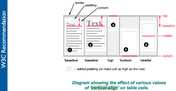
Table vertical-align in Firefox
There is a responsive-friendly and flexible solution. If you don't know the width or height of the div, you can use this CSS3 code:
Vertical align center with transform - fiddle
.valign{
  transform: translate(-50%, -50%);
  -webkit-transform: translate(-50%, -50%);
  -moz-transform: translate(-50%, -50%);
  -ms-transform: translate(-50%, -50%);
  position: absolute;
  top: 50%;
  left: 50%;
}
webkit-baseline-middle and -moz-middle-with-baseline
@VSG24:
Are they part of any standards?
Both properties are not part of any standards, according to W3C CSS reference. They only seem to be used by Webkit and Gecko to behave correctly, as expected in CSS 2.1 specification:
Align the vertical midpoint of the box with the baseline of the parent box plus half the x-height of the parent.
CSS 2.1 specs, p170
@VSG24:
What is the expected behavior when using them?
After some search on the web, here's what I've found about -webkit-baseline-middle on the Safari CSS Reference:
vertical-align: -webkit-baseline-middle:
The center of the element is aligned with the baseline of the text.
I was unable to get any info about -moz-middle-with-baseline other than this one :
Q: Webkit-baseline-middle - are there alternatives?
A: the same, only for Mozilla
>vertical-align: -moz-middle-with-baseline;https://toster.ru/q/255210
Below is a test, you may try it using Webkit based browsers (such as Chrome) and Gecko (Firefox):
div {
  width: 15%;
  height: 100px;
  display: inline-block;
  box-sizing: border-box;
}

hr {
  width: 100%;
  position: absolute;
  top: 90px;
  height: 1px;
  background: hotpink;
  border: none;
}

.container {
  border: 2px solid hotpink;
  position: absolute;
  top: 0;
  left: 0;
  height: 200px;
  width: 100%;
  z-index: -1;
}

.reference {
  background: darkblue;
}

.standard {
  background: teal;
  vertical-align: middle;
}

.moz {
  background: antiquewhite;
  vertical-align: -moz-middle-with-baseline;
}

.webkit {
  background: darksalmon;
  vertical-align: -webkit-baseline-middle
}
<div class="container">
<hr />
<div class="reference"></div>
<div class="standard"></div>
<div class="moz"></div>
<div class="webkit"></div>
</div>Related Topics
Animate Transform Only One Property (Scale) Override Other (Translate)
How to Set Horizontal Gradient to Text via CSS? (Left Letter One Colour, Right - Another Colour)
CSS Display Inline-Block Issue with Ie
Firefox 30.0 - -Moz-Appearance: None Not Working
Can Not Use Theme Color with Text or Bg
Ie Background Size Not Working
Specificity Rules for Comma Delineated Lists
How to Pass !Important as Parameter/Option for Lesscss Mixins
Clipping or Chamfering Corners of Image to See Background
Rendering Font Differs from Ie Compared to Ff and Chrome
How to Set Custom Fonts in Javafx Scene Builder Using CSS
Why Does Internet Explorer Need the "Haslayout" Flag
Display Footer in Primefaces Template, When Fullpage of P:Layout Is Set to False
How to Apply Clippath to a Div with the Clippath Position Being Relative to the Div Position
Consistent Origin in CSS Rotation Between IE8 and Everything Else