vertical-align: middle with Bootstrap 2
Try this:
.row > .span3 {
    display: inline-block !important;
    vertical-align: middle !important;
}
Edit:
Fiddle: http://jsfiddle.net/EexYE/
You may need to add Diego's float: none !important; also if span3 is floating and it interferes.
Edit:
Fiddle: http://jsfiddle.net/D8McR/
In response to Alberto: if you fix the height of the row div, then to continue the vertical center alignment you'll need to set the line-height of the row to be the same as the pixel height of the row (ie. both to 300px in your case). If you'll do that you will notice that the child elements inherit the line-height, which is a problem in this case, so you will then need to set your line height for the span3s to whatever it should actually be (1.5 is the example value in the fiddle, or 1.5 x the font-size, which we did not change when we changed the line-height).
Bootstrap Center Vertical and Horizontal Alignment
Bootstrap 5 (Updated 2021)
Bootstrap 5 is still flexbox based so vertical centering works the same way as it did in Bootstrap 4. For example, align-items-center (flex-direction: row) and justify-content-center (flex-direction: column) can used on the flexbox parent (row or d-flex).
Centering examples in Bootstrap 5
Vertical center (don't forget the parent must have a defined height!):
my-autofor centering inside flex (.d-flex) elementsmy-autocan be used to center columns (.col-) insiderowalign-items-centerto center columns (col-*) insiderow
Horizontal center:
text-centerto centerdisplay:inlineelements & column contentmx-autofor centering inside flex elementsmx-autocan be used to center columns (.col-) insiderowjustify-content-centerto center columns (col-*) insiderow
Bootstrap 4.3+ (Update 2019)
There's no need for extra CSS. What's already included in Bootstrap will work. Make sure the container(s) of the form are full height. Bootstrap 4 now has a h-100 class for 100% height...
Vertical center:
<div class="container h-100">
  <div class="row h-100 justify-content-center align-items-center">
    <form class="col-12">
      <div class="form-group">
        <label for="formGroupExampleInput">Example label</label>
        <input type="text" class="form-control" id="formGroupExampleInput" placeholder="Example input">
      </div>
      <div class="form-group">
        <label for="formGroupExampleInput2">Another label</label>
        <input type="text" class="form-control" id="formGroupExampleInput2" placeholder="Another input">
      </div>
    </form>
  </div>
</div>
https://codeply.com/go/raCutAGHre
the height of the container with the item(s) to center should be 100%
(or whatever the desired height is relative to the centered item)
Note: When using height:100% (percentage height) on any element, the element takes in the height of it's container. In modern browsers vh units height:100vh; can be used instead of % to get the desired height.
Therefore, you can set html, body {height: 100%}, or use the new min-vh-100 class on container instead of h-100.
Horizontal center:
text-centerto centerdisplay:inlineelements & column contentmx-autofor centering inside flex elementsoffset-*ormx-autocan be used to center columns (.col-)justify-content-centerto center columns (col-*) insiderow
Vertical Align Center in Bootstrap
Bootstrap 4 full-screen centered form
Bootstrap 4 center input group
Bootstrap 4 horizontal + vertical center full screen
Vertical Align Center in Bootstrap 4
Important! Vertical center is relative to the height of the parent
If the parent of the element you're trying to center has no defined
height, none of the vertical centering solutions will work!
Now, onto vertical centering...
Bootstrap 5 (Updated 2021)
Bootstrap 5 is still flexbox based so vertical centering works the same way as Bootstrap 4. For example, align-items-center, justify-content-center or auto margins can used on the flexbox parent (row or d-flex).
- use
align-items-centeron a flexbox row parent (roword-flex) - use
justify-content-centeron a flexbox column parent (d-flex flex-column) - use
my-autoon a flexbox parent
Vertical Center in Bootstrap 5
Bootstrap 4
You can use the new flexbox & size utilities to make the container full-height and display: flex. These options don't require extra CSS (except that the height of the container (ie:html,body) must be 100%).
Option 1 align-self-center on flexbox child
<div class="container d-flex h-100">
    <div class="row justify-content-center align-self-center">
     I'm vertically centered
    </div>
</div>
https://codeply.com/go/fFqaDe5Oey
Option 2 align-items-center on flexbox parent (.row is display:flex; flex-direction:row)
<div class="container h-100">
<div class="row align-items-center h-100">
<div class="col-6 mx-auto">
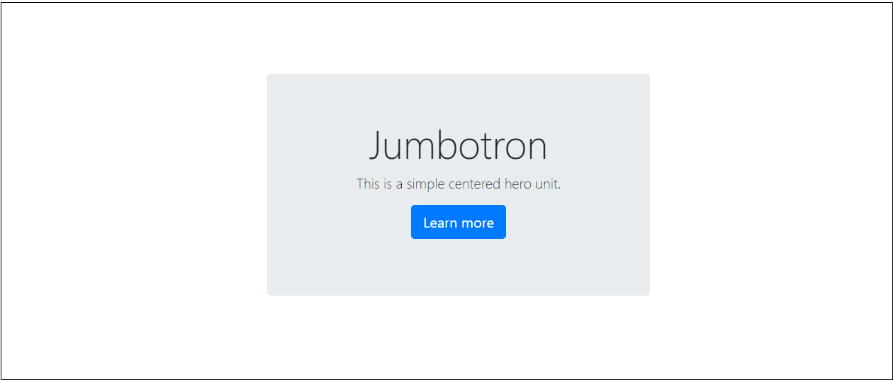
<div class="jumbotron">
I'm vertically centered
</div>
</div>
</div>
</div>
https://codeply.com/go/BumdFnmLuk
Option 3 justify-content-center on flexbox parent (.card is display:flex;flex-direction:column)
<div class="container h-100">
    <div class="row align-items-center h-100">
        <div class="col-6 mx-auto">
            <div class="card h-100 border-primary justify-content-center">
                <div>
                    ...card content...
                </div>
            </div>
        </div>
    </div>
</div>
https://codeply.com/go/3gySSEe7nd
More on Bootstrap 4 Vertical Centering
Now that Bootstrap 4 offers flexbox and other utilities, there are many approaches to vertical
alignment. http://www.codeply.com/go/WG15ZWC4lf
1 - Vertical Center Using Auto Margins:
Another way to vertically center is to use my-auto. This will center the element within it's container. For example, h-100 makes the row full height, and my-auto will vertically center the col-sm-12 column.
<div class="row h-100">
    <div class="col-sm-12 my-auto">
        <div class="card card-block w-25">Card</div>
    </div>
</div>
Vertical Center Using Auto Margins Demo
my-auto represents margins on the vertical y-axis and is equivalent to:
margin-top: auto;
margin-bottom: auto;
2 - Vertical Center with Flexbox:

Since Bootstrap 4 .row is now display:flex you can simply use align-self-center on any column to vertically center it...
       <div class="row">
           <div class="col-6 align-self-center">
                <div class="card card-block">
                 Center
                </div>
           </div>
           <div class="col-6">
                <div class="card card-inverse card-danger">
                    Taller
                </div>
          </div>
    </div>
or, use align-items-center on the entire .row to vertically center align all col-* in the row...
       <div class="row align-items-center">
           <div class="col-6">
                <div class="card card-block">
                 Center
                </div>
           </div>
           <div class="col-6">
                <div class="card card-inverse card-danger">
                    Taller
                </div>
          </div>
    </div>
Vertical Center Different Height Columns Demo
See this Q/A to center, but maintain equal height
3 - Vertical Center Using Display Utils:
Bootstrap 4 has display utils that can be used for display:table, display:table-cell, display:inline, etc.. These can be used with the vertical alignment utils to align inline, inline-block or table cell elements.
<div class="row h-50">
    <div class="col-sm-12 h-100 d-table">
        <div class="card card-block d-table-cell align-middle">
            I am centered vertically
        </div>
    </div>
</div>
Vertical Center Using Display Utils Demo
More examples
Vertical center image in <div>
Vertical center .row in .container
Vertical center and bottom in <div>
Vertical center child inside parent
Vertical center full screen jumbotron
Important! Did I mention height?
Remember vertical centering is relative to the height of the parent element. If you want to center on the entire page, in most cases, this should be your CSS...
body,html {
  height: 100%;
}
Or use min-height: 100vh (min-vh-100 in Bootstrap 4.1+) on the parent/container. If you want to center a child element inside the parent. The parent must have a defined height.
Also see:
Vertical alignment in bootstrap 4
Bootstrap Center Vertical and Horizontal Alignment
Vertically middle align text in a bootstrap column
Try this. Use display: table; for parent class and display: table-cell; vertical-align: middle; for child elements. This will give you vertical align correctly.
<html>
<head>
    <link rel="stylesheet" href="https://maxcdn.bootstrapcdn.com/bootstrap/3.3.7/css/bootstrap.min.css">    <script src="https://ajax.googleapis.com/ajax/libs/jquery/3.2.0/jquery.min.js"></script>    <script src="https://maxcdn.bootstrapcdn.com/bootstrap/3.3.7/js/bootstrap.min.js"></script>    <style>        a {            display: block;        }        .customclass {            display: table;        }        .customclass img, .customclass a{            display: table-cell;            vertical-align: middle;        }    </style></head>
<body>    <div class="row">        <div class="col-xs-4 text-center customclass" style="background:red">            <img src="http://placehold.it/75">            <a style="background: yellow">Some text red-yellow</a>        </div>
        <div class="col-xs-4 text-center customclass" style="background:lightgreen">            <img src="http://placehold.it/75">            <a style="background: gray">some other text long text some other long text lightgreen-gray</a>        </div>        <div class="col-xs-4 text-center customclass" style="background:skyblue">            <img src="http://placehold.it/75">            <a style="background: violet">this is another long long long text that should be here skyblue-violet</a>        </div>    </div></body>
</html>
Vertical align middle with Bootstrap responsive grid
Add !important rule to display: table of your .v-center class.
.v-center {
    display:table !important;
    border:2px solid gray;
    height:300px;
}
Your display property is being overridden by bootstrap to display: block.
Example
How to vertically center a container in Bootstrap?
The Flexible box way
Vertical alignment is now very simple by the use of Flexible box layout. Nowadays, this method is supported in a wide range of web browsers except Internet Explorer 8 & 9. Therefore we'd need to use some hacks/polyfills or different approaches for IE8/9.
In the following I'll show you how to do that in only 3 lines of text (regardless of old flexbox syntax).
Note: it's better to use an additional class instead of altering .jumbotron to achieve the vertical alignment. I'd use vertical-center class name for instance.
Example Here (A Mirror on jsbin).
<div class="jumbotron vertical-center"> <!--
                      ^--- Added class  -->
  <div class="container">
    ...
  </div>
</div>
.vertical-center {
  min-height: 100%;  /* Fallback for browsers do NOT support vh unit */
  min-height: 100vh; /* These two lines are counted as one :-)       */

  display: flex;
  align-items: center;
}
Important notes (Considered in the demo):
A percentage values of
heightormin-heightproperties is relative to theheightof the parent element, therefore you should specify theheightof the parent explicitly.Vendor prefixed / old flexbox syntax omitted in the posted snippet due to brevity, but exist in the online example.
In some of old web browsers such as Firefox 9 (in which I've tested), the flex container -
.vertical-centerin this case - won't take the available space inside the parent, therefore we need to specify thewidthproperty like:width: 100%.Also in some of web browsers as mentioned above, the flex item -
.containerin this case - may not appear at the center horizontally. It seems the applied left/rightmarginofautodoesn't have any effect on the flex item.
Therefore we need to align it bybox-pack / justify-content.
For further details and/or vertical alignment of columns, you could refer to the topic below:
- vertical-align with Bootstrap 3
The traditional way for legacy web browsers
This is the old answer I wrote at the time I answered this question. This method has been discussed here and it's supposed to work in Internet Explorer 8 and 9 as well. I'll explain it in short:
In inline flow, an inline level element can be aligned vertically to the middle by vertical-align: middle declaration. Spec from W3C:
middle
Align the vertical midpoint of the box with the baseline of the parent box plus half the x-height of the parent.
In cases that the parent - .vertical-center element in this case - has an explicit height, by any chance if we could have a child element having the exact same height of the parent, we would be able to move the baseline of the parent to the midpoint of the full-height child and surprisingly make our desired in-flow child - the .container - aligned to the center vertically.
Getting all together
That being said, we could create a full-height element within the .vertical-center by ::before or ::after pseudo elements and also change the default display type of it and the other child, the .container to inline-block.
Then use vertical-align: middle; to align the inline elements vertically.
Here you go:
<div class="jumbotron vertical-center">
  <div class="container">
    ...
  </div>
</div>
.vertical-center {
  height:100%;
  width:100%;

  text-align: center;  /* align the inline(-block) elements horizontally */
  font: 0/0 a;         /* remove the gap between inline(-block) elements */
}

.vertical-center:before {    /* create a full-height inline block pseudo=element */
  content: " ";
  display: inline-block;
  vertical-align: middle;    /* vertical alignment of the inline element */
  height: 100%;
}

.vertical-center > .container {
  max-width: 100%;

  display: inline-block;
  vertical-align: middle;  /* vertical alignment of the inline element */
                           /* reset the font property */
  font: 16px/1 "Helvetica Neue", Helvetica, Arial, sans-serif;
}
WORKING DEMO.
Also, to prevent unexpected issues in extra small screens, you can reset the height of the pseudo-element to auto or 0 or change its display type to none if needed so:
@media (max-width: 768px) {
  .vertical-center:before {
    height: auto;
    /* Or */
    display: none;
  }
}
UPDATED DEMO
And one more thing:
If there are footer/header sections around the container, it's better to position that elements properly (relative, absolute? up to you.) and add a higher z-index value (for assurance) to keep them always on the top of the others.
Vertically Center Text Bootstrap
Use margin-top:50%; to the text;
.vertical{margin-top:50%;}<!DOCTYPE html><html lang="en"><head> <title>Bootstrap Example</title> <meta charset="utf-8"> <meta name="viewport" content="width=device-width, initial-scale=1"> <link rel="stylesheet" href="https://maxcdn.bootstrapcdn.com/bootstrap/3.3.7/css/bootstrap.min.css"> <script src="https://ajax.googleapis.com/ajax/libs/jquery/3.2.1/jquery.min.js"></script> <script src="https://maxcdn.bootstrapcdn.com/bootstrap/3.3.7/js/bootstrap.min.js"></script></head><body>
<div class="container"> <div class="row"> <div class="col-sm-6"> <img alt="img" src="http://asianmeditour.com/assets/images/post/1542457653tourism.jpg" class="img-responsive"> </div> <div class="col-sm-6"> <h3 class="vertical">Column 3</h3> </div> </div></div>
</body></html>Vertical align in bootstrap table
Based on what you have provided, your CSS selector is not specific enough to override the CSS rules defined by Bootstrap.
Try this:
.table > tbody > tr > td {
     vertical-align: middle;
}
In Boostrap 4 and 5, this can be achieved with the .align-middle Vertical Alignment utility class.
<td class="align-middle">Text</td>
How to use vertical align in bootstrap
.parent {
    display: table;
    table-layout: fixed;
}

.child {
    display:table-cell;
    vertical-align:middle;
    text-align:center;
}
table-layout: fixed prevents breaking the functionality of the col-* classes.
vertical alignment inside div column with bootstrap 5
Here you go...
#align-text-end {
  width: 100%;
}
<!DOCTYPE html>
<html lang='en'>
<head>
<meta charset='UTF-8'>
<meta http-equiv='X-UA-Compatible' content='IE=edge'>
<meta name='viewport' content='width=device-width, initial-scale=1.0'>
<title>Document</title>
<link rel='stylesheet' href='https://cdn.jsdelivr.net/npm/bootstrap@5.1.1/dist/css/bootstrap.min.css' integrity='sha384-F3w7mX95PdgyTmZZMECAngseQB83DfGTowi0iMjiWaeVhAn4FJkqJByhZMI3AhiU' crossorigin='anonymous'>
<script src='https://cdn.jsdelivr.net/npm/bootstrap@5.1.1/dist/js/bootstrap.min.js' integrity='sha384-skAcpIdS7UcVUC05LJ9Dxay8AXcDYfBJqt1CJ85S/CFujBsIzCIv+l9liuYLaMQ/' crossorigin='anonymous'></script>
</head>
<body>
<div class="row bg-dark text-white">
<div class="col-sm-2 d-flex align-items-center">align me vertically
</div>
<div class="col-sm-1">
<div class="row text-center">
<span class="text-center">1</span>
</div>
<div class="row">
<img src="https://pngimg.com/uploads/futurama/futurama_PNG73.png" class="img-fluid">
</div>
</div>
<div class="col-sm-2">
<div class="row">
<span class="text-center">2</span>
</div>
<div class="row">
<img src="https://pngimg.com/uploads/futurama/futurama_PNG73.png" class="img-fluid">
</div>
<div class="row mb-1">
some text could be here
</div>
</div>
<div class="col-sm-1">
<div class="row text-center">
<span class="text-center">3</span>
</div>
<div class="row">
<img src="https://pngimg.com/uploads/futurama/futurama_PNG73.png" class="img-fluid">
</div>
</div>
<div class="col-sm-1">
<div class="row text-center">
<span class="text-center">4</span>
</div>
<div class="row">
<img src="https://pngimg.com/uploads/futurama/futurama_PNG73.png" class="img-fluid">
</div>
</div>
<div class="col-sm-1">
<div class="row text-center">
<span class="text-center">5</span>
</div>
<div class="row">
<img src="https://pngimg.com/uploads/futurama/futurama_PNG73.png" class="img-fluid">
</div>
</div>
<div class="col-sm-1">
<div class="row text-center">
<span class="text-center">6</span>
</div>
<div class="row">
<img src="https://pngimg.com/uploads/futurama/futurama_PNG73.png" class="img-fluid">
</div>
</div>
<div class="col-sm-1">
<div class="row text-center">
<span class="text-center">7</span>
</div>
<div class="row">
<img src="https://pngimg.com/uploads/futurama/futurama_PNG73.png" class="img-fluid">
</div>
</div>
<div class="col-sm-1">
<div class="row text-center">
<span class="text-center">8</span>
</div>
<div class="row">
<img src="https://pngimg.com/uploads/futurama/futurama_PNG73.png" class="img-fluid">
</div>
</div>
<div class="col-sm-1 d-flex align-items-center">
<div class='text-end' id='align-text-end'>
<svg width="24" height="24" viewBox="0 0 24 24" fill="none" stroke="red" stroke-width="2" stroke-linecap="round" stroke-linejoin="round">
<circle cx="12" cy="12" r="10"></circle>
<line x1="15" y1="9" x2="9" y2="15"></line>
<line x1="9" y1="9" x2="15" y2="15"></line>
</svg>
</div>
</div>
</div>
</body>
</html>Related Topics
CSS How to Properly Use Ems Instead of Pixels
How to Style Contenteditable in Firefox
Freeze Keyframe Animation for Debugging
Fixed Positioned Div Is Extending Outside of HTML & Body
Set Canvas Element as Background of a Div Element
How to Avoid Content of Span Break in Two Lines
React Bootstrap - How to Center Image Vertically in a Row
Connecting Xslt to External CSS
Sass "Error: Can't Find Stylesheet to Import."
Bootstrap Scrollspy Link Active Not Applied
Bootstrap Styles Missing After Deploy to Heroku
Table Row Borders in HTML5 Without Gaps
React Strap Cards Unable to Align Items According to The Screen Size