Slanted Edge Buttons
You could use a skewed div in this case. The only issue here is that as your buttons get taller, due to the skew, they will get slightly wider. This may not be an issue if you are only dealing with 1 or 2 lines. If they get very tall it may cause things to noticeably not line up exactly:
http://jsfiddle.net/AaP47/3/
.button.triangle:after {
    content: "";
    background-color: red;
    display: block;
    height: 100%;
    position: absolute;
    right: -30px;
    top: 0;
    width: 60px;
    transform: skewX(-10deg);
}
This is also not completely scalable. You would need to decide on the largest height you have to support and adjust accordingly. The taller you need to support, the wider the skewed div must be.
Result (without the red): http://jsfiddle.net/AaP47/4/
How to create a custom slanted edge for button?
You need to use a clippath widget as child. Nested in it the container.
child:ClipPath(
  child:Container(),
  clipper: CustomClips()
)
class CustomClips extends CustomClipper<Path>{
  @override
  Path getClip(Size size) {
    Path path = Path();
    path.lineTo(size.width / 12, size.height);
    path.lineTo(size.width, 0.0);
    return path;
  }
  @override
  bool shouldReclip(CustomClipper<Path> oldClipper) => false;
}
Button with beveled edge on semi-transparent background
I love a good css challenge so I tried a few things and this is what I could come up with:
http://jsfiddle.net/QE67v/3/
The css (unprefixed) looks like this:
a.cta {
    position: relative;
    float: left;
    padding: 8px 10px;
    text-align: center;
    text-decoration: none;
    text-transform: uppercase;
    font-size: 15px;
    font-weight: normal;
    background-image: linear-gradient(top, #ffffff 0%, #e4e4e4 100%);
    box-shadow: inset 0 -2px 1px 2px #fff;
    line-height: 16px;
    height: 16px;
    z-index: 2;
}
a.cta:after {
    content: '';
    display: block;
    position: absolute;
    width: 32px;
    height: 32px;
    right: -16px;
    top: 0;
    background-image: linear-gradient(top, #ffffff 0%, #e4e4e4 100%);
    box-shadow: inset -3px -2px 1px 2px #fff;
    transform: skewX(-45deg);
    z-index: -1;
}
There are two main differences with your code:
- I use a inset box-shadow to achieve the white 'bevel'. You could
probably do this with gradients as well, but I just find the shadows
more intuitive. - In stead of making the button wider and covering the bottom left
corner with a pseudo element in the color of the background, I kept
the button in its normal width and added a pseudo element to which a
applied the skewX transformation. This allows for any background, as
you can see by the gradient I set as a background in my fiddle.
I believe this is what you where after. Feel free to ask if you need any further help/explanation.
Create a slanted edge to a div
You can use a skewed pseudo element to make the slanted solid background of your element. This way, the text won't be affected by the transform property.
The transform origin property allows the pseudo element to be skewed from the right bottom corner and the overflowwing parts are hidden with overflow:hidden;.
The pseudo element is stacked behind the content of the div with a negative z-index:
div {  position: relative;  display: inline-block;  padding: 1em 5em 1em 1em;  overflow: hidden;  color: #fff;}
div:after {  content: '';  position: absolute;  top: 0;  left: 0;  width: 100%;  height: 100%;  background: #000;  -webkit-transform-origin: 100% 0;  -ms-transform-origin: 100% 0;  transform-origin: 100% 0;  -webkit-transform: skew(-45deg);  -ms-transform: skew(-45deg);  transform: skew(-45deg);  z-index: -1;}
body {  background: url('https://farm3.staticflickr.com/2878/10944255073_973d2cd25c.jpg');  background-size: cover;}
<div>slanted div text</div><div> slanted div text<br/> on several lines<br/> an other line</div><div>wider slanted div text with more text inside</div>div with slanted side and rounder corners
Note: I am adding a separate answer because though the answers that I linked in comment seem to give a solution, this one is a bit more complex due to the presence of border also along with the border-radius.
The shape can be created by using the following parts:
- One main container element which is positioned relatively.
- Two pseudo-elements which are roughly half the width of parent element. One element is skewed to produce the skewed left side whereas the other is not skewed.
- The skewed pseudo-element is positioned at the left while the normal element is positioned at the right of the container element.
- The skewed pseudo-element has only top, left and bottom borders. The right border is omitted as it would come right in the middle of the shape. For the pseudo-element that is not skewed, the left border is avoided for the same reason.
- Left border of the skewed pseudo-element is a bit more thicker than other borders because skew makes the border look thinner than it actually is.
I have also added a hover effect to the snippet to demonstrate the responsive nature of the shape.
.outer {  position: relative;  height: 75px;  width: 300px;  text-align: center;  line-height: 75px;  color: white;  text-transform: uppercase;}.outer:before,.outer:after {  position: absolute;  content: '';  top: 0px;  height: 100%;  width: 55%;  background: purple;  border: 2px solid white;  border-left-width: 3px;  z-index: -1;}.outer:before {  left: 0px;  border-radius: 20px;  border-right: none;  transform: skew(20deg);  transform-origin: top left;}.outer:after {  right: 0px;  border-top-right-radius: 20px;  border-bottom-right-radius: 20px;  border-left: none;}
/* Just for demo of responsive nature */
.outer{  transition: all 1s;}.outer:hover{  height: 100px;  width: 400px;  line-height: 100px;}body{  background: lightblue;}
<div class='outer'> Call me back</div>Creating a container with a slanted edge
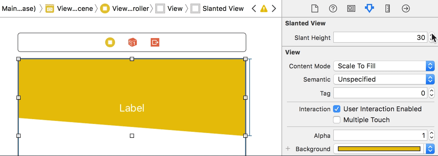
Can I do it within the interface builder or do I have to do it programmatically?
You'll have to do this programmatically: Define the UIBezierPath, using it as the path of a CAShapeLayer and then mask the view's layer using this shape layer.
@IBDesignable
class SlantedView: UIView {

    @IBInspectable var slantHeight: CGFloat = 50 { didSet { updatePath() } }

    private let shapeLayer: CAShapeLayer = {
        let shapeLayer = CAShapeLayer()
        shapeLayer.lineWidth = 0
        shapeLayer.fillColor = UIColor.white.cgColor    // with masks, the color of the shape layer doesn’t matter; it only uses the alpha channel; the color of the view is dictate by its background color
        return shapeLayer
    }()

    override func layoutSubviews() {
        super.layoutSubviews()
        updatePath()
    }

    private func updatePath() {
        let path = UIBezierPath()
        path.move(to: bounds.origin)
        path.addLine(to: CGPoint(x: bounds.maxX, y: bounds.minY))
        path.addLine(to: CGPoint(x: bounds.maxX, y: bounds.maxY))
        path.addLine(to: CGPoint(x: bounds.minX, y: bounds.maxY - slantHeight))
        path.close()
        shapeLayer.path = path.cgPath
        layer.mask = shapeLayer
    }
}
But by making this an @IBDesignable view, you can then render it in IB so you can at least design the UI with a greater sense of what the final product will look like:
FYI, if you do make this designable, they recommend that you create a separate framework target for your designables (so that if you go to IB while working on your main project, the ability to render the designable views isn't impacted by the fact that your main project may not be in a stable, compilable state).
How can I Use Clip-Path for slanted edges?
You can adjust like below. You make the second point to start lower by 3vw and you put back the other one to 100%
.box { height: 100px; background: red; clip-path: polygon( 0 0, 100% 3vw, 100% 100%, 0 100%); /* (0,0) ----------------- (100%,0) | |<---------(100%,3vw) | | | | | | (0,100%) ----------------- (100%,100%)}<div class="box">
</div>Related Topics
How to Create Circle with Four Quarters
How to Put Text in the Upper Right, or Lower Right Corner of a "Box" Using CSS
How to Create Hollow Triangle in CSS
Create a W3C Validated Anchor Link with Target="_Blank"
Can Reactjs Programmatically Handle :Before
How to Make a Color Wheel Structure with CSS
Change Color in Shinydashboard
How to Import CSS File into Google Colab Notebook (Python3)
Dropdown Menu - Make the <Ul> Submenu 100% Width
Css: How to Center a Horizontal List? Display:Inline Not Working
How to Override Bootstrap 3 Styles with External Custom CSS
CSS Background Sizing Polyfill
Sass: How to Remove /*# Sourcemappingurl Comment
Rendering CSS3 Inset Shadow with an Image
Unicode Character-Specific CSS - a Thought
Best Practices - Only Download CSS You Need, or Use a Minification Process
Is There a Clean Way to Get Borders on a <Tbody /> in Pure CSS