Search input with an icon Bootstrap
Bootstrap 5 Beta - (update 2021)
     <div class="input-group">
            <input class="form-control border-end-0 border rounded-pill" type="text" value="search" id="example-search-input">
            <span class="input-group-append">
                <button class="btn btn-outline-secondary bg-white border-start-0 border rounded-pill ms-n3" type="button">
                    <i class="fa fa-search"></i>
                </button>
            </span>
     </div>
Demo
Bootstrap 4 (original answer)
Why not use an input-group?
<div class="input-group col-md-4">
      <input class="form-control py-2" type="search" value="search" id="example-search-input">
      <span class="input-group-append">
        <button class="btn btn-outline-secondary" type="button">
            <i class="fa fa-search"></i>
        </button>
      </span>
</div>
And, you can make it appear inside the input using the border utils...
        <div class="input-group col-md-4">
            <input class="form-control py-2 border-right-0 border" type="search" value="search" id="example-search-input">
            <span class="input-group-append">
              <button class="btn btn-outline-secondary border-left-0 border" type="button">
                    <i class="fa fa-search"></i>
              </button>
            </span>
        </div>
Or, using a input-group-text w/o the gray background so the icon appears inside the input...
        <div class="input-group">
            <input class="form-control py-2 border-right-0 border" type="search" value="search" id="example-search-input">
            <span class="input-group-append">
                <div class="input-group-text bg-transparent"><i class="fa fa-search"></i></div>
            </span>
        </div>
Alternately, you can use the grid (row>col-) with no gutter spacing:
<div class="row no-gutters">
     <div class="col">
          <input class="form-control border-secondary border-right-0 rounded-0" type="search" value="search" id="example-search-input4">
     </div>
     <div class="col-auto">
          <button class="btn btn-outline-secondary border-left-0 rounded-0 rounded-right" type="button">
             <i class="fa fa-search"></i>
          </button>
     </div>
</div>
Or, prepend the icon like this...
<div class="input-group">
  <span class="input-group-prepend">
    <div class="input-group-text bg-transparent border-right-0">
      <i class="fa fa-search"></i>
    </div>
  </span>
  <input class="form-control py-2 border-left-0 border" type="search" value="..." id="example-search-input" />
  <span class="input-group-append">
    <button class="btn btn-outline-secondary border-left-0 border" type="button">
     Search
    </button>
  </span>
</div>
Demo of all Bootstrap 4 icon input options

Example with validation icons
Search input with an icon Bootstrap 4 with rounded textbox
Here's a Bootstrap only solution...
Use the negative margin utils to slide the button to the left:
 <div class="input-group">
     <input class="form-control py-2 rounded-pill mr-1 pr-5" type="search" value="search">
     <span class="input-group-append">
         <button class="btn rounded-pill border-0 ml-n5" type="button">
               <i class="fa fa-search"></i>
         </button>
     </span>
 </div>
This also works using input-group-text, or using the grid col-auto method explained in my other answer:
    <div class="row no-gutters mt-3 align-items-center">
        <div class="col-4">
            <input class="form-control border-secondary rounded-pill pr-5" type="search" value="search" id="example-search-input2">
        </div>
        <div class="col-auto">
            <button class="btn btn-outline-light text-dark border-0 rounded-pill ml-n5" type="button">
                <i class="fa fa-search"></i>
            </button>
        </div>
    </div>
https://www.codeply.com/go/cDQQcNY8kP
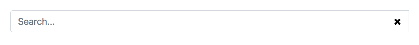
Bootstrap 4: search input x clear search
I think that input-group-addon is the problem.
Try this:
<div class="input-group">
    <input type="text" class="form-control" placeholder="Search...">
    <button type="button" class="btn bg-transparent" style="margin-left: -40px; z-index: 100;">
      <i class="fa fa-times"></i>
    </button>
</div>
This looks like this:
Icon in bootstrap 4 inside the input
You don't need to have the icon inside the input- you can place it next to the input field, and remove the input field's border using CSS.
HTML:
<div class="input-group">
<i class="fa fa-user-circle-o"></i>
<input type="text" class="form-control" placeholder="Enter Name Here" >
</div>
CSS:
input{
  border:none;
  background-color: transparent;
}

input:focus,
select:focus,
textarea:focus,
button:focus {
    outline: none;
}

.fa-user-circle-o{
  color: gray;
}
Updated fiddle:
https://jsfiddle.net/5db2ho62/2/
Put search icon near textbox using bootstrap
Here are three different ways to do it:

Here's a working Demo in Fiddle Of All Three
Validation:
You can use native bootstrap validation states (No Custom CSS!):
<div class="form-group has-feedback">
    <label class="control-label" for="inputSuccess2">Name</label>
    <input type="text" class="form-control" id="inputSuccess2"/>
    <span class="glyphicon glyphicon-search form-control-feedback"></span>
</div>
For a full discussion, see my answer to Add a Bootstrap Glyphicon to Input Box
Input Group:
You can use the .input-group class like this:
<div class="input-group">
    <input type="text" class="form-control"/>
    <span class="input-group-addon">
        <i class="fa fa-search"></i>
    </span>
</div>
For a full discussion, see my answer to adding Twitter Bootstrap icon to Input box
Unstyled Input Group:
You can still use .input-group for positioning but just override the default styling to make the two elements appear separate.
Use a normal input group but add the class input-group-unstyled:
<div class="input-group input-group-unstyled">
    <input type="text" class="form-control" />
    <span class="input-group-addon">
        <i class="fa fa-search"></i>
    </span>
</div>
Then change the styling with the following css:
.input-group.input-group-unstyled input.form-control {
    -webkit-border-radius: 4px;
       -moz-border-radius: 4px;
            border-radius: 4px;
}
.input-group-unstyled .input-group-addon {
    border-radius: 4px;
    border: 0px;
    background-color: transparent;
}
Also, these solutions work for any input size
Add a Search icon in the end of a input-group IN bootstrap 3
Try this..
.input-group-btn > .btn {
  border-left-width:0;left:-2px;
  -webkit-box-shadow: inset 0 1px 1px rgba(0, 0, 0, 0.075);
  box-shadow: inset 0 1px 1px rgba(0, 0, 0, 0.075);
}
.input-group .form-control:focus {
 box-shadow:none;
 -webkit-box-shadow:none;
 border-color:#cccccc;
}
You may want to use a special CSS class instead of overriding all of the input-groups
Demo: http://bootply.com/86446
Add Bootstrap Glyphicon to Input Box
Without Bootstrap:
We'll get to Bootstrap in a second, but here's the fundamental CSS concepts in play in order to do this yourself. As beard of prey points out, you can do this with CSS by absolutely positioning the icon inside of the input element. Then add padding to either side so the text doesn't overlap with the icon.
So for the following HTML:
<div class="inner-addon left-addon">
    <i class="glyphicon glyphicon-user"></i>
    <input type="text" class="form-control" />
</div>
You can use the following CSS to left and right align glyphs:
/* enable absolute positioning */
.inner-addon {
    position: relative;
}

/* style icon */
.inner-addon .glyphicon {
  position: absolute;
  padding: 10px;
  pointer-events: none;
}

/* align icon */
.left-addon .glyphicon  { left:  0px;}
.right-addon .glyphicon { right: 0px;}

/* add padding  */
.left-addon input  { padding-left:  30px; }
.right-addon input { padding-right: 30px; }
Demo in Plunker

Note: This presumes you're using glyphicons, but works equally well with font-awesome.
For FA, just replace.glyphiconwith.fa
With Bootstrap:
As buffer points out, this can be accomplished natively within Bootstrap by using Validation States with Optional Icons. This is done by giving the .form-group element the class of .has-feedback and the icon the class of .form-control-feedback.
The simplest example would be something like this:
<div class="form-group has-feedback">
    <label class="control-label">Username</label>
    <input type="text" class="form-control" placeholder="Username" />
    <i class="glyphicon glyphicon-user form-control-feedback"></i>
</div>
Pros:
- Includes support for different form types (Basic, Horizontal, Inline)
- Includes support for different control sizes (Default, Small, Large)
Cons:
- Doesn't include support for left aligning icons
To overcome the cons, I put together this pull-request with changes to support left aligned icons. As it is a relatively large change, it has been put off until a future release, but if you need these features today, here's a simple implementation guide:
Just include the these form changes in css (also inlined via hidden stack snippet at the bottom)
*LESS: alternatively, if you are building via less, here's the form changes in less
Then, all you have to do is include the class .has-feedback-left on any group that has the class .has-feedback in order to left align the icon.
Since there are a lot of possible html configurations over different form types, different control sizes, different icon sets, and different label visibilities, I created a test page that shows the correct set of HTML for each permutation along with a live demo.
Here's a demo in Plunker

P.S. frizi's suggestion of adding
pointer-events: none;has been added to bootstrap
Didn't find what you were looking for? Try these similar questions:
- Add Twitter Bootstrap icon to Input box
- Put search icon near textbox bootstrap
Addition CSS for Left Aligned feedback icons
.has-feedback .form-control { padding-right: 34px;}.has-feedback .form-control.input-sm,.has-feedback.form-group-sm .form-control { padding-right: 30px;}.has-feedback .form-control.input-lg,.has-feedback.form-group-lg .form-control { padding-right: 46px;}.has-feedback-left .form-control { padding-right: 12px; padding-left: 34px;}.has-feedback-left .form-control.input-sm,.has-feedback-left.form-group-sm .form-control { padding-left: 30px;}.has-feedback-left .form-control.input-lg,.has-feedback-left.form-group-lg .form-control { padding-left: 46px;}.has-feedback-left .form-control-feedback { left: 0;}.form-control-feedback { line-height: 34px !important;}.input-sm + .form-control-feedback,.form-horizontal .form-group-sm .form-control-feedback { width: 30px; height: 30px; line-height: 30px !important;}.input-lg + .form-control-feedback,.form-horizontal .form-group-lg .form-control-feedback { width: 46px; height: 46px; line-height: 46px !important;}.has-feedback label.sr-only ~ .form-control-feedback,.has-feedback label.sr-only ~ div .form-control-feedback { top: 0;}@media (min-width: 768px) { .form-inline .inline-feedback { position: relative; display: inline-block; } .form-inline .has-feedback .form-control-feedback { top: 0; }}.form-horizontal .has-feedback-left .form-control-feedback { left: 15px;}Related Topics
Position Element Fixed Vertically, Absolute Horizontally
Css Transparent Curved Shape With Two Rounded Sides
Flushing Footer to Bottom of the Page, Twitter Bootstrap
What Is the Purpose of the '@' Symbol in Css
Why Doesn't the Selector H3:Nth-Child(1):Contains('A') Work
Why Does 'Overflow: Auto' Clear Floats? And Why Are Clear Floats Needed
My CSS Is Not Getting Injected Through My Content Script
Changing :Hover to Touch/Click For Mobile Devices
Using Variables in Property Names in Less (Dynamic Properties/Property Name Interpolation)
Why Adding Version Number to CSS File Path
Ampersand (&) at the End, and Part of, a Selector in SASS
How to Align Left Last Row/Line in Multiple Line Flexbox
Bootstrap Dropdowns Menus Appearing Behind Other Elements - IE7
IE7 Relative/Absolute Positioning Bug with Dynamically Modified Page Content
Match All Elements Having Class Name Starting With a Specific String