Pure CSS triangle with semi-transparent border. Possible?
This still needs some work, but here's the general idea:
Use a pseudo-element, rotate it 45deg and apply the styling to that:
.arrow {
    bottom: -25px;
    left: 30px;
    width: 40px;
    height: 40px;
    position: absolute;
    overflow: hidden;
}
.arrow:after {
    content: ' ';
    display: block;
    background: red;
    width: 20px;
    height: 20px;
    transform: rotate(45deg);
    position: absolute;
    top: -19px;
    left: 3px;
    background: #999;
    border: 5px solid rgba(0, 0, 0, 0.2);
    background-clip: padding-box;
}
Here's the fiddle: http://jsfiddle.net/yZ3vB/
The problem with this is that the borders overlap, making it darker by the edges.
This could probably be remedied by adding another element though.
Update: Yes! Here you go: http://jsfiddle.net/sJFTT/
Update 2: You don't even need that additional element. You can use the pseudo element from the main box:
.ui-overlay-content:after {
    content: ' ';
    border-width: 13px;
    border-color: #999 transparent transparent;
    border-style: solid;
    bottom: -10px;
    left: 30px;
    width: 0;
    height: 0;
    position: absolute;
}
Here's the fiddle: http://jsfiddle.net/6v9nV/
Update 3: Actually, you can do all this with just a single element and no transform, by using both pseudo-elements - the before and the after:
.speech-bubble {
    background: #999;
    background: linear-gradient(top, #444 0%,#999 100%);
    background-clip: padding-box;
    border: 5px solid rgba(0, 0, 0, 0.2);
    padding: 20px;
    width: 200px;
    height: 100px;
    position: relative;
}
.speech-bubble:before{
    content: ' ';
    border-color: rgba(0, 0, 0, 0.2) transparent transparent;
    border-style: solid;
    border-width: 17px;
    position: absolute;
    bottom: -39px;
    left: 16px;
}
.speech-bubble:after{
    content: ' ';
    border-color: #999 transparent transparent;
    border-style: solid;
    border-width: 13px;
    position: absolute;
    bottom: -26px;
    left: 20px;
}
Here's the fiddle: http://jsfiddle.net/95vvr/
P.S. Don't forget the vendor prefixes in production!
Add a border to a triangle using pure CSS
The only way you could do something like this is to create another arrow just like it and put it behind the first to fake the border like this:
.arrow-tip {    width: 0;     height: 0;     border-left: 15px solid transparent;    border-right: 15px solid transparent;    border-bottom: 15px solid #222;    position: relative;}
.arrow-tip:after {    content: "";    display: block;    width: 0;     height: 0;     position: absolute;    bottom: -16px;    left: -17px;    z-index: -1;    border-left: 17px solid transparent;    border-right: 17px solid transparent;    border-bottom: 17px solid red;}
<div class="arrow-tip"></div>triangle with border with pure css
Here FIDDLE. :after and :before are called pseudo elements.
<div id="message-holder"></div>
#message-holder {
    margin-top:50px;
    width:300px;
    height:300px;
    background: #F9EDEF;
    position:relative;
    border:1px solid #edb2b7;
}

#message-holder:before,#message-holder:after{
    content:"";
    position:absolute;
    top:-24px;
    left:25px;
    border-bottom:25px solid #f9edef;
    border-left:25px solid transparent;
    border-right:25px solid transparent;
}
#message-holder:before{
    top:-25px;
    border-bottom-color:#edb2b7;
}
How to draw triangle with transparent background with border?
Demo
 .triangle {
     width: 0;
     height: 0;
     border-left: 50px solid transparent;
     border-right: 50px solid transparent;
     border-bottom: 100px solid red;
     position:relative;
 }
 .triangle:after{
     content:'';
     position:absolute;
     top:5px;
     left:-45px;
     width: 0;
     height: 0;
     border-left: 45px solid transparent;
     border-right: 45px solid transparent;
     border-bottom: 92px solid white;
}
CSS Transparent Border Problem In Firefox 4?
if transparent is not work for you then use rgba may be that's work.
Write:
.arrow {
    border-color:#eee rgba(255,255,255,0)  rgba(255,255,255,0)  rgba(255,255,255,0);
}
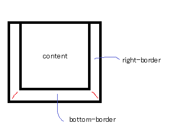
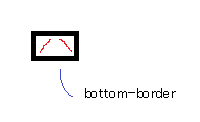
How do CSS triangles work?
CSS Triangles: A Tragedy in Five Acts
As alex said, borders of equal width butt up against each other at 45 degree angles:
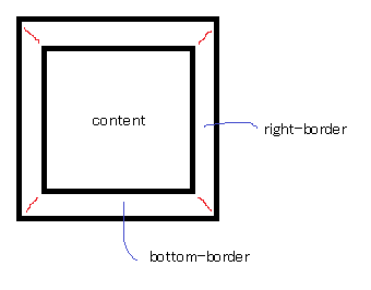
When you have no top border, it looks like this:
Then you give it a width of 0...
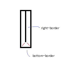
...and a height of 0...
...and finally, you make the two side borders transparent:
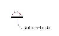
That results in a triangle.
Add border to 2 sides of CSS triangle?
100% pure CSS, no... but add an extra div in there and:
HTML
<div class="arrow-right">
  <div></div>
</div>
CSS
.arrow-right {
    width: 0;
    height: 0;
    border-top: 60px solid transparent;
    border-bottom: 60px solid transparent;
    border-left: 60px solid black;
}
.arrow-right > div {
    width: 0;
    position: relative;
    left: -60px;
    top: -59px;
    border-top: 59px solid transparent;
    border-bottom: 59px solid transparent;
    border-left: 59px solid green;
}
http://jsfiddle.net/qJJxm/
(replace every instance of 59 with a smaller number to make a wider border - all four should always be the same number)
Creating a triangle div with CSS
This is the typical way to do it:
JSFiddle
.arrow-up:after {
    position:absolute;
    content:"";
    width: 0;
    height: 0;
    margin-top:1px;
    margin-left:2px;
    border-left: 10px solid transparent;
    border-right: 10px solid transparent;
    border-bottom: 10px solid white;
}

.arrow-up:before {
    position:absolute;
    content:"";
    width: 0;
    height: 0;
    border-left: 12px solid transparent;
    border-right: 12px solid transparent;
    border-bottom: 12px solid black;
}
Related Topics
Bootstrap Align Columns of Different Height
How to Apply CSS for Specific Chrome Version
@Font-Face Does Not Work Properly for Italic/Bold Fonts
Error While Using The Custom Fonts in CSS
Highcharts CSS Styles When Exporting
CSS Percentage Widths and Heights and Resolution Problems
How to Make a Wordpress Theme Full Width
Color Change of Navigation Buttons When Scrolling Up and When Scrolling Down
Tailwindcss Not Using My Custom Class Inside Breakpoints
Wrap Bootstrap Navbar List Items Around Centered Brand Image
What Is Wrong with My CSS? Active Links Not Changing Color
What CSS Properties Can Be Animated
How to Style an Independent Tableview Column
How to Display Entire Option Value When Hovered in Mat-Autocomplete
Space Between Border and Content/Border Distance from Content