Pure CSS star shape
Let's break it into pieces:
The yellow borders are actually set as transparent in the final product so they don't show. They are yellow here to show how the borders look.
As commented above, this answer shows the idea behind the basic triangle shape.
The div by itself:
<div id="star-five"></div>

Combining the :before pseudo element is the same as this:
<div id="star-five">
    <div id="before"></div>
</div>

Finally, combining the :after pseudo element is the same as this:
<div id="star-five">
    <div id="before"></div>

    <div id="after"></div>
</div>

Now you overlap each element precisely using position: absolute; and rotate with transform as needed to get the final product:
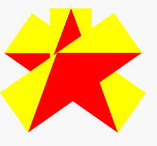
Let's visualise it!
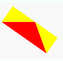
CSS Star outline
You could use an SVG:
<svg width="320" height="320"><path  d="

M 160.000 180.000

L 183.511 192.361

L 179.021 166.180

L 198.042 147.639

L 171.756 143.820

L 160.000 120.000

L 148.244 143.820

L 121.958 147.639

L 140.979 166.180

L 136.489 192.361

L 160.000 180.000

" stroke="#f00" stroke-width="1" fill="none"/></svg>
Half Star and Body Transparent Star
With yours requirements I would use SVG. This is how I would do it:
.star{border:1px solid #d9d9d9; width:30px;}

.star{fill:gold; stroke:orange; stroke-width:5px;}

.star.full use:nth-child(2){display:none;}

.star.half use:nth-child(1),

.star.empty use:nth-child(2)

{display:none;}

.star.empty{fill:none;}
<svg viewBox="0 0 95.1 90.45" style="width:0; height:0; display:none">
<defs>
<polygon id="half_star" points="47.6, 75 18.21, 90.45 23.82, 57.72 0.047, 34.55 32.9, 29.77 47.6, 0"></polygon>
<polygon id="star" points="47.6, 0 62.29, 29.77 95.15, 34.55 71.38, 57.73 76.99, 90.458 47.6, 75 18.21, 90.45 23.82, 57.73 0.05, 34.55 32.9, 29.77"></polygon>
</defs>
</svg>
<svg viewBox="0 0 95.1 90.45" class="star full">
<use xlink:href="#star" />
<use xlink:href="#half_star" />
</svg>
<svg viewBox="0 0 95.1 90.45" class="star half">
<use xlink:href="#star" />
<use xlink:href="#half_star" />
</svg>
<svg viewBox="0 0 95.1 90.45" class="star empty">
<use xlink:href="#star" />
<use xlink:href="#half_star" />
</svg>Ribbon and stars - How to get this done without an image file?
I would recommend combining CSS triangles with pseudo elements :before and :after for the side triangles of the ribbon, and html character ★ for the stars:
working jsFiddle
HTML:
<h1>★ KRISTINE COADY ★</h1> <!-- ★ is html star character -->
CSS:
h1{ /* all regular attributes here */
    background:#A52927;
    display:inline-block;
    padding:0px 30px;
    color:#EEE4D3;
    position:relative;
    height:40px;
    line-height:40px;
}

h1:before{ /* this will create white triangle on the left side */
    position:absolute;
    content:"";
    top:0px;
    left:0px;
    height:0px;
    width:0px;
    border-top: 20px solid transparent;
    border-left: 20px solid white;
    border-bottom: 20px solid transparent;
}

h1:after{ /* this will create white triangle on the right side */
    position:absolute;
    content:"";
    top:0px;
    left:auto;
    right:0px;
    height:0px;
    width:0px;
    border-top: 20px solid transparent;
    border-right: 20px solid white;
    border-bottom: 20px solid transparent;
}
This way you will not have to use wrappers or border-radius.. You should ofcourse alter the font, font size, height, (etc.) to your needs..
Half star with CSS
This works in both chrome and IE
.star {
    font-size: x-large;
    width: 50px;
    display: inline-block;
    color: gray;
}
.star:last-child {
    margin-right: 0;
}
.star:before {
    content:'\2605';
}
.star.on {
    color: gold;
}
.star.half:after {
    content:'\2605';
    color: gold;
    position: absolute;
    margin-left: -20px;
    width: 10px;
    overflow: hidden;
}
Chrome: http://jsfiddle.net/Auqj8/1/
IE: http://jsfiddle.net/86pqx/3/
Related Topics
Linking to CSS Files from React Index
Conventional Order of CSS Properties
Responsive Layout - Px, Em, or %
Which Browsers Support Page Break Manipulation Using CSS and the Page-Break-Inside Element
CSS Dotted Border Render Issue
How to Find Out Where a CSS Rule Is Coming From
Css3 Transform Reverts Position: Fixed
Iframe and Conflicting Absolute Positions
What Does an Asterisk Before an Equal Sign Mean (*=) ? What About the Exclamation Mark
Flexbox, Min-Height, Margin Auto and Internet Explorer
Rstudio 0.98.1028 Add Background Image Only to Title Slide
Chrome 10/Windows @Font-Face Encoding Trouble
How to Implement Read More/Read Less in Pure CSS