Modify Flexdashboard CSS in R
By modifying a CSS theme (we chose to modify Lumen) in a flexdashboard subdirectory my colleague and I learned we could control the dimensions of certain elements in flexdashboard.
Specifically, we altered the CSS file in this directory:
C:\Program Files\R\R-3.4.2\library\flexdashboard\rmarkdown\templates\flex_dashboard\resources
See the annotated CSS file (again, for the Lumen theme) below for how we changed the dimensions of the border boxes. The edits shown were placed at the end of the existing lumen.css file.
/* Jeff's Edits */

.storyboard-nav {
    box-sizing: border-box;
    width: 100% !important; /* This prevents JS transformation on width */
    height: auto; /* This overrides the height */
}

.storyboard-nav .sbnext, .storyboard-nav .sbprev {
    height: auto; /* This overrides the height */
    font-size: 3rem;
}

.storyboard-nav .sbframelist {
    height: auto; /* This overrides the height */
}

.storyboard-nav .sbframelist ul {
    box-sizing: border-box;
    width: 100% !important; /* This prevents JS transformation on width */
    height: auto; /* This overrides the height */
}

.storyboard-nav .sbframelist ul li {
    height: auto; /* This overrides the height */
    width: auto; /* This overrides the width */
}
Change Hover color on flexdashboard pages using custom CSS
I've included three different CSS calls. There are inline comments specifying their purpose.
- navbar background
- navbar active tab selected/hover/focus
- navbar inactive tab on hover/focus
It's important to note that while you add elements to your dashboard, you may see these original blue colors in other places. There are more calls set to the initial colors in the CSS.
<style>
.navbar-inverse {                /* navbar */
    background-color: #A8F79E;
    border-color: #A8F79E;
}
.navbar-inverse .navbar-nav>.active > a, .navbar-inverse .navbar-nav>.active > a:hover, .navbar-inverse .navbar-nav>.active > a:focus {
  color: #ffffff;
  background-color: #570861;     /* active tab */
}
.navbar-inverse .navbar-nav>li > a:hover, .navbar-inverse .navbar-nav > li > a:focus {
  color: #ffffff;
  background-color: #570861;     /* inactive tab on hover/focus */
}
</style>
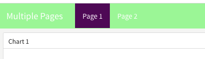
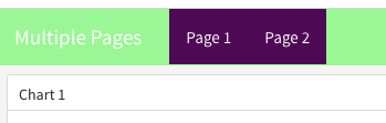
In this image, I'm hovering on "Page 2" (it doesn't show the mouse, though.)
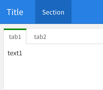
R flexdashboard tabset styles
Try this:
<style>
  .nav-tabs-custom > .nav-tabs > li.active {border-top-color: green}
</style>
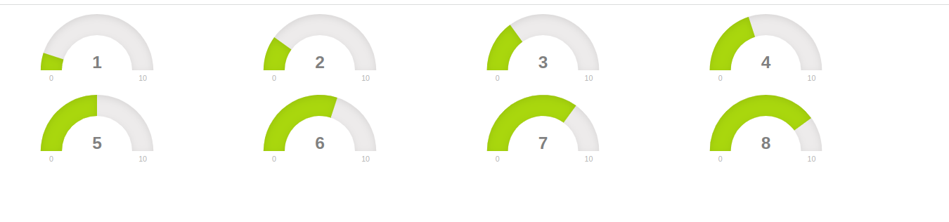
Adjust layout of flexdashboard gauges in R shiny app?
use this
# import libraries
library(shiny)
library(flexdashboard)
library(purrr)
library(magrittr)

ui <- fluidPage(
    # add first gauge set to ui
    fluidRow(
        uiOutput("first_gauge")),
    # add second gauge set to ui
    fluidRow(
        uiOutput("second_gauge")),
    tags$style(".gauge.html-widget {display: inline-block;}"),
)

server <- function(input, output){
    # create first set of gauges
    output$first_gauge <- renderUI({
        # create 4 values and dynamically create gauges
        tagList(
            1:4 %>%
                purrr::map(flexdashboard::gauge, min = 0, max = 10),
            tags$script("$('.gauge.html-widget').css({height: '100px', width: '22%'})")
        )
    })
    # create second set of gauges
    output$second_gauge <- renderUI({
        # create 4 values and dynamically create gauges
        tagList(
            5:8 %>%
                purrr::map(flexdashboard::gauge, min = 0, max = 10),
            tags$script("$('.gauge.html-widget').css({height: '100px', width: '22%'})")
        )
    })
}

# run shiny app
shinyApp(ui, server)
- We first need to change the gauge display from
block(default) toinline-blockso they can be displayed in the same row.blockmeans the current element take up all width of current row, so we need to change it. To change this, we can simply add astyletag. - Default
flexdashboard::gaugetakes a lot of height and width, however the R function doesn't provide us any argument to change the default height and width, and it usesstyle="xxx"for the CSS later on HTML, which has the highest priority. Addingstyletag will not do the work. We need to use javascript change this. Since the gauge is dynamically rendered from server, the script also needs to be added on server. - To display 4 gauge per row, each one of them takes 25% of the width, but there is some padding added in the original style, so we can't use exact 25, must be smaller than this number. Here 22 is used, change it to a reasonable number you want.
R Markdown change backround color of sections in CSS
Sure you can. Could use classes like colored or check the id's of the sections in the page source (row, row-1, ...) and use those in the CSS styles.
---
title: "Test"
output:
  flexdashboard::flex_dashboard:
  vertical_layout: scroll
self_contained: no
---
  Overview {data-orientation=rows data-icon="ion-ios-home"}
=====================================

<style>
.colored {
  background-color: #DDDDDD;
}
</style>

  Row { .colored }
-------------------------------------

  ### Plot 1

  ### Plot 2

  Row
-------------------------------------

  ### Plot 3

  ### Plot 4
Related Topics
Universal CSS Selector to Match Any and All HTML Data-* Attributes
Lesscss - Ie Gradient Filter with Variables and Lighten
How to Draw a Border Around The Text of a Javafx Label
Path-Relative Style Sheet Import Vulnerabilities
How to Adjust Bootstrap's Container Div to 100Px Off The Left Viewport Edge
Vh/% Units and Keyboard on Mobile Devices
How to Reuse React-Native Stylesheet (Styles) in React
Chrome Dev Tools Showing a CSS Rule on a Grey Background. Why
Media Queries Running Weird Because of Non-Integer Width
How to Add Linear-Gradient Color to Slider
Using Rems with a Pixel Fallback
Unexpected Empty Space Using Flexbox
Why Does Input's Size Increase in CSS Grid Layouts
Understanding The Z-Offset in Transform-Origin
Detect Screen Width with CSS Media Queries
Cannot Find Definitions of Editor-Label and Editor-Field in MVC 4, Did Ms Remove It? Why