Make a div span two rows in a grid
You have fixed heights on your child elements (.block). Based on that information, we can extrapolate the height of the container (#wrapper).
By knowing the height of the container, your layout can be achieved using CSS Flexbox with flex-direction: column and flex-wrap: wrap.
A fixed height on the container serves as a breakpoint, telling flex items where to wrap.
#wrapper { display: flex; flex-direction: column; flex-wrap: wrap; height: 120px; width: 516px;}.block { width: 90px; flex: 0 0 50px; margin: 5px; background-color: red;}.bigger { flex-basis: 110px;}<div id="wrapper"> <div class="block"></div> <div class="block"></div> <div class="block bigger"></div> <div class="block"></div> <div class="block"></div> <div class="block"></div> <div class="block"></div> <div class="block"></div> <div class="block"></div></div>How can I make a div span multiple rows and columns in a grid?
Keeping your HTML as-is, the layout is not natively possible with flexbox. This is primarily because of the 2 x 2 box occupying the third and fourth columns. The closest you can get is this:
#wrapper{ display: flex; flex-direction: column; flex-wrap: wrap; align-content: flex-start; height: 180px; width: 516px;}.block { width: 90px; flex: 0 0 50px; margin: 5px; background-color: red;}.bigger{ flex-basis: 110px;}<div id="wrapper"> <div class="block"></div> <div class="block"></div> <div class="block"></div> <div class="block bigger"></div> <div class="block"></div> <div class="block"></div> <div class="block bigger"></div> <div class="block"></div> <div class="block bigger"></div> <div class="block"></div> <div class="block"></div> <div class="block"></div></div>HTML div span two columns and two rows
..so you need add row
and fix col- classes for 12 columns (look at engineersmnky comment )
<div class="row">
  <div class="col-md-5 col-xs-5">
    <span>Issued: test</span>
  </div>
  <div class="col-md-7 col-xs-7">
    <span>Expires: 01/01/1900 %></span>
  </div>
</div>
<div class="row">
  <div class="col-md-5 col-xs-5">
    <span>Terminal</span>
  </div>
  <div class="col-md-7 col-xs-7">
    <span>Rec Expires: 01/01/2000</span>
  </div>
</div>
if you need equal width of columns, you must set col-md-6 instead col-md-5 and col-md-7 and col-xs respectively
Make a grid area span two rows
Solution
You need to move grid-area: logo from img#header__logo to the a parent.
Explanation
You have a misconception about how Grid works, or a coding error, depending on how you see it.
This is your grid HTML:
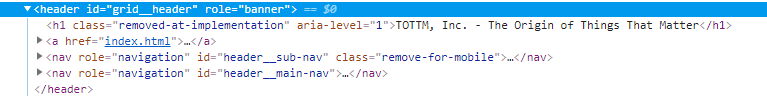
There are four grid items.
Here's the CSS for the container:
header#grid__header {
    height: 9vw;
    z-index: 1;
    margin: 0;
    display: grid;
    grid-template-columns: calc(15vw + 1em) 9fr;
    grid-template-rows: 1fr 2fr;
    grid-template-areas: "logo sub-nav"
                         "logo main-nav";
}
Looks good. The logo is set to span two rows.
The sub-nav grid area is defined correctly:
nav#header__sub-nav {
    grid-area: sub-nav;
    height: auto;
    width: calc(75vw - 1em);
    height: auto;
    margin: 0;
}
The main-nav grid area is defined correctly:
nav#header__main-nav {
    grid-area: main-nav;
    width: calc(75vw - 1em);
    height: auto;
}
However, your logo grid area is missing.
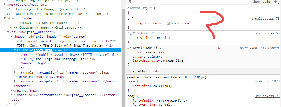
Actually, you've defined the logo grid area on the child of the grid item:
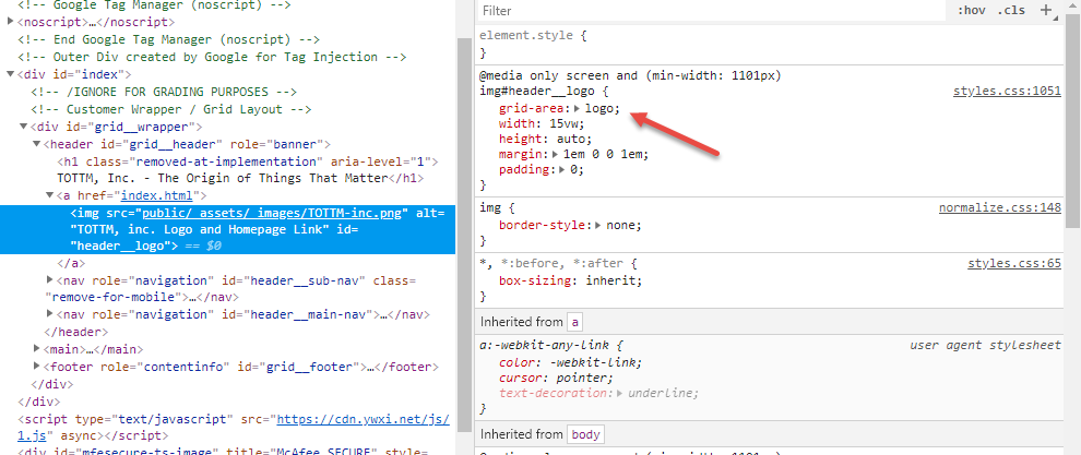
Because the grid area is applied to the child of a grid item, it is out of scope and the rule is ignored. Move the rule to the parent, where it can be seen by the grid container.
How to use row span in a css grid
As said in the comment, you dont span 2 rows, you span 2 columns. Also you need to apply the class to the 1st element: .wide { grid-column: span 2; }
In your picture you also have a 6 column grid not a 5 column one
.grid {
  display: grid;
  grid-template-columns: repeat(6, 90px);
  grid-auto-rows: 50px;
  grid-gap: 5px;
}

.wide {
  grid-column: span 2;
}


/* for styling purpose only */
.grid > div:nth-child(n+1) {
  background-color: grey;
}

.grid > div:nth-child(1) {
  background-color: brown;
}
<div class="grid">
<div class="wide"></div>
<div></div>
<div></div>
<div></div>
<div></div>
<div></div>
<div></div>
<div></div>
<div></div>
<div></div>
<div></div>
</div>How to span a column two rows in Bootstrap 4
Using custom grid layout is my first suggestion. (Or maybe bootstrap has some shortcuts to that, but I don't know of them) You can play with order-X classes of bootstrap. But that will not help you to get logo div, in between nav divs in different wrapper
.special {  display: grid;}
div {border: 1px solid grey;}
/* for tablets and desktops*/@media screen and (min-width: 600px) {  .special {    grid-template-columns: 1fr 2fr;    grid-template-rows: 50px 50px;  }    .logo {grid-area: 1/1/3/2;}
}
<div class="special"> <div class="topNav">top nav</div> <div class="logo">logo</div> <div class="bottomNav">bottom nav</div></div>How to make a div span two rows (only on mobile layout)?
Just going off your diagram:
<div class="container">
    <div class="col-sm-12 col-md-4">
        <div class="col-sm-3 col-md-12">The X icon in the diagram</div>
        <div class="col-sm-9 col-md-12">
            The article text
        </div>
    </div>
</div>
Related Topics
What Is the Way to Add Horizontal Scroll on Material-Ui Table With Many Columns
Want My Button to Remain Dark When Clicked
How to Align a ≪Div≫ to the Middle (Horizontally/Width) of the Page
Is There a CSS Parent Selector
Bootstrap Navbar With Left, Center or Right Aligned Items
Css to Select/Style First Word
Semi-Transparent Color Layer Over Background-Image
Why Don't :Before and :After Pseudo Elements Work With 'Img' Elements
Why Does Order of Transforms Matter? Rotate/Scale Doesn't Give the Same Result as Scale/Rotate
:First-Child Not Working as Expected
Family Tree With Pure HTML and CSS (Or With Minimal Js)
Bootstrap 4 - Change Position of Carousel Controls
How to Easily Horizontally Center a ≪Div≫ Using Css
Is There a "Previous Sibling" Selector
What Does the CSS Rule "Clear: Both" Do
Difference Between Normalize.Css and Reset Css
How to Reference Jsf Image Resource as CSS Background Image Url