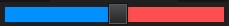
JavaFX Slider with 2 different colors , for example green for selected area and red for unselected area
1 slider and 2 progress bars , I will post below the .fxml code , .java code and the needed .css for look and feel :)
Any question feel free to answer :)
As for the code , this is created for XR3Player (Open Source Github Project)


.fxml:
<?xml version="1.0" encoding="UTF-8"?>

<?import java.lang.String?>
<?import javafx.geometry.Insets?>
<?import javafx.scene.control.ProgressBar?>
<?import javafx.scene.control.Slider?>
<?import javafx.scene.layout.BorderPane?>
<?import javafx.scene.layout.HBox?>
<?import javafx.scene.layout.StackPane?>

<fx:root prefHeight="389.0" prefWidth="228.0" style="-fx-background-color: #202020;" stylesheets="@../../style/application.css" type="StackPane" xmlns:fx="http://javafx.com/fxml/1" xmlns="http://javafx.com/javafx/9.0.1">
   <children>
      <BorderPane fx:id="borderPane" minHeight="0.0" minWidth="0.0">
         <bottom>
            <StackPane minHeight="0.0" minWidth="0.0" BorderPane.alignment="CENTER">
               <children>
                  <HBox alignment="CENTER" maxHeight="-Infinity" minHeight="0.0" minWidth="0.0" prefHeight="15.0">
                     <children>
                        <ProgressBar fx:id="volumeProgress1" maxWidth="1.7976931348623157E308" minHeight="0.0" minWidth="0.0" mouseTransparent="true" prefHeight="15.0" progress="1.0" HBox.hgrow="ALWAYS">
                           <styleClass>
                              <String fx:value="transparent-progress-bar" />
                              <String fx:value="transparent-volume-progress-bar2-nostrip" />
                           </styleClass>
                        </ProgressBar>
                        <ProgressBar fx:id="volumeProgress2" layoutX="10.0" layoutY="10.0" maxWidth="1.7976931348623157E308" minHeight="0.0" minWidth="0.0" mouseTransparent="true" prefHeight="15.0" progress="1.0" HBox.hgrow="ALWAYS">
                           <styleClass>
                              <String fx:value="transparent-progress-bar" />
                              <String fx:value="transparent-volume-progress-bar3-nostrip" />
                           </styleClass>
                        </ProgressBar>
                     </children>
                  </HBox>
                  <Slider fx:id="masterVolumeSlider" majorTickUnit="15.0" max="150.0" maxWidth="1.7976931348623157E308" minorTickCount="55" value="75.0">
                     <styleClass>
                        <String fx:value="transparency-slider" />
                        <String fx:value="timer-slider" />
                     </styleClass>
                  </Slider>
               </children>
               <BorderPane.margin>
                  <Insets left="5.0" right="5.0" />
               </BorderPane.margin>
            </StackPane>
         </bottom>
      </BorderPane>
   </children>
</fx:root>
.java
import java.io.IOException;

import javafx.fxml.FXML;
import javafx.fxml.FXMLLoader;
import javafx.scene.control.ProgressBar;
import javafx.scene.control.Slider;
import javafx.scene.layout.BorderPane;
import javafx.scene.layout.StackPane;
import main.java.com.goxr3plus.xr3player.application.tools.InfoTool;

public class MixTabInterface extends StackPane {

    //--------------------------------------------------------------

    @FXML
    private BorderPane borderPane;

    @FXML
    private ProgressBar volumeProgress1;

    @FXML
    private ProgressBar volumeProgress2;

    @FXML
    private Slider masterVolumeSlider;

    // -------------------------------------------------------------

    /**
     * Constructor.
     */
    public MixTabInterface() {

        // ------------------------------------FXMLLOADER ----------------------------------------
        FXMLLoader loader = new FXMLLoader(getClass().getResource(InfoTool.PLAYERS_FXMLS + "MixTabInterface.fxml"));
        loader.setController(this);
        loader.setRoot(this);

        try {
            loader.load();
        } catch (IOException ex) {
            ex.printStackTrace();
        }

    }

    /**
     * Called as soon as fxml is initialized
     */
    @FXML
    private void initialize() {

        //masterVolumeSlider
        masterVolumeSlider.boundsInLocalProperty().addListener((observable , oldValue , newValue) -> calculateBars());
        masterVolumeSlider.valueProperty().addListener((observable , oldValue , newValue) -> {
            calculateBars();
        });
    }

    /**
     * Calculate bars positioning
     */
    private void calculateBars() {

        //Variables
        double value = masterVolumeSlider.getValue();
        double half = masterVolumeSlider.getMax() / 2;
        double masterVolumeSliderWidth = masterVolumeSlider.getWidth();

        //Progress Max1
        volumeProgress1.setProgress(1);
        volumeProgress2.setProgress(1);

        //Below is mind tricks
        if ((int) value == (int) half) {
            volumeProgress1.setMinWidth(masterVolumeSliderWidth / 2);
            volumeProgress2.setMinWidth(masterVolumeSliderWidth / 2);
        } else if (value < half) {
            double progress = 1.0 - ( value / half );
            double minimumWidth = masterVolumeSlider.getWidth() / 2 + ( masterVolumeSlider.getWidth() / 2 ) * ( progress );
            volumeProgress1.setMinWidth(masterVolumeSliderWidth - minimumWidth);
            volumeProgress1.setMaxWidth(masterVolumeSliderWidth - minimumWidth);
            volumeProgress2.setMinWidth(minimumWidth);
        } else if (value > half) {
            double progress = ( value - half ) / half;
            double minimumWidth = masterVolumeSlider.getWidth() / 2 + ( masterVolumeSlider.getWidth() / 2 ) * ( progress );
            volumeProgress1.setMinWidth(minimumWidth);
            volumeProgress2.setMinWidth(masterVolumeSliderWidth - minimumWidth);
            volumeProgress2.setMaxWidth(masterVolumeSliderWidth - minimumWidth);
        }

    }

    /**
     * @return the borderPane
     */
    public BorderPane getBorderPane() {
        return borderPane;
    }

    /**
     * @return the masterVolumeSlider
     */
    public Slider getMasterVolumeSlider() {
        return masterVolumeSlider;
    }

}
.css
.transparent-volume-progress-bar2-nostrip > .bar,.transparent-volume-progress-bar2-nostrip:indeterminate .bar,.transparent-volume-progress-bar2-nostrip:determinate .track,.transparent-volume-progress-bar2-nostrip:indeterminate .track{
    -fx-accent:rgb(0.0, 144.0, 255.0);
    -fx-background-color: -fx-accent;
    -fx-background-radius:0.0;
    -fx-border-radius:0.0;
}

.transparent-volume-progress-bar3-nostrip > .bar,.transparent-volume-progress-bar3-nostrip:indeterminate .bar,.transparent-volume-progress-bar3-nostrip:determinate .track,.transparent-volume-progress-bar3-nostrip:indeterminate .track{
    -fx-accent:#fc4f4f;
    -fx-background-color: -fx-accent;
    -fx-background-radius:0.0;
    -fx-border-radius:0.0;
}

.progress-bar > .bar {
    -fx-accent:firebrick;
    /*-fx-background-color:firebrick;*/
    -fx-background-color: linear-gradient(
        from 0.0px 0.75em to 0.75em 0.0px,
        repeat,
        -fx-accent 0.0%,
        -fx-accent 49.0%,
        derive(-fx-accent, 30.0%) 50.0%,
        derive(-fx-accent, 30.0%) 99.0%
    );

    -fx-background-insets: 3.0;
    -fx-padding: 0.2em;
}

.transparent-progress-bar:determinate .track,.transparent-progress-bar:indeterminate .track{
    -fx-background-color:rgb(0.0,0.0,0.0,0.5);
}

  /* .transparent-progress-bar */
.transparent-progress-bar > .bar,.transparent-progress-bar:indeterminate .bar{
    -fx-accent:firebrick;
}
how to change fill color of slider in javafx
Long post below.. if you want an easy way to achieve the color on your slider I should mention that you can just use the JFoenix Slider which has the functionalities you need.
Although there is actually no need to use a 3rd library if you can achieve the same result natively.
Well, there isn't any CSS rule like -fx-progress-color which you set to a specific color and then you are done. The color of the .track is set with the CSS rule below :
.slider .track {
      -fx-background-color:
          -fx-shadow-highlight-color,
          linear-gradient(to bottom, derive(-fx-text-box-border, -10%), -fx-text-box-border),
          linear-gradient(to bottom,
            derive(-fx-control-inner-background, -9%),
            derive(-fx-control-inner-background, 0%),
            derive(-fx-control-inner-background, -5%),
            derive(-fx-control-inner-background, -12%)
          );
    -fx-background-insets: 0 0 -1 0, 0, 1;
    -fx-background-radius: 0.25em, 0.25em, 0.166667em; /* 3 3 2 */
    -fx-padding: 0.25em; /* 3 */
}
There are few things you need to do, the first one is to listen for value changes of your slider and second to update your track color depending on the slider's value. To set the background color you will need to set a linear-gradient to the background like :
-fx-background-color: linear-gradient(to right, #2D819D START, #969696 END);
With the code above, you will set a linear gradient background starting from the left to right using the color #2D819D which is the 'progress' color and the #969696 which represents the remaining progress. Now the START and the END should be numbers and in order to have the look you want, both numbers must be equal so when the one stops the other starts. For example if you set :
-fx-background-color: linear-gradient(to right, #2D819D 20%, #969696 20%);

The real challenge is to find a way to set these values programmatically inside the ChangeListener of your slider. My first approach was to use a CSS variable like :
.slider .track{
    -progress : 0.2;
    -fx-background-color: linear-gradient(to right, #2D819D -progress, #969696 -progress);
}
And to update the -progress using inline CSS rules on ChangeListener. Sadly for some reason this is not supported. I would love to find out why too. Also, you can't apply inline CSS for the subclass, which means you can not do slider.setStyle(".track {...}");
So to summarize, you could either :
1. Access the slider's track using lookup and apply the CSS directly.
import javafx.application.Application;
import javafx.beans.value.ChangeListener;
import javafx.beans.value.ObservableValue;
import javafx.geometry.Insets;
import javafx.scene.Scene;
import javafx.scene.control.Slider;
import javafx.scene.layout.BorderPane;
import javafx.scene.layout.StackPane;
import javafx.stage.Stage;

public class CustomSlider extends Application {

    @Override
    public void start(Stage stage) throws Exception {
        BorderPane mainPane = new BorderPane();
        mainPane.setPadding(new Insets(15));

        Slider slider = new Slider();
        slider.setId("color-slider");

        mainPane.setCenter(slider);

        Scene scene = new Scene(mainPane, 250, 400);
        stage.setScene(scene);
        stage.show();

        StackPane trackPane = (StackPane) slider.lookup(".track");

        slider.valueProperty().addListener(new ChangeListener<Number>() {
            public void changed(ObservableValue<? extends Number> ov, Number old_val, Number new_val) {
                String style = String.format("-fx-background-color: linear-gradient(to right, #2D819D %d%%, #969696 %d%%);",
                        new_val.intValue(), new_val.intValue());
                trackPane.setStyle(style);
            }
        });

        trackPane.setStyle("-fx-background-color: linear-gradient(to right, #2D819D 0%, #969696 0%);");

    }

    public static void main(String[] args) {
        launch(args);
    }
}
2. Make a custom Slider from scratch (not that hard)
import javafx.application.Application;
import javafx.beans.value.ChangeListener;
import javafx.beans.value.ObservableValue;
import javafx.geometry.Insets;
import javafx.scene.Scene;
import javafx.scene.control.Slider;
import javafx.scene.layout.BorderPane;
import javafx.scene.layout.StackPane;
import javafx.scene.paint.Color;
import javafx.scene.shape.Rectangle;
import javafx.stage.Stage;

public class SliderTest extends Application {

    @Override
    public void start(Stage primaryStage) {
        BorderPane mainPane = new BorderPane();
        mainPane.setPadding(new Insets(15));

        mainPane.setCenter(new ColorSlider());

        Scene scene = new Scene(mainPane, 250, 400);
        primaryStage.setScene(scene);
        primaryStage.show();

    }

    public static void main(String[] args) {
        launch(args);
    }

    public class ColorSlider extends StackPane {

        public ColorSlider() {
            getStylesheets().add(this.getClass().getResource("colorSlider.css").toExternalForm());
            Slider slider = new Slider();
            slider.setId("color-slider");

            // The rectangle which shows the progress
            Rectangle progressRec = new Rectangle();
            // Bind both width and height to match the size of Slider
            progressRec.heightProperty().bind(slider.heightProperty().subtract(7));
            progressRec.widthProperty().bind(slider.widthProperty());

            progressRec.setFill(Color.web("#969696"));

            // Make the corners of Rectangle to be rounded
            progressRec.setArcHeight(15);
            progressRec.setArcWidth(15);

            // Listen on value changes on the slider to update the progress (color)
            slider.valueProperty().addListener(new ChangeListener<Number>() {
                public void changed(ObservableValue<? extends Number> ov, Number old_val, Number new_val) {
                    // Using linear gradient we can fill two colors to show the progress
                    // the new_val gets values between 0 - 100
                    String style = String.format("-fx-fill: linear-gradient(to right, #2D819D %d%%, #969696 %d%%);",
                            new_val.intValue(), new_val.intValue());
                    // set the Style
                    progressRec.setStyle(style);
                }
            });

            getChildren().addAll(progressRec, slider);
        }
    }
}
colorSlider.css
#color-slider .track{
    -fx-background-color:transparent;
}
How to create transparent slider in javafx
you can set opacity for slider and it will make it transparent...javafx every control have a opacity property...you can use it
like this
Slider sb = new Slider();
sb.setOpacity(0.25);
How to change color of selected RadioButton in JavaFX [CSS]?
-jfx-selected-color and -jfx-unselected-color are not defined in JavaFX. They are attributes from JFoenix (docs). Also -fx-selected-color and -fx-unselected-color are not available in JavaFX.
To change the color of the dot in the RadioButton you can use the :selected pseudoclass like this (docs):
.radio-button:selected .radio .dot {
    -fx-background-color: red;
    -fx-background-insets: 0;
}
Additionally to the -fx-background-color you should set -fx-background-insets: 0;, because otherwise the dot is not exactly in the center anymore.
The result will look like this:

How do I remove the default border glow of a JavaFX button (when selected)?
To remove the focus ring display from any control from within code:
control.setStyle("-fx-focus-color: transparent;");
To remove the focus ring for all controls, apply a stylesheet:
.root { -fx-focus-color: transparent; }
To only remove the ring for all buttons, use:
.button { -fx-focus-color: transparent; }
I find the -fx-focus-color attribute setting more straight-forward than relying on some weird combination of insets to remove the focus ring.
In addition, you can use the same setting to change the focus ring to a different color, such as -fx-focus-color: firebrick.
Update Jan 20, 2015
JavaFX 8 shipped with a new default user agent stylesheet (modena). This new user agent stylesheet shipped with an additional setting for focus highlights: -fx-faint-focus-color. For Java 8 applications, it is necessary to set both -fx-focus-color and -fx-faint-focus-color to transparent to remove all traces of the focus ring. See good4m's answer to this question.
Update Dec 10, 2015
If you only set the focus colors to transparent as previously recommended in this answer, for some controls you may see some subtle differentiation between when a control is focused and when it is not. For many applications this will not be an issue and setting the focus colors to transparent will be sufficient.
For more information and alternate solutions, review James_D's answer to Remove blue frame from JavaFX input field and Jens Deter's blog post about How to get rid of focus highlighting in JavaFX. Be aware that the link to Jens Deter's blog unfortunately has some annoying pop-ups.
Related Topics
Fit <Svg> to The Size of <Object> Container
How to Position Two Divs Above Each Over
Left Align Text and Right Align Image in CSS
CSS Selector for Shadow Root or All Top Level Elements in Shadow Root
Fade/Transition Tailwind Class to Something Else Over Certain Amount of Time
Yii2 - Detailview Widget Float Left
Page-Break-Before:Auto Not Working for Me....Why
Sass "Error: Can't Find Stylesheet to Import."
How to Make Vertically Rotated Links in HTML
How to Change The Image Inside an HTML5 Form-Validation Message
How to Display Only a Certain Div Within an Iframe
Nested Rows in Bootstrap 3 Fail to Respect The Grid
How to Scroll Programmatically a Div with Its Own Scrollbars
How to Add Custom Breakpoints in Bootstrap4 and How to Use Responsive Breakpoint Mixins in SCSS