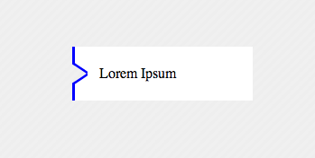
Inside transparent arrow on the left
with a single element you could do this i have to go to work hope this help
<div>Lorem Ipsum</div>
the style:
   div{
        width:200px;
        height:60px;
        margin:100px;
        background-color:transparent;
        color:black;
        position:relative;
        text-indent:30px;
        line-height:60px;
        box-shadow:inset 20px 0 0 200px white;
        overflow:hidden;
        -webkit-box-shadow: inset -164px 0 0 20px white;
        -moz-box-shadow: inset -164px 0 0 20px white;
        box-shadow: inset -164px 0 0 20px white;
    }
    div:before{
        content: '';
    position: absolute;
    left: 0px;
    top: 4px;
    width: 14px;
    border-bottom: 3px solid blue;
    border-left: 3px solid blue;
    height: 18px;
        background-color:white;
    -webkit-transform: skew(0deg,34deg);
        -moz-transform: skew(0deg,34deg);
    transform: skew(0deg,34deg);
    }
    div:after{
    content: '';
    position: absolute;
        background-color:white;
    left: 0px;
    bottom: 4px;
    width: 14px;
    border-top: 3px solid blue;
    border-left: 3px solid blue;
    height: 18px;
    -webkit-transform: skew(0deg,-34deg);
        -moz-transform: skew(0deg,-34deg);
    transform: skew(0deg,-34deg);
    }
    body{
        background-color: #EEEEEE;
        khtml-background-size: 10px 10px;
    -webkit-background-size: 10px 10px;
    -moz-background-size: 10px 10px;
    -ms-background-size: 10px 10px;
    -o-background-size: 10px 10px;
    background-size: 10px 10px;
    background-image: -khtml-linear-gradient(135deg, rgba(255, 255, 255, .15) 25%, transparent 25%, transparent 50%, rgba(255, 255, 255, .15) 50%, rgba(255, 255, 255, .15) 75%, transparent 75%, transparent);
    background-image: -webkit-gradient(linear, left top, right bottom, color-stop(.25, rgba(255, 255, 255, .15)), color-stop(.25, transparent), color-stop(.5, transparent), color-stop(.5, rgba(255, 255, 255, .15)), color-stop(.75, rgba(255, 255, 255, .15)), color-stop(.75, transparent), to(transparent));
    background-image: -webkit-linear-gradient(135deg, rgba(255, 255, 255, .15) 25%, transparent 25%, transparent 50%, rgba(255, 255, 255, .15) 50%, rgba(255, 255, 255, .15) 75%, transparent 75%, transparent);
    background-image: -moz-linear-gradient(135deg, rgba(255, 255, 255, .15) 25%, transparent 25%, transparent 50%, rgba(255, 255, 255, .15) 50%, rgba(255, 255, 255, .15) 75%, transparent 75%, transparent);
    background-image: -ms-linear-gradient(135deg, rgba(255, 255, 255, .15) 25%, transparent 25%, transparent 50%, rgba(255, 255, 255, .15) 50%, rgba(255, 255, 255, .15) 75%, transparent 75%, transparent);
    background-image: -o-linear-gradient(135deg, rgba(255, 255, 255, .15) 25%, transparent 25%, transparent 50%, rgba(255, 255, 255, .15) 50%, rgba(255, 255, 255, .15) 75%, transparent 75%, transparent);
    background-image: linear-gradient(135deg, rgba(255, 255, 255, .15) 25%, transparent 25%, transparent 50%, rgba(255, 255, 255, .15) 50%, rgba(255, 255, 255, .15) 75%, transparent 75%, transparent);
        width:100%;
        height:100%;

    }
Inside transparent arrow on the top
As stated in the question, your case is a bit different from the example that was provided by web-tiki. In the example that you were referring to, the border with the transparent cut was included as the bottom border for the image whereas you need it as the top border of the plain text area.
The expected output can be achieved with the same skew technique described in that answer. However, it needs to be tweaked a bit to match your case.
- First thing is, the skewed pseudo-elements (that produce the border) should be added to the container of plain text area and not the top section which holds the image. This part you have already done correctly.
- Next, you need to position the border such that even with the border the height of your text container will be equal to the other two images placed by its side. For this, you need to position the elements that form the border within the plain text container (
top: 0%) instead of above it (bottom: 100%in your code). - Then, if the text container has a non-transparent background, you need to clip it such that it is not present behind the elements that is creating the border effect. This can be achieved by adding a
padding-topon the text container equal to theheightof the border pseudo-elements and then settingbackground-clip: content-boxto it. - Finally, you need to move the entire bottom part up by the same number of pixels as the height of the border in order for the top image to be seen through the transparent cut out area. This can be done by adding a negative
margin-topto the bottom container.
Putting it altogether your code should be similar to the below snippet to achieve the effect that you need. (Note: Your fiddle has way too much code and so I have created a simpler sample for the demo).
.section { height: 200px; width: 500px; background: url(http://lorempixel.com/500/200/nature/3);}.bottom-container { margin-top: -15px; height: 100px; width: 500px;}.text,.middle-image,.right-image { float: left; height: 100%; width: calc(100% / 3);}.middle-image { background: url(http://lorempixel.com/200/100/nature/2);}.right-image { background: url(http://lorempixel.com/250/100/nature/1);}.text { position: relative; box-sizing: border-box; height: 100%; padding-top: 15px; text-align: center; line-height: 85px; background: #F7F7F7; /* Just for demo */ background-clip: content-box; /* needed only if your background is not transparent */ overflow: hidden;}.text:after,.text:before { position: absolute; content: ''; top: 0px; height: 15px; background: rgb(215,182,115);}.text:before { left: 0px; width: 25%; transform-origin: left bottom; transform: skew(45deg);}.text:after { right: 0px; width: 75%; transform-origin: right bottom; transform: skew(-45deg);}<!-- prefix free library to avoid browser prefixes in CSS --><script src="https://cdnjs.cloudflare.com/ajax/libs/prefixfree/1.0.7/prefixfree.min.js"></script>
<section class="section"></section><div class="bottom-container"> <div class="text">Some text</div> <div class="middle-image"></div> <div class="right-image"></div></div>Transparent arrow on right side of image
There are two polygons with white background over the image, it is not an arrow but the space between the two polygons. Changin the width and the position of :before and :after you can move the triangle.
.wrap {  position: relative;  overflow: hidden;  width: 70%;  height:150px;  margin: 0 auto;  background-color:#fff;}.wrap img {  width: 100%;  height: auto;  display: block;}.wrap:before, .wrap:after {  content:'';  position: absolute;  bottom: 0;  width: 100%;  background-color: inherit;  padding-bottom:3%;}.wrap:before {
  -ms-transform-origin: 100% 100%;  -webkit-transform-origin: 100% 100%;  transform-origin: 100% 100%;  -ms-transform: skewX(45deg);  -webkit-transform: skewX(45deg);  transform: skewX(45deg);}.wrap:after {  left: 97%;  -ms-transform-origin: 0 100%;  -webkit-transform-origin: 0 100%;  transform-origin: 0 100%;  -ms-transform: skewX(-45deg);  -webkit-transform: skewX(-45deg);  transform: skewX(-45deg);}
<div class="wrap"> <img src="https://farm8.staticflickr.com/7187/6895047173_d4b1a0d798.jpg" /></div>transparent shape with arrow in upper corner
You can do it like in the below snippet. The method used to achieve the shape is as given below:
- The main
divelement only has a top, bottom and left border. The right border is nullified because the element and its arrows needs to be transparent. With a transparent arrow, if a right border is present that would also get displayed. - The arrow on the right is achieved using a
skewed element placed with respect to the right edge of the shape. - The right border of the shape is achieved by using another pseudo-element whose size is the same as the height of the whole container - height of the arrow pseudo-element. This element is positioned with respect to the bottom right of the shape.
You can adjust the height and border-radius as required. I have set the positioning such that even a change in height/width of parent would not affect it.
div.shape {  position: relative;  width: 300px;  height: 100px;  padding: 4px;  margin-top: 20px;  border: 2px solid gray;  border-right: none; /* not required as the shape needs to be transparent */  border-radius: 8px; /* not required as the right border is done through pseudo element */  border-top-right-radius: 0px;  border-bottom-right-radius: 0px;}div.shape:before {  position: absolute;  content: '';  top: -2px; /* equal to border top of parent - no need to change*/  right: -6px; /* for positioning - no need to change*/  height: 15%; /* should be changed depending on height of arrow */  width: 10%; /* should be changed depending on width of arrow */  border-top: 2px solid gray;  border-right: 3px solid gray; /* thicker border because skew makes it thin */
  /* to achieve the arrow like shape */   -webkit-transform-origin: bottom right;  -webkit-transform: skew(-45deg);  -moz-transform: skew(-45deg);  transform: skew(-45deg);}div.shape:after {  position: absolute;  content: '';  right: -6px; /* for positioning - no need to change*/  height: 85%; /* height of parent - height of arrow */  width: 2%; /* no need to change */  bottom: -2px; /* equal to border bottom of parent - no need to change*/  border-right: 2px solid gray;  border-bottom: 2px solid gray;  border-bottom-right-radius: 8px; /* for producing curve on bottom right */}
/* Just for demo */
body {  background: -webkit-linear-gradient(0deg, crimson, indianred, purple);  background: -moz-linear-gradient(90deg, crimson, indianred, purple);  background: linear-gradient(90deg, crimson, indianred, purple);}
<div class="shape"> Lorem Ipsum Dolor Sit Amet...</div>Transparent arrow/triangle indented over an image
There are several approaches to make a transparent arrow over an image with CSS. The two I will describe involve pseudo elements to minimize markup and have the same output. You can also see an SVG approach at the end of this answer :
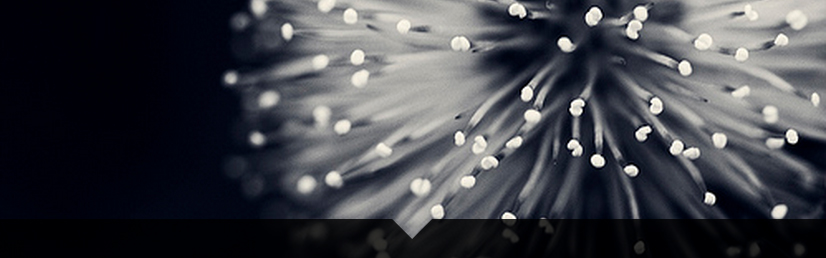
The transparent effect on the black part arround the arrow is made with rgba() colors that allow transparency. But you can use opacity on the pseudo elements if you prefer.
1. SkewX()
You can use the CSS3 skewX() property on two pseudo elements to make the transparent arrow. The main asset of this approach is that the transparent arrow can be responsive but it also allows you to put a border on the black shape and around the traingle.
The responsiveness of the shape is made with the padding-bottom property to maintain it's aspect ratio (this technique is described here).
DEMO
.wrap { position: relative; overflow: hidden; width: 70%; margin: 0 auto;}.wrap img { width: 100%; height: auto; display: block;}.arrow { position: absolute; bottom: 0; width: 100%; padding-bottom: 3%; background-color: rgba(0, 0, 0, 0.8);}.arrow:before,.arrow:after { content: ''; position: absolute; bottom: 100%; width: 50%; padding-bottom: inherit; background-color: inherit;}.arrow:before { right: 50%; -ms-transform-origin: 100% 100%; -webkit-transform-origin: 100% 100%; transform-origin: 100% 100%; -ms-transform: skewX(45deg); -webkit-transform: skewX(45deg); transform: skewX(45deg);}.arrow:after { left: 50%; -ms-transform-origin: 0 100%; -webkit-transform-origin: 0 100%; transform-origin: 0 100%; -ms-transform: skewX(-45deg); -webkit-transform: skewX(-45deg); transform: skewX(-45deg);}<div class="wrap"> <img src="https://farm8.staticflickr.com/7187/6895047173_d4b1a0d798.jpg" /> <div class="arrow"></div></div>Left/right transparent cut out arrow
This solution is adapted from this answer : Transparent arrow/triangle
The point is to use two skewed pseudo elements to make the transparent cut out arrow. Both pseudo elements are absolutely positioned and skewed.
In the following demo, the arrow is on the left. To make the same on on the right, you could duplicate the .arrow element and use scaleX(-1) + positioning on the second one. This will allow you to change both sides at the same time and have less CSS. Or you can make a new element based on the first one and change the positioning and skew properties.
DEMO
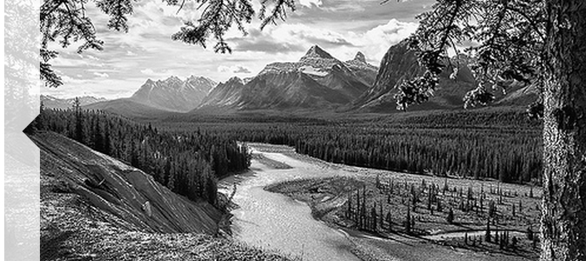
.wrap { position: relative; overflow: hidden; width: 70%; margin: 0 auto;}.wrap img { width: 100%; height: auto; display: block;}.arrow { position: absolute; left: 0; top:0; width: 3%; height:100%; background-color: rgba(255,255,255,.8);}.arrow:before, .arrow:after { content:''; position: absolute; left: 100%; width: 100%; height:50%; background-color: inherit;}.arrow:before { bottom: 50%; -ms-transform-origin: 0 100%; -webkit-transform-origin: 0 100%; transform-origin: 0 100%; -ms-transform: skewY(-45deg); -webkit-transform: skewY(-45deg); transform: skewY(-45deg);}.arrow:after { top: 50%; -ms-transform-origin: 0 0; -webkit-transform-origin: 0 0; transform-origin: 0 0; -ms-transform: skewY(45deg); -webkit-transform: skewY(45deg); transform: skewY(45deg);}<div class="wrap"> <img src="https://farm7.staticflickr.com/6217/6216951796_e50778255c.jpg" /> <div class="arrow"></div></div>CSS arrow. Only a portion of the arrow is being displayed
Is this what you're looking for?
http://jsfiddle.net/61tc5em9/2/
HTML
<div id="container">
    <div id="arrow">text text text</div>
    <div id="content">text text text text</div>
</div>
CSS
#container {
    height: 75px;
    background-color: black;
    position: relative;
    white-space: nowrap;
    }

#arrow {
    width: 30%;
    background-color: red;
    text-align: center;
    font-size: 1.5em;
    line-height: 75px;
}

#arrow::after {
    content: "";
    border-top: 37px solid transparent;
    border-bottom: 38px solid transparent;
    border-left: 50px solid red;
    position: absolute;
    left: 30%;
}

#content {
    color: yellow;
    font-size: 1.5em;
    position: absolute;
    left: 50%;
    top: 25px;
}
Hope this helps. Let me know if you need any changes.
Border with a transparent centred arrow
There are two methods to achieve this using CSS3. One is using skewX on pseudo-elements while the other is using rotate on pseudo-elements. Both the methods are also responsive.
Using Skew:
This method is adapted from web-tiki's answer in this thread. It basically uses two pseudo-elements (with roughly 50% width of the container) that are skewed in opposite directions and positioned appropriately to arrive at the arrow shape. The shapes have borders where as the background is set to transparent meaning the pseudo-elements would produce a bottom border + downward arrow effect. The arrow fill would always be transparent (or body color) in this sample.
body {  background: rgb(245, 242, 242);}.bordered {  position: relative;  height: 200px;  width: 200px;  margin: 10px;  line-height: 200px;}.bordered:after,.bordered:before {  position: absolute;  content: ' ';  height: 8px;  width: 50%;  bottom: 0px;}.bordered:before {  left: 0px;  border-top: 1px solid gray;  border-right: 1px solid gray;  transform-origin: left bottom;  transform: skewX(45deg);}.bordered:after {  right: 0px;  border-top: 1px solid gray;  border-left: 1px solid gray;  transform-origin: right bottom;  transform: skewX(-45deg);}.bordered img {  width: 150px;  padding: 25px;  vertical-align: middle;}/* Just for demo */
.bordered {  transition: all 1s;  text-align: center;}.bordered:hover {  height: 250px;  width: 250px;  line-height: 250px;}
<!-- library included only to avoid browser prefixes --><script src="https://cdnjs.cloudflare.com/ajax/libs/prefixfree/1.0.7/prefixfree.min.js"></script>
<div class="bordered"> <img src="http://i.imgur.com/0Xqum3A.png" /></div>Creating a transparent arrow above image in CSS3
To draw a transparent / inverted triangle in CSS3
you could use the CSS3 triangle technic, and make the inverted shape by combining the :before and :after pseudo objects, each to draw one part of the triangle.
You could do something like this:
.image {
    position:relative;
    height:200px;
    width:340px;
    background:orange;
}
.image:before, .image:after {
    content:'';
    position:absolute;
    width:0;
    border-left:20px solid white;
    left:0;
}
.image:before {
    top:0;
    height:20px;
    border-bottom:16px solid transparent;
}
.image:after {
    top:36px;
    bottom:0;
    border-top:16px solid transparent;
}
here is an illustrative jsfiddle
I just used a plane orange background for the example ... but you can change it to image, and you hopefully get what you wanted =)
Edit: and a more final result could then be something like this
Related Topics
Taghelpers Add Custom Class for Labeltaghelper Based on Validation Attribute [Required]
Overflow:Hidden on Body Is Broken in iOS6
Why Does Setting Overflow Alter Layout of Child Elements
Why Do You Put a Display:Block on an "A" Tag That Is Inside a List
Firefox Text-Overflow with Nowrap Ignored (Chrome Works)
Advanced CSS Selector - Select Based on Styling
How to Animate a Svg Figure Like a Progress Bar with CSS
Colouring of Table Rows Alternatively
What Is the Math Behind -Webkit-Perspective
Safari Page-Break-Inside:Avoid Not Working
Lesscss Stops Processing Styles
Draw an Arrow Inside Table Cell Using CSS
CSS Animation on Hover Stay at Last Keyframe When Using Transform: Rotate
How to Add Zig Zag Border to a Box Contains Background Image