Making a form input 100% width of what's left after the label
Well, I would use JavaScript to do this, since CSS can't do the math and this is how it would look like without changing your HTML or CSS.
(Note: This will work even if you change the width of your .container)
Demo on Fiddle
HTML:
<div class="container">
  <form>
    <p>
      <label>*First Name</label>
      <input type="text" />
    </p>
    <p>
      <label>*Last Name</label>
      <input type="text" />
    </p>
    <p>
      <label>*Street Address</label>
      <input type="text" />
    </p>
    <p>
      <label>Address Line 2</label>
      <input type="text" />
    </p>
  </form>
</div>
JavaScript:
var fWidth = window.getComputedStyle(document.getElementsByClassName('container')[0]).width.slice(0, -2);
var labels = document.getElementsByTagName('label');
var inputs = document.getElementsByTagName('input');

for (i = 0; i < labels.length; i++) {
  var labelWidth = window.getComputedStyle(labels[i]).width.slice(0, -2);
  var inputWidth = fWidth - labelWidth;
  inputs[i].style.width = inputWidth + 'px';
}
CSS:
.container {
    width: 500px;
    padding: 40px;
    border: 1px solid black;
}
label {
    display: inline-block;
}
p {
    white-space: nowrap;
}
input {
    -webkit-box-shadow: -2px 2px 10px 0px rgba(50, 50, 50, 0.22);
    -moz-box-shadow: -2px 2px 10px 0px rgba(50, 50, 50, 0.22);
    box-shadow: -2px 2px 10px 0px rgba(50, 50, 50, 0.22);
    border: 0;
    padding: 10px;
    display: inline-block;
}
How to make an input field have 100% width minus the width of the submit button?
Because you have a fixed height, you could use absolute position to achieve this (If you don't require to support IE 6)
EDIT update my answer base on your jsfiddle, but I only could test it in current Chrome, Safari and FF right now.
jsfiddle
To get auto enlarging work proper with FF you need to use a wrapper around it and the input needs to have a width of 100%. To prevent the padding of the input elements to be added to the width the following css rules needs to be use:
-webkit-box-sizing: border-box; /* Safari/Chrome, other WebKit */
-moz-box-sizing: border-box;    /* Firefox, other Gecko */
box-sizing: border-box;         /* Opera/IE 8+ */
box-sizing is supported by: IE 8+, Chrome, Opera 7+, Safari 3+, Firefox
EDIT
Styling input elements is typically problematic because of their padding and margin.
To have the result you want to achieve without the css3 calc feature you need to do the following steps:
Define the height to the surrounding
.form-wrapperand set itspositiontorelativeso that this element is responsible for the positionabsoluteof the elements it contains.Wrap a container (
.input-wrapper) around the theinputelement, defining its position asabsolutewithleft:0px,top:0px,bottom:0pxandright:[the width of your button]that way the wrapper always has a distance of thewidth of the buttonto the right side.Set the
widthandheightof theinputelement to100%. To prevent the padding of theinputelement to be added to thewidthyou need to set thebox-sizingtoborder-box.Set the position of the
buttontoabsolutewithtop:0px,bottom:0pxandright:0and setting the width towidth: [width of your button]
CSS Input with width: 100% goes outside parent's bound
According to the CSS basic box model, an element's width and height are applied to its content box. Padding falls outside of that content box and increases the element's overall size.
As a result, if you set an element with padding to 100% width, its padding will make it wider than 100% of its containing element. In your context, inputs become wider than their parent.
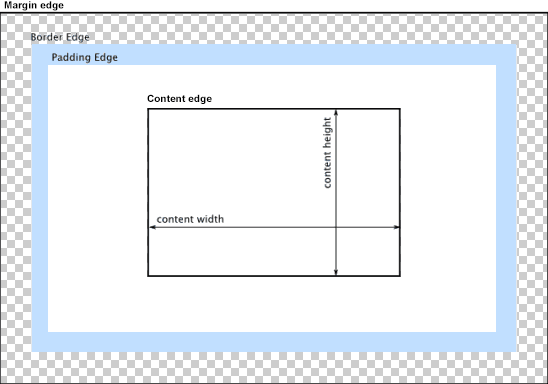
You can change the way the box model treats padding and width. Set the box-sizing CSS property to border-box to prevent padding from affecting an element's width or height:
border-box : The width and height properties include the padding and border, but not the margin... Note that padding and border will be inside of the box.
Note the browser compatibility of box-sizing (IE8+).
At the time of this edit, no prefixes are necessary.
Paul Irish and Chris Coyier recommend the "inherited" usage below:
html {
  box-sizing: border-box;
}
*, *:before, *:after {
  box-sizing: inherit;
}
For reference, see:
* { Box-sizing: Border-box } FTW
Inheriting box-sizing Probably Slightly Better Best-Practice.
Here's a demonstration in your specific context:
#mainContainer {
  line-height: 20px;
  font-family: "Helvetica Neue", Helvetica, Arial, sans-serif;
  background-color: rgba(0, 50, 94, 0.2);
  margin: 20px auto;
  display: table;
  -moz-border-radius: 15px;
  border-style: solid;
  border-color: rgb(40, 40, 40);
  border-radius: 2px 5px 2px 5px / 5px 2px 5px 2px;
  border-radius: 2px;
  border-radius: 2px 5px / 5px;
  box-shadow: 0 5px 10px 5px rgba(0, 0, 0, 0.2);
}
.loginForm {
  width: 320px;
  height: 250px;
  padding: 10px 15px 25px 15px;
  overflow: hidden;
}
.login-fields > .login-bottom input#login-button_normal {
  float: right;
  padding: 2px 25px;
  cursor: pointer;
  margin-left: 10px;
}
.login-fields > .login-bottom input#login-remember {
  float: left;
  margin-right: 3px;
}
.spacer {
  padding-bottom: 10px;
}
input[type=text],
input[type=password] {
  width: 100%;
  height: 30px;
  padding: 5px 10px;
  background-color: rgb(215, 215, 215);
  line-height: 20px;
  font-size: 12px;
  color: rgb(136, 136, 136);
  border-radius: 2px 2px 2px 2px;
  border: 1px solid rgb(114, 114, 114);
  box-shadow: 0 1px 0 rgba(24, 24, 24, 0.1);
  box-sizing: border-box;
}
input[type=text]:hover,
input[type=password]:hover,
label:hover ~ input[type=text],
label:hover ~ input[type=password] {
  background: rgb(242, 242, 242);
  !important;
}
input[type=submit]:hover {
  box-shadow: inset 0 1px 0 rgba(255, 255, 255, 0.3), inset 0 -10px 10px rgba(255, 255, 255, 0.1);
}
.login-top {
  height: auto;/*85px;*/
}
.login-bottom {
  padding: 35px 15px 0 0;
}
<div id="mainContainer">
<div id="login" class="loginForm">
<div class="login-top">
</div>
<form class="login-fields" onsubmit="alert('test'); return false;">
<div id="login-email" class="login-field">
<label for="email" style="-moz-user-select: none;-webkit-user-select: none;" onselectstart="return false;">E-mail address</label>
<span><input name="email" id="email" type="text" /></span>
</div>
<div class="spacer"></div>
<div id="login-password" class="login-field">
<label for="password" style="-moz-user-select: none;-webkit-user-select: none;" onselectstart="return false;">Password</label>
<span><input name="password" id="password" type="password" /></span>
</div>
<div class="login-bottom">
<input type="checkbox" name="remember" id="login-remember" />
<label for="login-remember" style="-moz-user-select: none;-webkit-user-select: none;" onselectstart="return false;">Remember my email</label>
<input type="submit" name="login-button" id="login-button_normal" style="cursor: pointer" value="Log in" />
</div>
</form>
</div>
</div>HTML input element not taking 100% width
The input element is getting inserted inside 'main' container. Hence, set the width to 100% for the main tag.
main, .mainMenu {
    position: absolute;
    top: 2.5em;
    width: 100%;
}
Here is the fix
* {    margin: 0;    padding: 0;}
html {    height: 100%;}
body {    height: 1%;}
header > button {    height: 1.5em;    width: 1.5em;    font-size: 1.5em;    top: 0;}
label.pageTitle {    display: inline-block;    width: calc(100% - 5em);    text-align: center;}
header {    border-bottom: 1px solid black;    width: 100%;    position: fixed;    top: 0;}
main, .mainMenu {    position: absolute;    top: 2.5em;    width: 100%;}
main {    z-index: -2;}
footer {    position: fixed;    bottom: 0;    width: 100%;}
footer > button {    font-size: 1em;    padding: 0.5em 1em;
}input {    font-size: 1em;    padding: 0.25em;    margin: 0.25em;    width: 100%;}
header, footer {    background-color: white;}
.horizontal-style {    display: table;    width: 100%}.horizontal-style li {    display: table-cell;    padding: 2px;}.horizontal-style button {    display: block;    border: 1px solid black;    text-align: center;    background: #dfdfdf;}
footer button {    width: 100%;    border-radius: 6px;    font-size: 1.5em;}
.mainMenu {    padding-left: 1em;    background-color: #dfdfdf;    width: 70%;    border-radius: 0 6px 10px 0;}
ul {    list-style-type: none;}
ul li img {    vertical-align: middle;    padding-right: 0.25em;}
a {    display: block;    padding: 1em 0em;}
// index.html
<!doctype html><html lang="en" ng-app="appModule"><head> <meta charset="UTF-8"> <title>Document</title> <link rel="stylesheet" href="index.css"> <meta name="viewport" content="width=device-width" />
<base href="http://localhost:63342/students/">
<!--<script src="https://ajax.googleapis.com/ajax/libs/angularjs/1.4.9/angular.js"></script>--> <!--<script src="https://ajax.googleapis.com/ajax/libs/angularjs/1.4.9/angular-route.js"></script>--> <script src="angular.js"></script> <script src="angular-route.js"></script>
<script src="app.js"></script>
<script src="services/routing.js"></script> <script src="services/menuToggle.js"></script>
<script src="controllers/menuToggleCtrl.js"></script> <script src="controllers/mainMenuCtrl.js"></script> <script src="controllers/page1Ctrl.js"></script> <script src="controllers/page2Ctrl.js"></script></head>
<body><header ng-controller="MenuToggleCtrl"> <button class="menuLeft" type="button" ng-model="clicked" ng-click="menuToggle()">☰</button> <label id="pageTitle" class="pageTitle">Select item from list</label> <button class="menuRight" type="button">⋮</button></header><!--<section class="mainMenu" ng-controller="MainMenuCtrl" ng-if="!clicked"> <ul> <li ng-repeat="item in menuItems"> <a href="#/{{item.name}}"> <image ng-src="images/{{item.image}}.png"></image> {{item.name}} </a> </li> </ul></section>-->
<main ng-view> <section> <input type="text" placeholder="page1-input1"></section> </main>
<footer ng-controller="MenuToggleCtrl" ng-if="clicked"> <ul class="horizontal-style"> <li><button type="button">NO</button></li> <li><button type="button">EXTRA</button></li> <li><button type="button">YES</button></li> </ul></footer>
</body></html>Getting the input box 100% even width inside a fieldset element
The issue you are facing is the default style that is computed on input by your browser. The browser adds padding and a border to the <input> element.
As you are setting width:100%; on the input, if you add the default padding and border, it renders wider than the container and therefore overflows.
You can solve this by adding : box-sizing:border-box; on the input so padding and border are contained in the 100% width.
FIDDLE
More info here about the box-sizing property.
Style input element to fill remaining width of its container
as much as everyone hates tables for layout, they do help with stuff like this, either using explicit table tags or using display:table-cell
<div style="width:300px; display:table">
    <label for="MyInput" style="display:table-cell; width:1px">label text</label>
    <input type="text" id="MyInput" style="display:table-cell; width:100%" />
</div>
CSS inline form with aligned inputs to label length and input width is remaining space
Simple solution using tables:
form, table, input{  width: 100%;}
.label-col{  width: 1px;  white-space: nowrap;}
label{    margin-right: 10px;}
label:after{    content: ": ";}
<form> <table> <tr> <td class="label-col"><label for="username">Username</label></td> <td><input type="text" id="username" required/></td> </tr> <tr> <td class="label-col"><label for="username2">This is some long text</label></td> <td><input type="text" id="username2" required/></td> </tr> <tr> <td class="label-col"><label for="username3">This text is even longer heh</label></td> <td><input type="text" id="username3" required/></td> </tr> </table></form>Align checkboxes having 100% width without labels to the left
Remove margin: 0 auto; width: 100%; from input[type="checkbox"]. Having auto on the sides places the box in the middle.
Having display block will make sure it's on its own line
Related Topics
Including CSS with '<Link>' or '@Import' - Which Is Better
React Native - Why Padding Does Not Work
Heroku Does Not Serve Background Image, Localhost Does
How Does 'Flex-Grow:0' Get Interpreted
How Does CSS Opacity Affect Accessibility
How to Tell Org-Mode to Embed My CSS File on HTML Export
CSS Filter Grayscale Not Working in Firefox
Visibility:Hidden in Angular 2
CSS Multiple Backgrounds Scrolling at Different Speeds
How to Hide One Column from Grid in Bootstrap Mobile Version
Text-Decoration: Underline Vs Border-Bottom
Have Border-Radius Cover Inner Divs
How to Get a Rotated Linear Gradient Svg for Use as a Background Image